Spline charts are similar to Line charts but use smoothed curves instead of straight line segments, making trends appear more fluid and visually continuous.
They are especially useful when you want to:
- emphasize gradual changes
- present smoother trend lines
- improve visual readability of time-based data
In this tutorial, we will reuse the Sales Tracking list created in the previous tutorial to create a Spline chart and compare it with a Line chart.
Instructions
Step 1: Prepare the data source
We will reuse the Sales Tracking list created in the previous tutorial.
The list contains:
- Month
- 2025 Sales
- 2026 Sales
- Index
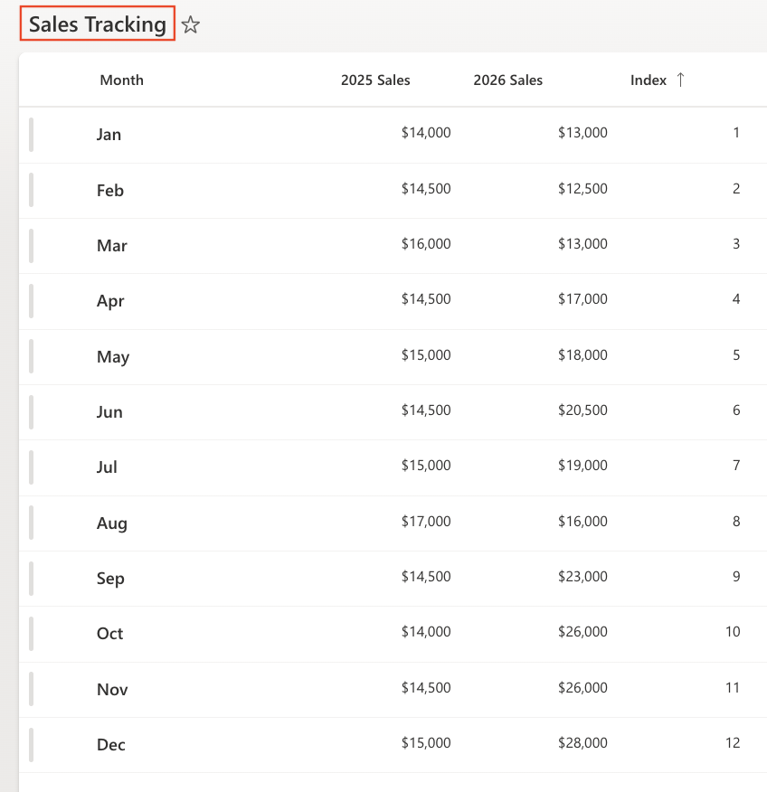
Make sure the view is sorted by: Index (Ascending)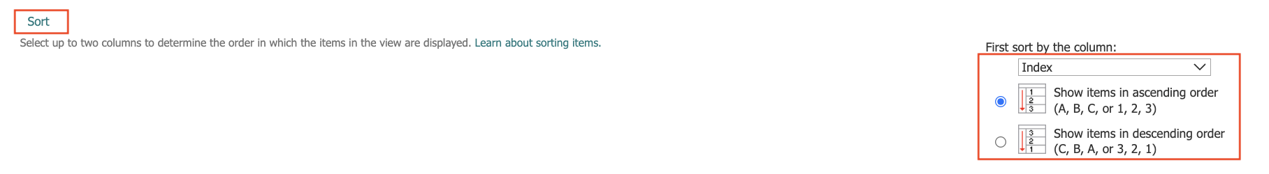
Step 2: Open Charts in Ultimate Forms
- Open Design
- Select Charts from the main menu.
- Click Add new profile
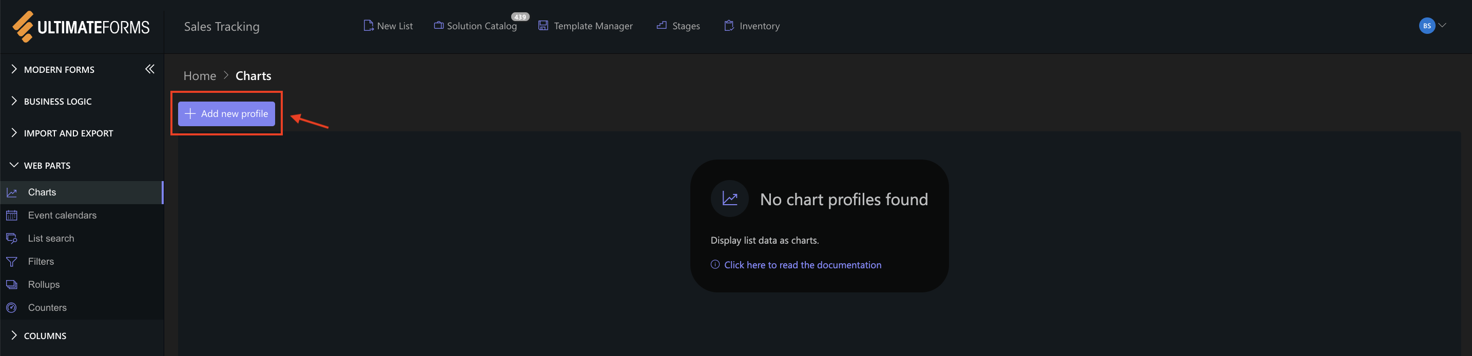
The Chart profile configuration panel opens.
Step 3: Configure General settings
- Title: Monthly Sales Trend
- View: All Items (or your sorted view)
- Category (X axis): Month
- Colors (Optional)
- Add two Series:
- Series 1
- Column: 2025 Sales
- Aggregation: Sum
- Label: 2025
- Series 2
- Column: 2026 Sales
- Aggregation: Sum
- Label: 2026
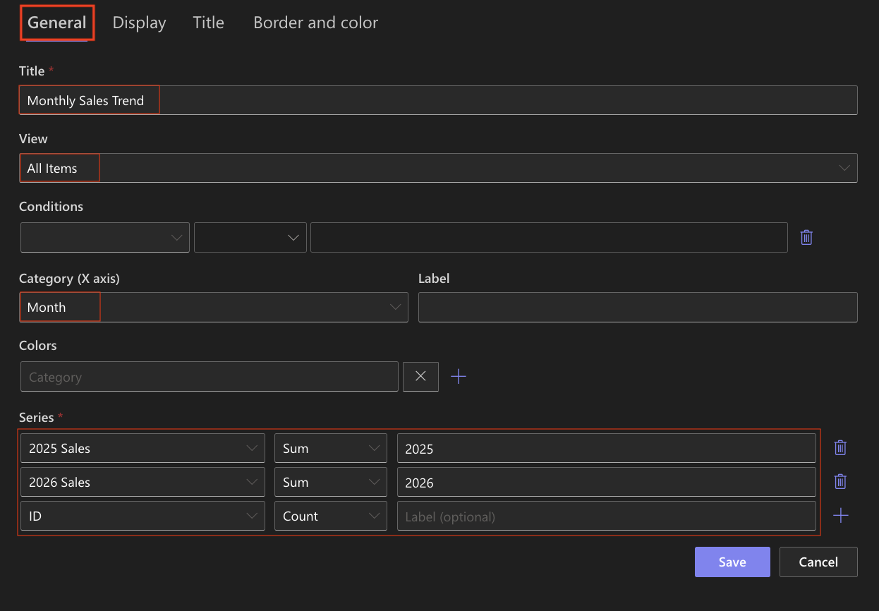
- Series 1
Step 4: Configure Display settings
Open the Display tab.
- Chart type: Spline
- Enable 3D: Optional
- Show legend: Enabled
- Show values: Enabled
- Show X grid lines / Show Y grid lines: Optional (Enable if you want to visually compare values)
- Width: 1000
- Height: 400
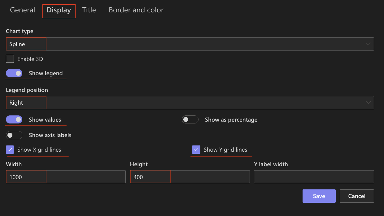
Spline charts smooth the transitions between data points, creating a more continuous visual flow.
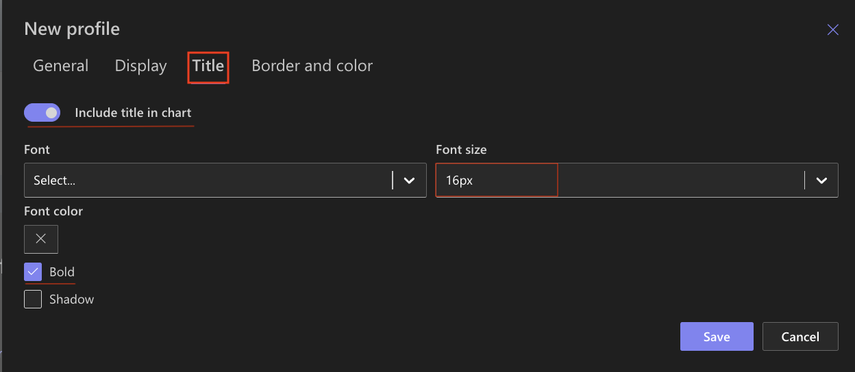
Step 5: Configure Title settings
- Include title: Enabled
- Font size: 16px
- Bold: Enabled
Step 6: Configure Border and color settings
Recommended settings:
- White background
- Light gray border
- Neutral chart area
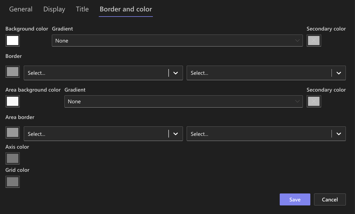
You may assign different colors to each series for better distinction between 2025 and 2026.
Step 7: Save the chart profile
- Click Save.

The Spline chart profile is now avalible for use.
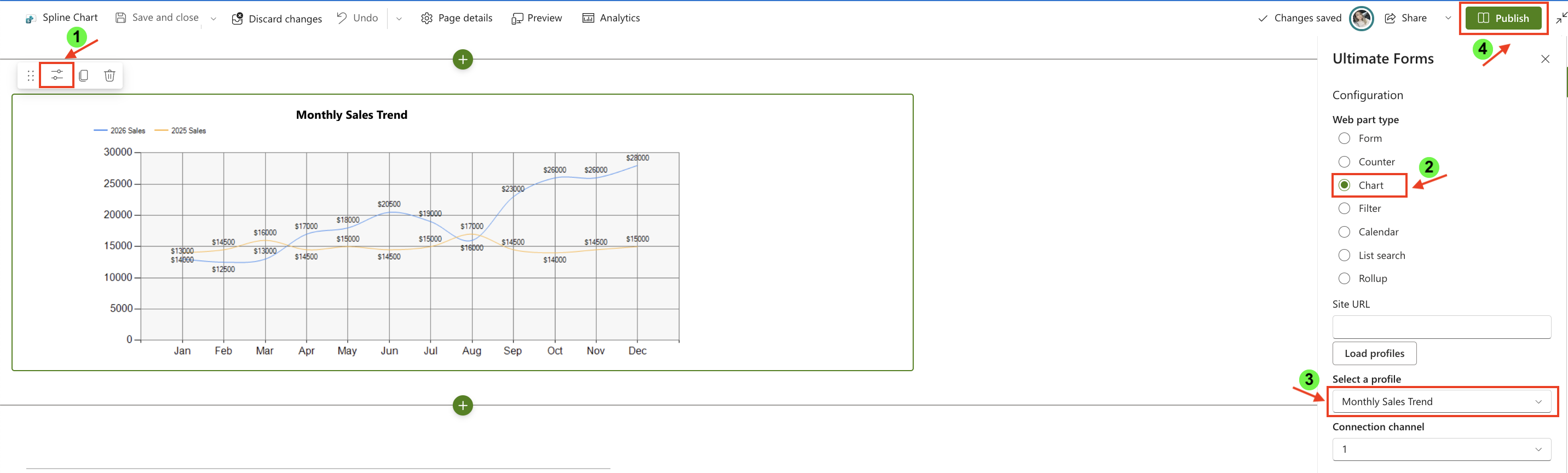
Step 8: Add the chart to a page
After saving the chart profile, you need to add it to a SharePoint page using a web part:
- Create a new SharePoint page.

- Click the + button and add the Ultimate Forms.
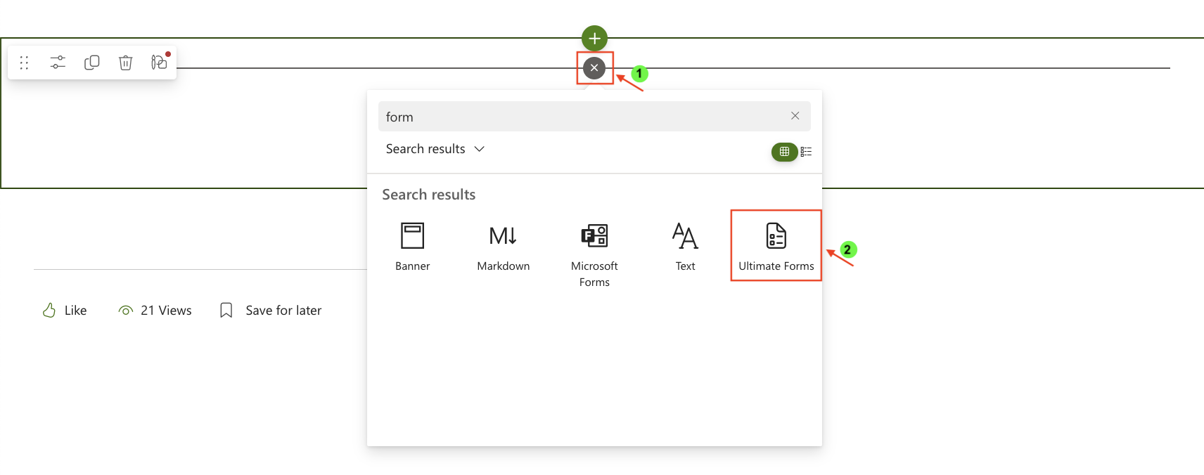
- Once added, click the Edit Properties.
- In the web part properties:
- Set Type to Charts
- Select the profile: Monthly Sales Trend
- Publish the page
Step 8: Compare with Line Chart
To better understand the difference, create a second chart using the same configuration but with Line chart type.
What changes:
- Line chart uses straight segments between points

- Spline chart uses smooth curves
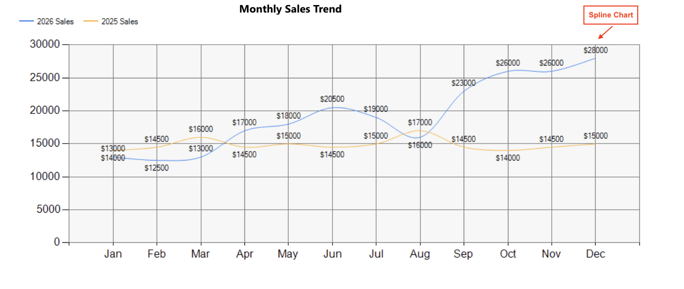
When to use each:
- Use Line chart when precise value transitions matter
- Use Spline chart when you want a smoother, more visually appealing trend
Result
The Line chart displays clear, direct connections between data points, while the Spline chart presents the same data with smooth curves, making trends appear more fluid.
Summary
In this tutorial, you learned how to create a Spline chart and compare it with a Line chart. Spline charts provide a smoother representation of trends, helping improve readability and visual flow of time-based data.