Range charts are useful when you need to display value ranges instead of single values. Unlike standard charts that show one number per category, Range charts visualize both minimum and maximum values together.
This makes them ideal for comparing ranges such as salary bands, temperature variations, pricing ranges, or performance thresholds.
In this tutorial, you will create both Range Column and Range Bar charts using salary range data.
Instructions
Before You Start
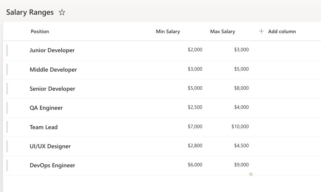
- Create a SharePoint list named: Salary Ranges
- Add Columns:
- Position (Single line of text)
- Min Salary (Currency)
- Max Salary (Currency)
- Sample Data:
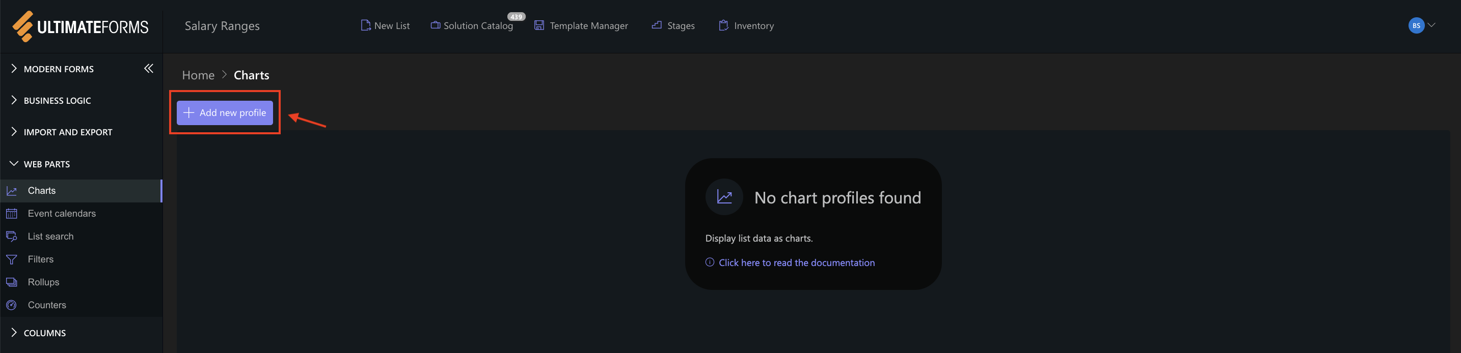
Step 1: Create a Range Column Chart Profile
- Open the Salary Ranges list
- Click Design
- Open Charts
- Click Add new profile
Step 2: Configure General settings
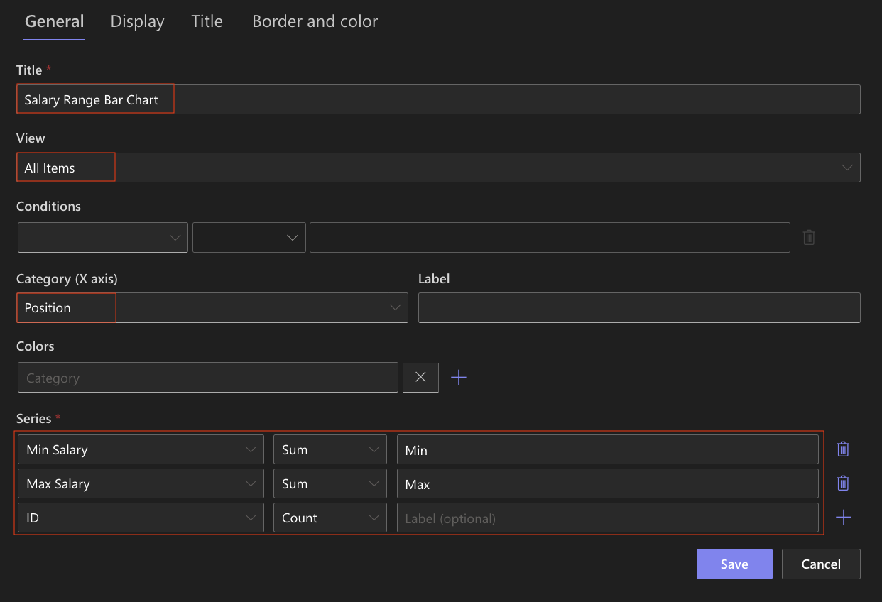
- Title: Salary Range Column Chart
- Category: Position
- Add two Series:
- Series 1:
- Column: Min Salary
- Aggregation: Sum
- Label: Min
- Series 2:
- Column: Max Salary
- Aggregation: Sum
- Label: Max
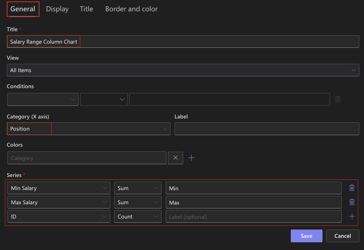
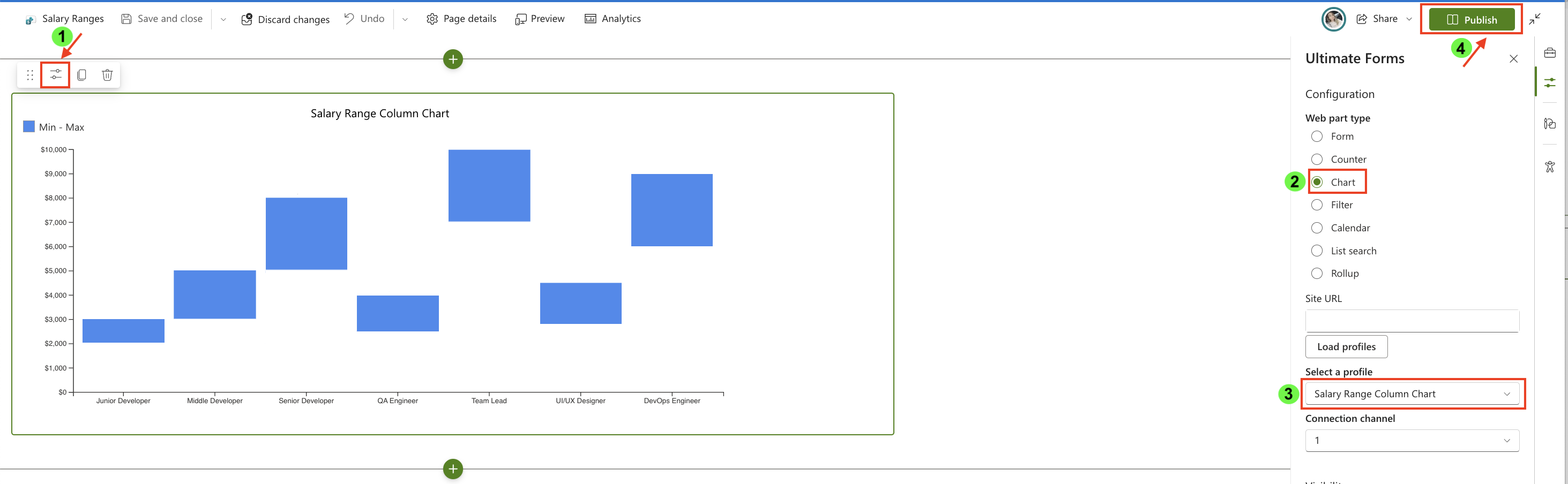
Range charts use two numeric columns to display value intervals.
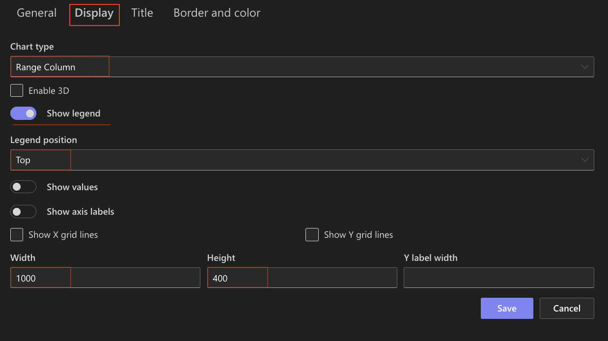
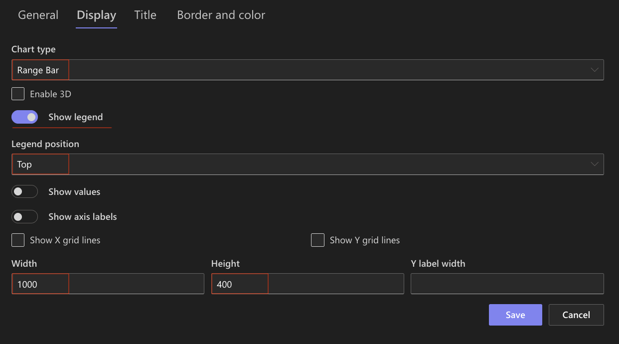
Step 3: Configure Display settings
Open the Display tab:
- Chart type: Range Column
- Enable 3D: Optional (can be enabled for a more visual effect)
- Show legend: Enabled
- Legend position: Top
- Show values: Optional
- Width: 1000
- Height: 400
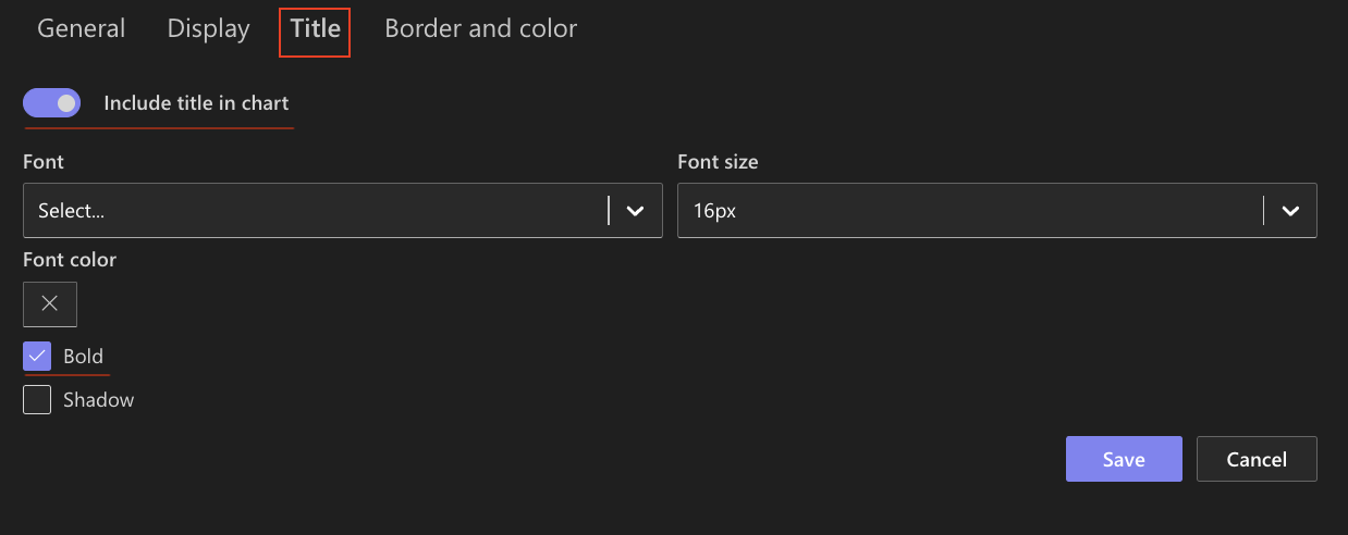
Step 4: Configure Title settings
- Include title: Enabled
- Front size: 16px
- Bold: Enabled
Step 5: Save the chart profile
- Click Save
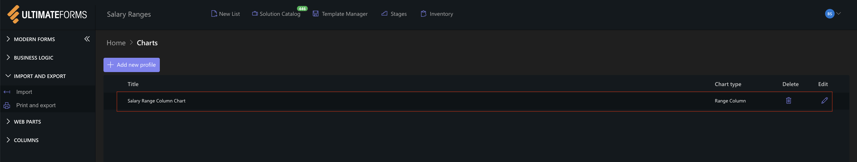
The Range Column chart profile is now available for use.
Step 6: Add the chart to a SharePoint page
After saving the chart profile, you need to add it to a SharePoint page using a web part:
- Create a new SharePoint page.
- Click the + button and add the Ultimate Forms.
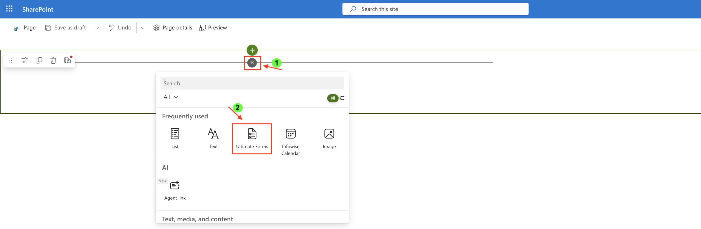
- Once added, click the Edit Properties.
- In the web part properties:
- Set Type to Charts
- Select the profile: Salary Range Column Chart
- Publish the page
Step 7: Create a Range Bar Chart
Create another chart profile using the same data.
- Title: Salary Range Bar Chart
- Category: Position
- Add two Series:
- Series 1: Min Salary
- Series 2: Max Salary
- Chart type: Range Bar
- Enable 3D: Optional (can be enabled for a more visual effect)
- Show legend: Enabled
- Legend position: Top
- Show values: Optional
- Width: 1000
- Height: 400
Step 8: Save the chart profile
- Click Save
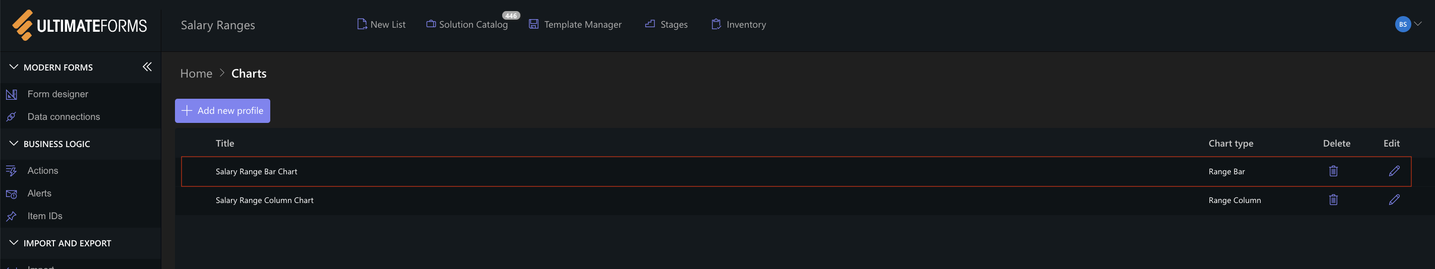
The Range Bar chart profile is now available for use.
Step 9: Add the Range Bar Chart to the Page
- Add another Charts web part to the page
- Select: Salary Range Bar Chart
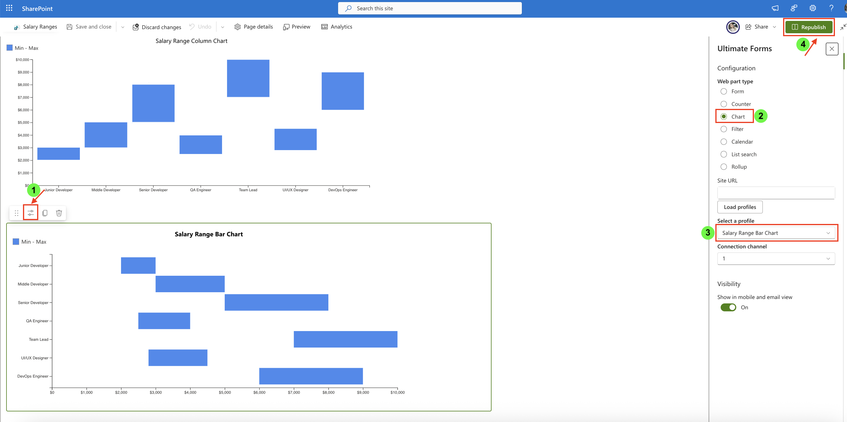
Comparing Range Column and Range Bar Charts
Range Column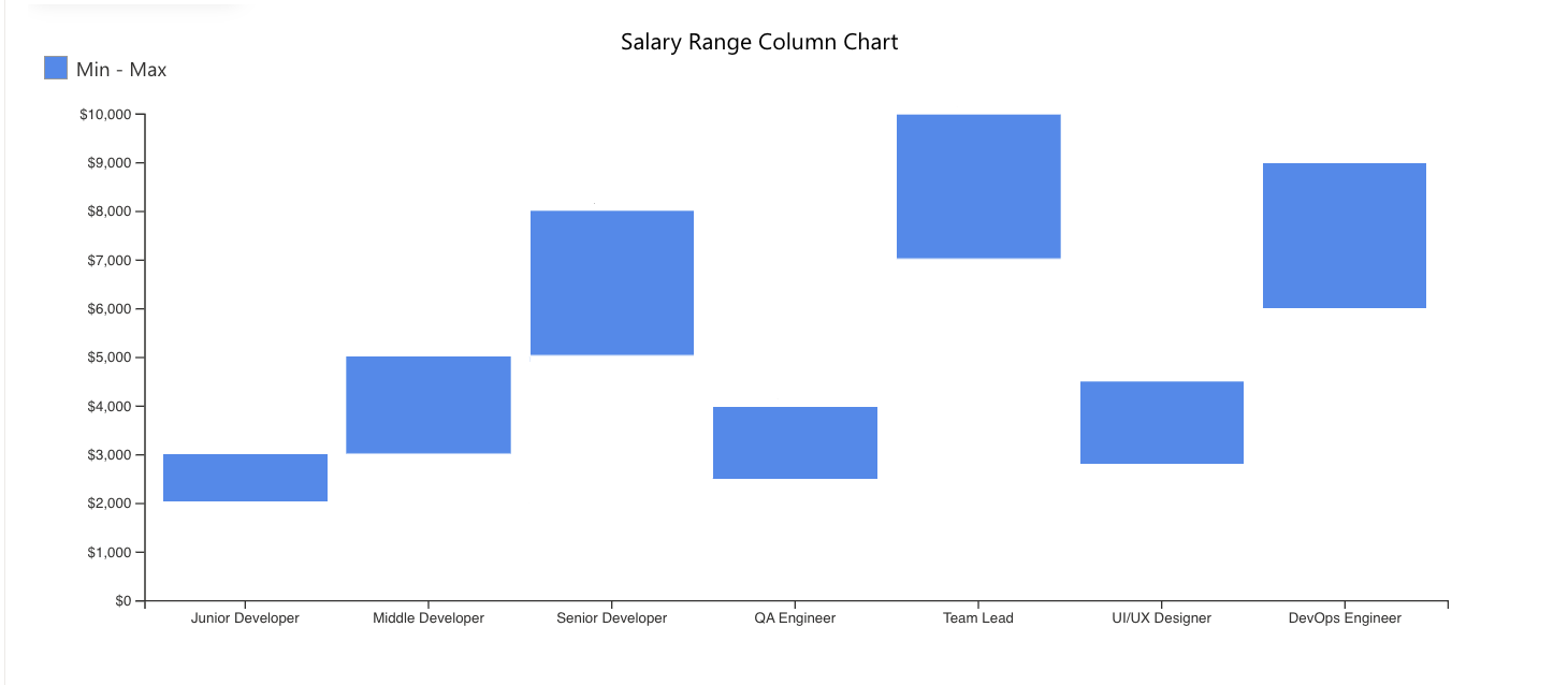
Displays ranges vertically and works well for compact category comparisons.
Range Bar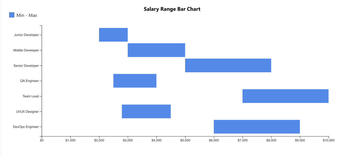
Displays ranges horizontally and is useful when category names are longer or easier to compare vertically.
Result
You now have two different visualizations displaying salary ranges using the same SharePoint data.
Both charts help visualize minimum and maximum values in a clear and easy-to-compare format.
Summary
In this tutorial, you learned how to create Range Column and Range Bar charts using minimum and maximum values from a SharePoint list.
Range charts are useful for visualizing value intervals and comparing ranges across categories.