Pyramid charts are used to represent how values are distributed across levels, typically showing a decreasing structure from bottom to top.
They are especially useful when you want to:
- visualize hierarchical levels
- show proportional distribution
- represent decreasing values across stages
- display structured data in a clear visual format
In this tutorial, you will create a Pyramid chart to visualize how employees are distributed across departments.
Instructions
Step 1: Prepare the data source
- Create a SharePoint list named: Department Distribution
- Create the following columns
- Department (Choice)
- Employees (Number)
- Index (Number)
- Add sample data:
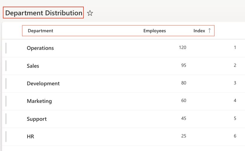
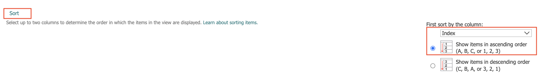
- Sort the view Sort by: Index (Ascending)
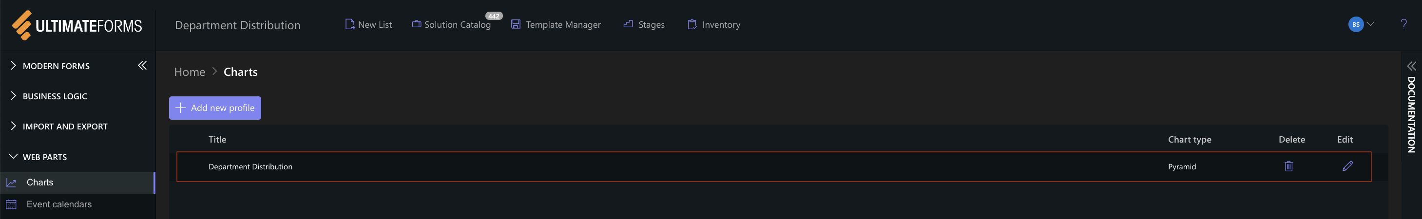
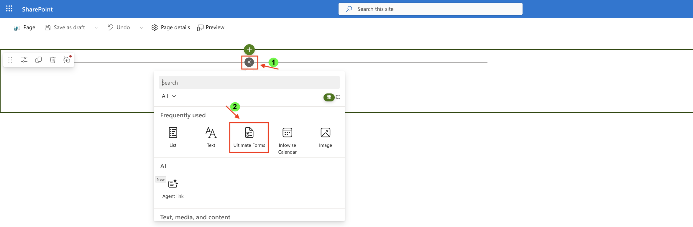
Step 2: Open Charts in Ultimate Forms
- Open Design
- Select Charts
- Click Add new profile
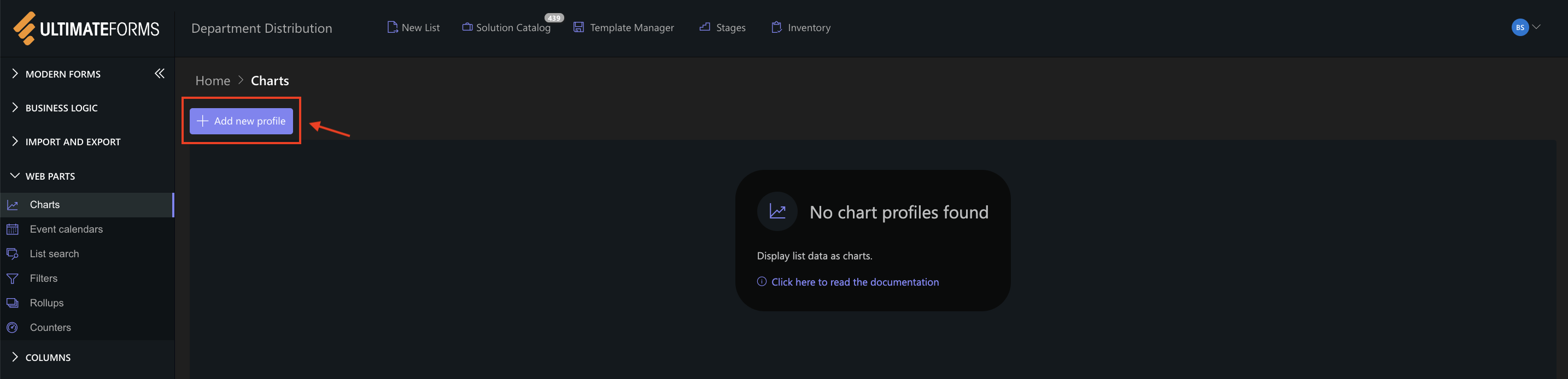
The Chart profile configuration panel opens.
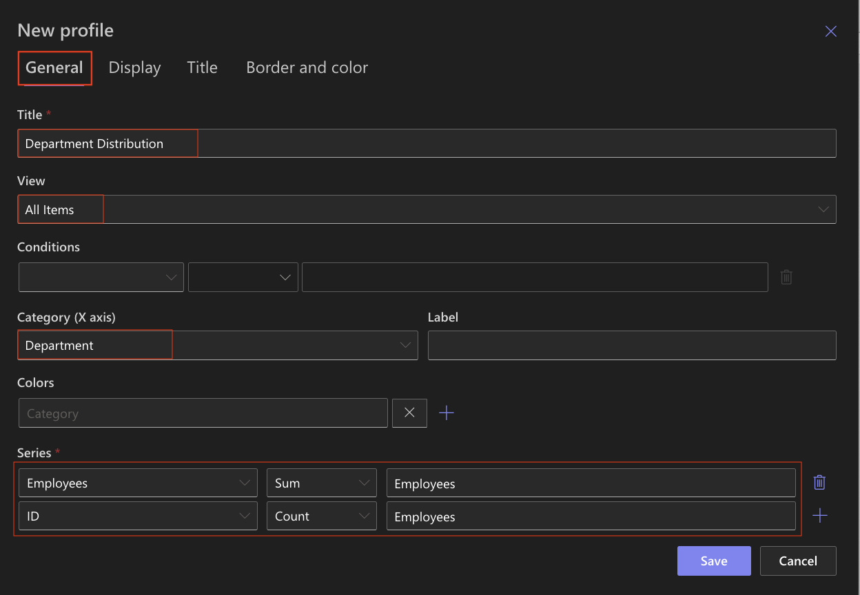
Step 3: Configure General settings
- Title: Department Distribution
- View: All Items
- Category (X axis): Department
- Colors (Optional)
- Add Series:
- Column: Employees
- Aggregation: Sum
- Label: Employees
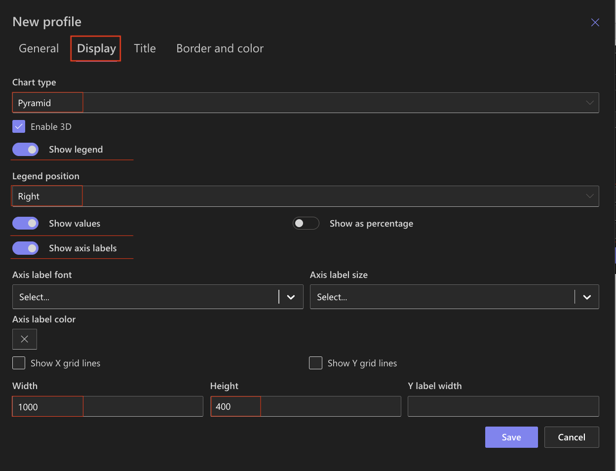
Step 4: Configure Display settings
Open the Display tab.
Use the following settings:
- Chart type: Pyramid
- Enable 3D - Optional
- Show legend: Enabled
- Legend position: Right
- Show values: Enabled
- Show axis labels: Enabled
- Width: 1000
- Height: 400
The Pyramid chart automatically arranges values to form a visual hierarchy.
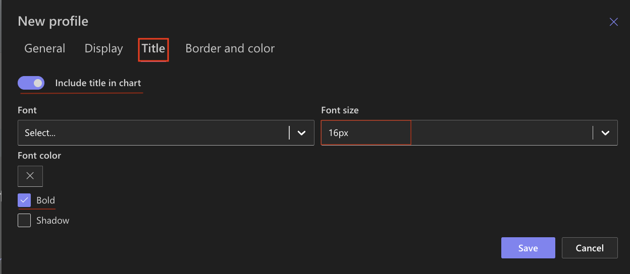
Step 5: Configure Title settings
Open the Title tab.
- Include title: Enabled
- Font size: 16px
- Bold: Enabled
Step 6: Save the chart profile
- Click Save.
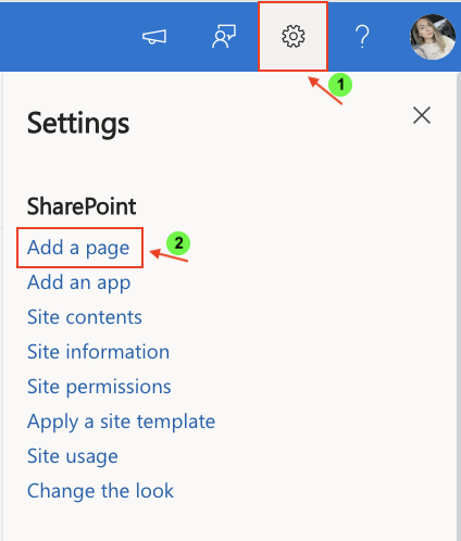
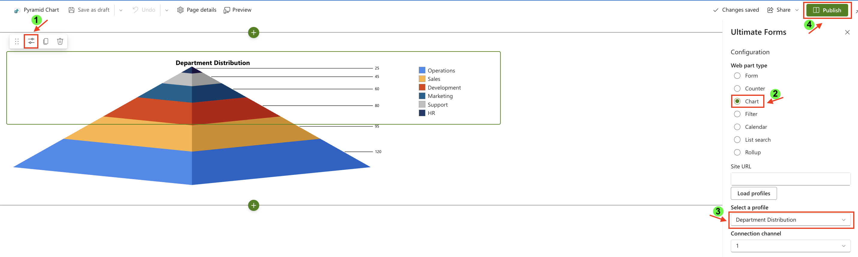
Step 7: Add the chart to a SharePoint page
After saving the chart profile, you need to add it to a SharePoint page:
- Create a new SharePoint page.
- Click the + button and add the Ultimate Forms.
- Once added, click the Edit Properties.
- In the web part properties:
- Set Type to Charts
- Select the profile: Department Distribution
- Publish the page
Result
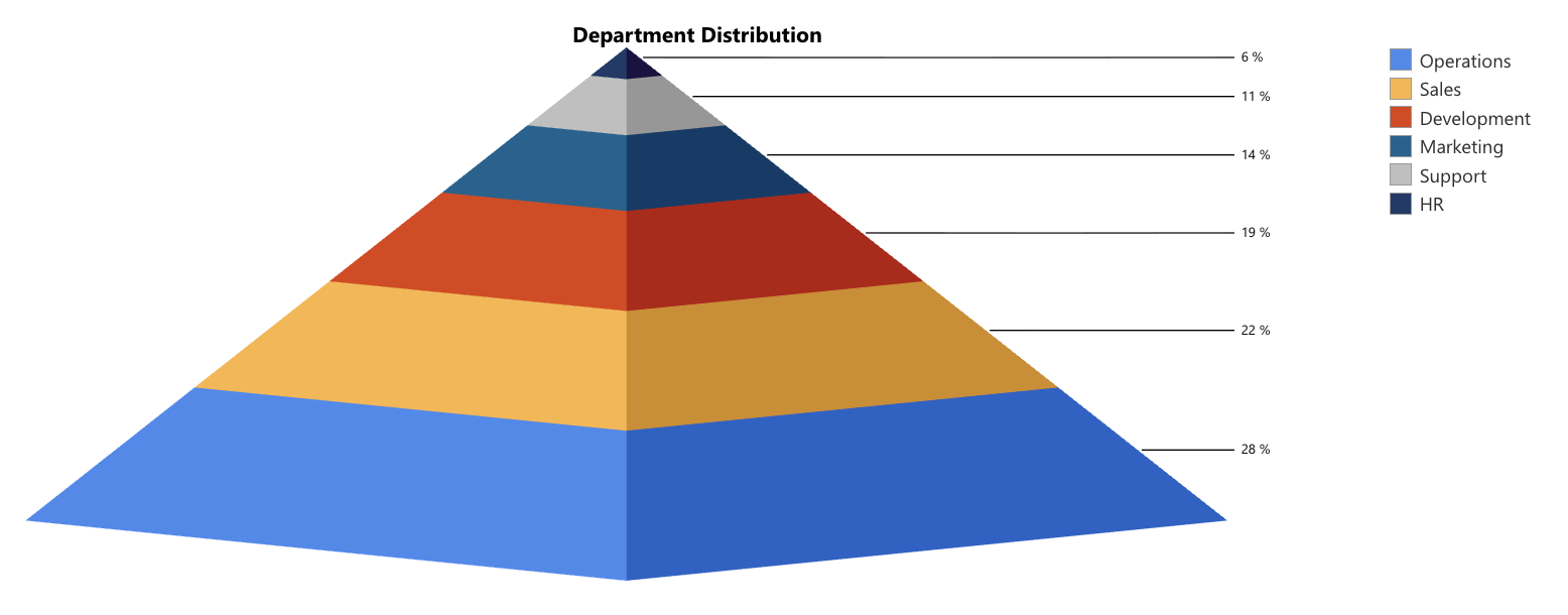
The Pyramid chart displays departments in a structured, hierarchical layout, with larger values at the base and smaller values toward the top.
This makes it easy to:
- understand distribution across departments
- identify largest and smallest groups
- visualize proportional differences

You can also display values as percentages instead of absolute numbers.
To do this:
- Open the chart profile
- Go to the Display tab
- Enable Show as percentage
- Save the chart
Summary
In this tutorial, you learned how to create a Pyramid chart to visualize hierarchical or proportional data. You also learned how to display values as percentages to better understand the relative contribution of each category