Column charts are widely used in financial and operational reporting because they clearly represent value differences between categories or time periods.
In revenue analysis scenarios, Column charts help answer key business questions such as:
- Which months generated the highest sales?
- Is revenue increasing or decreasing over time?
- Are there seasonal fluctuations in performance?
- How do recent results compare to previous periods?
By aggregating monthly sales data, you can quickly identify patterns and trends without manually reviewing individual list entries.
Because values are displayed vertically, Column charts naturally emphasize growth and magnitude, making them especially suitable for financial dashboards and executive summaries.
In this tutorial, you will create a Column chart that compares monthly sales between two different years.
Instructions
Step 1: Prepare the data source
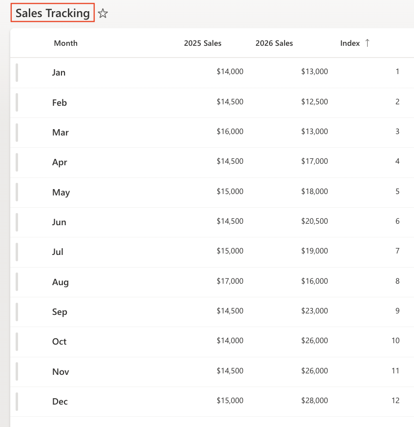
- Create a SharePoint list named: Sales Tracking with the following columns:
- Add sample data:
- Month - Choice
- 2025 Sales – Currency
- 2026 Sales – Currency
- Index – Number
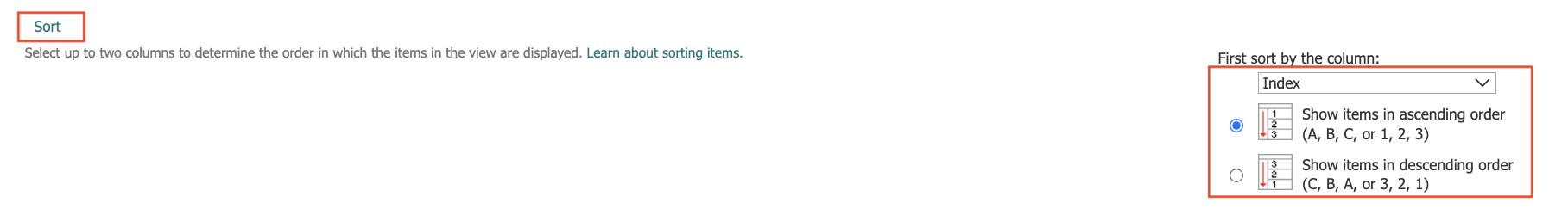
- Sort the list:
- Create or edit the default view:
- Sort by: Index (Ascending).
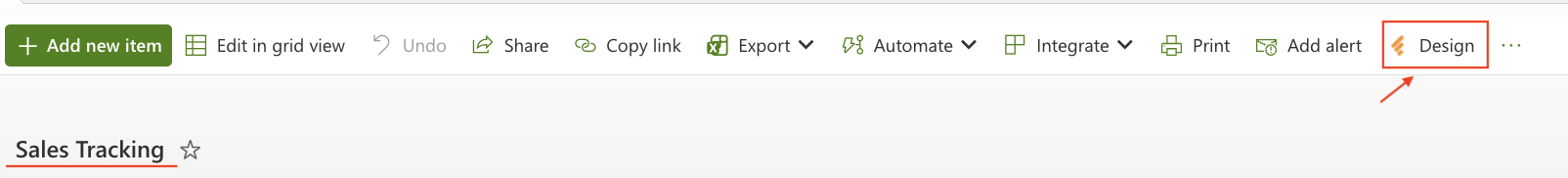
Step 2: Open Charts in Ultimate Forms
- Open Design.
- Select Charts from the main menu.
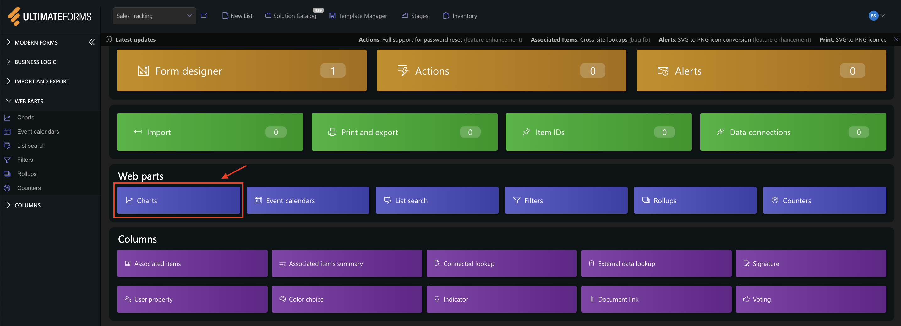
- Click Add new profile.
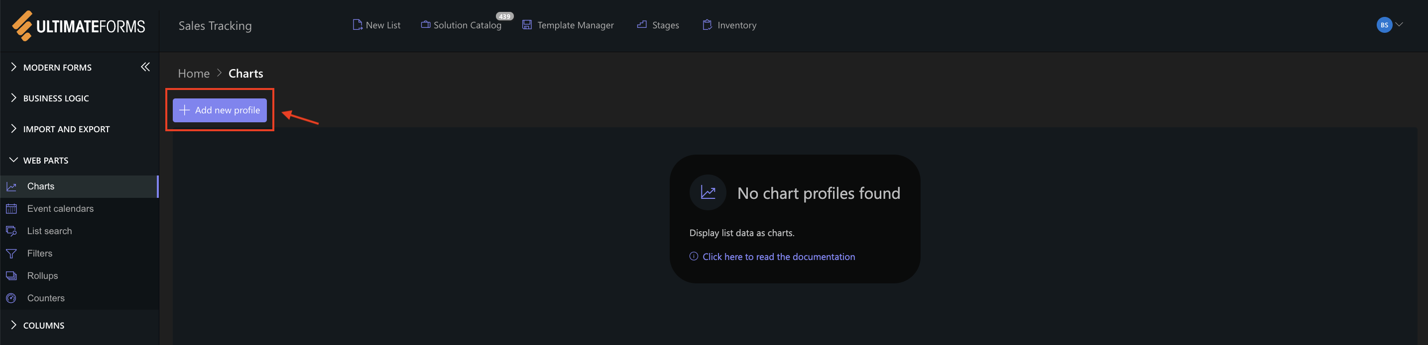
The Chart profile configuration panel opens.
Step 3: Configure General settings
- Title
Monthly Sales Comparison - View
All Items (or your sorted view) - Category (X axis)
Month - Colors (optional)
- Add two Series:
- Series 1:
- Column: 2025 Sales
- Aggregation: Sum
- Label: 2025
- Series 2
- Column: 2026 Sales
- Aggregation: Sum
- Label: 2026
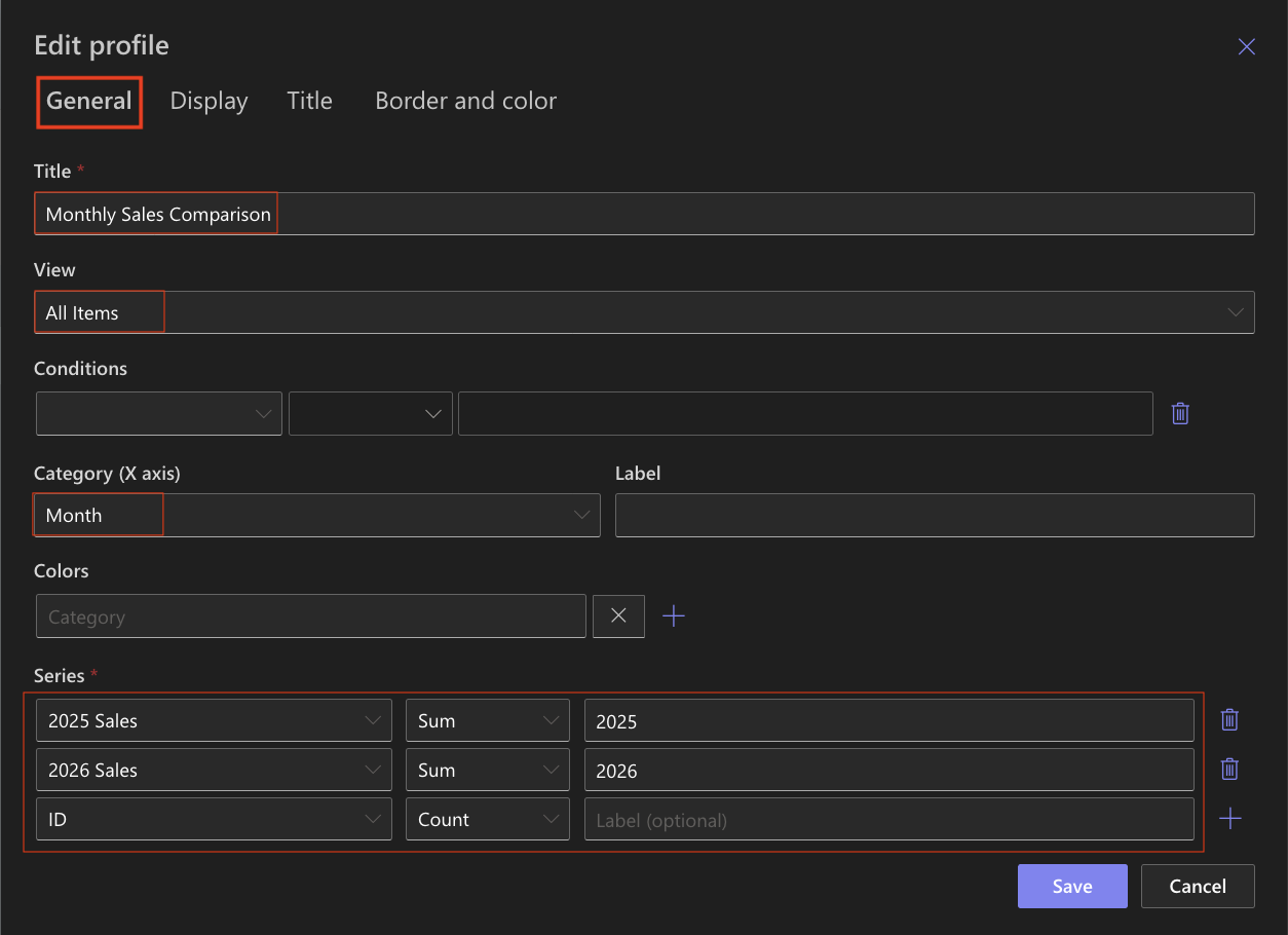
- Series 1:
This configuration creates a multi-series comparison chart, displaying both years side by side for each month.
Step 4: Configure Display settings
- Chart type → Column
- Enable 3D - Optional (can be enabled for a more visual effect)
- Show legend ✔ Enabled
- Legend position - Top
- Show values ✔ Enabled
- Show as percentage → Disabled
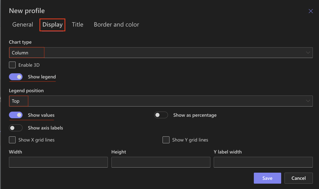
The vertical columns clearly display differences between years for each month.
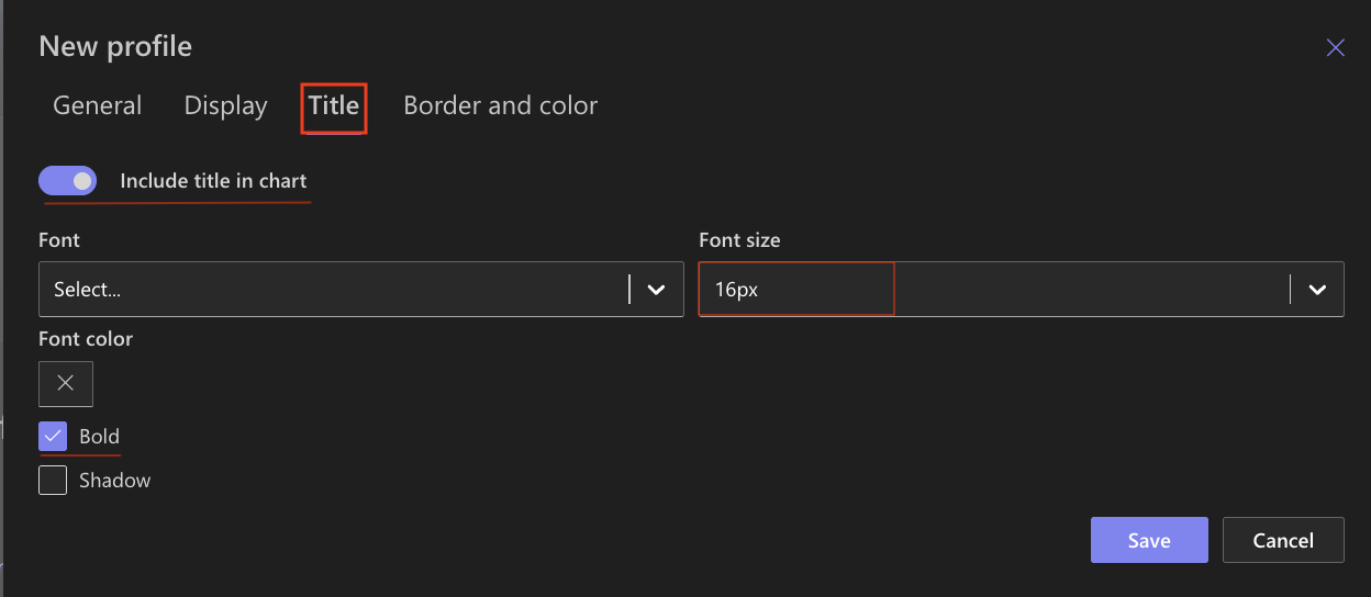
Step 5: Configure Title settings
- Include title in chart ✔ Enabled
- Font size: 16px
- Bold ✔ Enabled
Step 6: Configure Border and color settings
Recommended settings:
- White background
- Light gray border
- Neutral chart area
You may assign different colors to each series for better distinction between 2025 and 2026.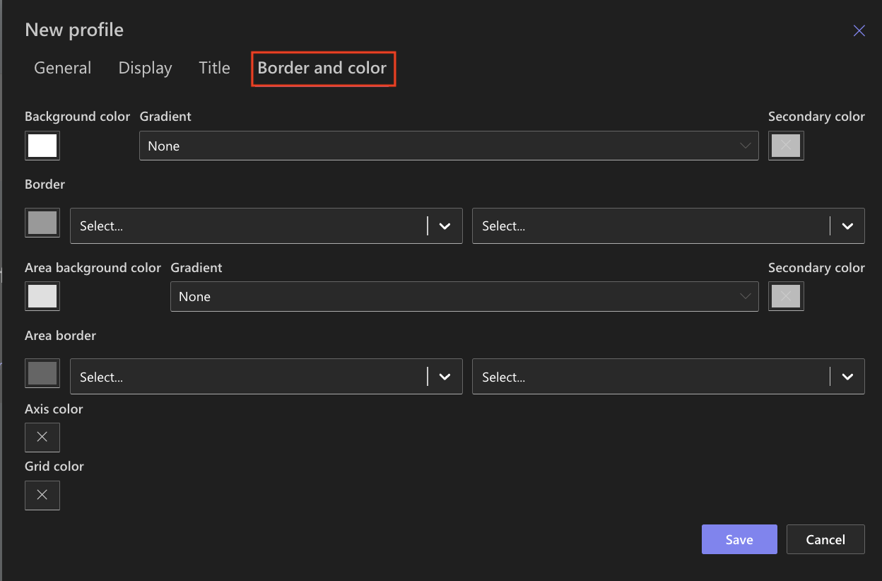
Step 7: Save the Chart profile
- Click Save.
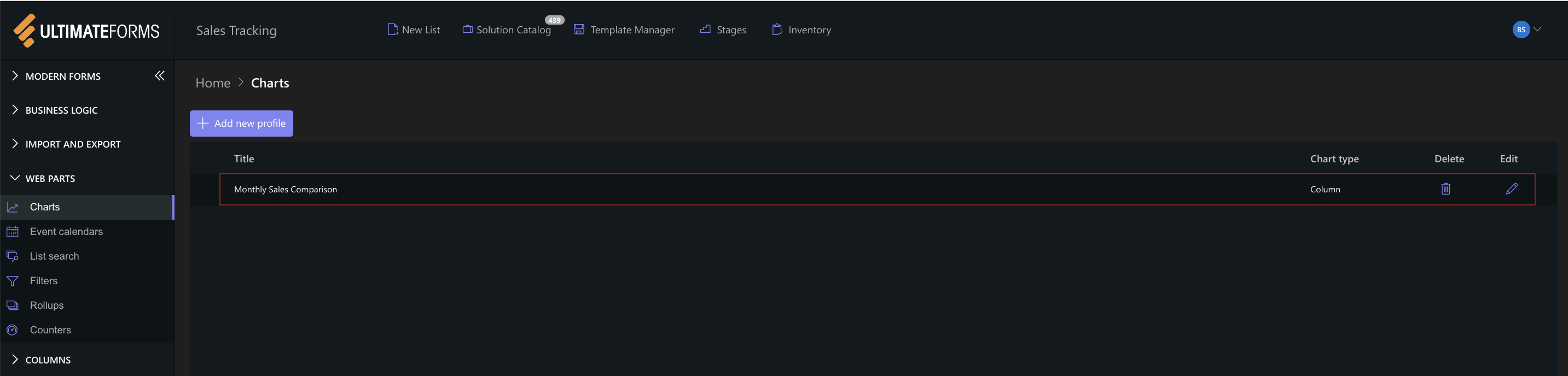
The Column chart profile is now available for use.
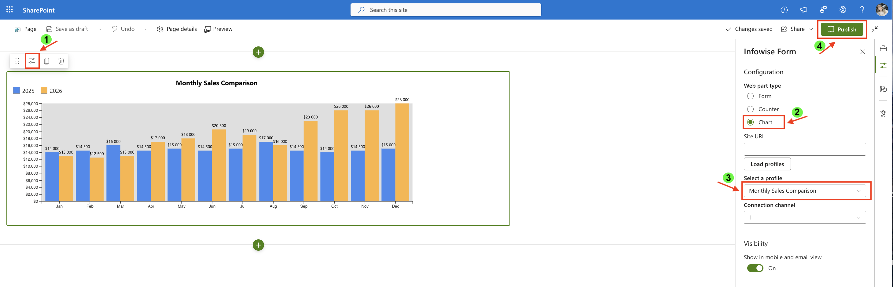
Step 8: Add the chart to a SharePoint page
After saving the chart profile, you need to add it to a SharePoint page using a web part.
- Create a new SharePoint page.
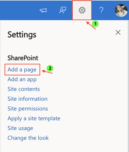
- Click the + button and add the Ultimate Forms.
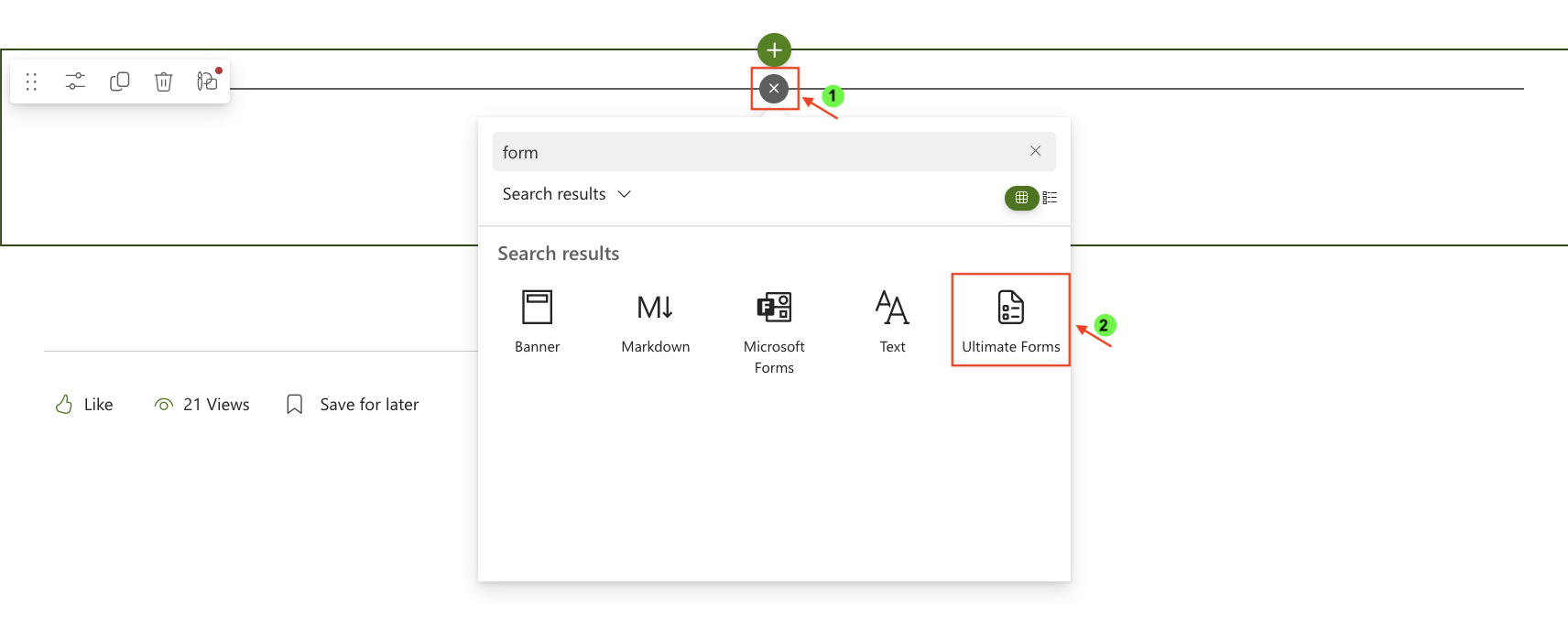
- Once added, click the Edit Properties.
- In the web part properties:
- Set Type to Charts.
- Select the profile: Monthly Sales Comparison.
- Publish the page.
Result:
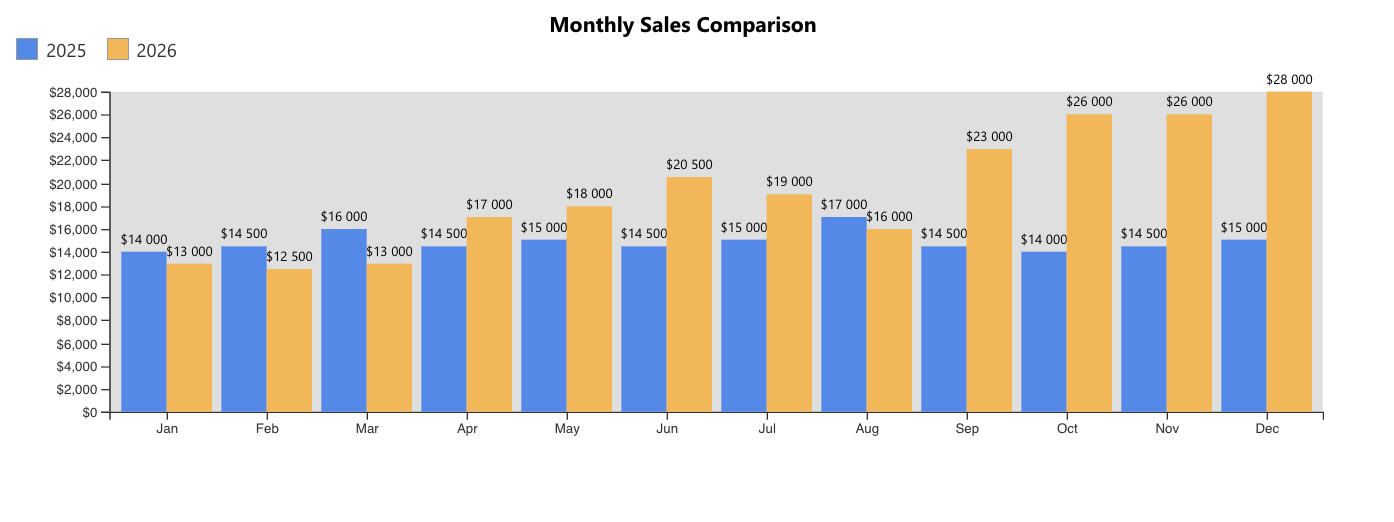
The Column chart displays two vertical columns for each month:
- A blue column representing 2025 sales
- An orange column representing 2026 sales
Each month appears along the X-axis in chronological order, controlled by the Index column.
The height of each column reflects the total sales value for that month.
From the chart, you can clearly observe:
- Gradual growth in 2026 compared to 2025
- Strong performance in the last quarter
- Significant year-over-year increase from September through December
- Seasonal patterns and monthly fluctuations
Summary
In this tutorial, you learned how to:
- Prepare structured monthly comparison data
- Control category order using an Index column
- Configure multiple data series in a Column chart
- Compare two years of sales side by side
Column charts are ideal for year-over-year analysis and structured financial reporting, especially when comparing multiple series across consistent time periods.