Actions
Getting Started
Kickstart Training
Working with Dates
Form Designer
Tabs and Tab Permissions
Views and View Customization
Advanced Column Permissions
Item IDs
Associated Items
Print Formatting
Event Calendar
Connected Lookups
Voting Columns
List Search
Signature
Rollups
Counter
Charts
Import
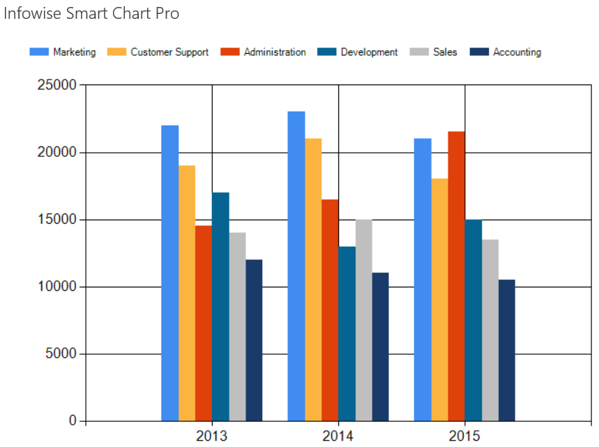
A Range Column chart is useful in comparing many series of data side by side. WIth this chart, changing the 3D setting has a distinctyly different effect.
In this example, we compare the spending between departments on a year to year basis:
Instructions
- Begin by creating a new list that is appropriate for the chart type.
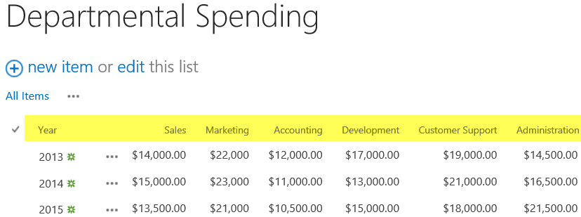
- Create a list called Deparmental Spending.
- Change the Title column to Year.
- Add currency columns for Sales, Marketing, Accounting, Development, Customer Support and Administration.
- Add test data as shown:
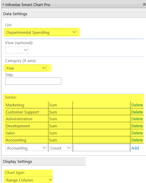
- Create a new page Departental Spending Chart.
- Add a Smart Chart web part as described in the Column Chart section.
- Use a large size of 500px height and 700px width.
- Choose the Range Column Chart type as shown.
- Include each of the departments as a series in the chart.
- Your chart output will look similar to above.
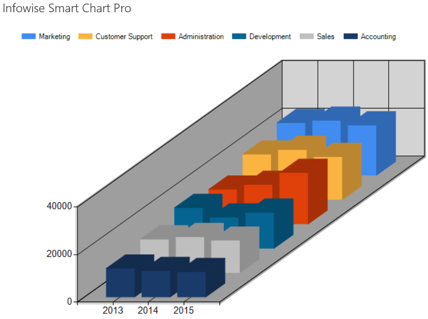
- Try turning on the 3D setting for a dramatically different chart.
Summary
Range Column is a good choice when examining the values for many fields in a list over time. Making use of the 3D settings produces a dramatically different chart.
Last modified: 4/29/2025 8:54 PM
Loading...
Add your comment
Comments are not meant for support. If you experiencing an issue, please open a support request.
Reply to: from