Actions
Getting Started
Kickstart Training
Working with Dates
Form Designer
Tabs and Tab Permissions
Views and View Customization
Advanced Column Permissions
Item IDs
Associated Items
Print Formatting
Charts, Filters and Other Web Parts
Pie Chart
Event Calendar
Connected Lookups
Voting Columns
List Search
Signature
Rollups
Counter
Charts
Import
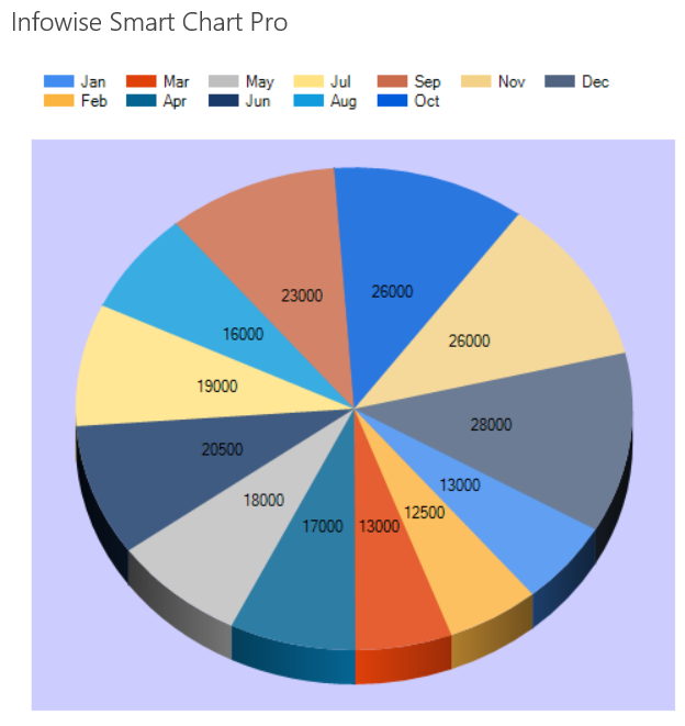
The Pie Chart is similar to the Doughnut Chart which demonstrates a set of data which comprise a logical unit. This data shows the distrution of a subset of data which makes up a whole. In this example we can see the "pie pieces" vary in size according to the total value for each record.

Instructions
- Create a custom list with two column:
- Month - choice or text column containing month names
- 2015 Sales - currency column
- 2014 Sales - currency column
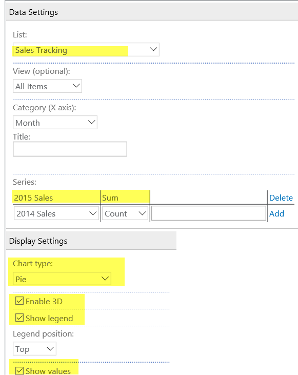
- Configure Series as shown in the picture below
- Adjust the Height and Width of the chart to be 600px to accomodate data labels.
- Enable 3D and Show values as demonstrated in settings below:

Summary
The Pie Chart is intended to show the distribution of data for records that comprise one whole logical unit. In this case we are showing the distrubution of sales for the 2015 calendar year.
Last modified: 5/8/2025 7:37 PM
Loading...
Add your comment
Comments are not meant for support. If you experiencing an issue, please open a support request.
Reply to: from