Actions
Getting Started
Kickstart Training
Working with Dates
Form Designer
Tabs and Tab Permissions
Views and View Customization
Advanced Column Permissions
Item IDs
Associated Items
Print Formatting
Charts, Filters and Other Web Parts
Spline Chart
Event Calendar
Connected Lookups
Voting Columns
List Search
Signature
Rollups
Counter
Charts
Import
A Spline Chart shows curved lines between the plot points instead of straight lines as seen on a Line Chart.
The smooth lines rendered in this chart are often more aesthetically pleasing than the sharp lines on other charts.
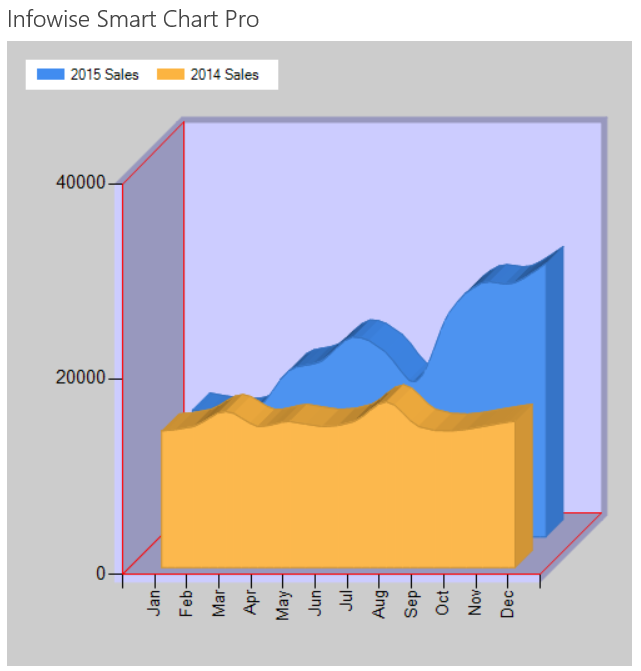
Here is example output using the Spline Area chart which fills in the area below the plot line:
Instructions
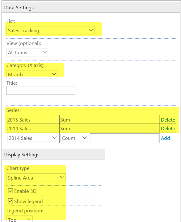
- Use the same data list from the Column Chart example.
- Apply the Spline Area chart setting. (Note that the Spline chart is identicle but does not fill in the area below the plot line.)
- Be sure to put the Series entries in order so that the smaller series is shown in front.
- Apply the other settings as shown:
Summary
The definiing characteristic of a Spline Chart is the curved line connecting plot points. This is often an improvement over the sharp lines on a normal Line Chart.
Last modified: 5/8/2025 5:24 PM
Loading...
Add your comment
Comments are not meant for support. If you experiencing an issue, please open a support request.
Reply to: from