Ultimate Forms: Charts allow you to visualize SharePoint list data on a page. A Chart profile defines how this data is configured and displayed as a chart.
In a profile, you configure the data source, grouping, aggregations, chart type, and visual appearance.
All charts in Ultimate Forms use the same approach:
- Create a Chart profile
- Display it on a page using the Charts web part
This process is identical in Microsoft 365 and SharePoint On-Premises.
In this tutorial, examples and screenshots are based on a Sales Tracking list.
A Pie chart is used as an example to demonstrate the configuration, but the same profile can be reused for other chart types.
Example scenario:
You want to visualize sales data to understand how deals are distributed across different sales stages.
To do this, you create a Chart profile based on the Sales Tracking list.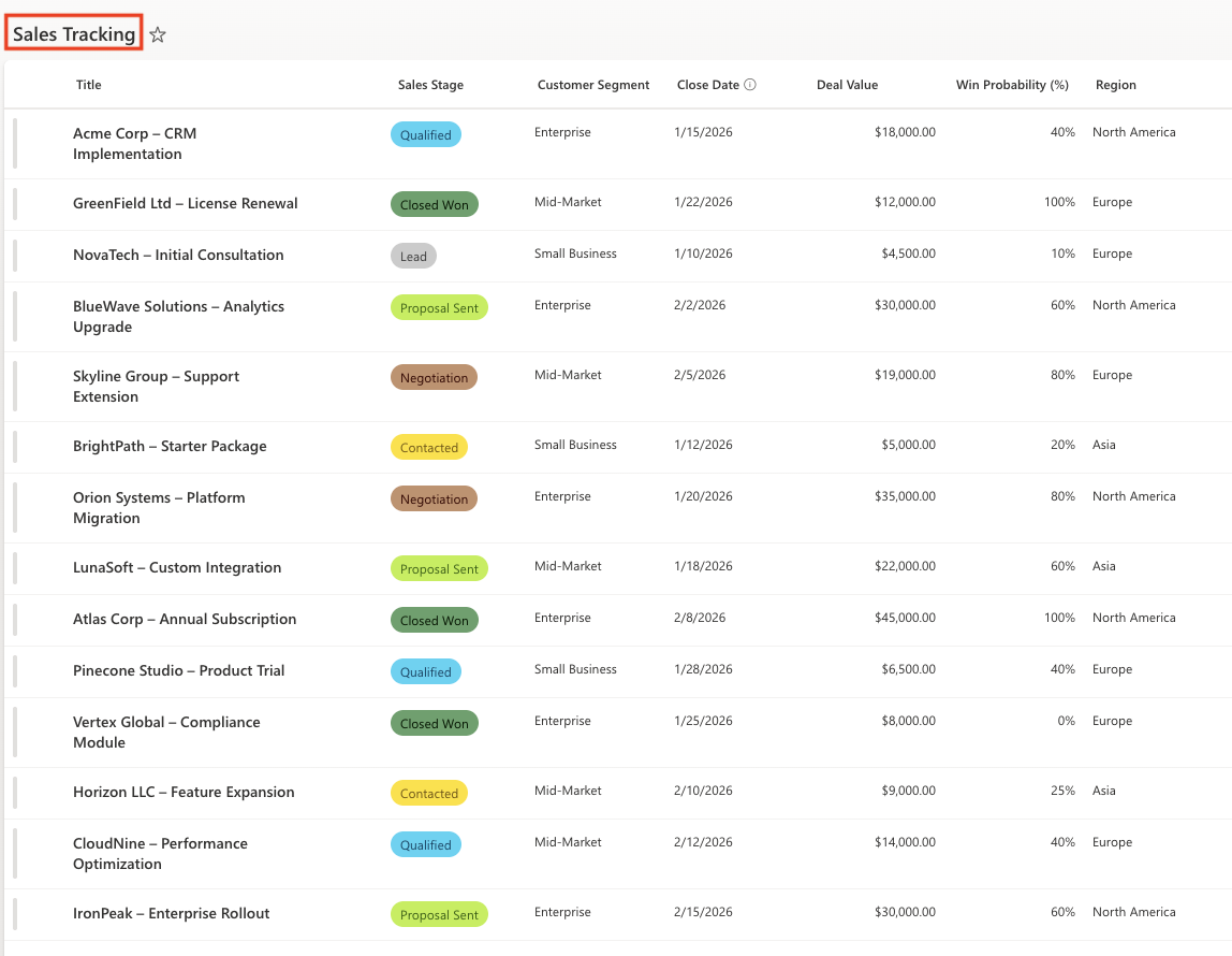
Instructions
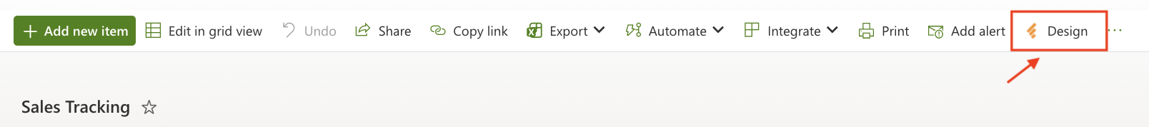
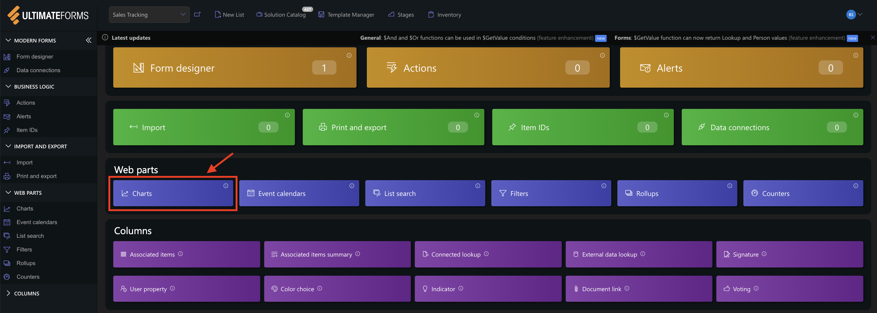
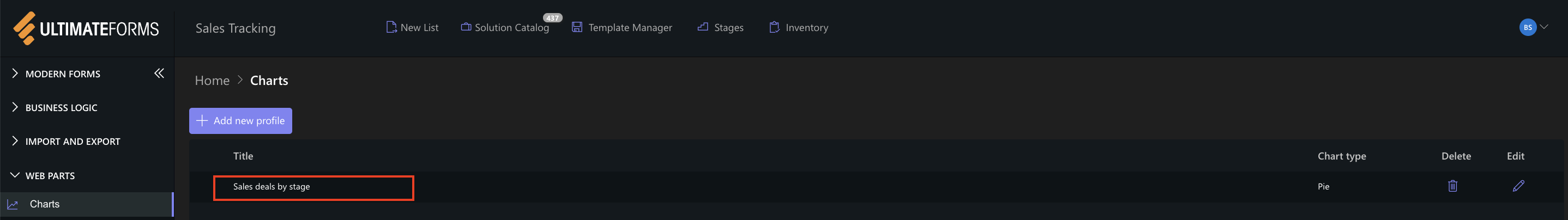
Step 1: Open Charts in Ultimate Forms
- Open Design.
- Select Charts from the main menu.
- Click Add new profile.
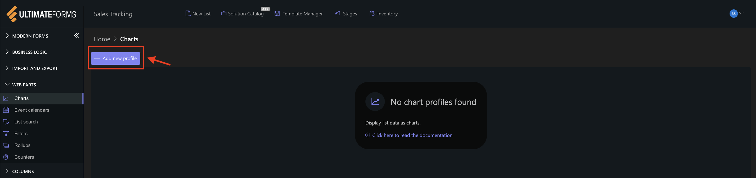
This opens the Chart profile configuration panel.
Step 2: Configure General settings
The General tab defines the data source and structure of the chart.
Settings used in this example
- Title:
- Sales deals by stage
- View:
- Active Deals (shows only deals that are not closed)
- Category (X axis):
- Sales Stage (groups deals by sales stage)
- Colors:
Assign colors to category values (Sales Stage) to keep consistent colors in the chart. - Label (leave empty or use defaul)
- Series: Add one series with following settings:
- Column: Title
- Aggregation: Count
- Label: Deal
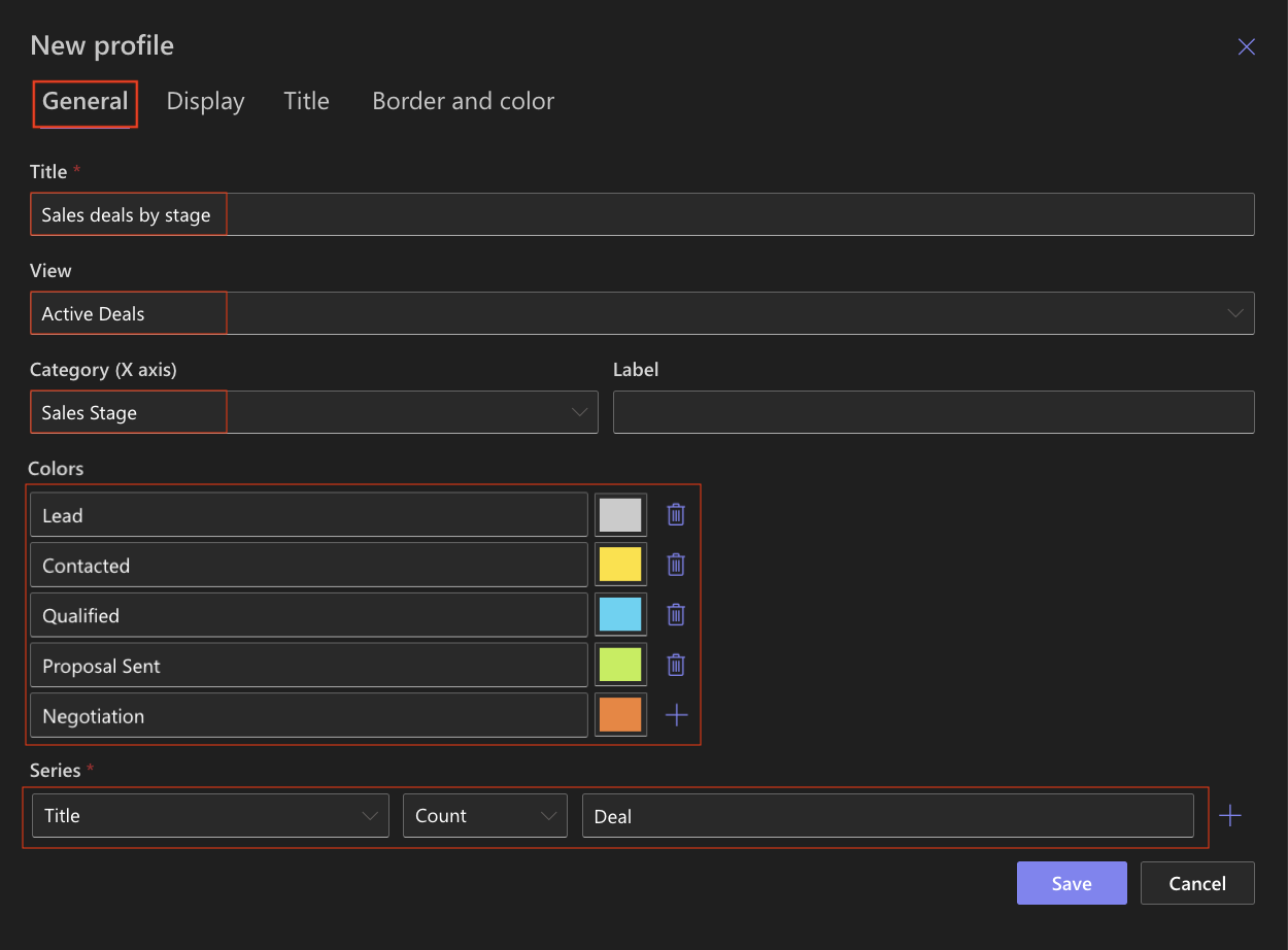
This configuration counts how many deals exist in each sales stage.
Step 3: Configure Display settings
The Display tab controls how the chart is rendered.
Settings:
- Chart type
Pie (used as an example; the chart type can be changed later if needed) - Enable 3D
Optional - Show legend
✔ Enabled - Legend position
Top - Show values
✔ Enabled - Show as percentage
Optional - Show axis labels/grid lines
Not required for Pie. - Width / Height
Leave default values unless you need a specific size.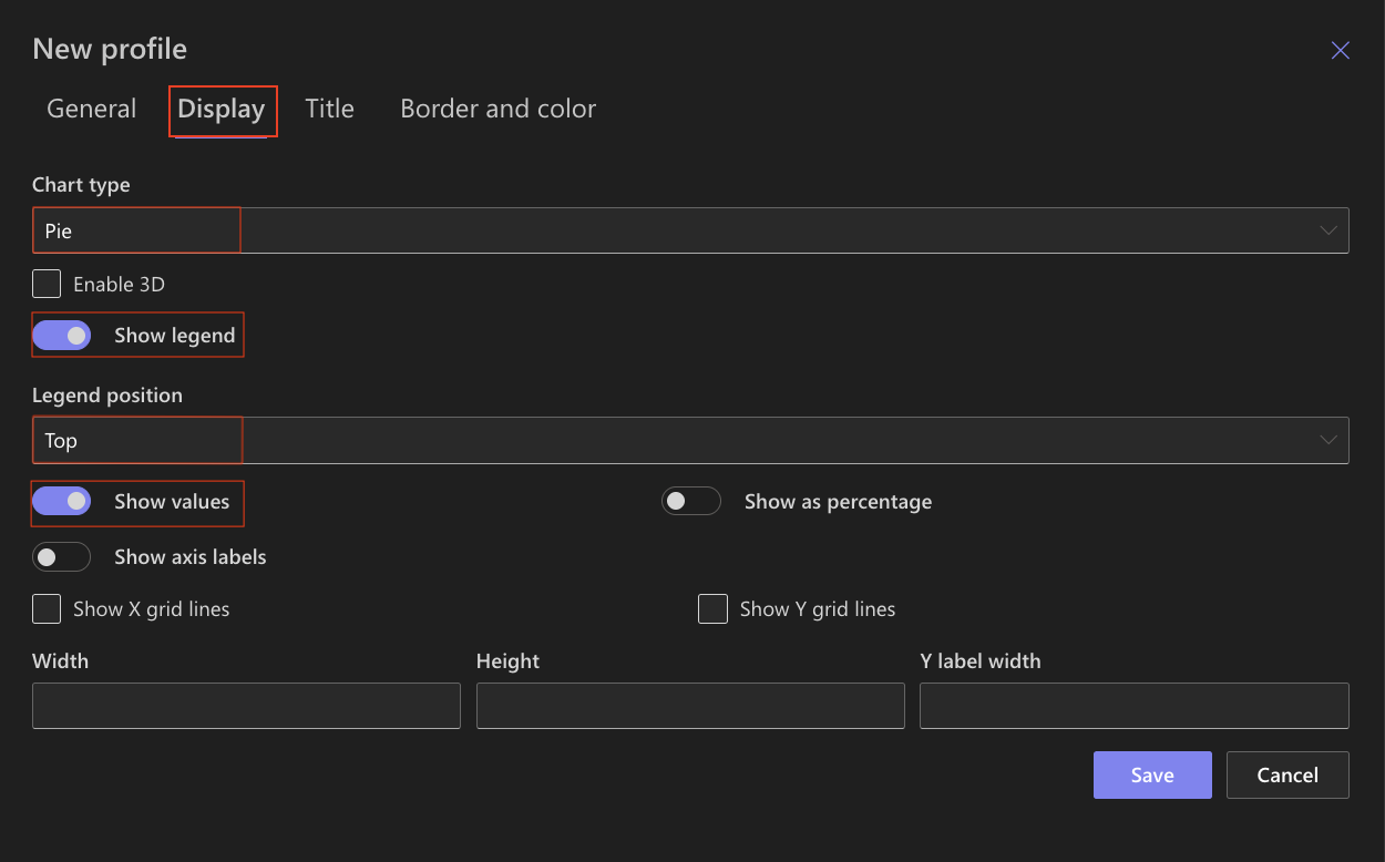
Other display options can remain unchanged for this example.
Step 4: Configure Title settings
Use the Title tab to enable and style the chart title.
Settings used in this example
- Include title in chart
✔ Enabled (Displays the chart title directly above the chart.) - Font
e.g: Time New Roman (Uses the default font for consistency with the page design.) - Font size
16px (Ensures the title is clearly visible without overpowering the chart.) - Font color
Default - Bold
✔ Enabled (Makes the chart title stand out.) - Shadow
Disabled (Keeps the title clean and easy to read.)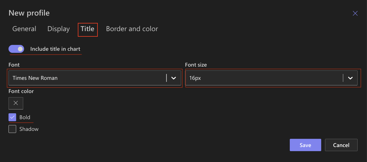
These settings create a clear and readable chart title that works well for dashboards and analytical pages.
Step 5: Configure Border and color settings
Use the Border and color tab to customize the chart appearance and make it visually distinct on the page.
Settings used in this example
Chart background:
- Background color
#FFFFFF (White) - Gradient
None - Secondary color
Not set
Creates a clean background that works well on most SharePoint pages.
Chart border:
- Border color
#999999 (Light Gray)
Adds a frame around the chart without drawing too much attention.
Chart area:
- Area background color
#cccccc (Very light gray) - Gradient
None - Secondary color
Not set - Area border color
#adadad (Soft gray)
Helps visually separate the chart area from the page background.
Axis and grid:
- Axis color
#545353 (Dark gray) - Grid color
#d1cfcf (Light gray)
Ensures good readability while keeping the chart visually light.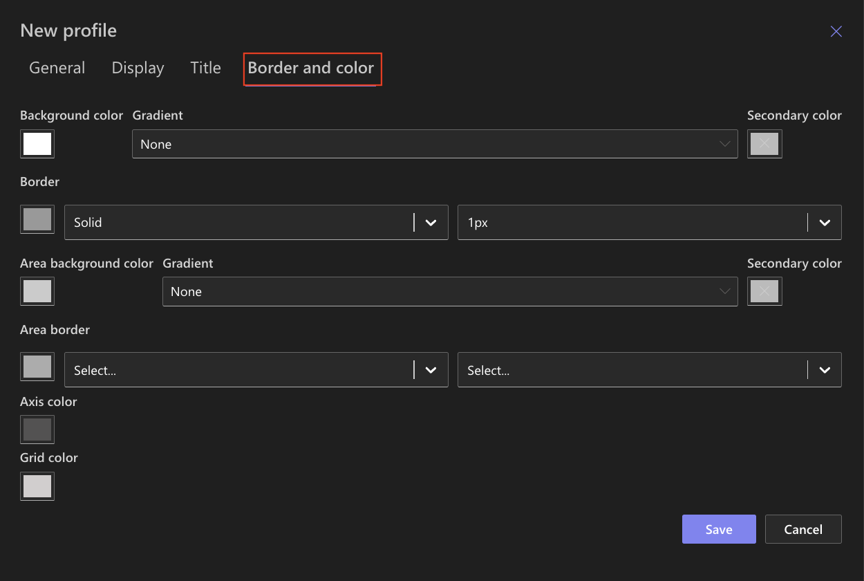
Step 6: Save the Chart Profile
After completing the configuration:
- Click Save.
- The chart profile is saved and becomes available for use in the Charts web part.
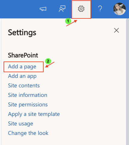
Step 7: Add the Charts web part to a page
After creating and saving the Chart profile, add it to a SharePoint page.
- Open Setting.
- Click Add a page.
- Add the Charts web part.
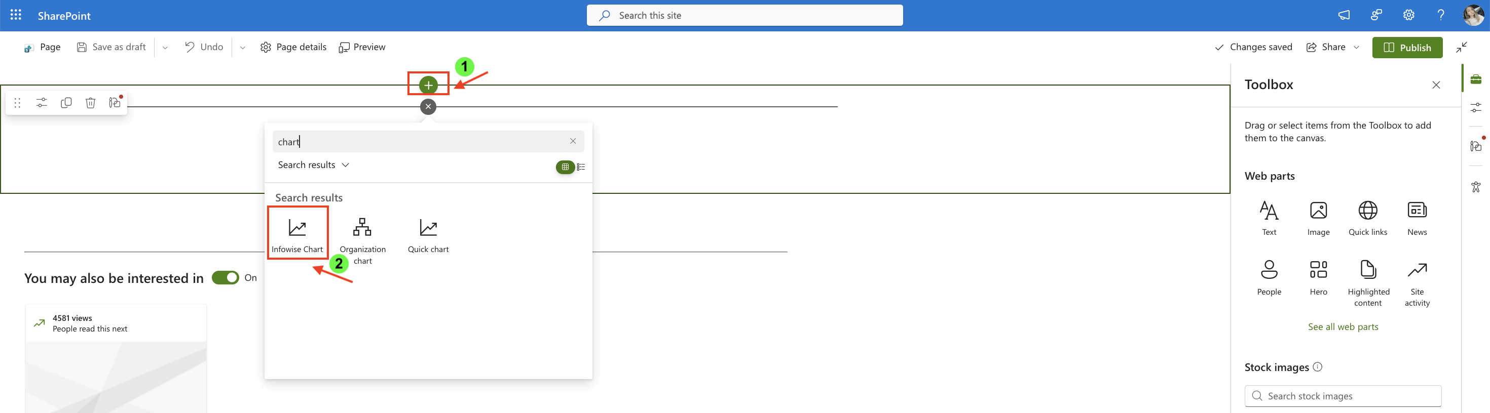
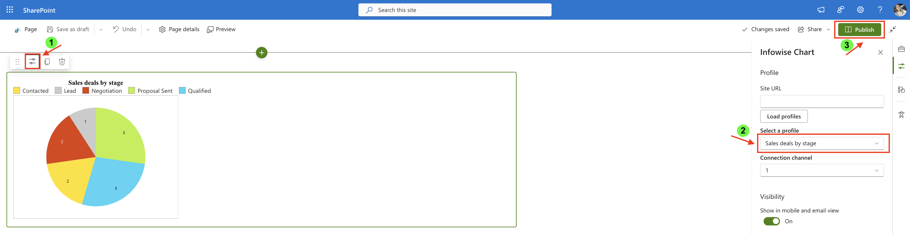
- Open the web part settings.
- Select the chart profile you created (Sales deals by stage).
- Publish the page.
Result
The chart displays a simple Pie chart that shows the number of active sales deals by sales stage.
Each slice represents a sales stage, and its size reflects how many active deals currently belong to that stage.
This visualization provides a quick overview of how deals are distributed across the sales pipeline.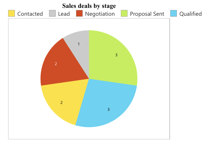
Summary
You have now created a Chart profile and added a chart to a SharePoint page.
In the next tutorials, we will explore the settings and use cases for each chart type to help you choose the best visualization for your data.