Forms
Actions
Alerts
Associated Items
Connected Lookup
Print
Import
Signature
External Data Lookup
Calendar
Rollups
Charts
Counters
List Search
Filters
Item IDs
Color Choice
User Property
Document Link
Voting
Stay in the know
Get helpful videos
Create live charts from SharePoint list data: bar, line, pie, and more, with drill-down filtering and multiple series. No Power BI, no code required.

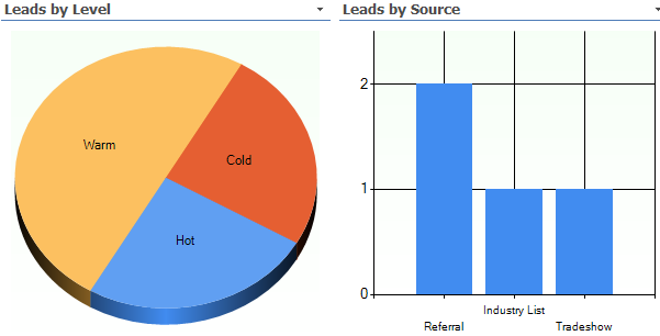
Ultimate Forms: Charts turns SharePoint list data into live, configurable charts directly on your pages: bar, line, pie, and other chart types, summarized by any category column, with counts, sums, and averages calculated for you. Charts are interactive, so clicking a segment can filter a connected list view to the matching items, and everything reads straight from the list, with no Power BI, no exports, and no code.
The data already answers the question. Charts makes the answer visible.
The missing chart web part
Modern SharePoint pages have no serious charting: the built-in options cap out almost immediately, and the usual escalation is a Power BI project, with its licensing, workspaces, and refresh schedules, for what is often a status pie and a monthly trend line. That gap is why so much list data ends up charted in Excel, again, every Friday.Charts fills the gap where the data lives. Configure the chart on the page, point it at the list, and it stays current on its own, one of the building blocks behind dashboards you can build without Power BI.
What Charts can do
From list to chart, no middleman
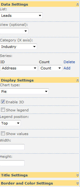
Pick a list, a category column, and what to calculate: count the items, sum the amounts, or average the values, across any number of columns. Choose from a variety of chart types and show more than one data series on a single chart, so plan versus actual, or this quarter versus last, live side by side. Values can display as percentages when share matters more than size. Guidance on matching type to question lives in our chart types article.Click the chart, filter the page
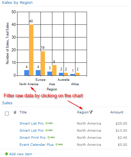
Charts participates in web part connections in both directions. As a filter provider, clicking a chart segment filters connected web parts: click the Open slice of the ticket pie and the list view below shows exactly those tickets. As a filter consumer, the chart redraws to match filters applied elsewhere on the page. That two-way behavior turns a page of parts into an interactive dashboard.Show only what you mean
Scope the chart's data by any list view, so the sales chart reflects exactly the pipeline definition your team already maintains. Control layout, backgrounds, and borders to match the page, and assign your own colors to categories, so Open is always red and Closed is always green, here and on every other chart, consistent with your color coding elsewhere.Complete the dashboard
Charts carries the trends and breakdowns; Counters carry the headline numbers; Rollups aggregates across sites; Filters puts the audience in control. Together they assemble the operational dashboards that answer Monday's questions without a BI backlog.Compared with Native SharePoint
| Ultimate Forms | Native SharePoint | |
|---|---|---|
| Multiple chart types | ✓ |
|
| Connects to SharePoint lists | ✓ |
|
| Allows multiple series on a single chart | ✓ |
|
| Fully customizable look and feel | ✓ |
|
| Show values as percentage | ✓ |
|
| Localization into English, French, German and Spanish | ✓ |
✓
|
Where teams use it
Ticket volume by status on the help desk page, clickable through to the queue. Requests per department with month-over-month series. Pipeline value by stage beside the quote list. Training completion by team, expenses by category, incidents by severity. Across the 450+ templates in the Solution Catalog, Charts is how the numbers become visible.Frequently asked questions
Q: Can I create a chart from a SharePoint list without Power BI?
A: Yes. Charts renders live charts directly from list data on any SharePoint page, with aggregation, multiple series, and drill-down, no Power BI license or dataset required.
Q: Which chart types are supported?
A: A variety of standard types, including bar, line, pie, and more, each fully configurable in layout and color. See our chart types guide for choosing among them.
Q: Do charts update when the list changes?
A: Yes. Charts read directly from the list, so the visualization reflects current data every time the page loads, with no refresh schedule to manage.
Q: Can clicking the chart filter other web parts?
A: Yes. Charts acts as a filter provider through web part connections: clicking a category filters connected views to the matching items. It also consumes filters from other web parts.
Q: Can a chart show sums and averages, not just counts?
A: Yes. Summarize by count, sum, or average across any number of columns, with optional percentage display.
Q: Can I limit a chart to specific items?
A: Yes. Charts can be scoped by any list view, inheriting the columns and filters your team already maintains.
Screenshots