
Bring Visual Clarity: Color & Progress Bars in SharePoint with Ultimate Forms
Numbers and status labels are useful—but humans interpret visuals faster. When your lists and forms include progress bars, color-coding, and icons, you turn abstract data into immediate insight. Infowise Ultimate Forms gives you built-in tools to add color, KPIs, progress bars, and dynamic visual indicators—without custom code.
Rather than relying on manual formatting or inconsistent styles, you can let status, percentage, or deadline data drive visuals automatically. Below, we’ll walk through how color and progress bars work in Ultimate Forms, how to set them up, and real scenarios where they transform user experience.
Understanding the Color & Indicator Features in Ultimate Forms
Before diving into setup details, it’s helpful to understand the building blocks Infowise provides:
Color Choice Columns
The Color Choice column type extends a standard Choice column by allowing you to assign colors or icons to each choice value. You can apply color to:
-
the column itself (background or font)
-
the full row
-
or text only
You retain flexibility in how the visuals show while keeping the underlying choice logic intact.
Indicator Columns
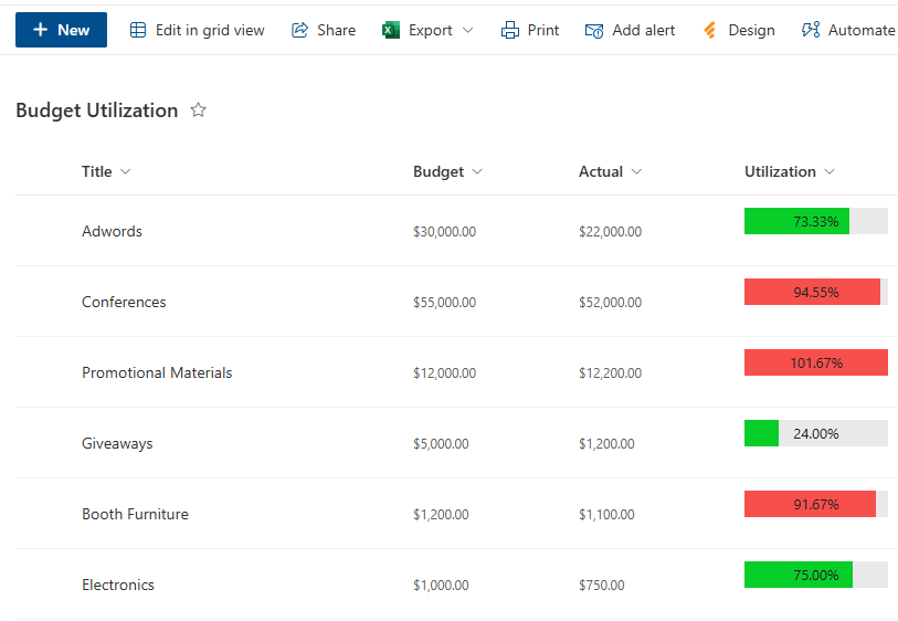
The Indicator column is a specialized column type that turns numeric or date data into rich visual indicators—like KPIs, progress bars, or dynamic countdowns. Use it to compare actual vs goal, show progress toward a target, or count down to a date.
-
Progress Bar Mode: Display a bar that fills proportionally based on a value’s relation to a goal.
-
KPI / Icon Mode: Use thresholds to assign icons or color states (low / medium / high).
-
Countdown Mode: Show how close or how overdue a date is.
Because Ultimate Forms integrates these into views, print templates, forms, alerts, and associated workflows, your visuals stay consistent across your solution.
How to Add Colors & Progress Bars: Step by Step
Here’s a guide to set up color and progress visualization in your SharePoint lists using Ultimate Forms.
1. Plan Your Visual Logic
Decide which data you want to visualize. Common examples:
-
Task or project completion percentage (0–100%)
-
Status columns (e.g. Not Started, In Progress, Completed)
-
Milestones or deadlines (countdown)
-
KPI metrics (e.g. sales vs quota)
Then decide how you want to show visuals: whole row coloration, column background, icons, progress bar, or countdown.
2. Add or Convert to a Color Choice Column
-
In your list, create a new column of type Infowise Color Choice or convert an existing Choice column into it.
-
Enter the choice values (e.g. “Not Started”, “In Progress”, “Completed”).
-
Assign a color or icon to each value. You can decide whether the color applies to text, the column background, or the entire row. You can also opt to use icon instead of colors.
-
Save and include that column in your views and on your forms.
3. Add an Indicator Column for Progress
-
Add a new column of type Indicator.
-
Choose the mode: progress bar, KPI (icons), or countdown.
-
Configure the data source (e.g. a percentage column or date column).
-
For progress bar mode, set a target/goal (static or dynamic, e.g.
[Total], formula, or another column). -
For KPIs, set thresholds or ranges.
-
For countdown, define the date target and units (days, hours, etc.).
-
Save the column and include it in forms or views.
4. Configure Visual Behavior & Permissions
-
Use conditional visibility or permissions on forms so that only certain users see the indicator or full row color.
-
In views, you can hide the raw numeric columns and show only the color or indicator for cleaner dashboards.
-
In print templates, color and progress visuals will appear automatically (if the template respects styling).
-
If you use fragments or help text, you can explain what the colors or indicators mean (e.g. green = good, red = overdue).
5. Test Across Contexts
-
In the list view: see rows, colored columns, and progress bars.
-
In forms: make sure colors/icons render correctly in Display and Edit modes.
-
In print/PDF exports: verify the visuals carry through correctly.
-
On mobile or compact layouts: check that visuals scale or degrade gracefully.
Real Use Cases: When Colors & Progress Bars Make a Difference
Use Case A: Project Task Tracking
You have a “Percent Complete” numeric column. Add an Indicator column configured as a progress bar. As a task moves from 0% to 100%, users see the bar fill. When it's complete, you might also trigger a Color Choice status change to “Completed” (green).
Use Case B: SLA / Deadline Countdown
For tasks or support tickets, use an Indicator column in countdown mode to show how many days remain until deadline, or how overdue the ticket is. Use colors to flag approaching or overdue states (e.g. yellow then red).
Use Case C: Status Visuals Across Rows
For a list of workflows (e.g. onboarding), you have a Status choice column. Convert it to a Color Choice and assign colors: blue for “In Progress”, orange for “On Hold”, green for “Completed”. Users immediately recognize status visually.
Use Case D: KPI Dashboard in List
You have a metric like monthly sales. Add an Indicator column for KPI mode with thresholds: below 70% = red, 70–90% = yellow, >90% = green. In a list view, each row shows a colored icon representing performance.
Use Case E: Calendar Color & Progress Integration
When using the Infowise Calendar component, color categories of events come from Color Choice or Category columns. Progress bars for associated tasks can appear inside event views.
Benefits & Trade-Offs
Benefits
-
Faster Visual Interpretation – Users spot high priority, completed tasks, or problem areas instantly.
-
Consistency Across interfaces – Colors and progress visuals show up in list views, forms, print/export, and dashboards.
-
No Coding Required – All configuration is point-and-click in Ultimate Forms.
-
Integrates with other features – Works with alerts, actions, KPI logic, associated items, and print templates.
Trade-Offs / Things to Watch
-
Performance Impact – Many visuals in large lists may slow rendering. Use wisely and test performance.
-
Color Overload / Confusion – Too many colored statuses or visuals can overwhelm users; limit to key states.
-
Print / PDF limitations – Some styling or color rendering may degrade in certain print formats or black/white outputs.
-
Accessibility / Color Blindness – Relying solely on color can be problematic—use icons or text indicators in addition.
-
Permission Conflicts – Be cautious if some users lack permission to see certain columns or colors—you should fallback gracefully.
Tips & Best Practices
-
Start simple – Begin with one color-based status or progress bar, then expand.
-
Use meaningful color conventions – e.g., green for complete, red for alert, yellow for in progress.
-
Include legends or help text – A small label or fragment explaining color coding helps new users.
-
Limit to essentials – Don’t color every column; pick status or progress visuals that deliver value.
-
Consider contrast and readability – Make sure text is legible on colored backgrounds.
-
Plan for export and printing – Preview visuals in print and PDF output to ensure they render well.
-
Document logic – In admin notes or documentation, explain color logic, thresholds, and relationships.
-
Test across devices – On mobile or narrow layouts, colors or progress visuals may need fallback or truncation.
-
Combine with actions or alerts – For example, when a progress bar reaches 100%, trigger an action or status update.
Conclusion
Adding color, icons, and progress bars transforms ordinary SharePoint lists into intuitive dashboards. At a glance, users see what’s done, what’s behind, and what needs attention. Infowise Ultimate Forms brings this visual power into your reach with Color Choice columns and Indicator columns, fully integrated into forms, views, print templates, and workflow logic.
Whether you’re tracking tasks, enforcing SLAs, building dashboards, or simply improving usability, these visual tools let your users see real insights instantly—making data actionable, not just informative.