Each chart type has one job: bars compare categories, lines show trends over time, pies show parts of a whole, and area charts show accumulating volume. Here is when to use each in your SharePoint dashboards.
Data is only as valuable as your ability to understand it. A SharePoint list with five thousand rows of help desk tickets, sales orders or inspection records contains real answers to real business questions, but nobody finds those answers by scrolling. That is what charts are for: they turn rows and columns into shapes your brain can process in a second.
The catch is that different questions call for different shapes. A chart that brilliantly shows a trend over time can completely hide a comparison between categories, and vice versa. Ultimate Forms includes a full charting component with sixteen chart types (and growing!). So whatever question you are asking of your data, there is a shape that answers it. In this article we will walk through each chart type, what it does, when to use it. And then we look at how easily you can put them all together into live dashboards, without writing a single line of code.
Comparing categories: Column and Bar
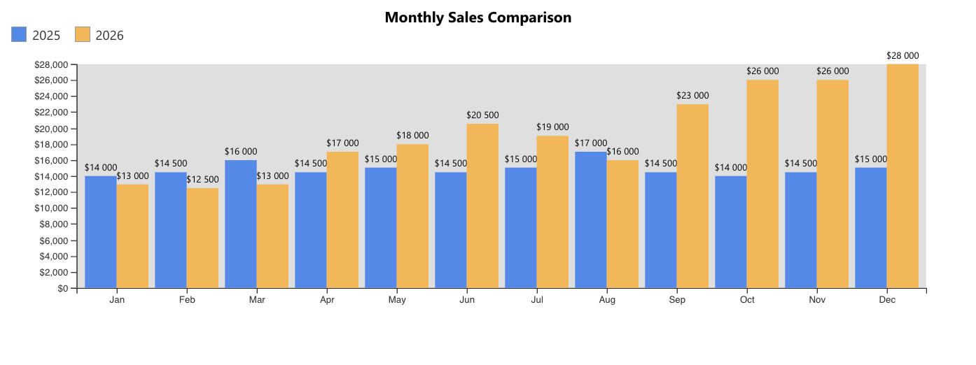
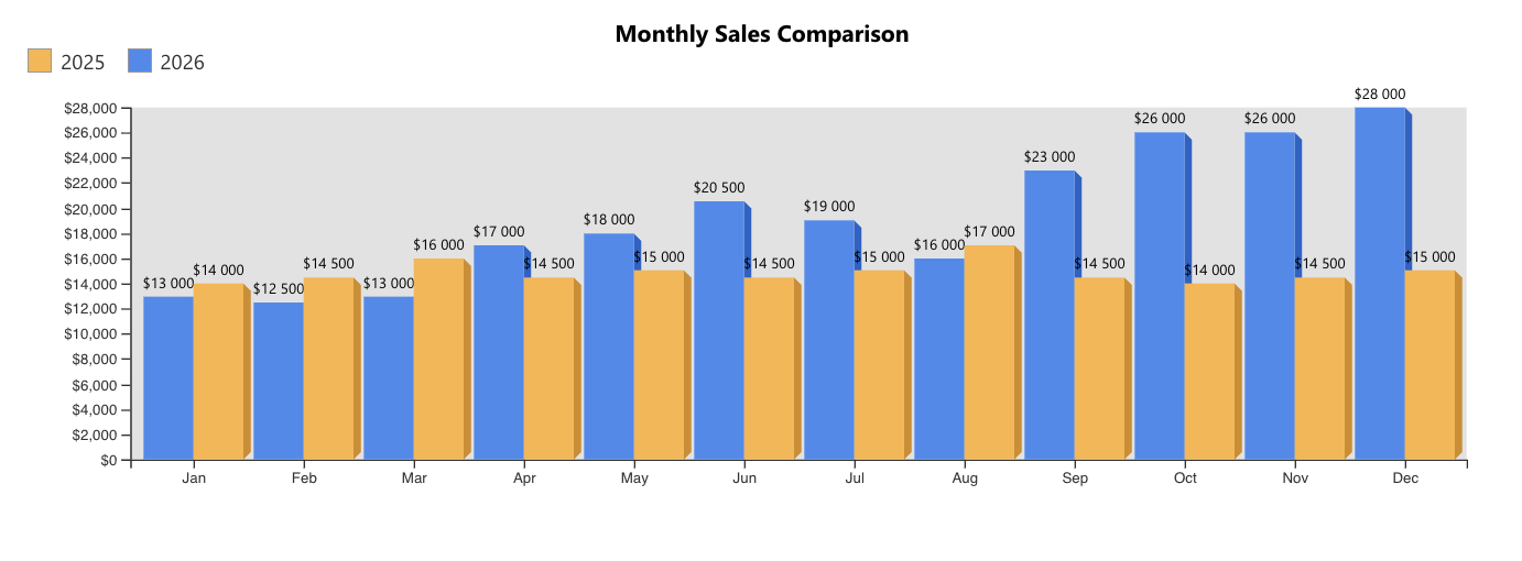
The Column chart is the workhorse of business reporting. Vertical columns rise from a common baseline, making it effortless to compare values across categories: tickets per support agent, sales per region, incidents per month. If your manager asks "which branch sold the most last quarter?", a column chart answers before the question is even finished.
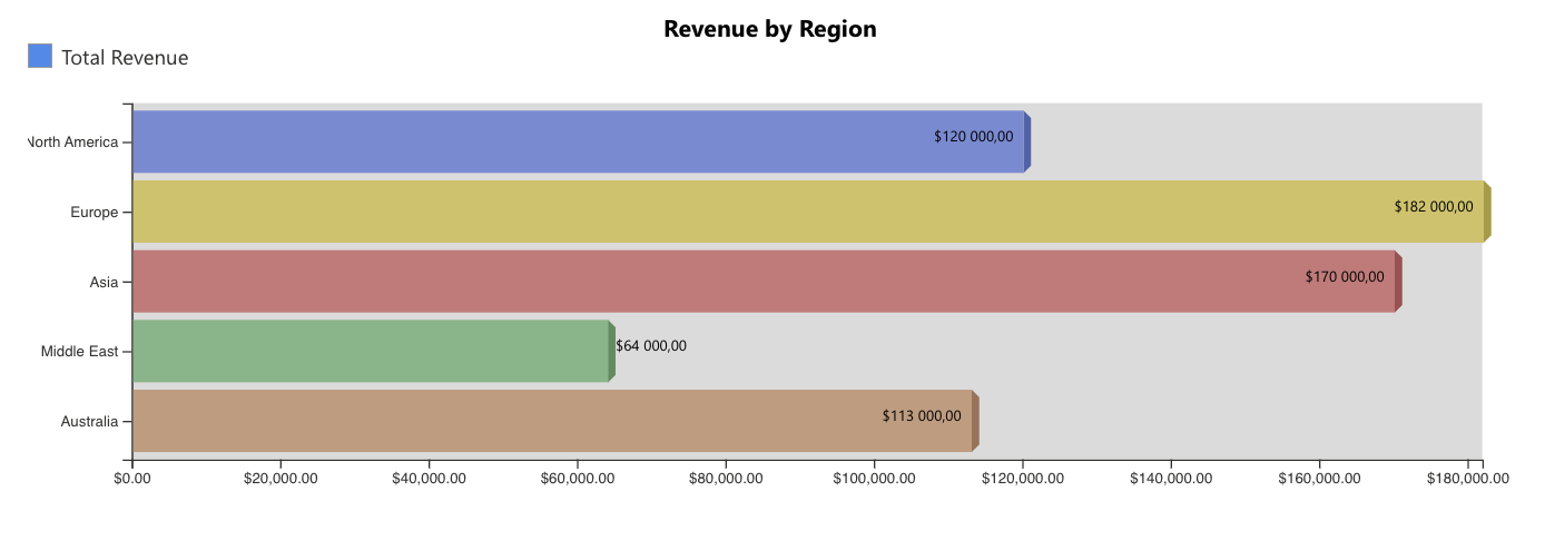
The Bar chart is its horizontal twin, and it earns its keep whenever category names are long. Try squeezing "Facilities Maintenance and Groundskeeping" under a vertical column and you will see the problem. A hospital comparing patient satisfaction across fifteen departments, or an HR team showing headcount by job title, will find bars far more readable than columns.
Showing composition: Pie, Doughnut, Funnel and Pyramid
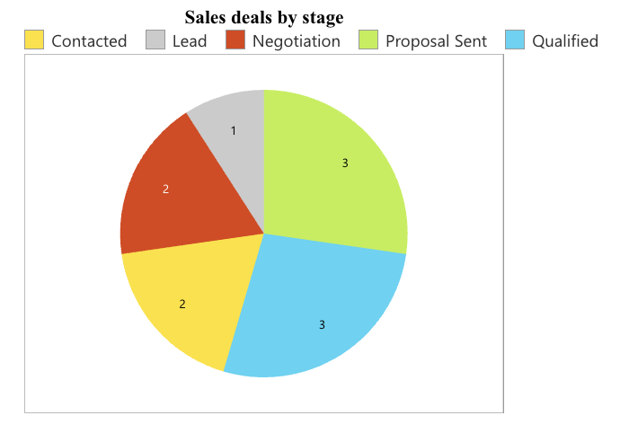
The Pie chart shows parts of a whole. Each slice represents a category's share of the total, which makes it perfect for questions like "what percentage of our IT budget goes to licensing versus hardware versus services?" Keep it to a handful of slices; a pie with twenty slivers helps no one.
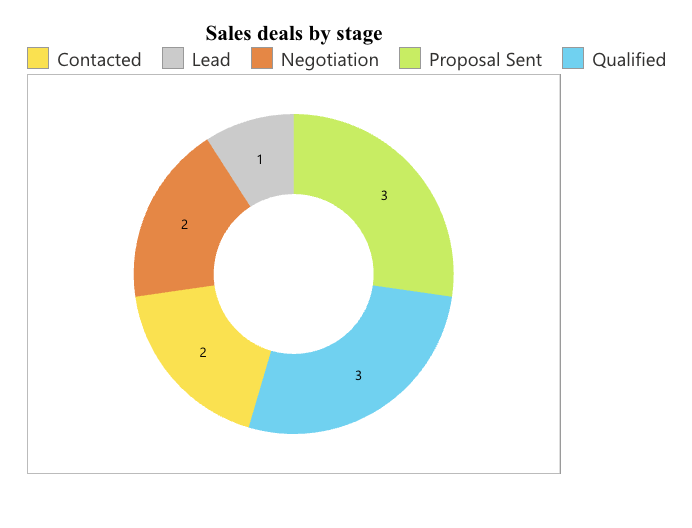
The Doughnut chart is a pie with a hole in the middle. Beyond looking modern, that hole is useful real estate: you can visually anchor a total or a headline figure there. A project management office might use a doughnut to show the distribution of projects by status, with the overall project count as the centerpiece of the story.
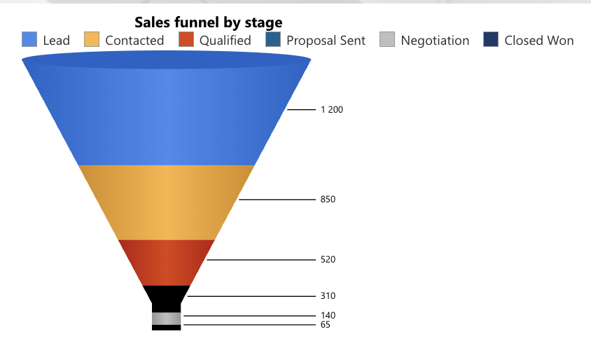
The Funnel chart shows values shrinking through sequential stages, which is exactly how sales pipelines behave: 200 leads become 80 qualified opportunities, become 30 proposals, become 12 closed deals. Each narrowing of the funnel shows where prospects drop off. Recruiters use funnels the same way to track applicants from submission through screening, interview and offer.
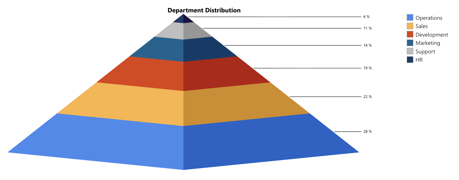
The Pyramid chart flips that idea, widening from a small top to a broad base. It is a natural fit for hierarchies and tiered structures: an organizational headcount pyramid from executives down to front-line staff, or a risk pyramid showing a few critical issues sitting atop many minor ones.
Tracking change over time: Line, Spline and Area
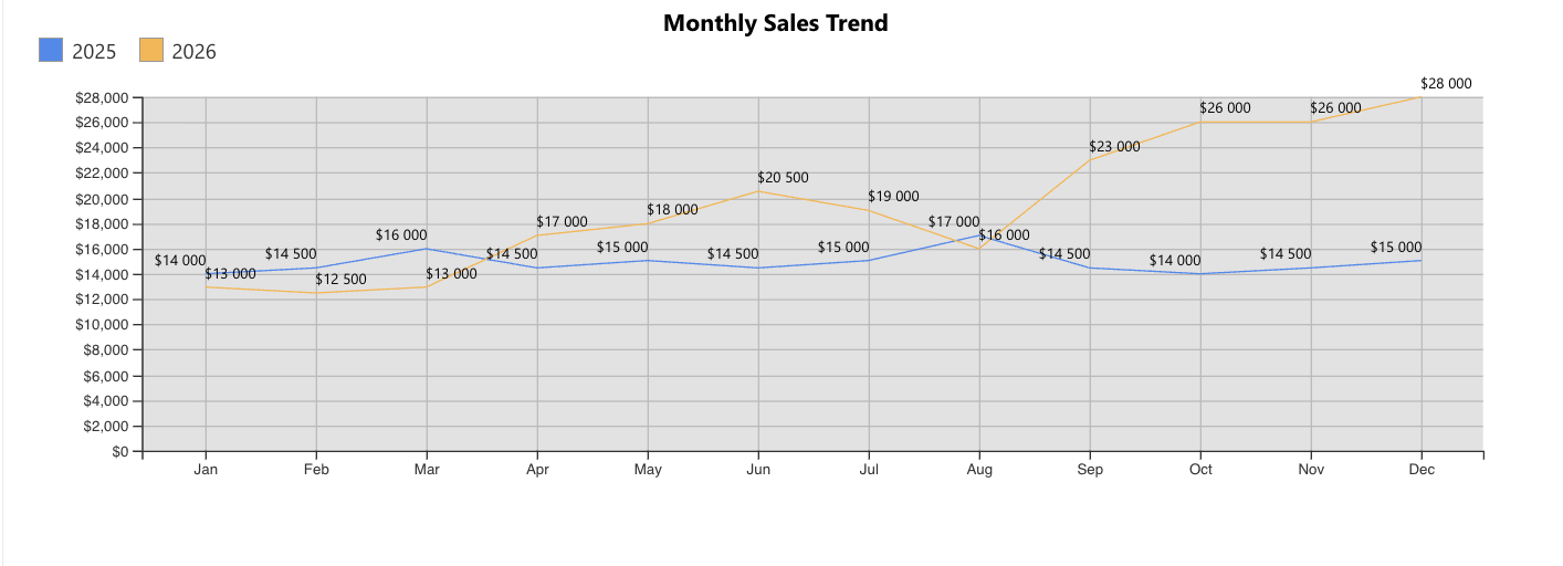
The Line chart connects data points in sequence and is the definitive way to show change over time. A support team plotting ticket volume week by week can instantly spot the spike that followed a product release. Plot several lines together and you can compare trends, such as this year's revenue against last year's, month by month.
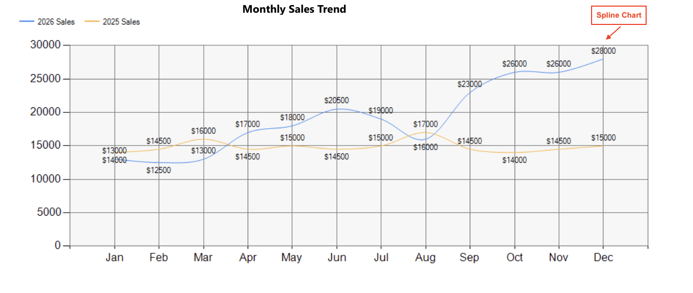
The Spline chart does the same job with smooth curves instead of angular segments. When the underlying phenomenon is continuous, temperature readings from facility sensors, say, or website traffic through the day, the flowing curve of a spline both looks better and better reflects reality.
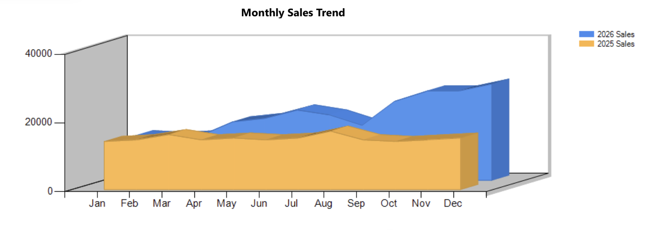
The Area chart fills the space beneath the line with color, adding a sense of volume and magnitude. It is ideal when the cumulative quantity matters as much as the trend: total hours logged by a team across the year, or growing storage consumption on your SharePoint tenant. The filled area makes growth feel tangible in a way a bare line does not.
Individual data points: Point and Scatter Plot
The Point chart plots each value as a standalone marker rather than connecting them. When your observations are discrete events, individual quality inspection scores, delivery times for specific shipments, plotting them as points avoids implying a continuity that is not there and lets outliers jump out immediately.
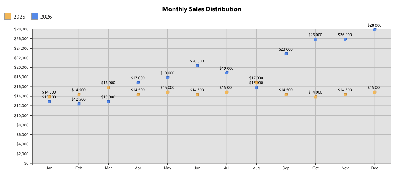
The Scatter Plot takes points further by mapping two numeric variables against each other, one on each axis, to reveal relationships. Does more training correlate with fewer safety incidents? Plot training hours against incident counts per site and the pattern, or the absence of one, becomes visible. Facilities teams use scatter plots to relate building age to maintenance cost; marketers use them to relate campaign spend to leads generated.
Showing spans: Range Bar and Range Column
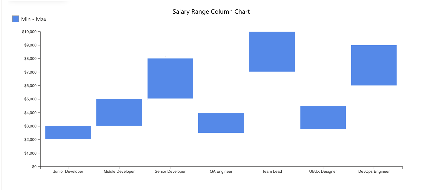
Sometimes a value is not a single number but a span between two numbers, and that is where range charts shine. The Range Column chart draws vertical columns stretching from a low value to a high value. Think of daily minimum and maximum warehouse temperatures, or the best-case and worst-case cost estimate for each project in your portfolio.
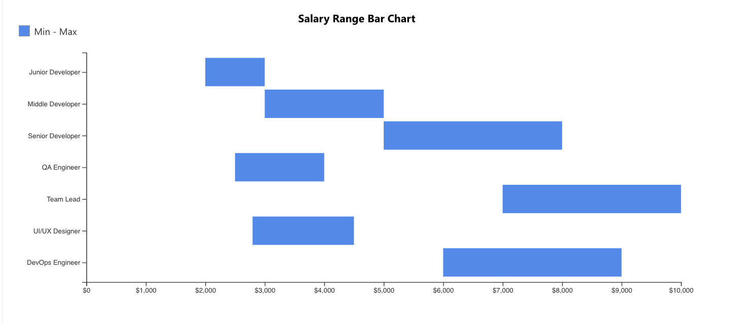
The Range Bar chart draws those spans horizontally, which makes it a natural lightweight timeline. Plot each project's start date to end date and you have an instant Gantt-style overview of your entire portfolio, perfect for spotting overlaps and resource crunches at a glance.
Stacking it up: Stacked Column, Stacked Bar and Stacked Area
Stacked charts answer two questions at once: how big is the total, and what is it made of? The Stacked Column chart piles multiple series into a single column per category. A help desk can show total tickets per month, with each column split into segments for hardware, software and network issues, revealing both overall workload and its changing mix.
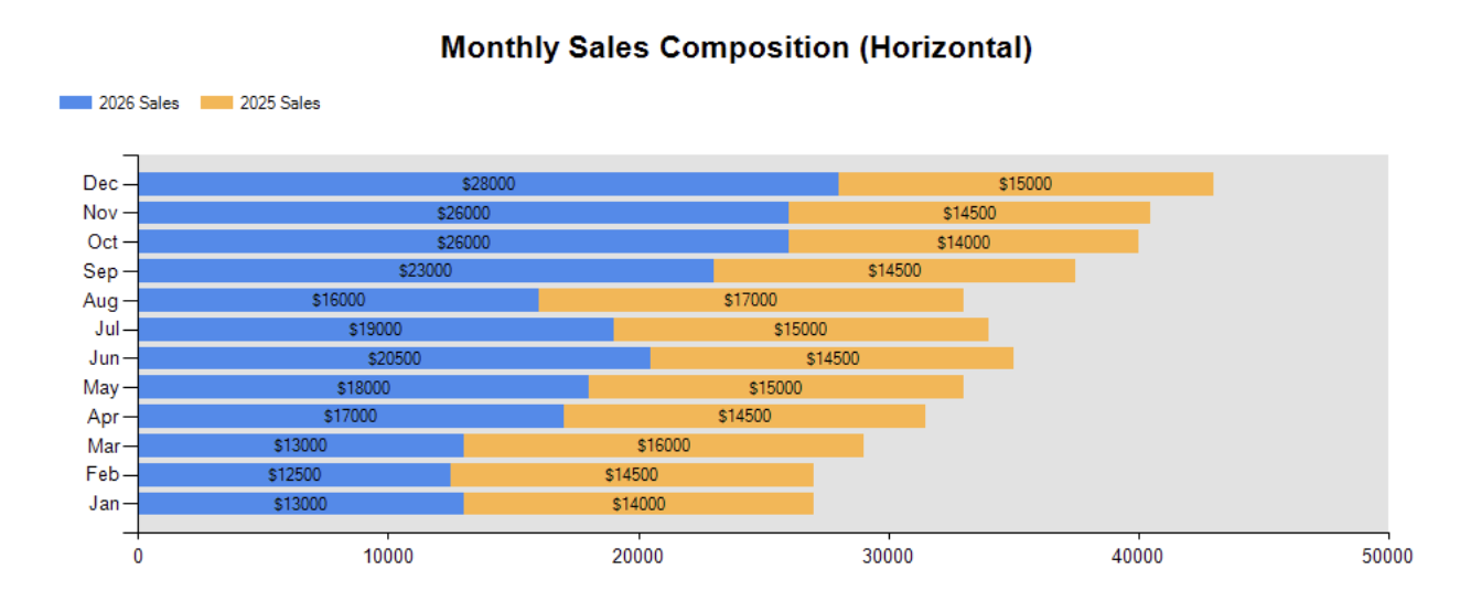
The Stacked Bar chart does the same horizontally, ideal when categories are numerous or wordy: total expenses per department, broken down into travel, supplies and contractor costs.
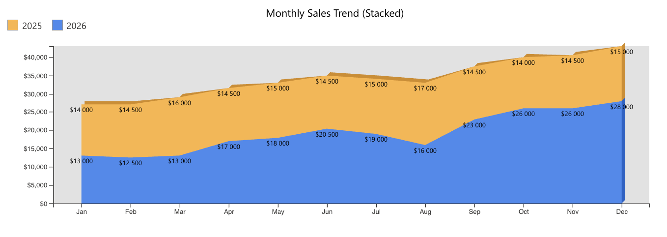
The Stacked Area chart stacks trends over time, filling the layers with color. Picture your revenue over three years as a rising landscape, with colored bands for each product line. You see total growth and each product's contribution to it in one continuous picture.
Configuring charts in Ultimate Forms: minutes, not days
Here is the best part: putting any of these charts on a SharePoint page with Ultimate Forms requires no code, no scripts and no export to external BI tools. Your charts run directly against your live SharePoint lists.
Configuration is a simple, guided process. You point the chart at a list and optionally a view, and any filtering defined in that view is automatically applied to the chart. You choose your category column, then add one or more data series with an operation: count items, sum a numeric column or average it. Then you pick your chart type from a dropdown, and switching from, say, a column chart to a stacked area chart to see which tells the story better takes exactly one click. From there you can fine-tune everything: legend position, value labels, 3D rendering, sizes, titles, colors, gradients and borders, so the result matches your site's branding perfectly.
Because charts read your lists in real time, they are always current. When a new ticket is logged or an order status changes, the chart reflects it on the next page load. No refresh jobs, no stale spreadsheets.
Dashboards: the whole story on one page
Individual charts answer individual questions; dashboards answer "how is the business doing?" A dashboard is simply a SharePoint page with several charts (plus counters or rollups) working together, and with Ultimate Forms it takes minutes to assemble one. Add multiple chart web parts to a page: a doughnut of tickets by priority, a stacked column of monthly volume by category, a line of average resolution time, and your service desk has a command center.
Charts can even be connected to other web parts on the page to act as interactive filters. Click a slice or a column, and a connected list view drills down to the underlying items. Your dashboard stops being a static report and becomes an exploration tool, one that managers can check every morning without asking anyone to compile anything.
The takeaway
Every chart type exists because some question is best answered by that particular shape: columns and bars for comparisons, pies and doughnuts for composition, lines, splines and areas for trends, funnels for pipelines, scatter plots for relationships, ranges for spans, and stacks for totals with their breakdowns. With Ultimate Forms, all sixteen types are a few clicks away from your live SharePoint data, and a full management dashboard is just a page of them. The answers were in your lists all along; now you can actually see them.
Add your comment