A Doughnut chart is very similar to a Pie chart and is used to show how individual categories contribute to a whole.
The main difference is the hollow center, which makes Doughnut charts more compact and suitable for dashboards.
If you are familiar with the Pie chart, creating a Doughnut chart will feel almost identical.
Example scenario
You want to visualize how active sales deals are distributed across sales stages, but with a more compact layout that fits better into a dashboard.
Instructions
Create a Doughnut Chart
Before creating a Doughnut chart, make sure you have completed the tutorial Creating and Configuring Charts. This tutorial uses the same Sales Tracking list and Active Deals view as the Pie chart example.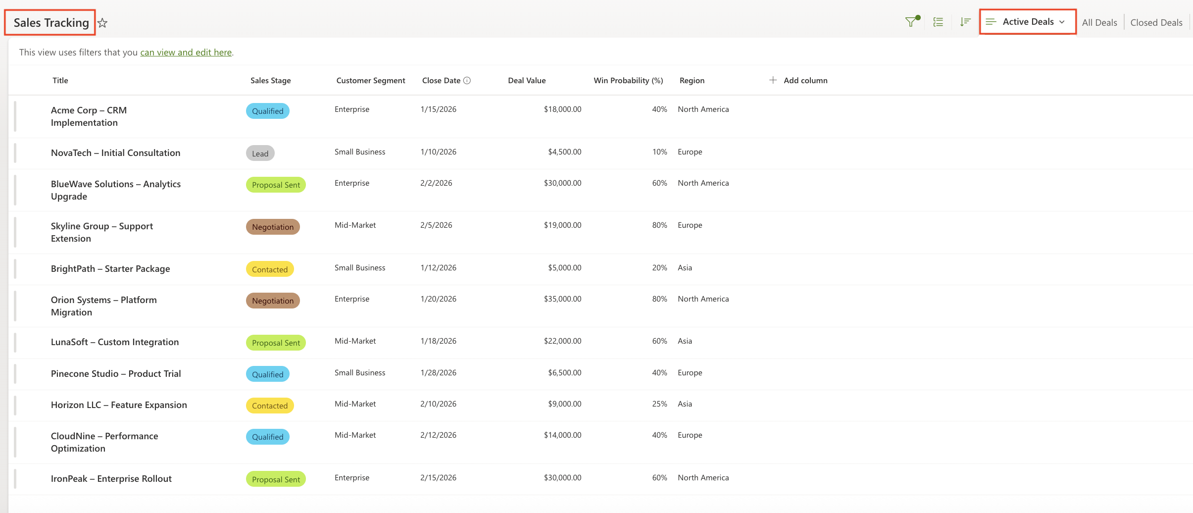
Doughnut-specific settings
Display tab
Configure the following settings in the Display tab:
- Chart type:
Doughnut - Show legend:
Enabled - Legend position:
Top - Show values:
Enabled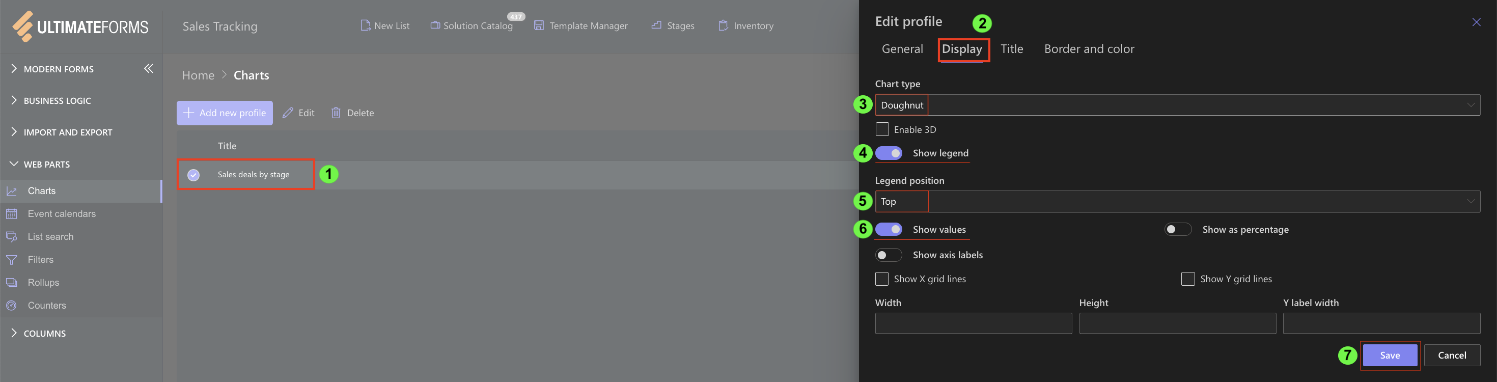
Other display settings can remain the same as in the Pie chart example.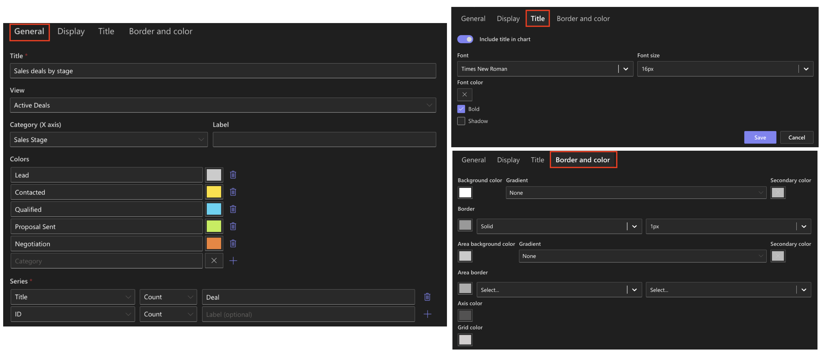
Result
The Doughnut chart shows the number of active sales deals grouped by sales stage.
Each segment represents a sales stage, and its size reflects how many active deals belong to that stage.
The hollow center makes the chart easier to read in compact dashboard layouts.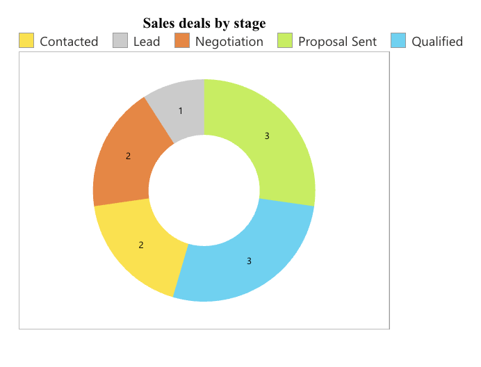
Summary
Here, you reused an existing chart configuration and changed the chart type to Doughnut.
This allows you to present the same data in a more compact format without changing the data source or aggregation logic.
The Doughnut charts are useful when you want to keep dashboards clean while still showing proportional data clearly.