The Form Designer gives you comprehensive control over the appearance of your custom forms. While SharePoint provides default styling, Infowise Ultimate Forms enhances it by allowing pixel-perfect customization using built-in visual tools—and, when needed, CSS overrides.
NOTE: Some dynamic elements of the form, such as active and inactive tab colors, hover fills, etc., can only be controlled via CSS.
This can be somewhat tricky, since it can be difficult at times to identify the exact CSS element that needs modification. There can also be differences in the way CSS displays in different browsers. If you are not confident in CSS, it’s probably advisable to stick with the built-in tools.
We’ll address CSS styling in a future tutorial. For the definitive resource on CSS, please visit the W3Schools CSS page at https://www.w3schools.com/css/default.asp.
Instructions
Step 1: Choose Your Theme
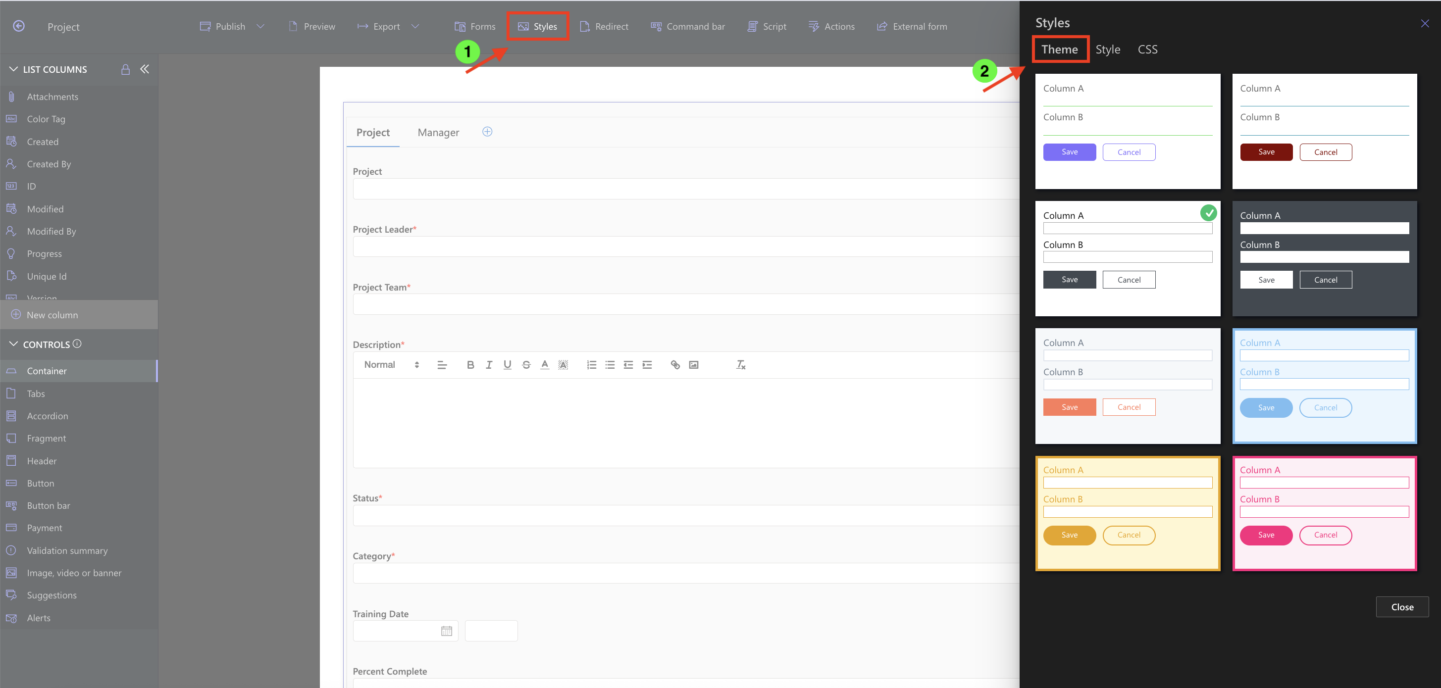
- Inside Form Designer, click the Style menu.
- You can choose between a light or dark look for your form
Step 2: Style Tabs or Accordion Elements
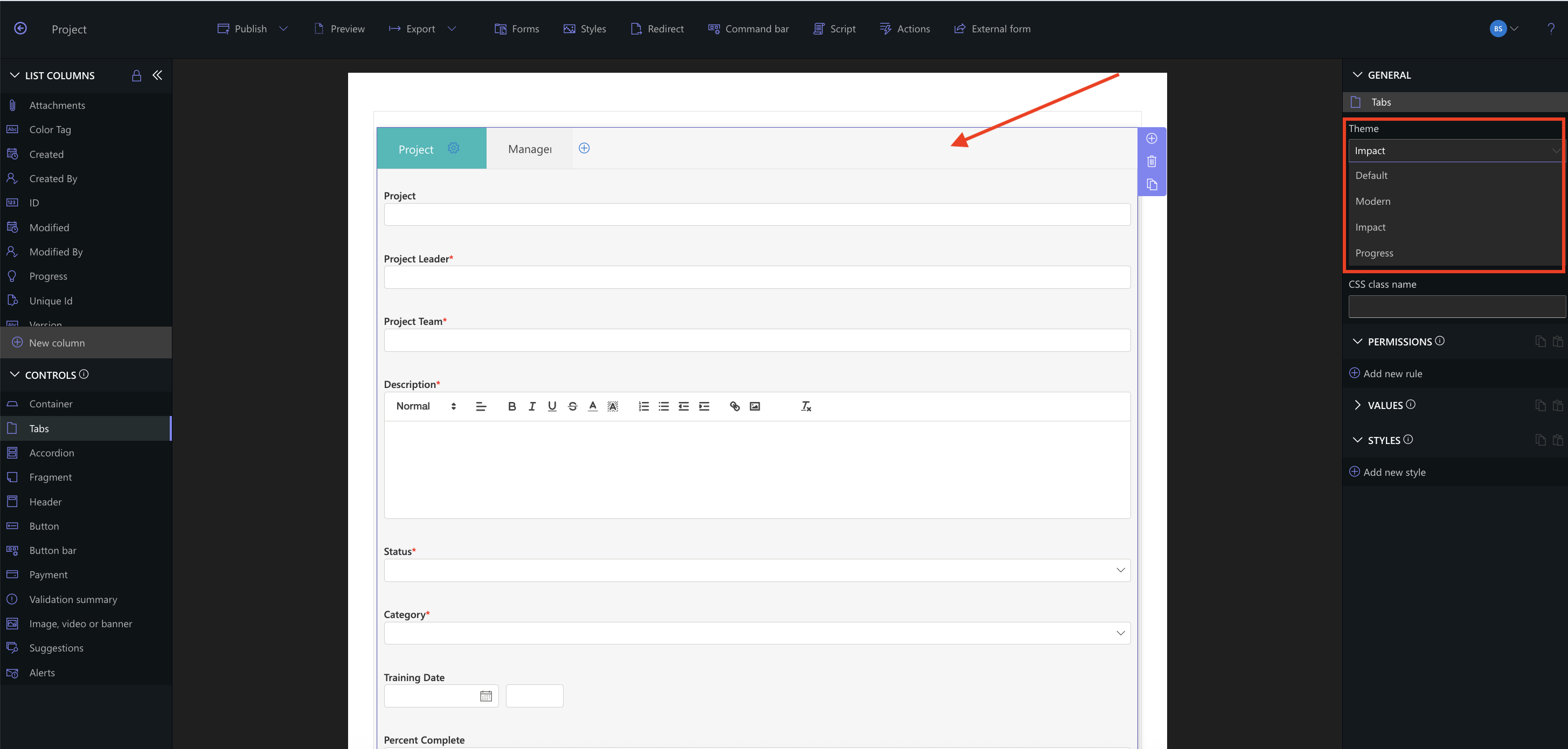
- Click to select an entire Tab or Accordion container.
- There are a couple of color and font combinations available to you in the right panel.
- These style settings only appear when the full tab or accordion element is selected.
- You need to make sure that you have the entire tab or accordion part selected for these to be active.
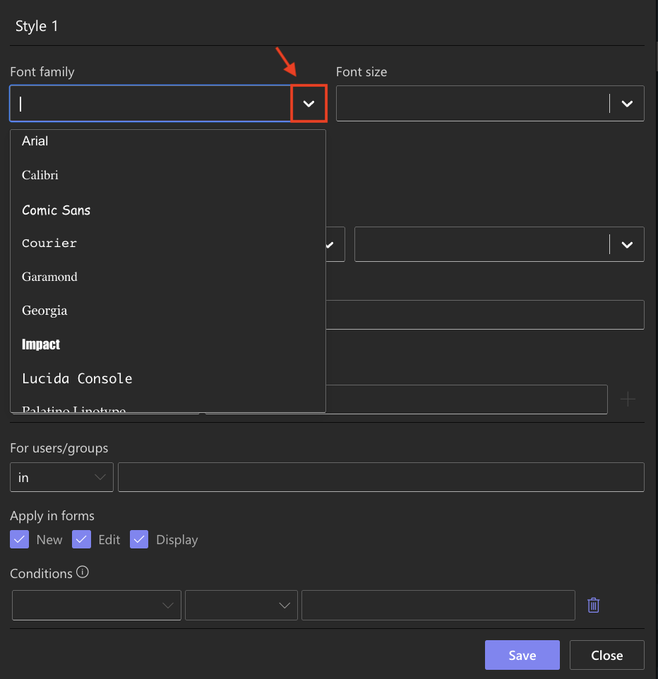
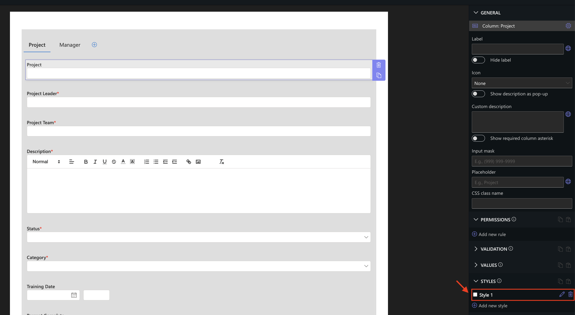
Step 3: Apply Manual Styling to Any Element
- Select any form element (column, container, fragment, etc.).
- Click the Add new style button in the right-hand panel.
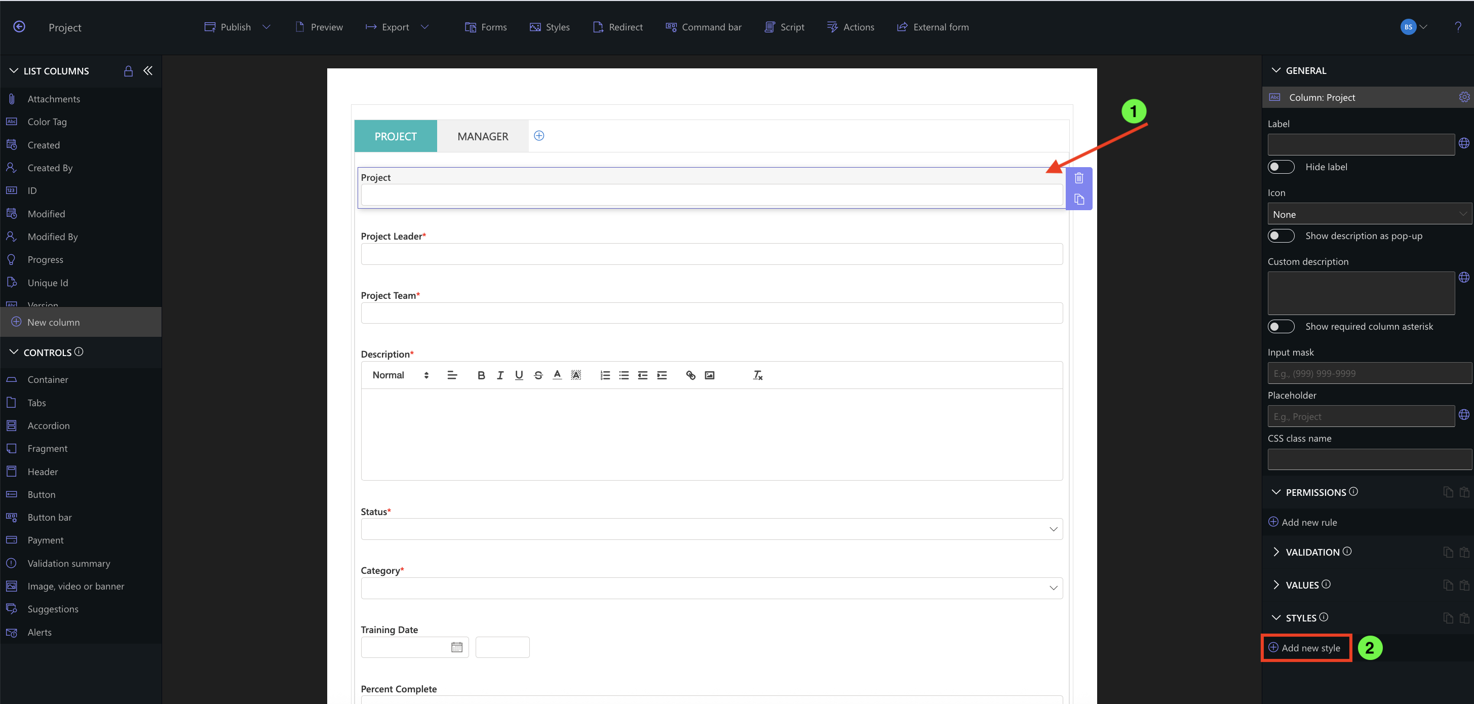
- The Styling dialog will open, providing options to fine-tune appearance.
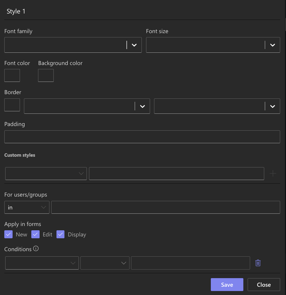
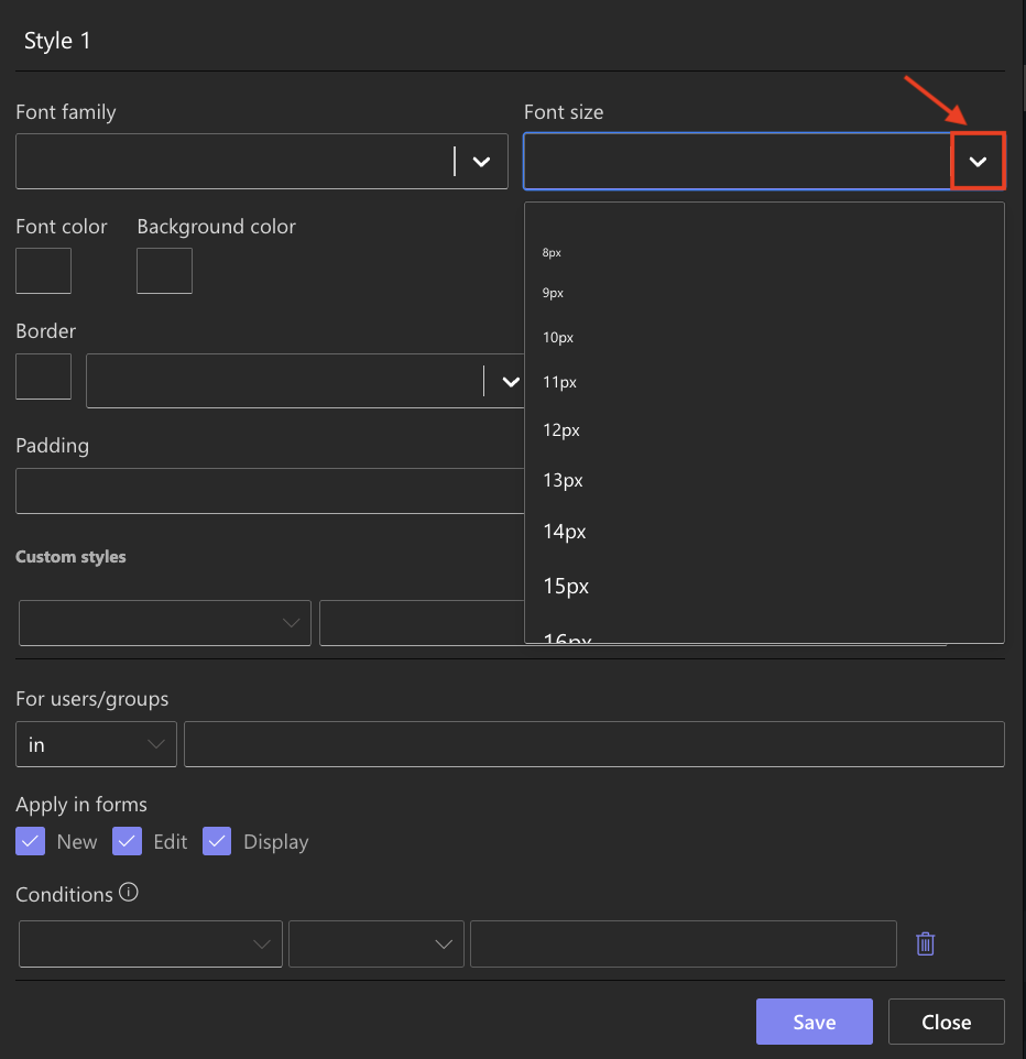
You can customize:
- Font (choose from available web-safe fonts)
- Font size (select predefined sizes)
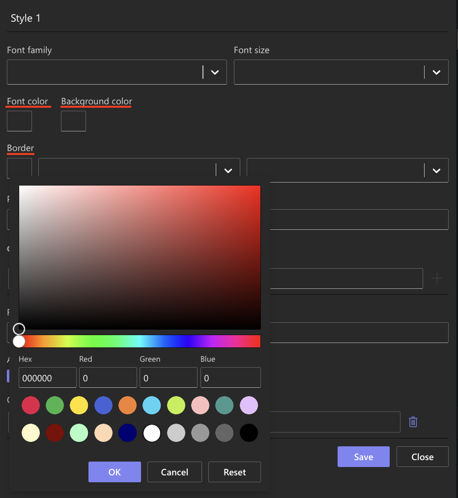
- Colors (use HEX, RGB, or built-in color picker) for:
- Font color
- Background
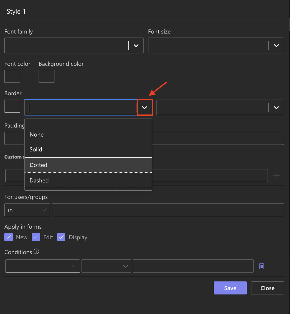
- Border
- Border styles (solid, dotted, dashed)
Step 4: Custom Section
In the Custom section of the style dialog, you can change values for a variety of CSS properties. This gives you a finer level of control, and adds controls for things like padding, margins, etc.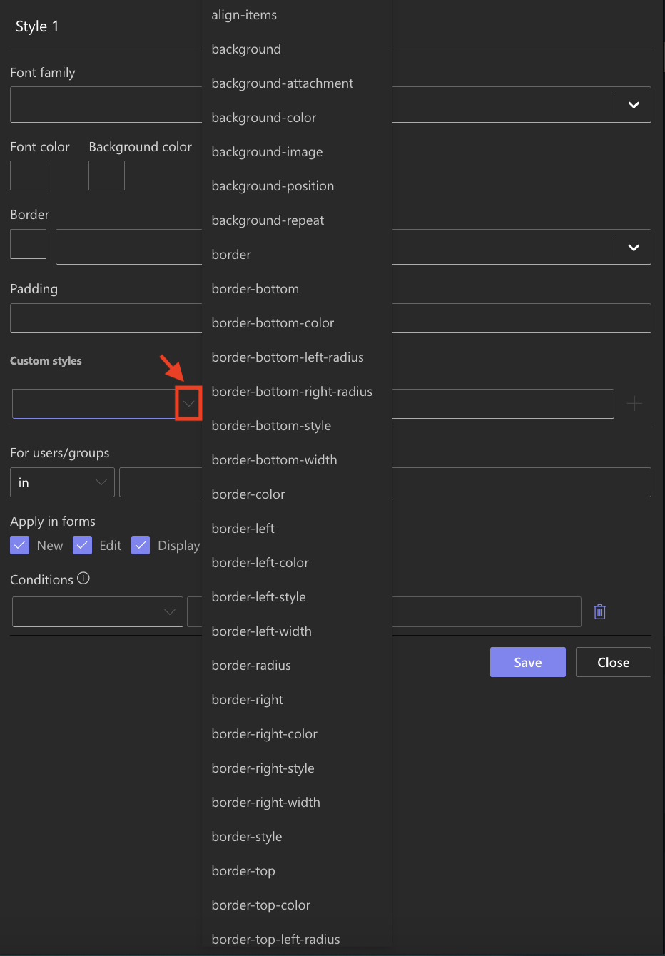
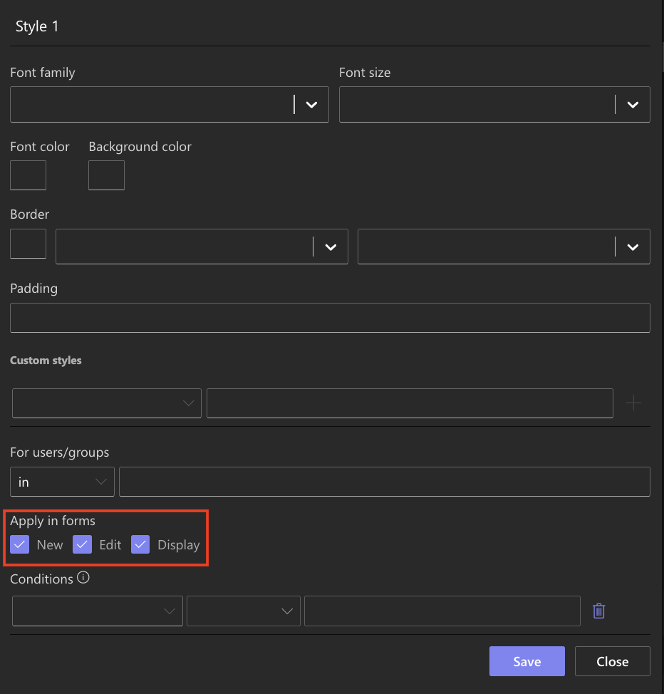
Step 5: Apply Styles Per Form State
- At the bottom of the Styling dialog, choose where your style should apply:
- New, Edit, Display, or all.
- This lets you conditionally style elements based on form state.
Step 6: Save and Manage Styles
- After applying styles, click Save.
- The style appears in the Style list in the right panel.
- To edit, click the pencil icon next to a style entry; to delete, click the trash icon.
Note: You can apply multiple styles to a single element, but conflicting rules may produce unpredictable results, so apply with care.
For a visual demonstration, see the video below:
Summary
The Basic Styling tools in Form Designer allow you to apply themes, tweak tabs, and style elements using a mix of visual controls and optional CSS overrides.
- Start with theme or tab styles for quick global changes.
- Use the Styling dialog to customize any element.
- Leverage the Custom style tab for advanced tweaks.
- Carefully manage styles per form state and watch out for style conflicts.