A Bar chart is used to compare values across categories using horizontal bars.
It is ideal for:
- comparing performance across regions
- ranking categories by value
- visualizing financial data
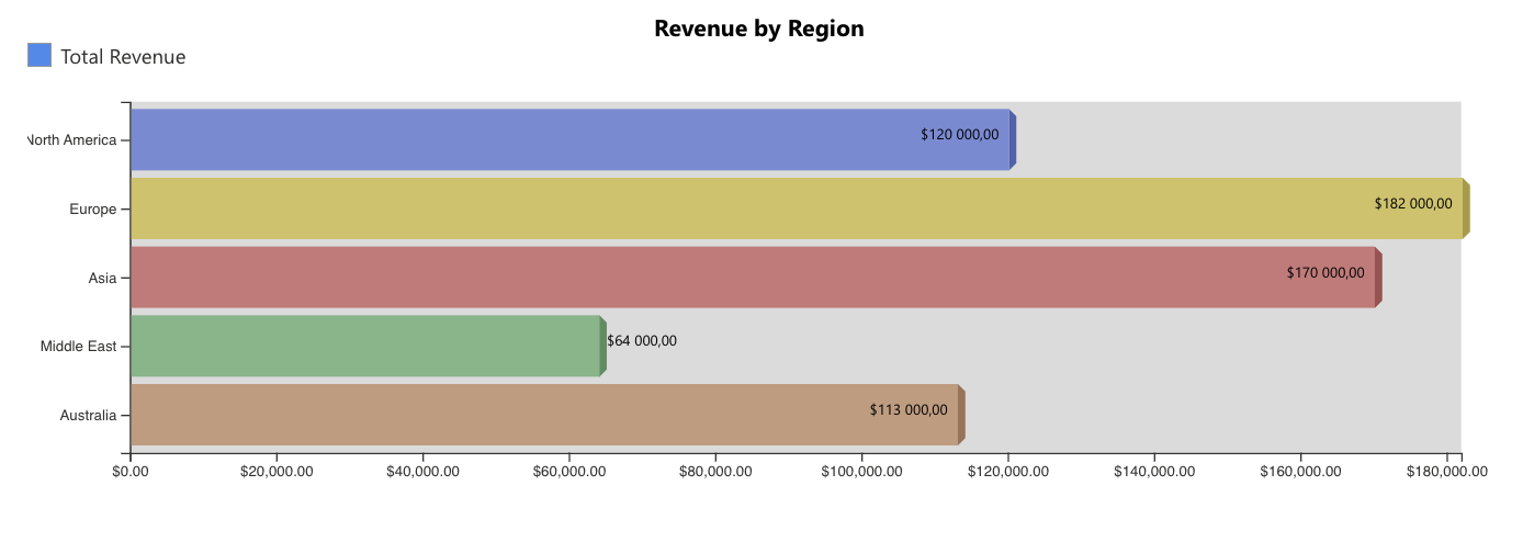
In this tutorial, you will create a Bar chart that compares total revenue across regions using aggregated deal values.
Instructions
Step 1: Prepare the data source
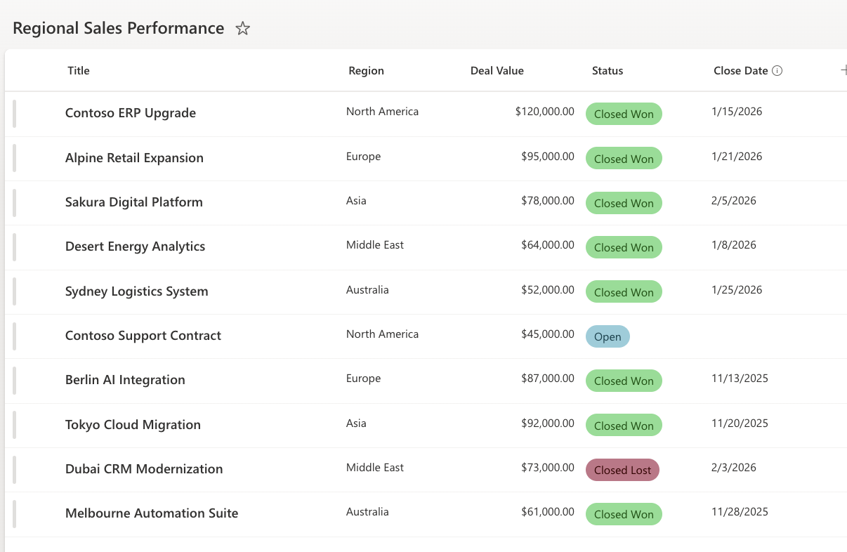
- Create a SharePoint list named: Regional Sales Performance with the following columns:
- Title - Single line of text
- Region – Choice
- Deal Value – Currency
- Status – Choice
- Close Date – Date
- Choice values:
- Region (North America, Europe, Asia, Middle East, Australia)
- Status (Open, Closed Won, Closed Lost)
- Add sample data:
- Add several deals with different regions and statuses.
- Make sure some deals are marked as Closed Won, as these will be used in the chart.
- Create a filtered view:
- Create a view named: Closed Won Deals
- Filter condition: Status = Closed Won
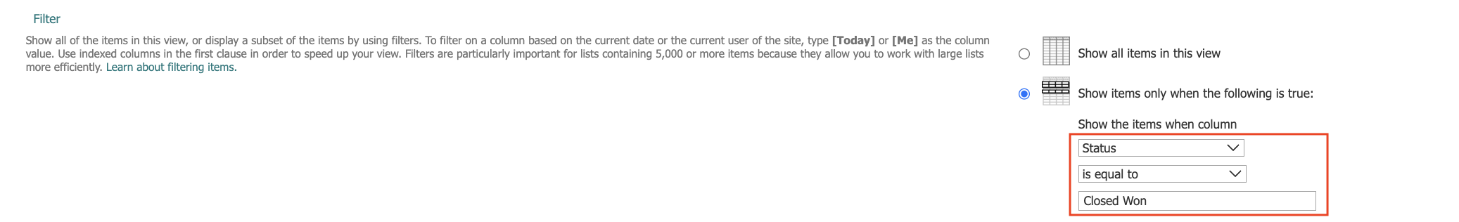
This ensures the chart displays revenue from successfully closed deals only.
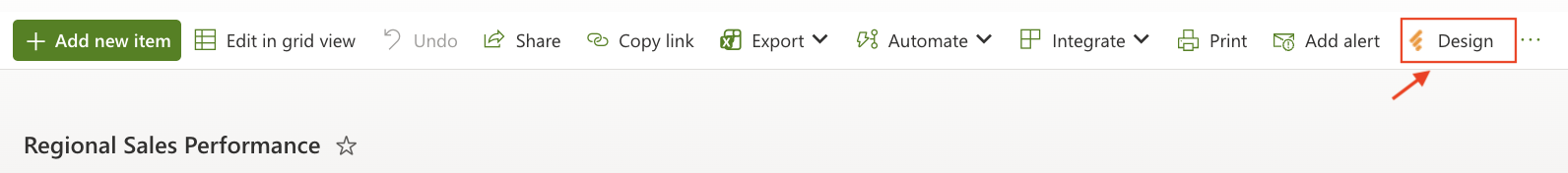
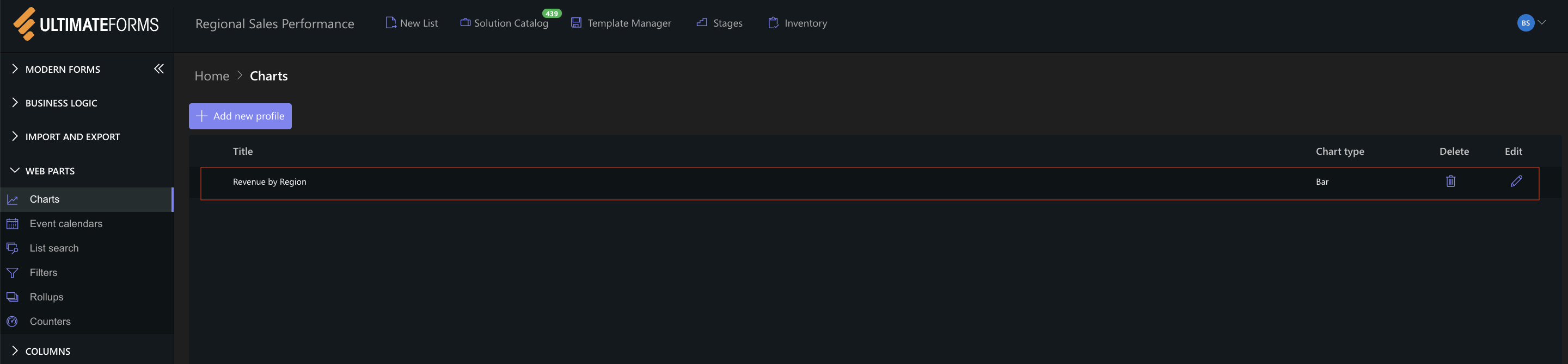
Step 2: Open Charts in Ultimate Forms
- Open Design.
- Select Charts from the main menu.
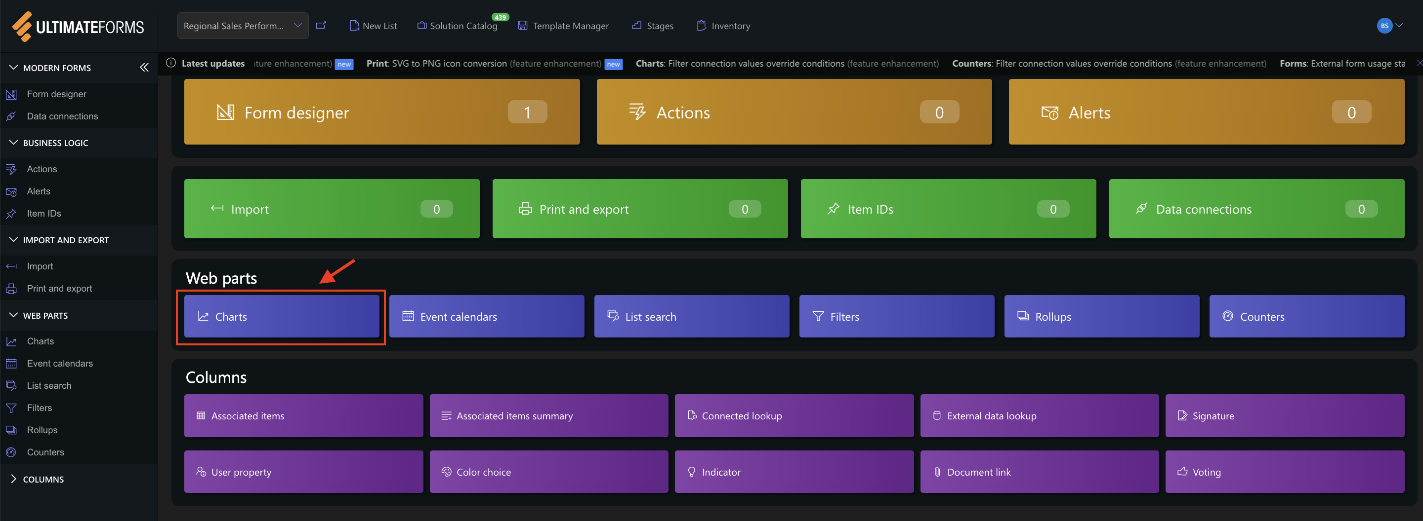
- Click Add new profile.
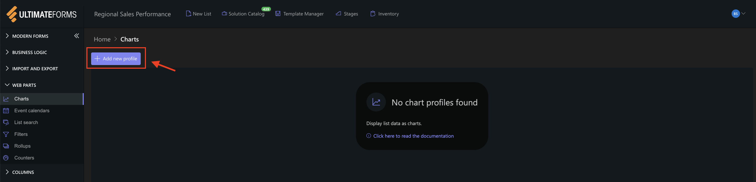
The Chart profile configuration panel opens.
Step 3: Configure General settings
The General tab defines the data source and structure of the chart.
Settings used in this example:
- Title
Revenue by Region - View
Closed Won Deals - Category (X axis)
Region - Colors (optional)
You may assign custom colors for each region. - Series
- Add one series with the following settings:
- Column: Deal Value
- Aggregation: Sum
- Label: Total Revenue
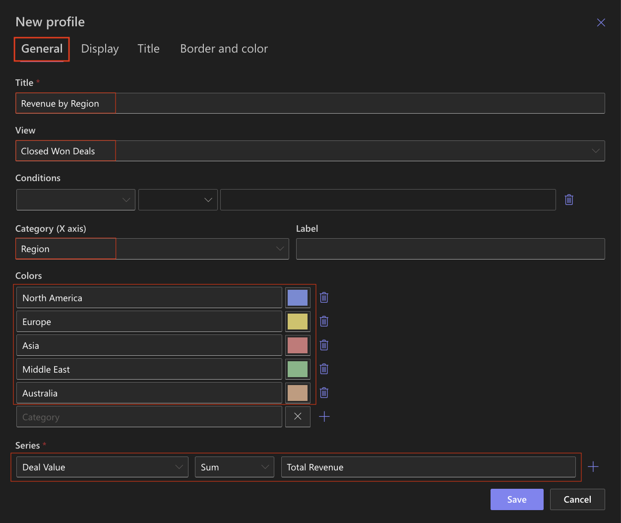
This configuration calculates the total revenue per region based on closed deals.
Step 4: Configure Display settings
The Display tab controls how the chart is rendered.
Settings used in this example:
- Chart type
Bar - 3D
Optional (can be enabled for a more visual effect) - Show legend
✔ Enabled - Legend position
Top - Show values
✔ Enabled - Show as percentage
Disabled - Width / Heigh
Leave default values unless a specific size is required.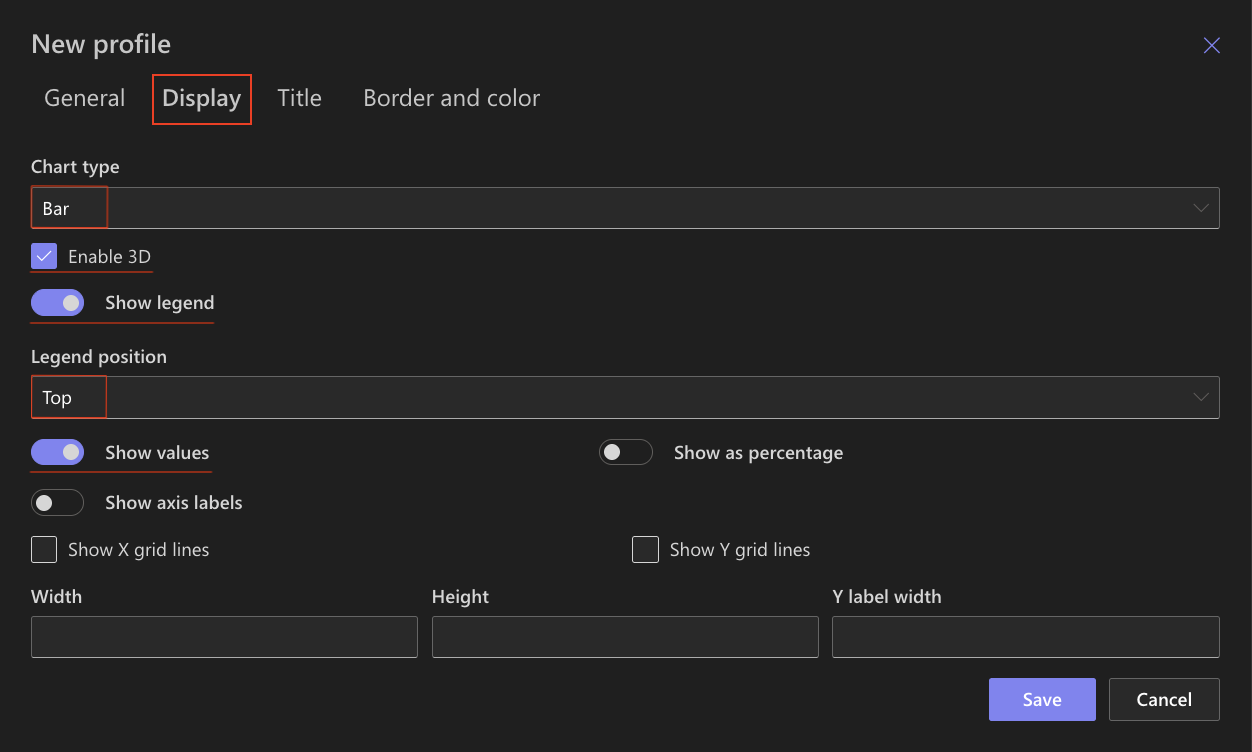
The horizontal orientation improves readability and makes ranking easier to interpret.
Step 5: Configure Title settings
Use the Title tab to control how the chart title appears.
Settings used in this example:
- Include title in chart: ✔ Enabled
- Font size: 16px
- Bold: ✔ Enabled
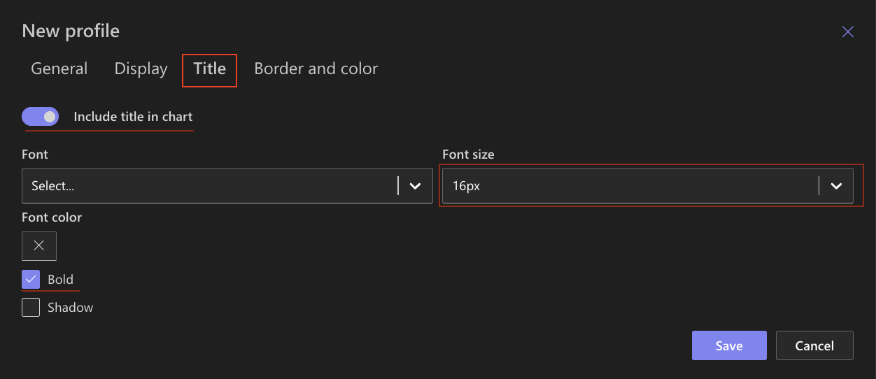
These settings ensure the title is clearly visible above the chart.
Step 6: Configure Border and color settings
Use the Border and color tab to refine the appearance.
Recommended settings:
- White background
- Light gray border
- Neutral chart area background
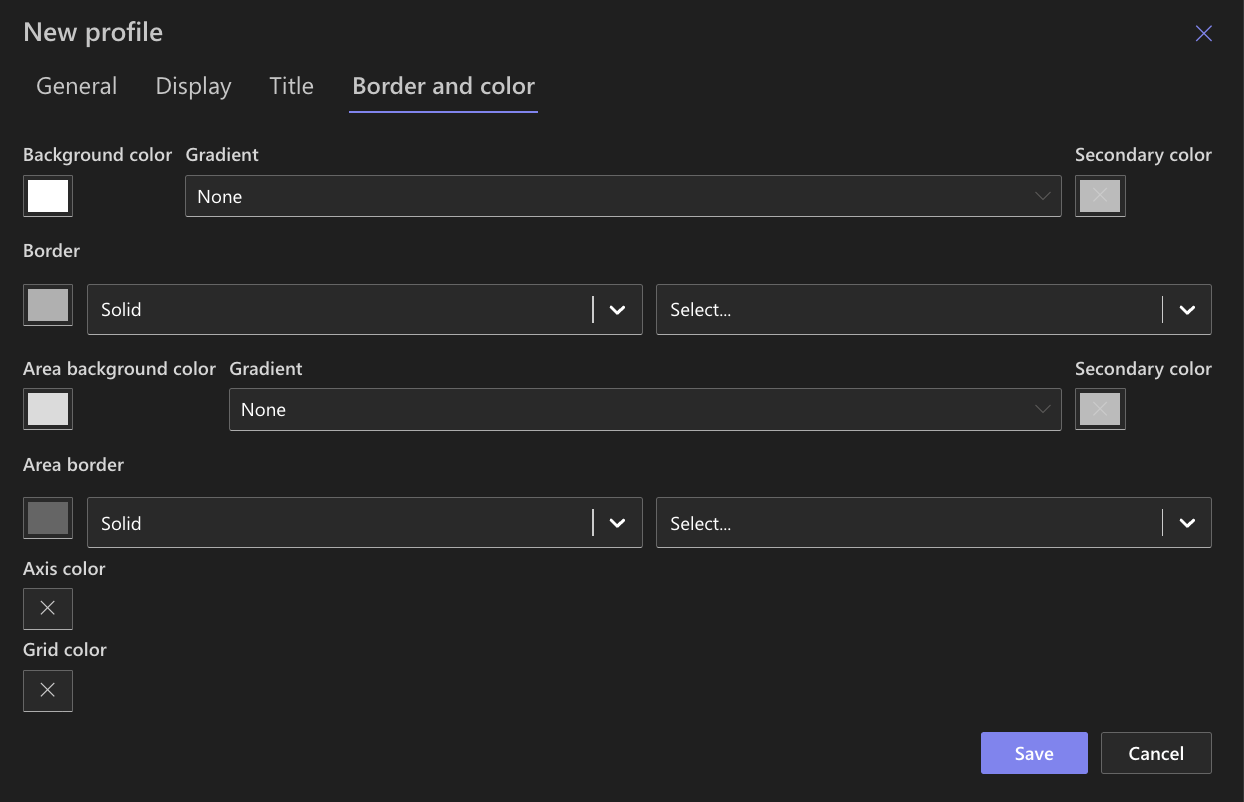
These settings keep the focus on revenue comparison.
Step 7: Save the Chart profile
- Click Save.
- The Bar Chart profile becomes available in the Charts web part.
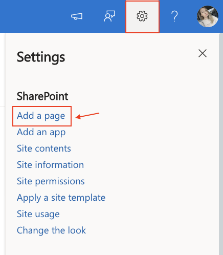
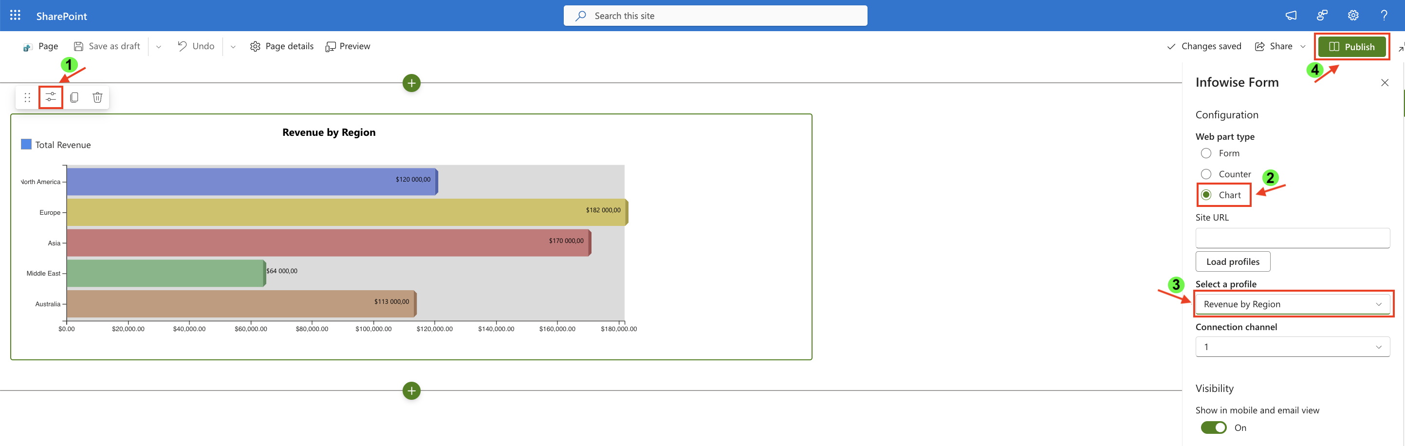
Step 8: Add the chart to a SharePoint page
After saving the chart profile, you need to add it to a SharePoint page using a web part.
- Create a new SharePoint page.
- Click the +button and add the Ultimate Forms.
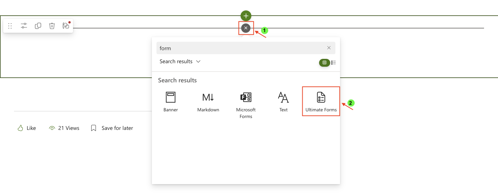
- Once added, click the Edit Properties.
- In the web part properties:
- Set Type to Charts.
- Select the profile: Revenue by Region.
- Publish the page.
Result
The Bar chart displays horizontal bars representing total revenue per region.
Each bar length reflects the aggregated deal value for successfully closed deals in that region.
This allows you to quickly:
- identify the highest-performing region
- compare regional revenue distribution
- evaluate business performance geographically
Summary
In this tutorial, you learned how to:
- prepare a filtered data source
- aggregate revenue using Sum
- configure and display a Bar chart
- compare financial performance across regions
Bar charts are ideal for category comparison and ranking scenarios, particularly when working with financial or performance data.