A Funnel chart is used to visualize a reduction process, where values decrease step by step as items move through a pipeline.
It is especially useful for analyzing conversion rates, drop-offs, and overall process efficiency.
In this tutorial, you will learn how to:
- prepare data specifically for a Funnel chart
- create a Funnel Chart profile
- display the chart on a SharePoint page
Example scenario
You want to visualize how potential customers move through a sales pipeline — from initial leads to successfully closed deals.
Instructions
Step 1: Prepare the data source
Create a SharePoint list named Sales Funnel Data with the following columns:
- Stage – Choice (Funnel stage)
- Count – Number (Number of leads at this stage)
- Order – Number (Defines the display order of stages)
Choice values for Stage column
- Lead
- Contacted
- Qualified
- Proposal Sent
- Negotiation
- Closed Won
Sample items: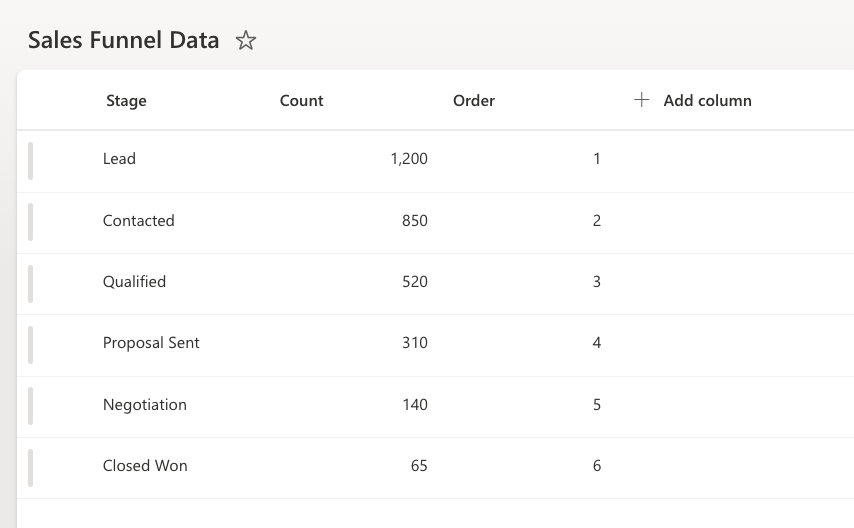
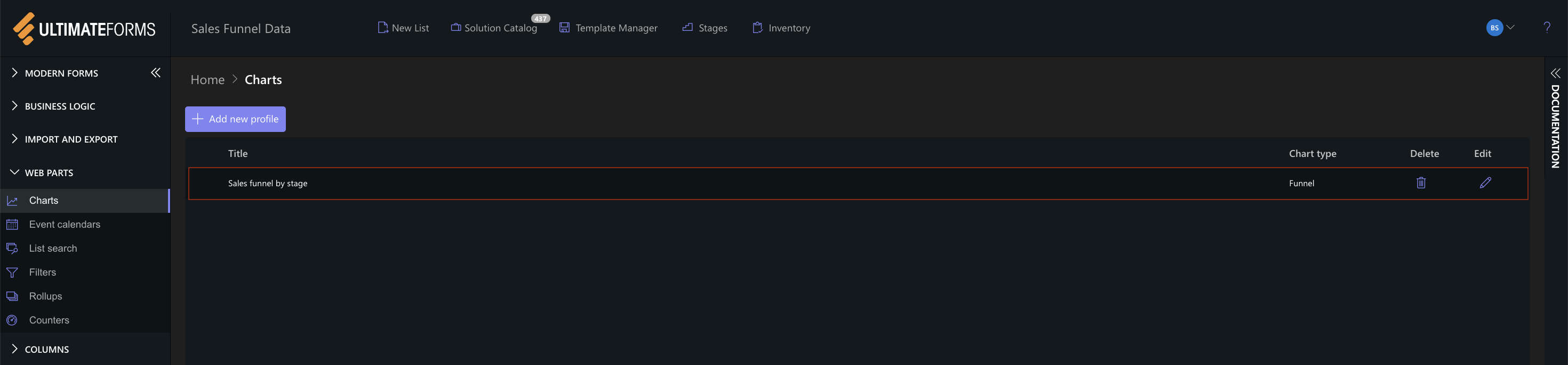
Step 2: Open Charts in Ultimate Forms
- Open Design.
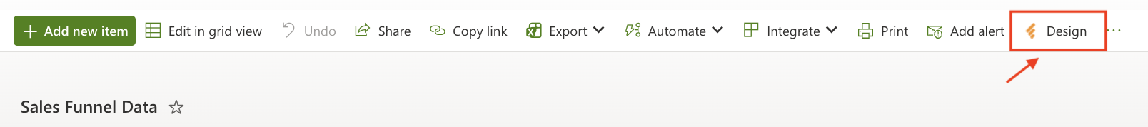
- Select Charts from the main menu.
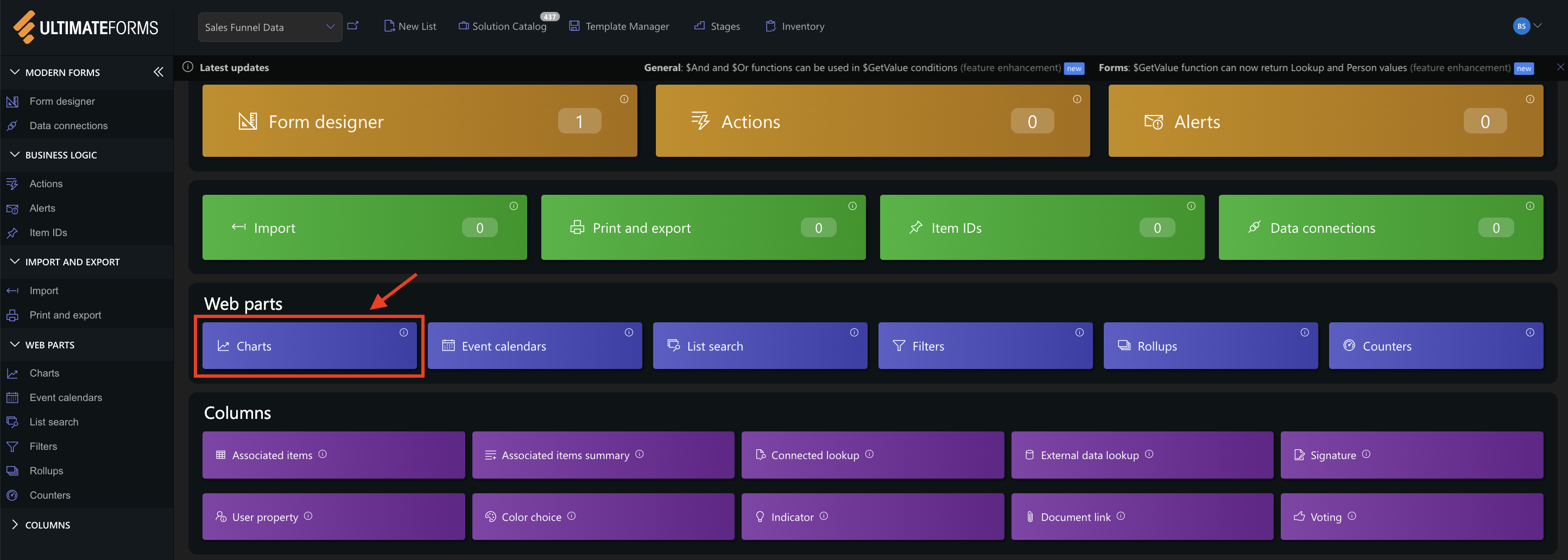
- Click Add new profile.
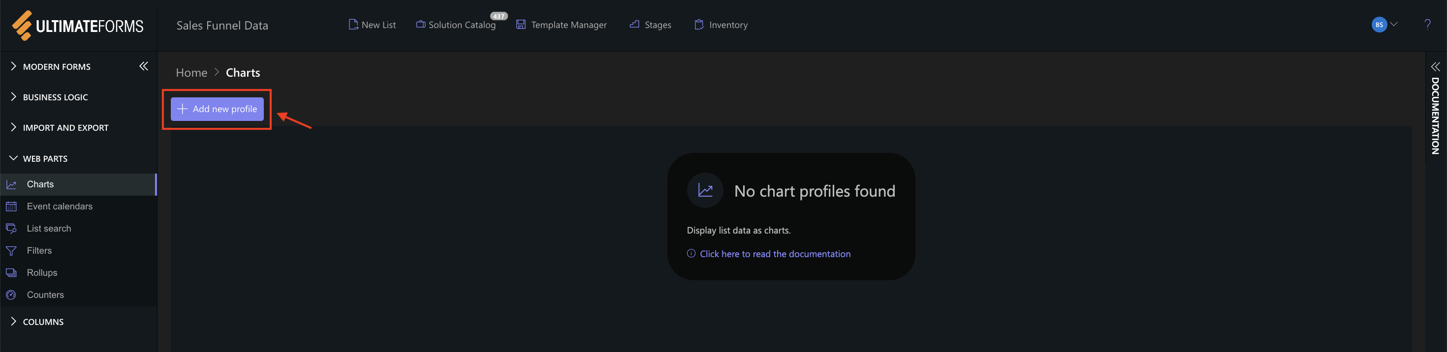
The Chart profile configuration panel opens.
Step 3: Configure General settings
The General tab defines the data source and structure of the chart.
Settings used in this example:
- Title:
Sales funnel by stage - View:
All Items - Category (X axis):
Stage - Series:
Add one series with the following settings: - Column: Count
- Aggregation: Sum
- Label: Leads
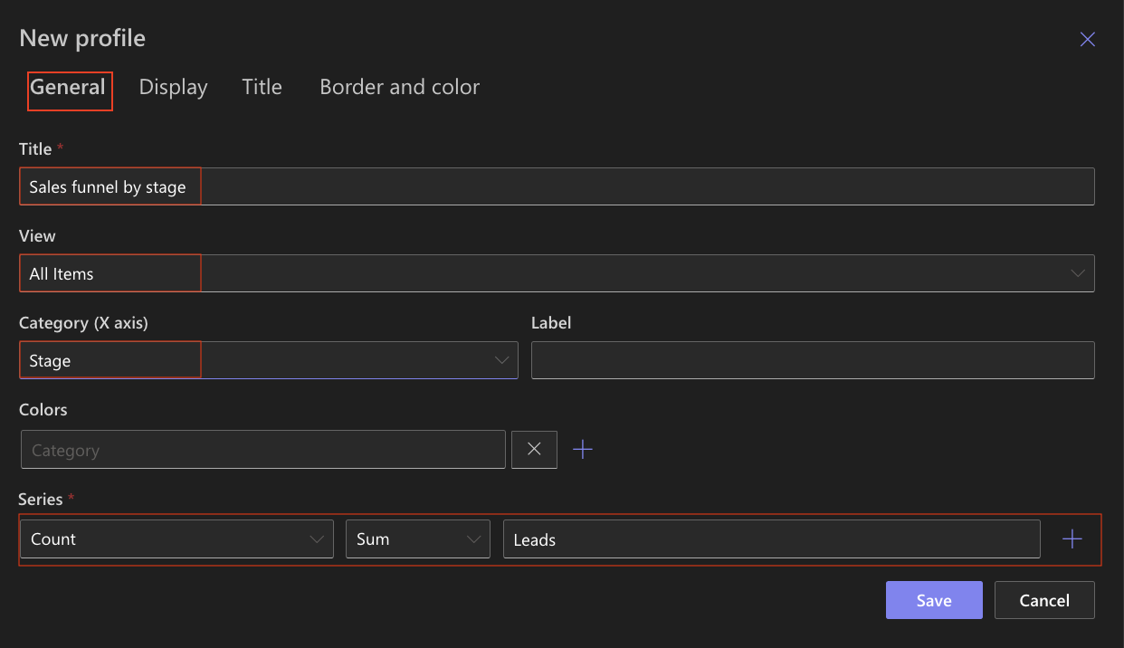
This configuration uses the pre-aggregated values stored in the list and ensures accurate funnel proportions.
Step 4: Configure Display settings
Settings used in this example:
- Chart type
Funnel - 3D
Optional (can be enabled for a more visual effect) - Show legend
✔ Enabled - Legend position
Top - Show values
✔ Enabled - Show as percentage
Optional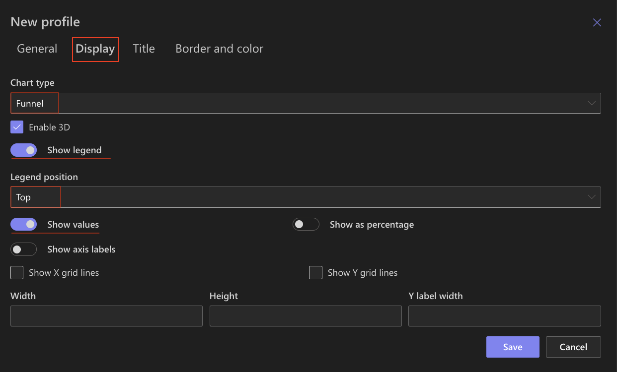
Other display options can remain unchanged.
Step 5: Configure Title settings
Use the Title tab to control how the chart title appears.
Settings used in this example
- Include title in chart
✔ Enabled - Font size
16px - Bold
✔ Enabled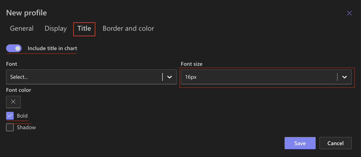
These settings ensure the title is clear and readable without distracting from the chart.
Step 6: Configure Border and color settings
Use the Border and color tab to refine the chart’s appearance.
Recommended settings
- Chart background
White, no gradient - Chart border
Light gray - Chart area
Very light background color to separate it from the page - Axis and grid
Default colors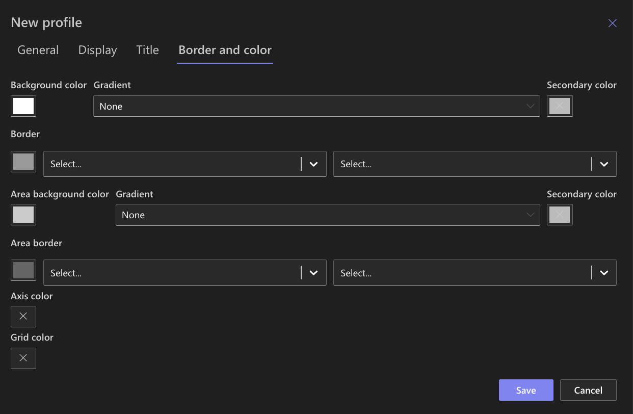
These settings keep the focus on the funnel shape and values.
Step 7: Save the Chart profile
- Click Save.
- The Funnel Chart profile becomes available for use in the Charts web part.
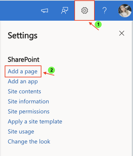
Step 8: Add the chart to a SharePoint page
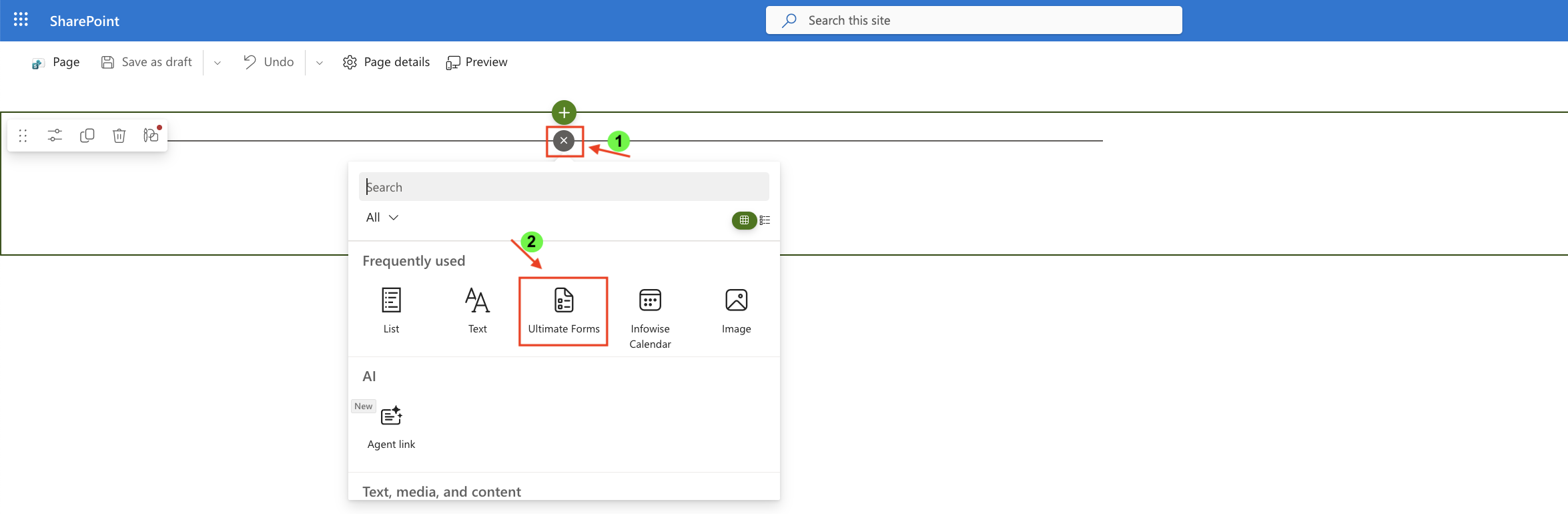
After saving the chart profile, you need to add it to a SharePoint page using a web part:
- Create a new SharePoint page.
- Click the + button and add the Ultimate Forms.
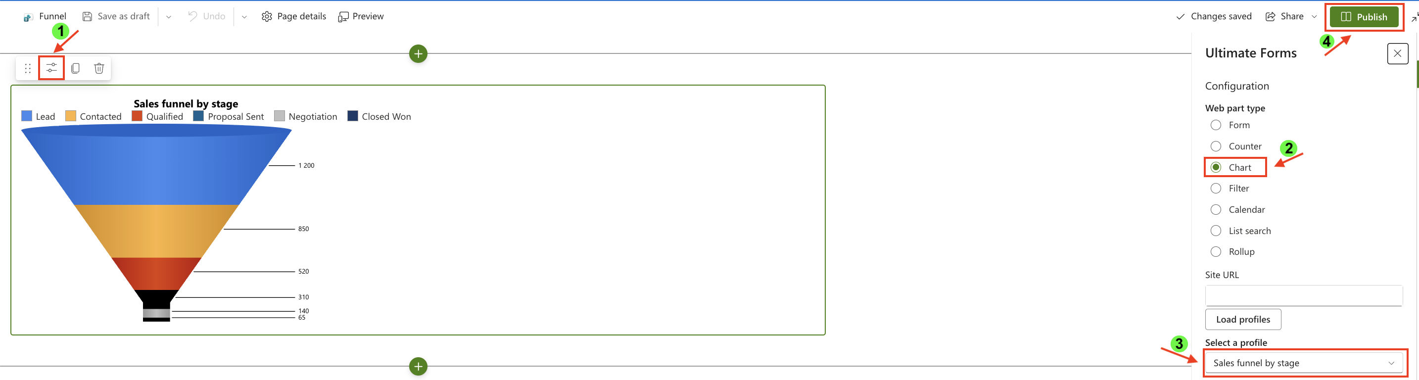
- Once added, click the Edit Properties.
- In the web part properties:
- Set Type to Charts
- Select the profile: Sales funnel by stage
- Publish the page
Result
The Funnel chart displays a clear sales funnel where each stage is ordered correctly and visually decreases from top to bottom.
Each section represents the number of leads remaining at that stage, making it easy to identify drop-offs and evaluate conversion efficiency across the sales pipeline.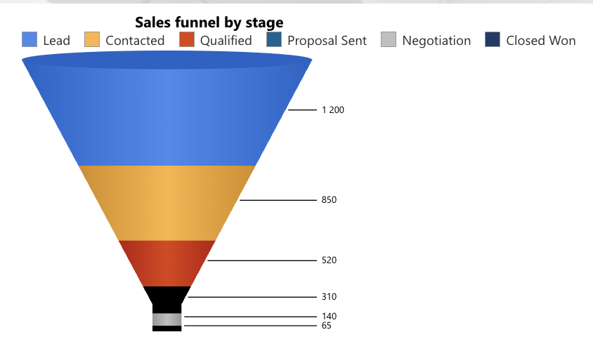
Summary
In this tutorial, you learned how to:
- prepare data specifically for a Funnel chart
- create and configure a Funnel Chart profile
- display the chart on a SharePoint page
Unlike Pie or Doughnut charts, Funnel charts require pre-aggregated and ordered data to accurately represent progression through a process.
In the next tutorials, we will explore other chart types and their best-fit data scenarios to help you choose the most effective visualization for your data.