Stacked Bar charts are similar to Stacked Column charts, but display data in a horizontal layout. This allows you to view totals and segment contributions in a different orientation.
They are especially useful when you want to:
- compare totals across categories
- understand how individual values contribute to a total
- display composition in a horizontal format
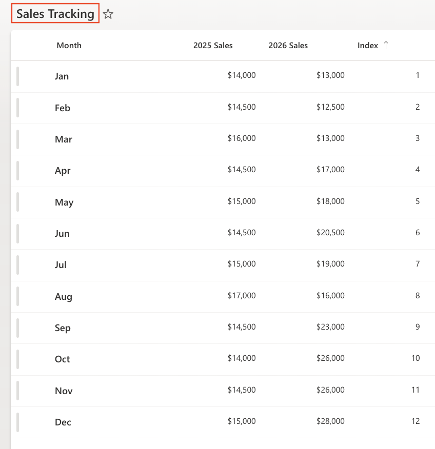
In this tutorial, you will reuse the Sales Tracking list to create a Stacked Bar chart that visualizes monthly sales composition.
Instructions
Step 1: Prepare the data source
We will reuse the Sales Tracking list created in previous tutorials.
The list contains:
- Month
- 2025 Sales
- 2026 Sales
- Index
Make sure the view is sorted by: Index (Ascending)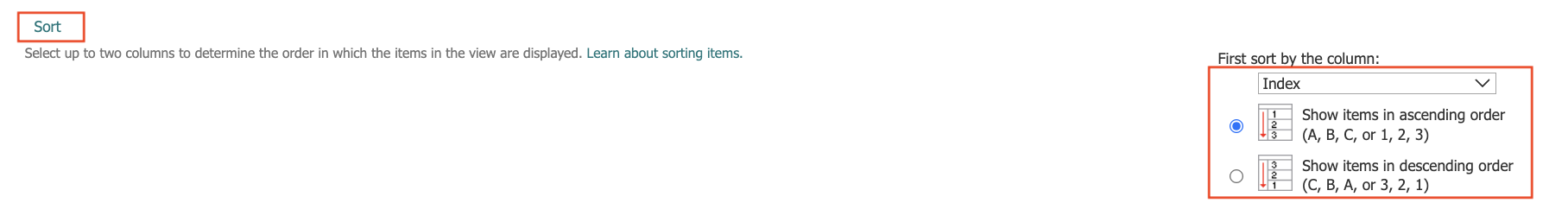
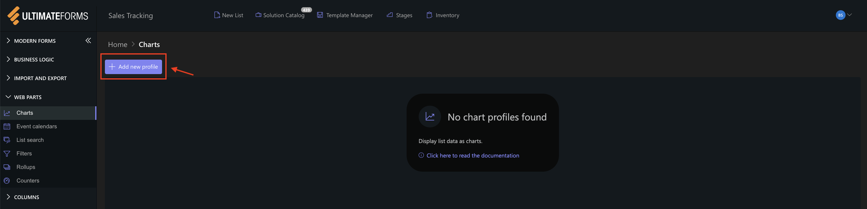
Step 2: Open Charts in Ultimate Forms
- Open Design
- Select Charts
- Click Add new profile
Step 3: Configure General settings
- Title: Monthly Sales Composition (Horizontal)
- View: All Items (or your sorted view)
- Category (X axis): Month
- Colors (optional)
- Add two Series:
- Series 1:
- Column: 2025 Sales
- Aggregation: Sum
- Label: 2025
- Series 2
- Column: 2026 Sales
- Aggregation: Sum
- Label: 2026
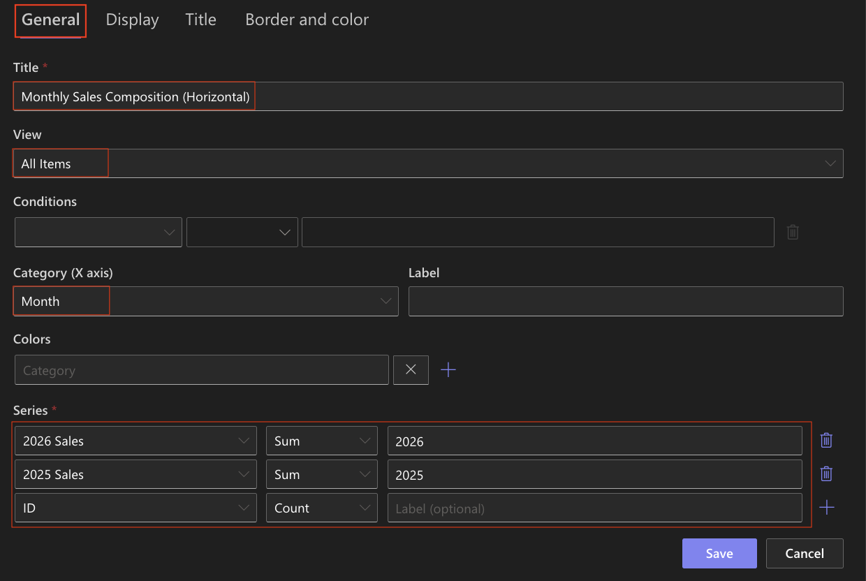
- Series 1:
Step 4: Configure Display settings
Open the Display tab.
- Chart type: Stacked Bar
- Enable 3D - Optional (can be enabled for a more visual effect)
- Show legend: Enabled
- Legend position: Top
- Show values: Enabled
- Width: 1000
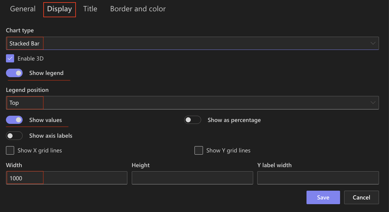
The chart will now display horizontal stacked bars instead of vertical columns.
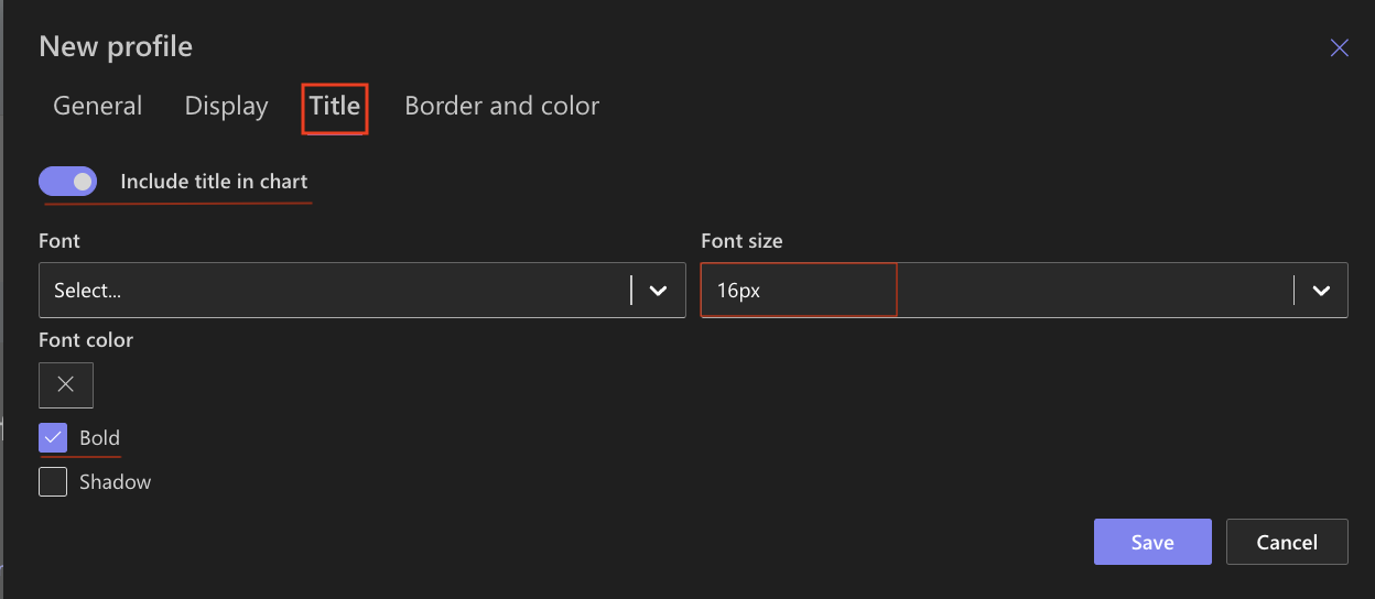
Step 5: Configure Title settings
- Include title: Enabled
- Font size: 16px
- Bold: Enabled
Step 6: Save the chart profile
- Click Save
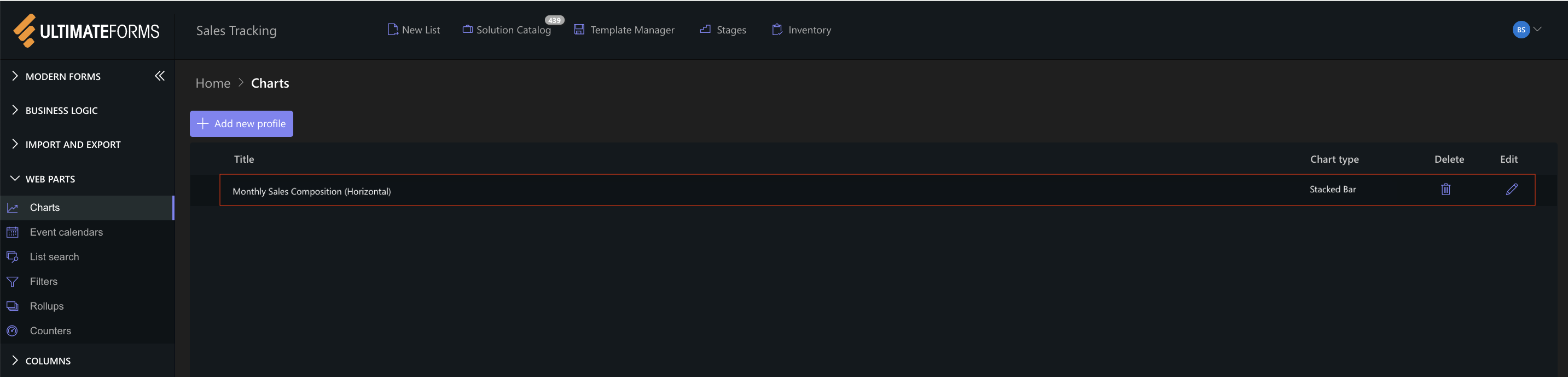
The Stacked Bar chart profile is now available for use.
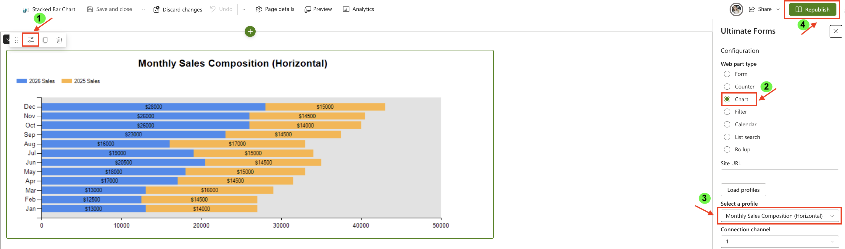
Step 7: Add the chart to a SharePoint page
After saving the chart profile, you need to add it to a SharePoint page using a web part:
- Create a new SharePoint page.
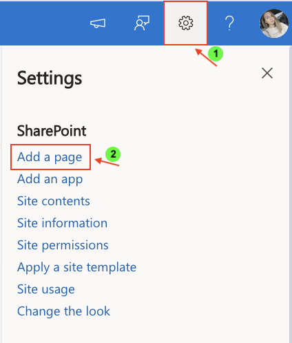
- Click the + button and add the Ultimate Forms.
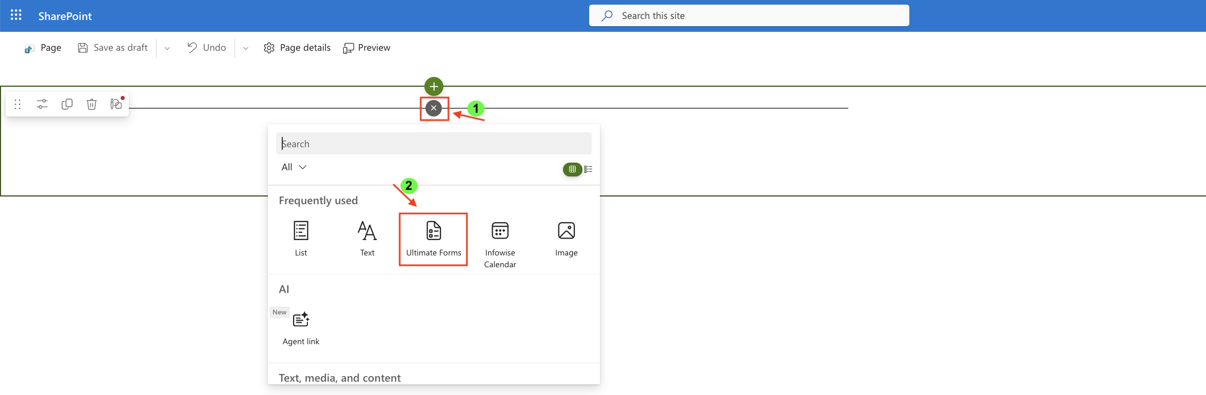
- Once added, click the Edit Properties.
- In the web part properties:
- Set Type to Charts
- Select the profile: Monthly Sales Composition (Horizontal)
- Publish the page
Result
The Stacked Bar chart displays total monthly sales while showing how each year contributes to that total, using a horizontal layout.
This makes it easier to read and compare values.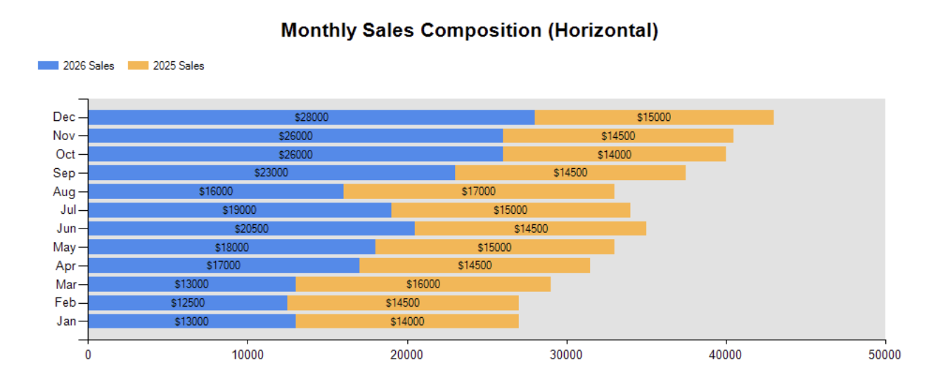
Compare with Stacked Column Chart
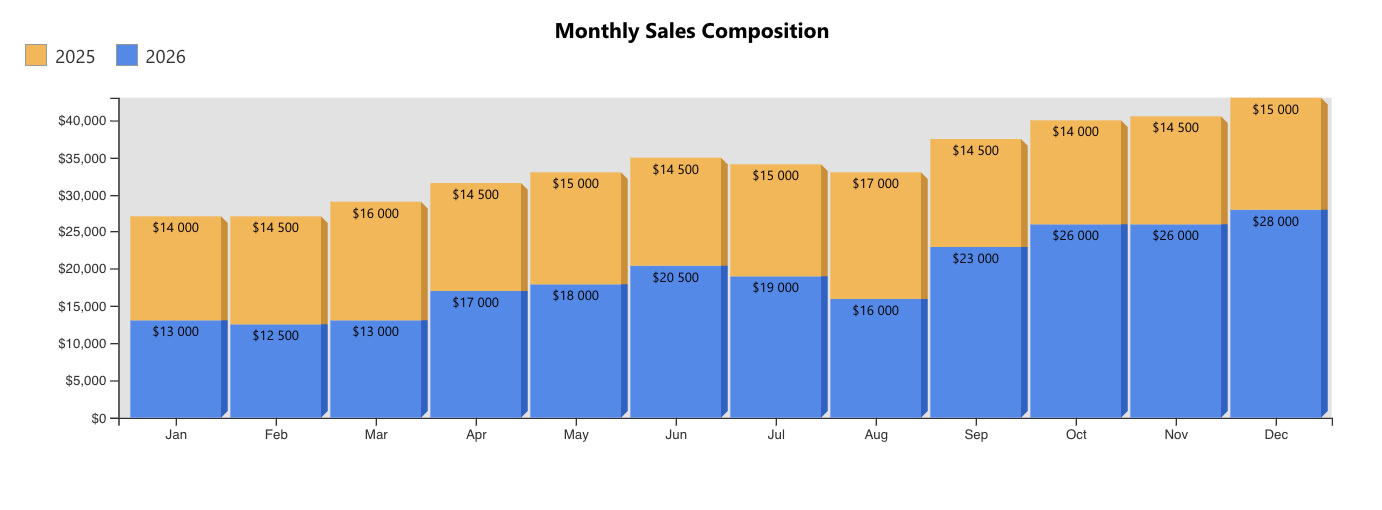
What changes:
- Stacked Column → vertical layout
- Stacked Bar → horizontal layout
Summary
In this tutorial, you learned how to create a Stacked Bar chart to visualize how multiple values contribute to a total using a horizontal layout. This chart type is ideal for improving readability while still showing composition.