Ultimate Forms: Charts allow you to visualize SharePoint list data using interactive, configurable charts.
Instead of scrolling through dozens or hundreds of list items, charts help you instantly understand trends, proportions, comparisons, and stages in your data.
Visual charts are especially useful when you want to:
- analyze data trends (e.g., progress over time)
- compare values across categories (e.g., department workload)
- show proportions (e.g., task statuses)
- track key metrics (e.g., budgets, counts, stages)
- build dashboards and analytical pages without code
Charts can be filtered and grouped using list views, just like other data components.
This makes them powerful tools for reporting in Microsoft 365 and SharePoint sites.
Charts are created using Chart profiles and displayed on SharePoint pages using the Charts web part.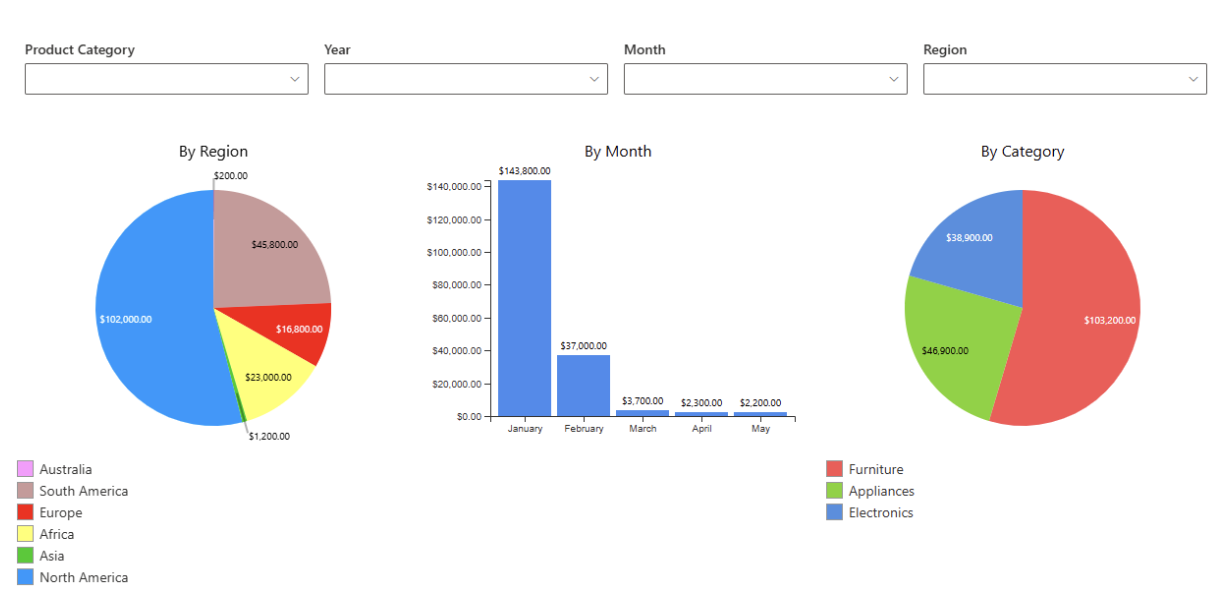
Supported environments
Charts work the same way in all supported environments:
- Microsoft 365
- SharePoint On-Premises
The configuration process and available options are identical.
Instructions
How Charts work
Charts in Ultimate Forms are created in two steps:
- Create a Chart profile
The profile defines: - which list and view are used as the data source
- how data is grouped and aggregated
- which chart type is used
- how the chart looks and behaves
- Add the Charts web part to a page
After the profile is created, you add the Charts web part to a SharePoint page and select the profile to display the chart.
This approach allows the same chart to be reused on multiple pages.
Available chart types
Each chart type serves a specific visualization need. The table below helps you quickly understand when to use each chart type.
| Chart type | Description |
| Pie | Shows how individual parts contribute to a whole. |
| Doughnut | Similar to a Pie chart, but with a hollow center. |
| Funnel | Represents data across sequential stages. |
| Bar | Displays horizontal comparisons between categories. |
| Column | Displays vertical comparisons between categories. |
| Line | Shows changes or trends over time using a continuous line. |
| Area | Highlight cumulative totals or trends. |
| Spline | A smoothed Line chart for gradual trend visualization. |
| Point | Displays individual data points. |
| Bubble | Displays relationships using bubbles of different sizes. |
| Pyramid | Displays hierarchical or proportional data in a pyramid shape. |
| Range Bar | Shows value ranges using horizontal bars. |
| Range Column |
Shows value ranges using vertical columns. |
| Stacked Area | Displays cumulative values over time, stacked by category. |
| Stacked Bar | Horizontal bars showing totals and category composition. |
| Stacked Column | Vertical columns showing totals and category composition. |
Each chart type has its own strengths. Choosing the right chart helps communicate your data more clearly and makes dashboards easier to understand.
Watch this quick video walkthrough from Infowise:
Summary
Ultimate Forms: Charts provide a powerful and flexible way to turn list data into visual insights.
With support for multiple chart types, aggregations, groupings, and easy embedding on SharePoint pages, charts help your team make faster, clearer decisions.
Instead of interpreting raw lists, charts let you:
- instantly see patterns and outliers
- compare categories at a glance
- track progress over time
- present metrics in dashboards
Charts are ideal for business reporting, performance tracking, process visualization, and executive dashboards.