A SharePoint form can end on a page you designed instead of dumping the user back at the list. Thank You pages in Ultimate Forms are built right inside Form Designer, with the same columns, controls, rules, and styling as the form itself, so the confirmation can greet the submitter by name, echo their submission, and offer the next action. External public forms use them automatically, which matters, because an anonymous submitter cannot be redirected into your intranet. This guide covers why the page after Save deserves design attention, and builds one end to end. For where it sits in the forms toolkit, see the ten must-have features.
The moment after Save
By default, saving a form returns the user to the list, and for internal power users that is fine. For everyone else it is somewhere between unhelpful and impossible.
Consider who submits forms. The employee filing a request who has never seen the underlying list and should not start now. The user who has Create access but no View access, for whom the default redirect lands on an error. And the external submitter, the applicant, the customer, the vendor, for whom internal pages do not exist at all. Each of them clicks Save and asks the same silent question: did it work?
The page after Save is where that question gets answered, and it is the one moment in the whole interaction when you have the user's full attention and their gratitude. A designed Thank You page confirms the submission, shows what was submitted, says what happens next, and offers the next action. A list view does none of that, and the redirect options exist precisely because one destination cannot fit every audience: a new blank form for repeat entry, continued editing, a custom page, or the Thank You page this article builds.
A page inside the form, not outside it
You could always build a confirmation as a separate SharePoint page and redirect to its URL, and for some internal cases that still works. It fails in two common situations: when the builder has no easy way to create custom pages, and, decisively, on external forms, where anonymous users are rightly barred from internal web part pages.
The Thank You page feature removes the dependency: the page is part of the form itself, designed in the same Form Designer, carrying the same look and feel, with the full modern-form toolkit available, column values, fragments, buttons, rules, and styling. It travels with the form everywhere the form goes, including to the public internet.
Building one: the walkthrough
The example uses the Bug Tracker solution, installable from the Solution Gallery, but any list works.
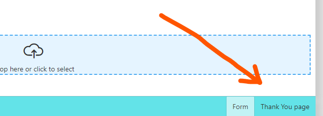
1. Enter the design mode. Open the list, click Design, enter Form Designer, and find the switch to Thank You page design mode in the bottom right corner:
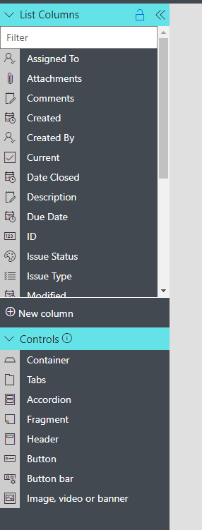
2. Meet the blank canvas. The page starts empty, with the familiar column and control pane on the left: most columns and controls are available to drag on, exactly as when designing the form:
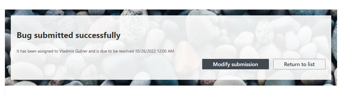
3. Make it personal. The example page uses two controls: a Header and a Fragment, with column values from the submission woven into the fragment's text, so the page reads "Thank you, Dana, your report about the login error has been received" rather than a generic acknowledgment:
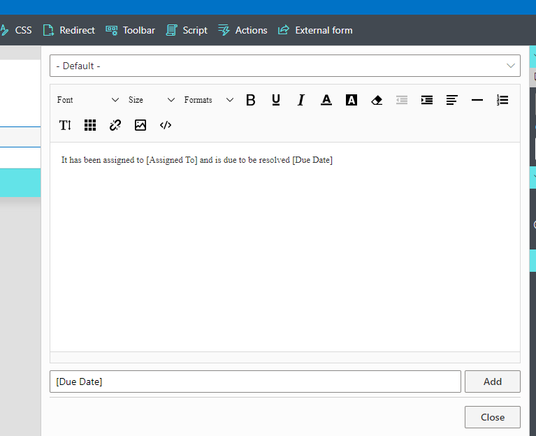
This is the single highest-value habit for Thank You pages: echo the submission. It personalizes the moment and lets the submitter double-check what they sent while correction is still one click away.
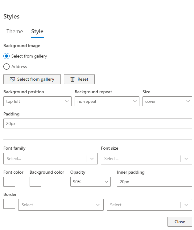
4. Style it. The Styles pane applies to this page as to any form: the example adds a background image from the gallery and inner padding on the content section. The page inherits the form's theme, so consistency comes free, and shared styles extend that across the tenant:
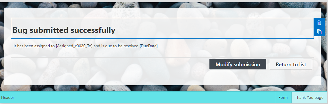
5. Offer the next action. A Button Bar completes the page, with the labels rewritten for the moment: Edit becomes "Modify submission," Close becomes "Return to list." The buttons are the page's quiet workhorses, because the user's next intent varies, fix a typo, file another, or leave, and each should be one click:
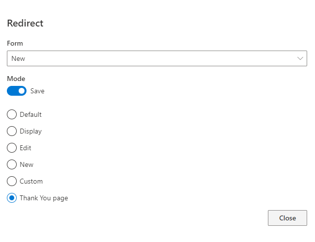
6. Wire the redirect. Click Redirects in the toolbar and point the New form's redirect at the Thank You page:
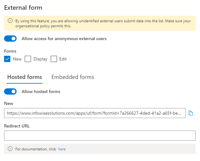
7. Optionally, go public. Enabling External form functionality lets anyone submit without signing in, and here the feature shows its best manners: external forms use the Thank You page automatically, no Redirect URL needed:
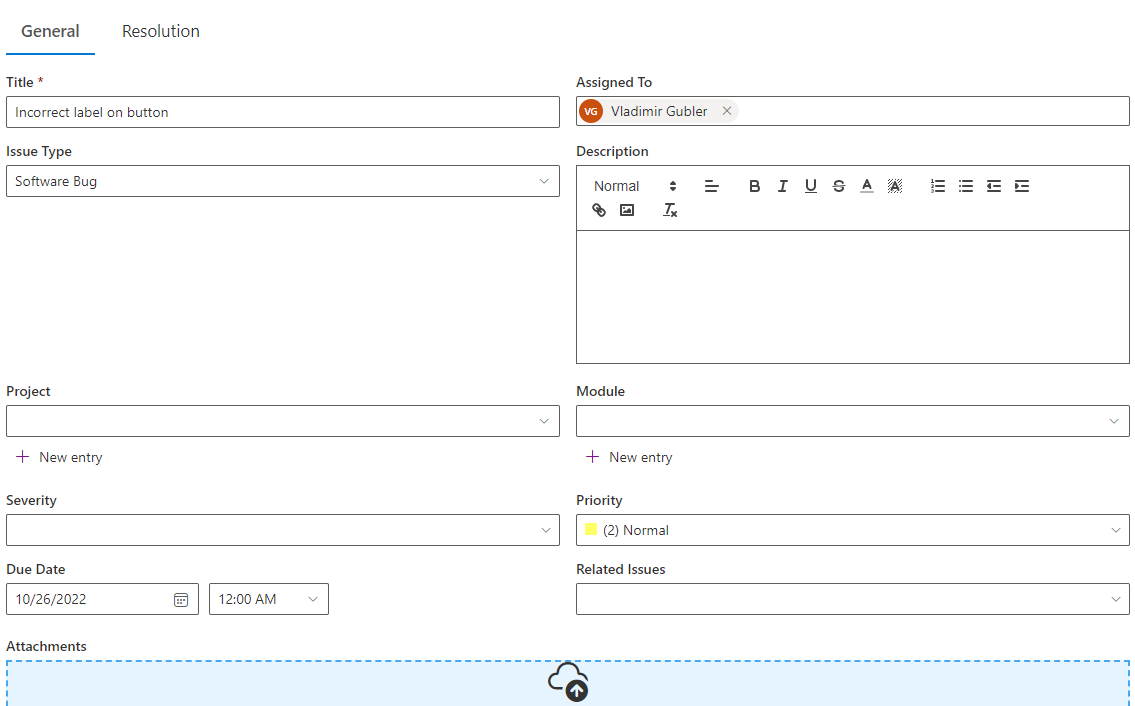
8. Test the round trip. Publish, fill the form, save:
And the designed page appears, personalized with the submission's values:
What a good Thank You page says
The walkthrough covers the how; four elements cover the what, and the best pages carry all four.
The confirmation, explicit and warm: the submission was received. The echo: the key values the user entered, via column values, so they can verify at a glance. The reference: if the process uses automatically generated item IDs, showing "your reference number is REQ-1174" on this page turns every future inquiry from a description into a lookup. The expectation: what happens next, and when, "your request goes to your manager; expect a decision within two business days", which is the sentence that prevents the follow-up email two hours later.
For processes that also confirm by email or let submitters subscribe to updates from the form, the Thank You page is the first beat of the same rhythm: the page answers "did it work," the email answers "what happened since."
New, Edit, and the endings that differ
The walkthrough wired the Thank You page to the New form, and that is deliberate. The redirect is set per form type, so each ending can match its moment. A first submission deserves the full confirmation: the thanks, the echo, the reference, the expectation. An edit usually does not; the user who fixed a typo wants to land back where they were, so Edit forms often keep the default return or redirect to the Display form. The per-form-type setting means you choose each ending once and the form behaves consistently after.
The same thinking applies within the page itself. Because the Thank You page accepts permission and style rules like any form, the confirmation can adapt to the submission: an urgent ticket's page can show an escalation notice in red, a routine one a calm acknowledgment, from one design. The page is not a static poster; it is a form surface that happens to render after Save, and everything the rule engine does elsewhere it does here.
Where the page earns the most
Internal request forms whose submitters never see the list. High-volume entry, where "Submit another" as the primary button saves a navigation per item. Candidate and applicant forms, where the page is part of the employer's first impression. And every external form without exception, surveys, registrations, client intake, because for an anonymous submitter the Thank You page is not a nicety; it is the only confirmation that exists.
The feature costs minutes, the walkthrough above is genuinely the whole of it, and it upgrades the last moment of every submission from an abrupt ending to a designed one. Forms are judged by their endings more than builders expect; this is the cheap way to end well.
Frequently asked questions
Add your comment