Users can subscribe to alerts on an item without ever leaving the form. The Alerts control in Ultimate Forms sits on the form itself, preconfigured by the form's designer. Saving the item creates the alert, either silently or after a one-checkbox confirmation. The user becomes the recipient automatically. No alert interface to learn, no settings to choose, no code anywhere. This guide covers how it works, when to use each mode, and the setup step by step.
The subscription problem
Alerts only help the people who have them. That is the quiet flaw in every notification system.
The traditional path asks users to do something separate: leave the item, find the alert interface, pick events, pick schedules, save. Almost nobody does. Not because they don't want the notifications, but because subscription is a second task, performed in a second place, in an interface they visit once a year. The requester who would love to follow their own ticket never signs up, and then emails someone to ask for status instead.
Ultimate Forms Alerts already removed the complexity from the alerts themselves: conditions, date-based timing, and fully designed email content, all without workflows, approachable for beginners. The Alerts control removes the remaining gap, the distance between the item and the subscription. Signing up happens where the user already is: inside the form, at the moment the item matters most to them.
One control, two postures
The form designer decides everything in advance: what the alert watches, when it sends, what it says. The user contributes exactly one thing, and you choose which.
Transparent mode creates the alert with no user interface at all. Save the item, and the subscription exists. This is the policy posture: when your process says requesters should always follow their own requests, transparency makes it true for every item, every time, with zero training and zero forgetting.
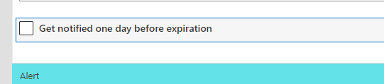
Confirmation mode shows a checkbox with a label you write. The user opts in with one click. This is the choice posture: right for notifications that help some users and annoy others, like due-date reminders that seasoned staff may not want. The label is fully yours to phrase, "Remind me 3 days before the due date", and it can be localized into multiple languages, so a multilingual form asks the question properly everywhere.
The decision rule is short. If missing the notification hurts the process, choose transparent. If missing it only hurts the user, offer the checkbox.
What the generated alert actually is
Here is the detail that keeps administrators comfortable: the alert created by the form is exactly like any alert created through the usual interface. It is not a special, hidden construct.
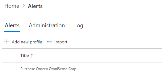
It appears on the Alerts page. It can be modified there, or deleted. It carries whatever the designer preconfigured: sending when the item is modified, or according to a date in a column, three days before the due date, say. The alert is created for the user who saves the item, and that same user is added as its recipient. And it is scoped to the specific item only, which is exactly what a subscription should be. The user follows this request, not the whole list, so the inbox stays proportional to their actual interest.
Setting it up
The implementation takes minutes in Form Designer.
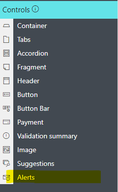
Place the control. Open the form in Form Designer. In the Controls gallery on the left, find the Alerts control:
Drag it onto the design canvas, positioned wherever it belongs in the form:
Configure the alert. Click the control to open its properties. Define how the alert should behave: sent when the item is modified, or driven by a date in a column with the interval you choose:
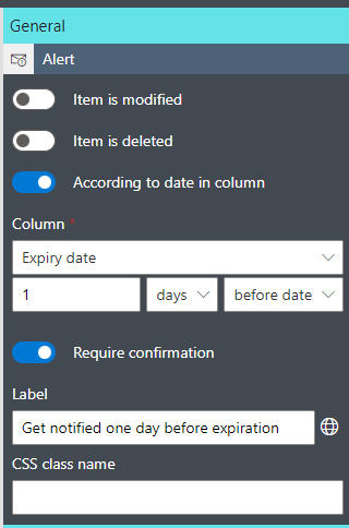
Set the confirmation behavior here too. Write the label users will see if confirmation is enabled, or disable confirmation so the alert is always created without any input.
Publish the form. Done. Every save from now on carries the subscription logic.
Seeing it work
Create or edit an item in the list. If confirmation is enabled, tick the checkbox before saving:
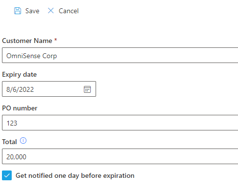
Then open the Alerts page in Ultimate Forms. The newly created alert is there, scoped to the specific item, attributed to the user who saved:
Open it and every setting is editable, and the alert can be deleted like any other:
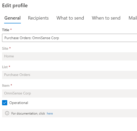
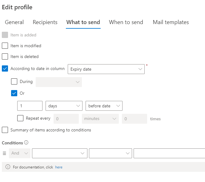
That round trip is worth showing to whoever administers your alerts. Nothing about form-created subscriptions is opaque. They live in the same place, obey the same rules, and clean up the same way.
Where the pattern pays
Requesters following their own requests. The headline case. A transparent Alerts control on the ticket form means every requester is notified on every status change of their own ticket, automatically. The "any update on my request?" email dies quietly, because the update arrives before the question forms.
Due-date reminders as a service. A confirmation checkbox on the task form, "Remind me 3 days before this is due", preconfigured by the administrator. Users opt in per task, and the date-driven alert fires at the configured interval with no further input from anyone.
Owners watching their records. Contract owners subscribing to their contracts at creation. Document authors following their documents through review. Project members opting into milestone changes. In each case, the subscription travels with the moment of ownership, which is the only moment it reliably happens.
Pair the control with the rest of the module and the experience completes itself: designed email templates make the notifications readable, and conditions keep them relevant. Subscription was always the weakest link in the alert chain. Moving it into the form is what finally fixes it, because the form is the one interface every user already visits.
Designing the subscription moment
A few small decisions make the control feel native rather than bolted on.
Place it near the end of the form, next to the save buttons. That is where commitment lives, and a subscription is a commitment. A checkbox buried between unrelated columns gets missed; one beside Save gets read.
Write the label as the benefit, not the mechanism. "Remind me 3 days before the due date" beats "Create alert" every time. Users opt into outcomes. They ignore features.
Match the mode to the form type. A New form is where ownership begins, so transparent subscriptions belong there. An Edit form is visited by many hands, approvers, assignees, administrators, so a checkbox respects that not every editor wants to follow the item forever.
And review the result occasionally. The Alerts page shows every form-created subscription, so a quarterly glance tells you whether the opt-in rate justifies the checkbox, or whether the process would be better served by going transparent. The control gives you the dial. The usage data tells you where to set it.
One subscription checkbox on one busy form is the whole pilot. Add it to the request list your team watches most, wait two weeks, and count the status-inquiry emails that no longer arrive. That count is the business case for the next form.
Frequently asked questions
Add your comment