Beyond the columns in your list, we support the following user interface controls, which can be dragged onto the design surface from the left panel:
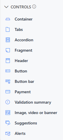
- Container - contains and lays out columns and other controls. Containers control layout by setting the number of layout columns with automatic support for changing screen size (for instance, 4 side-by-side columns on a big screen of a desktop computer will be displayed as 2 rows of 2 columns on a tablet or 4 rows of single columns on a phone). Container can also control permissions and styles of contained item, for instance you can make a group of columns hidden or read-only by placing them inside a container and assigning permission rules to the container.
- Tabs - lets you switch the displayed items based on the current selected tab. Each tab is a container that can contain other controls or columns. You can assign permissions and style to the tabs control as a whole or to the individual tabs. Note that tabs are displayed as Accordion on mobile devices with small screens to increase usability. You can navigate between tabs by clicking directly on tab labels. Additionally, you can set up rules to switch between tabs based on user identity and conditions, and you can enable navigation buttons for step-by-step progression between tabs (similar to the Wizard mode in Classic forms). You can also setup your tabs to use a Progress Theme. This helps, with the navigation buttons, with providing additional visualizatons to help when forms need a staged approach to help users with filling out the forms.
- Accordion - similar to tabs, but displays the container stacked one on top of the other.
- Fragment - rich text control for instructions or general text. Fragments can contain column values.
- Header - displays text in a header format. You can control the size of the header, format and icon image
- Button - allows users to perform actions, such as saving the form. You do not have to put buttons on the form, as it will always contain the top menu. You can choose predefined actions or write your own script.
A button can be set to one of the following types:- Save - initiate saving process of the item. When within a button bar, the button will not be present on Display forms.
- Save and edit - saves the item and stays on Edit form, for further editing. Useful for saving your items in the process of editing.
- Save and new - saves the item and re-opens the form for creating another item.
- Cancel - cancels Edit or New form.
- Edit - redirects from Display to Edit form.
- Close - closes Display form and returns to the list.
- Delete - displays confirmation prompt and deletes item when confirmed.
- Action - sets column values based on mappings. You can map to functions, column values or calculation results.You can use both columns present on the form as well as parameters that will be presented to users when the button is clicked.
- Action and save - sets columns values based on mappings, then saves the item
- Action, save and edit - sets columns values based on mappings, saves the items and opens it in Edit form (or stays in Edit form).
- Action, save and new - sets column values based on mappings, saves the item and opens New form.
- Trigger action - triggers backend action (configured under Actions).
- Create associated item - creates a new item with the configured Associated Items column.
- Custom - executes custom script.
- Button Bar - displays a set of buttons relative to the current form (such as Save and Cancel on Edit form, but Close and Delete on Display form). You can also use this control in manual mode to place multiple buttons in a row.
- Payment - allow integrating online payments in the form. For more details, read the dedicated article.
- Validation Summary - combines and displays validation error messages from all columns
- Image, video or banner - displays a static image or video on the form. You can use your own image by providing an image URL (make sure the location is accessible to users), or you can use Gallery mode by uploading your own shared images or selecting one of the images we provide. With these images you can specify the width and the height of the banner and the relative horizontal and vertical position of the image within the banner. When using YouTube videos, provide video URL and the desired size. For images, you can also optionally provide a link URL. Clicking on the image will navigate to that link URL.
- Suggestions - display preview of existing items as text is being entered into the form. Automatically searches and displays items matching the new entry. Use it for Knowledge Base integration or for prevention of entering duplicate information.
- Alerts - Register an alert directly on the form, this will create an alert to run based on the configuration you provide for this control, without having to go into the alert profiles to create it there. An alert will be created for the current user specifically for the item in the form.
- Comments - allows user to leave comments on list items. You can mention (and notify) any other user by typing an ampersand (@). Note that not all list types support comments.
Get helpful videos
- Containers
- Tab and Accordion
- Fragment
- Headers
- Button and Button Bar
- Validation Summary
- Image, Video or Banner
- Suggestions
- Alerts Control
- Comment Control
- Approval
- Payment
Also read these:
Last modified: 12/10/2025 7:35 PM
Loading...
Add your comment
Comments are not meant for support. If you experiencing an issue, please open a support request.
Reply to: from