Buttons allows users to perform actions, such as saving the form. You do not have to put buttons on the form, as it will always contain the top menu. However, you may need to add you own custom buttons for different functionality.
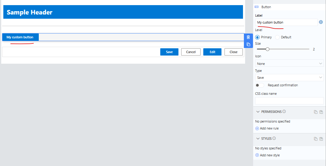
Buttons can be set to different levels as Primary or Default. You can also control the size of the button and its text using the slider.
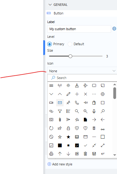
You can add an Icon image to the button
Action Types
You can choose predefined actions or write your own script.
A button can be set to one of the following types:
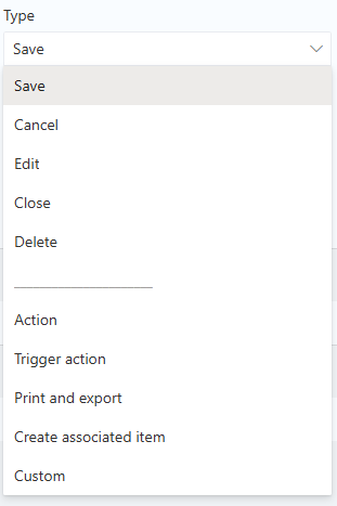
Form Button types
- Save - initiate saving process of the item.
- Cancel - cancels Edit or New form.
- Edit - redirects from Display to Edit form.
- Close - closes Display form and returns to the list.
- Delete - displays confirmation prompt and deletes item when confirmed.
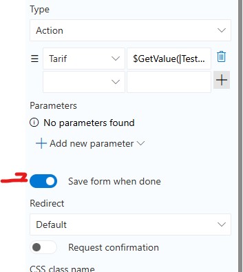
Action - sets column values based on mappings. You can map to functions, column values or calculation results.You can use both columns present on the form as well as parameters that will be presented to users when the button is clicked.
Trigger buttons - triggers backend action (configured under Actions) with the information on the form. There is an option to hide the trigger action progress dialog on this button.
Print and export - will provide the ability to print or export your record based the template created to generate the report.
Create associated item - creates a new item with the configured Associated Items column. This also allows you to set the fields for the associate item columns. You can even setup a parameter set of field to allow the user to enter their own values.
Custom - executes custom custom JavaScript. You can get or set values on your form using the SetValue and GetValue. For these and other Infowise Javascript API functions, see JavaScript API | Infowise Ultimate Forms Documentation.
Note: Actions, Triggers, Create Associiate Items, Print and Export and Custom buttons now have the ability to perform a save of the form and redirect according to the options selected.
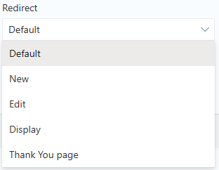
Redirect
Several action types, such as Save or Action support redirect configuration. By default such buttons return the user back to the list. You can specify a custom redirect location, such as a different form type or Thank You page.
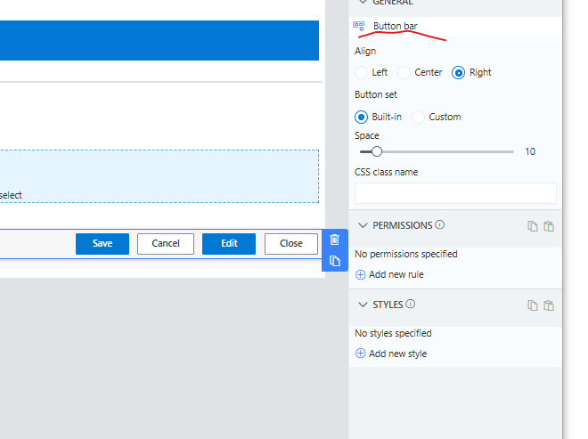
Button Bar
The behavior of this control depends on whether it's in its Built-in or Custom mode. In Built-in mode, it automatically displayes the buttons suitable for the current form type. When on a New or Edit form this container will show only the Save and Cancel buttons. On the Display form only the Edit and Close buttons will show.
In custom mode, you control which buttons appear. The container simply displays them on the page, without controling which should appear.
The Space slider allows for you to define the space between the buttons on the bar. You can also control the horizontal alignment of the buttons on the form.