Data alone does not drive better decisions. Visibility does. Many organizations store critical information in SharePoint lists. But without proper visualization, that data remains hidden inside rows and columns. Managers export to Excel. Teams build manual reports. Leadership waits for status updates that could be available instantly.
Dynamic dashboards solve this problem. When built properly, dashboards transform SharePoint from a data repository into a decision support platform.
Using Infowise Ultimate Forms, organizations can build powerful, real time dashboards directly in SharePoint. With charts, rollups, counters, and filters, data becomes visual, interactive, and actionable. The result is better oversight, faster decisions, and reduced reporting effort.
This article explores how dynamic dashboards work in SharePoint using Ultimate Forms, how easy they are to configure, and how they deliver measurable business value.
Why SharePoint Dashboards Matter
SharePoint is widely used to manage:
-
Help desk tickets
-
Project tracking
-
Purchase requests
-
HR processes
-
Inspections and audits
-
Inventory management
-
Resource scheduling
However, viewing this information as a simple list often limits insight. Managers need answers such as:
-
How many open requests do we have right now
-
Which projects are at risk
-
What is our monthly approval volume
-
Which departments generate the most tickets
-
Where are bottlenecks forming
Dashboards provide immediate answers without exporting data or building external reports.
Ultimate Forms allows you to create these dashboards directly within SharePoint pages using built in components.
Core Dashboard Components
Dynamic dashboards in Ultimate Forms are built using several powerful elements.
Charts
Charts transform list data into visual representations such as:
-
Pie charts
-
Line charts
Charts can display counts, sums, averages, and grouped data. They update automatically as the underlying data changes.
For example, a help desk dashboard can show:
-
Tickets by status
-
Tickets by priority
-
Tickets opened per month
-
Average resolution time
As new tickets are created or closed, the chart updates instantly.
There is no manual refresh or report generation required.
Rollups
Rollups aggregate data across lists or sites. This is especially valuable for organizations managing multiple departments or project sites.
For example:
-
Combine all regional sales data into one executive dashboard
-
Aggregate inspection results from multiple facilities
-
Summarize project metrics across business units
Rollups eliminate the need for copying data into central lists. Instead, the dashboard pulls information dynamically from the source.
This preserves data integrity while providing a unified view.
Counters
Counters display real time metrics in a clear and prominent way.
Examples include:
-
Number of open tickets
-
Total purchase value this month
-
Overdue tasks
-
Pending approvals
-
Active projects
Counters are simple but powerful. They give managers instant visibility into key performance indicators.
For example, a procurement dashboard might display:
-
14 Pending Approvals
-
3 Overdue Requests
-
92 Total Requests This Month
These figures update automatically as the list changes.
Filters
Filters make dashboards interactive. Instead of static reports, users can adjust views based on criteria such as:
-
Date range
-
Department
-
Employee
-
Status
-
Category
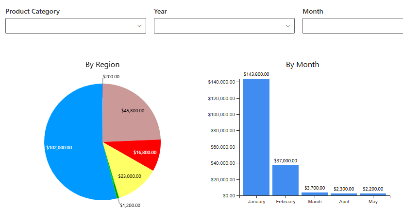
For example, a project dashboard could allow filtering by:
-
Active projects only
-
Specific project manager
-
Projects due this quarter
Filters allow users to tailor the dashboard to their needs without modifying the underlying data.
Ease of Configuration
One of the biggest advantages of building dashboards with Ultimate Forms is simplicity.
There is no need to:
-
Write code
-
Use Power BI
-
Export to Excel
-
Build custom web parts
-
Configure complex data connections
Charts, rollups, counters, and filters are configured through intuitive settings. You select:
-
The source list
-
The grouping column
-
The metric to calculate
-
Display options
Within minutes, you have a working visual component.
Business analysts and administrators can build dashboards independently without relying on developers.
Real World Example: Help Desk Dashboard
Consider an internal IT help desk.
The team tracks tickets in a SharePoint list with columns such as:
-
Status
-
Priority
-
Category
-
Assigned technician
-
Created date
-
Resolution date
Using Ultimate Forms, a dynamic dashboard can include:
-
Counter showing open tickets
-
Counter showing overdue tickets
-
Chart displaying tickets by priority
-
Chart showing tickets by category
-
Line chart showing ticket volume over time
-
Filter by technician
The IT manager can instantly see:
-
Workload distribution
-
Areas generating the most issues
-
Whether response times are improving
-
Which technicians are overloaded
No manual reporting is required.
This improves planning, staffing decisions, and service quality.
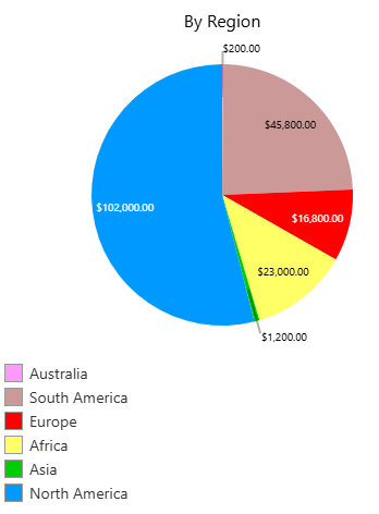
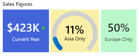
Real World Example: Executive Sales Dashboard
A sales team tracks opportunities in SharePoint. Columns include:
-
Region
-
Sales representative
-
Deal value
-
Stage
-
Close date
Using rollups, data from multiple regional sites can be combined into one executive dashboard.
The dashboard may include:
-
Total pipeline value counter
-
Pie chart showing deals by stage
-
Column chart showing revenue by region
-
Line chart of monthly sales trends
-
Filter by sales representative
Leadership can review current pipeline health in seconds.
This improves forecasting and strategic planning.
Real World Example: Compliance Monitoring
Compliance teams often manage audits and inspections across multiple locations.
A compliance dashboard could include:
-
Counter showing open findings
-
Counter showing overdue findings
-
Chart showing findings by severity
-
Rollup across locations
-
Filter by facility
If the number of high severity findings increases, leadership can respond immediately.
This reduces risk and improves accountability.
Dynamic and Real Time
One of the strongest advantages of dashboards built with Ultimate Forms is that they are dynamic.
As soon as a list item is:
-
Added
-
Modified
-
Closed
-
Approved
The dashboard updates automatically.
There is no batch refresh. No manual calculation. No waiting for someone to prepare a report.
This real time visibility enables proactive management rather than reactive reporting.
Supporting Better Business Decisions
Dynamic dashboards improve decision making in several ways.
Faster Response
Managers identify issues immediately instead of waiting for monthly reports.
Improved Transparency
Teams can see progress and workload distribution clearly.
Data Driven Planning
Resource allocation becomes more precise when workload trends are visible.
Reduced Reporting Time
Staff no longer spend hours preparing Excel summaries.
Consistent Metrics
Everyone sees the same numbers from the same source of truth.
Personalized Dashboards
Dashboards can also be tailored to different audiences.
For example:
-
Executives see high level KPIs
-
Managers see department metrics
-
Team members see personal workload
Using filters and permissions, dashboards can adapt to the viewer automatically.
This ensures relevance without duplicating pages.
Scalability Across the Organization
Because dashboards are built on SharePoint lists, they scale naturally.
As the organization grows:
-
New departments can be added
-
Additional lists can feed rollups
-
Metrics can be adjusted
-
Filters can expand
There is no need to redesign the entire reporting structure.
This flexibility supports long term growth.
Reducing Dependence on External Reporting Tools
Many organizations rely on external tools to visualize SharePoint data.
While powerful, those tools often require:
-
Additional licensing
-
Specialized skills
-
Data synchronization
-
Ongoing maintenance
For many operational dashboards, Ultimate Forms provides everything needed directly within SharePoint.
This reduces complexity and cost.
Simplicity Meets Power
The true strength of Ultimate Forms dashboards lies in the balance between power and simplicity.
You can build:
-
Multi-component dashboards
-
Cross-site rollups
-
Interactive filters
-
Real-time counters
-
Visual trend charts
Without writing a single line of code.
This empowers business users to take control of reporting.
Conclusion
Dynamic dashboards transform SharePoint from a data storage system into a decision making platform. With charts, rollups, counters, and filters provided by Ultimate Forms, organizations gain real time visibility into operations without complex setup.
Configuration is straightforward. Data updates automatically. Insights are immediate.
Whether tracking help desk tickets, sales performance, compliance findings, project status, or HR metrics, dynamic dashboards improve clarity, accountability, and speed of decision making.
For organizations seeking a simple yet powerful way to visualize SharePoint data, Ultimate Forms provides a practical and scalable solution.
Add your comment