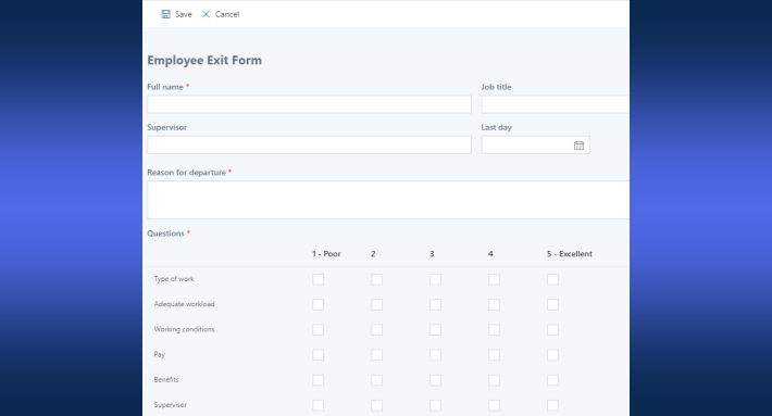
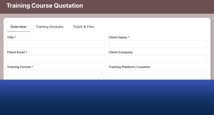
A long SharePoint form becomes a guided, multi-step experience with one control. Drag Tabs onto the form in Form Designer and choose the Progress theme. Next enable button navigation, and users now move through the form with Next buttons, always seeing where they are in the process and which steps remain. The configuration takes minutes, works on any list, and requires no code. This walkthrough builds one from scratch, with every setting shown, and closes with the design decisions that make multi-step forms genuinely easier rather than just differently arranged.
The form designer's dilemma
As form designers, we are permanently torn between two opposites: the form must include every necessary column, and the form must be as short and simple as possible. Both demands are legitimate. The process needs its data, and the user facing forty fields in one scroll needs mercy, because a form that looks overwhelming gets abandoned, rushed, or filled with whatever makes the red asterisks go away.
The multi-step form dissolves the dilemma rather than picking a side. Subdivide the form into tabs, each holding the set of columns that describe one topic, and the user faces one comprehensible step at a time: contact details, then request specifics, then attachments. Nothing was removed, yet nothing overwhelms. Add button navigation between the steps, Next after completing each tab, and two further things happen: users travel the form in the order you designed, and they always know exactly where they stand in the process. The psychology is the same one every checkout flow on the internet relies on; step three of five feels finishable in a way that a wall of fields never does. (For the concept in depth, see Multi-Step Wizard Forms in SharePoint; this article is the hands-on build.)
The Progress theme
The Tabs control ships with several visual themes, and one, Progress, was designed precisely for multi-step forms:
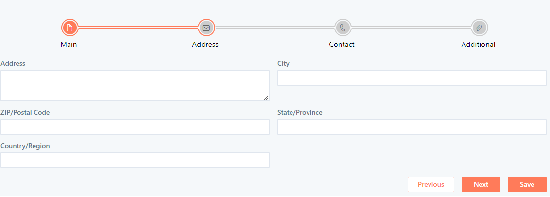
The tab headings become visual progress cues, guiding the user through the form: completed steps, the current step, the steps ahead. The buttons at the bottom are configured as the sole means of navigating between tabs, ensuring the form is filled step by step, exactly as intended. Theme choice is purely visual, the functionality is identical regardless of theme, and you can always use CSS for a unique look, but for wizard-style forms, Progress speaks the right visual language out of the box.
The build, from empty list to published form
The example uses a regular SharePoint Contacts list, but any list will do.
Get to the canvas. Click Design on the list view to enter Ultimate Forms, then open Form Designer.
Add the Tabs control. On the design canvas, drag a Tabs control from the gallery on the left:
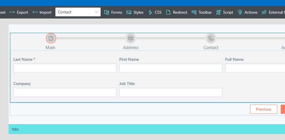
Configure the control. Click the Tabs control to open its settings on the right. Define the names of your tabs first, then the navigation options:
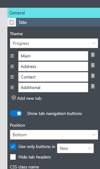
Three settings do the wizard work here. Set the Theme to Progress. Enable navigation buttons, which produces the Next/Previous controls. And enable button-only navigation, so users cannot jump around by clicking tab headers. In this build the restriction applies to the New form only, since a sequential first entry matters more than sequential later edits, but the choice is yours per form type.
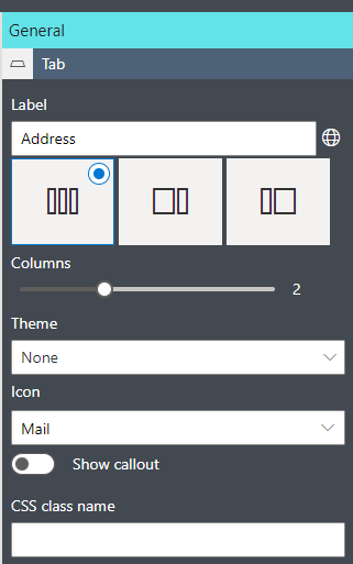
Shape each tab. Click a tab's surface to select it. If you land on a column inside it instead, the breadcrumbs at the bottom of the canvas will take you back up to the Tab level, a small navigation trick worth knowing early. Per tab you define the layout, an icon, and a callout with dynamic help. A suitable icon per tab pays off in the Progress header, where the icons become the step markers users read at a glance:
Fill the steps. Drag columns from the gallery into each tab, switching tabs by clicking their headers in the canvas. This is where the design thinking from the first section lands: one topic per tab, in the order the user naturally thinks about the request.
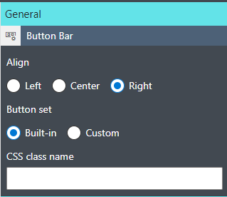
Polish the buttons. Clicking the button bar opens its settings; here the buttons are aligned right, the position users expect from every wizard they have ever completed. The button set itself is customizable too, and you can add your own buttons, up to and including action buttons that perform updates:
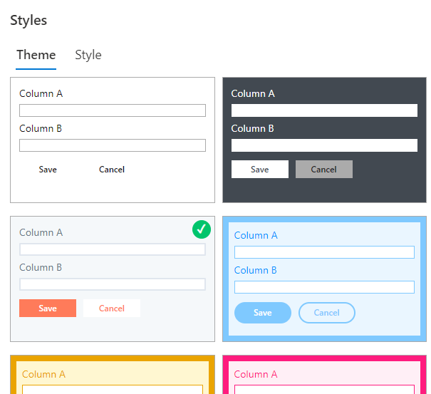
Theme the form. Last, a different visual theme for the form as a whole, because a guided form deserves to look finished:
Publish. The form is ready to use: progress displayed simply and obviously, the user guided toward the next step at every point.
Designing good steps, not just steps
The mechanics take minutes; the quality of a multi-step form lives in decisions the tooling cannot make for you. Group by topic, not by column type, a step should answer one question the user recognizes ("who are you?", "what do you need?"), because recognizable steps are the ones people complete without re-reading. Order steps as a narrative from easy to specific: familiar fields first build momentum, heavy fields late meet a user already invested. Keep step counts honest, three to six is the comfortable range; a twelve-step form has usually hidden a process problem inside a UX pattern. Name tabs as stages rather than categories where you can ("Review & Submit" beats "Miscellaneous"). And let the callouts carry the guidance, per-step help exactly where the user needs it, instead of an instruction block nobody reads at the top.
Remember also who the steps serve on later visits: the button-only restriction that guides a first submission can relax on Edit forms, where users legitimately jump to the one field they came to change.
Where to take it next
This build is deliberately the simple case, and the Tabs control has more in reserve. Tabs can hide or show based on conditions, so the "Manager Approval" step exists only for the users and states it applies to, and the form can automatically open on a specific tab based on conditions, landing an approver directly on the approval step. Those techniques have their own articles: controlling the active tab via rules, button-driven tab navigation patterns, and the styling options for tabs and accordions. And on small screens the whole construction adapts automatically, tabs become accordion sections below 480px, so the wizard you build today is already the mobile form your field users need, as covered in Ultimate Forms Tabs and Accordion for Better User Experience.
A long form is a fact of process life; a long scroll is a design choice. One control, one theme, one navigation setting, and the fact stops being a problem.
Frequently asked questions
Add your comment