
When Power Bi is Too Much
When it comes to making Summary Reports and SharePoint Dashboards some organizations reach for the Microsoft provided option Power BI. It seems like a good choice to use Microsoft's tool at first, but once you dive in you will discover two major problems with this approach.
Power Bi is expensive… REALLY expensive
Microsoft publishes rates to their public site and it is easy to check on this at any time. When you look at pricing, it is important to understand one key concept. Users are required to have paid licenses to VIEW Power BI Dashboards. Even though you might only have 1 or 2 developers making dashboards, you will be on the hook to buy licenses for all of your users who want to view the dashboards in your organization. Ask yourself, "Do I want to build reports for view by only select users, or do I want to be able to share reports throughout my organization?"
With the popularity of AI tools, it is pretty easy to find out how much you might have to spend. Try asking your favorite AI tool "How much does it cost if i want to be able to use Power BI where I have 1 developer create a dashboard and then be able to share that with 300 users in the organization?”" As of this article, this is the response:
Cost: ~$14 per user per month (when paid annually).
How it works:
Every user who creates or consumes shared Power BI reports in standard (non-Premium) workspaces must have a Pro license.
That means all 300 users need a Pro license if you aren’t using Premium capacity.
Example cost for 300 users:
300 × $14/month ≈ $4,200 per month
Annually: ~$50,400 (not including any volume discounts)
⚠️ This is a heavy cost because Power BI’s basic sharing model is per-user - both authors and viewers need licenses.
Building Power BI Reports is for Developers Only
While Power BI is undeniably powerful, it comes with a steep learning curve that places it firmly in the hands of technical specialists rather than everyday SharePoint users. In most organizations, the responsibility for building and maintaining Power BI reports falls to a single individual - or a very small team - with a strong development or data background. This is often someone who already wears multiple hats and has a backlog of other development and operational responsibilities competing for their time.
Creating a Power BI report is not a lightweight task. It requires understanding data modeling concepts, relationships between tables, refresh behavior, security roles, and often the DAX programming language. Even relatively simple summary reports can quickly become complex once real-world data, permissions, and edge cases are introduced. For business users who simply want to see totals, counts, or status summaries, Power BI is unapproachable.
As a result, Power BI is not a practical tool for quickly creating or adjusting basic SharePoint reports. Making even small changes such as adding a new metric, changing a calculation, or updating a visual often requires going back to the same technical resource who built the report in the first place. This creates a bottleneck where all reporting requests must flow through one developer, slowing down iteration and limiting flexibility.
Over time, this model becomes unsustainable. Reporting needs evolve constantly, but Power BI solutions tend to become static because only one person fully understands how they were built. What starts as a powerful analytics platform turns into a dependency risk, where critical reporting lives in the hands of a single expert rather than being accessible to the teams who rely on the data every day.
Infowise Ultimate Forms Counters Solve Most Needs
We have covered the pitfalls of Power BI, so what is your best alertnative? Infowise Ultimate Forms provides Counters and Charting that can be set up in minutes by non-developers. No programming is required. This tool allows you to set up profiles that show as a web part on a SharePoint page. This is included along with the rest of Ultimate Forms featues automatically. In other words, no extra costs are added when taking advantage of these features. This comes included as a part of an already valuable SharePoint Solutions platform.
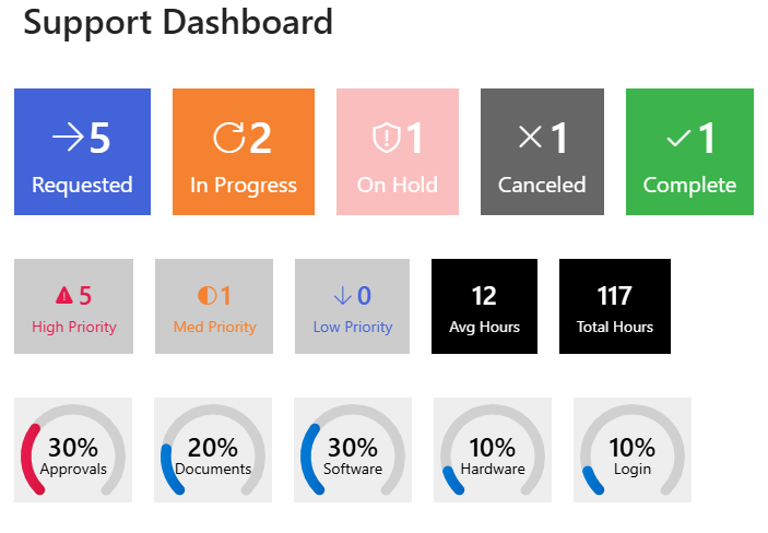
Here are two examples of what you can make with Ultimate Forms Counters. Here is a useful Support Dashboard:
And here is a great looking Sales Dashboard:
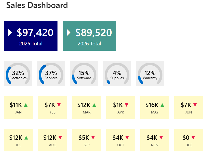
The process of building out a dashboard using Ultimate Forms is easy. The dashboard is comprised of individual counter boxes which hold summary data. For example, you can define a counter to get the sum total sales for a date range in a SharePoint list. When setting up the counter, you can define the data definition and have complete control over the appearance. This lets you set different colors, icons or even progress bar indicators to make your dashboard look nice. Each box can be configured individually, so there is room to combine all kinds of disparate data into one summary page.
We just went in depth on this topic in our recent webinar Ultimate SharePoint Status Board. You can watch the video and download the example shown for free by following the link. In the video, you can see just how simple it is to create this kind of SharePoint Dashboard.