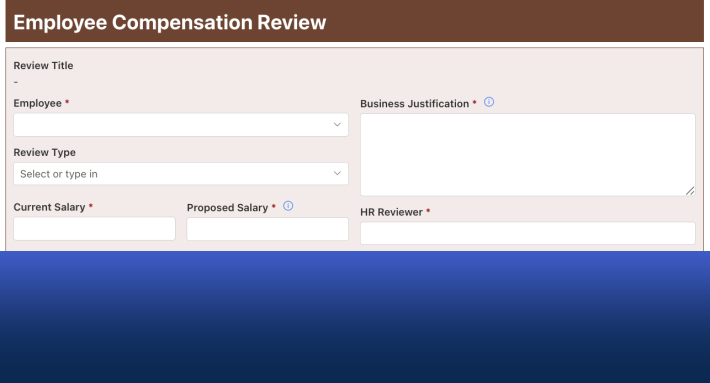
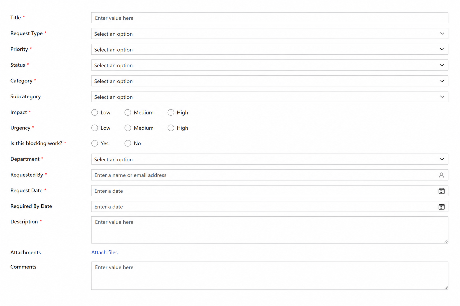
We've all seen Ugly SharePoint Forms
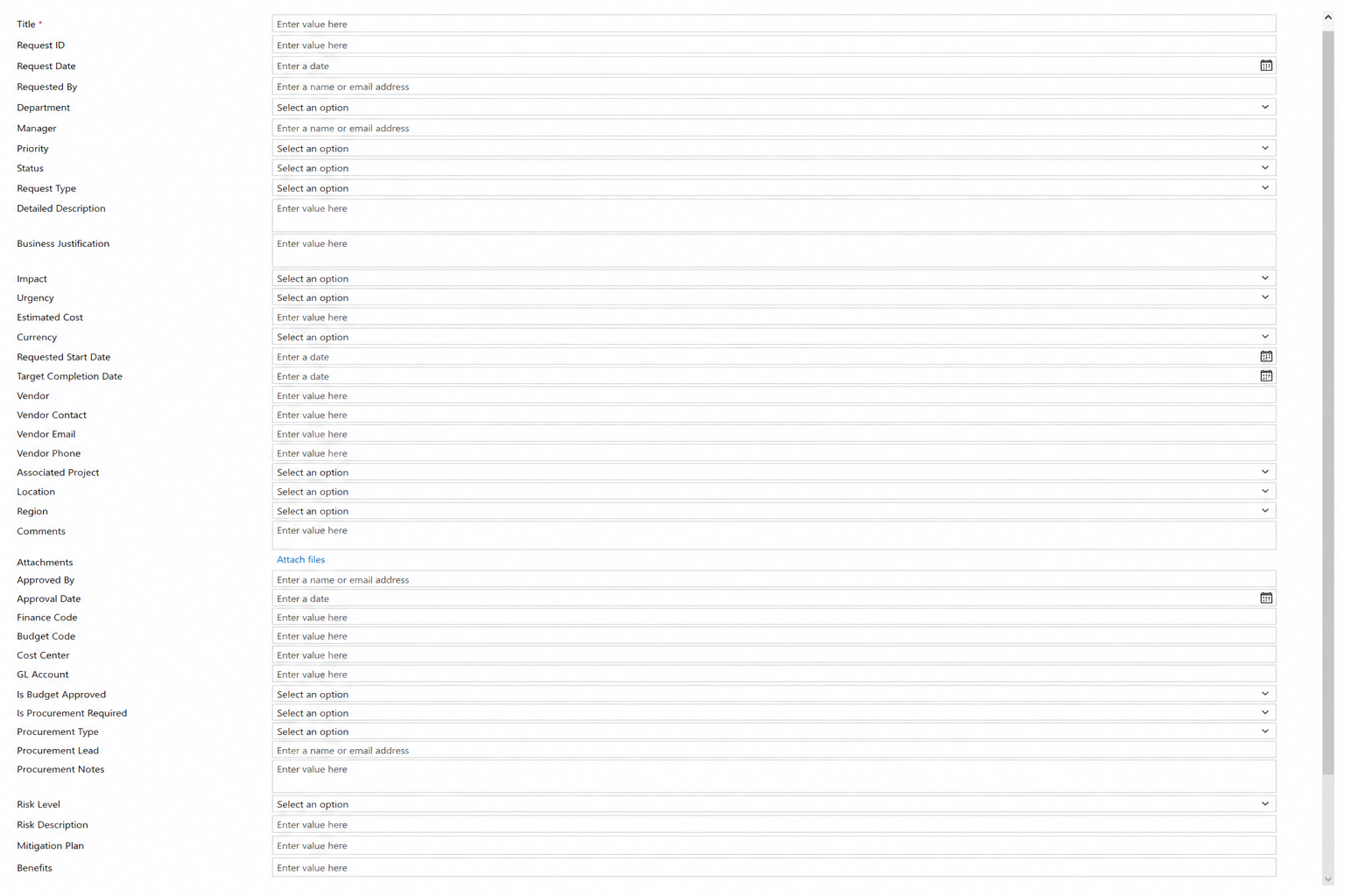
A SharePoint form that seems to go on forever. Fields are scattered everywhere, every possible option is displayed whether you need it or not, and finding the right place to enter information feels like a scavenger hunt. The form technically works, but using it is another story.
The reality is that users often judge an entire business process by the quality of its form. If the form is confusing, cluttered, or difficult to complete, users become frustrated before they even click Save.
Fortunately, you don't need custom code to create forms that are both attractive and easy to use. Here are seven common design mistakes that make SharePoint forms look ugly, along with simple ways Infowise Ultimate Forms can transform the experience.
1. The Endless Scroll
One of the quickest ways to overwhelm users is to place every field on a single page. Long forms require constant scrolling, making it difficult to find information and increasing the chances that users miss important fields.
Breaking a form into logical tabs or sections immediately improves usability. Users can focus on one area at a time instead of feeling overwhelmed by dozens of fields. Better organization also makes forms feel much shorter, even when the total number of fields hasn't changed.
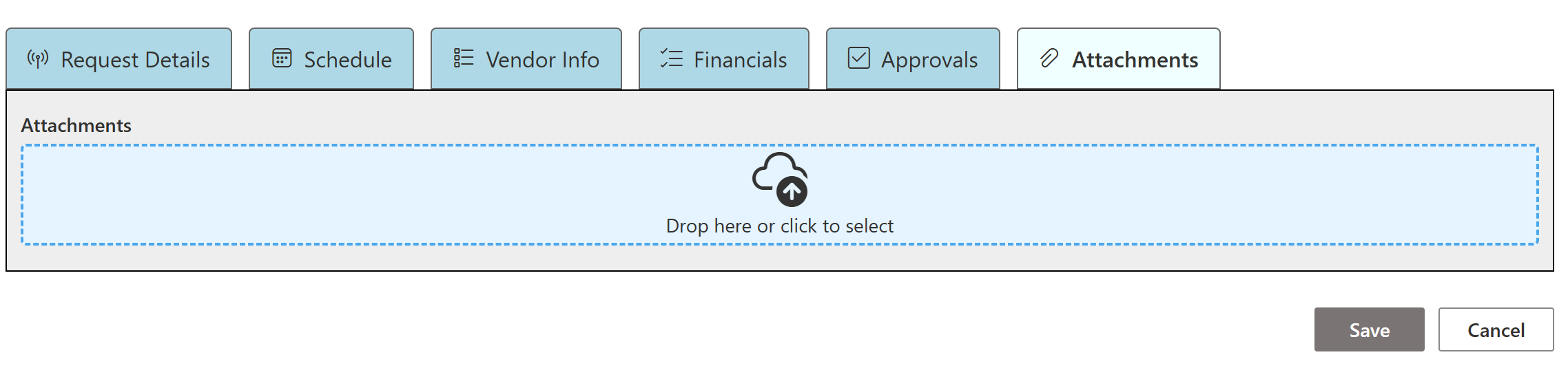
Learn how to organize complex SharePoint forms using Tabs and Accordion Sections using Ultimate Forms.
2. Everything Is Visible
Many SharePoint forms display every field for every user, regardless of whether the information is relevant. New users are often asked questions they can't answer yet, while experienced users have to constantly scroll past fields they never use.
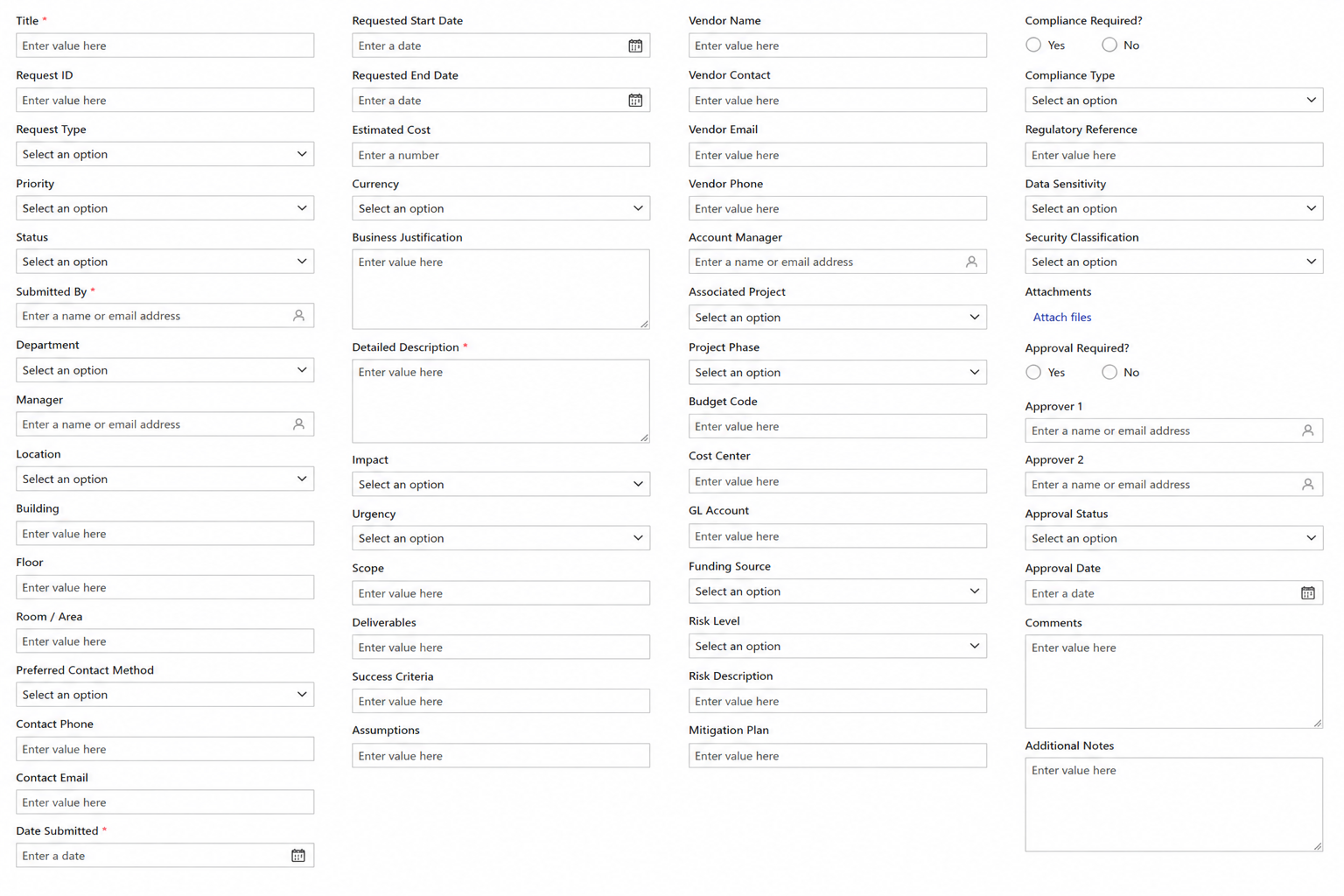
Instead, let the form adapt to the situation. Show only the fields that are needed based on the user's selections, the current workflow stage, or the person's role. The result is a cleaner interface that feels smarter and significantly easier to complete.
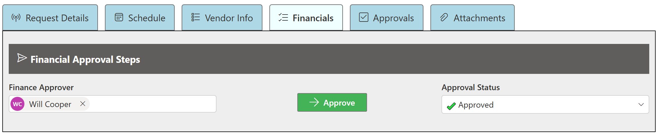
See how Conditional Visibility Rules automatically show and hide fields based on user selections, status, or security permissions.
3. The Tiny Attachment Button
The standard SharePoint attachment control works, but it certainly doesn't encourage users to document their work with photos.
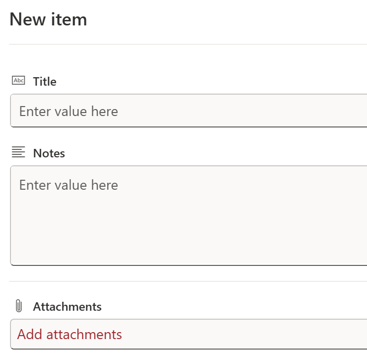
Ultimate Forms picture fields provide a much better experience. Users can tap the picture field on a phone or shared tablet, launch the camera instantly, and capture photos directly from the form. This is especially useful for inspections, quality management, field service, maintenance, safety incidents, and countless other business processes where pictures tell the story better than words.
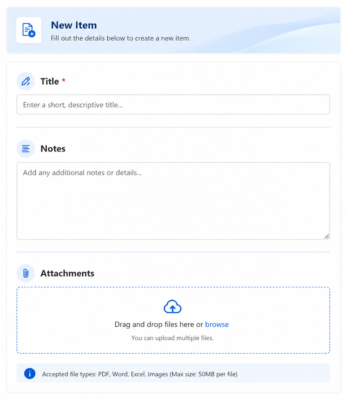
Learn more about Picture Fields and how they simplify mobile inspections and field data collection.
4. No Organization
A flat list of labels and text boxes gives users no indication of how information is related. Everything carries the same visual weight, forcing users to work harder than necessary.
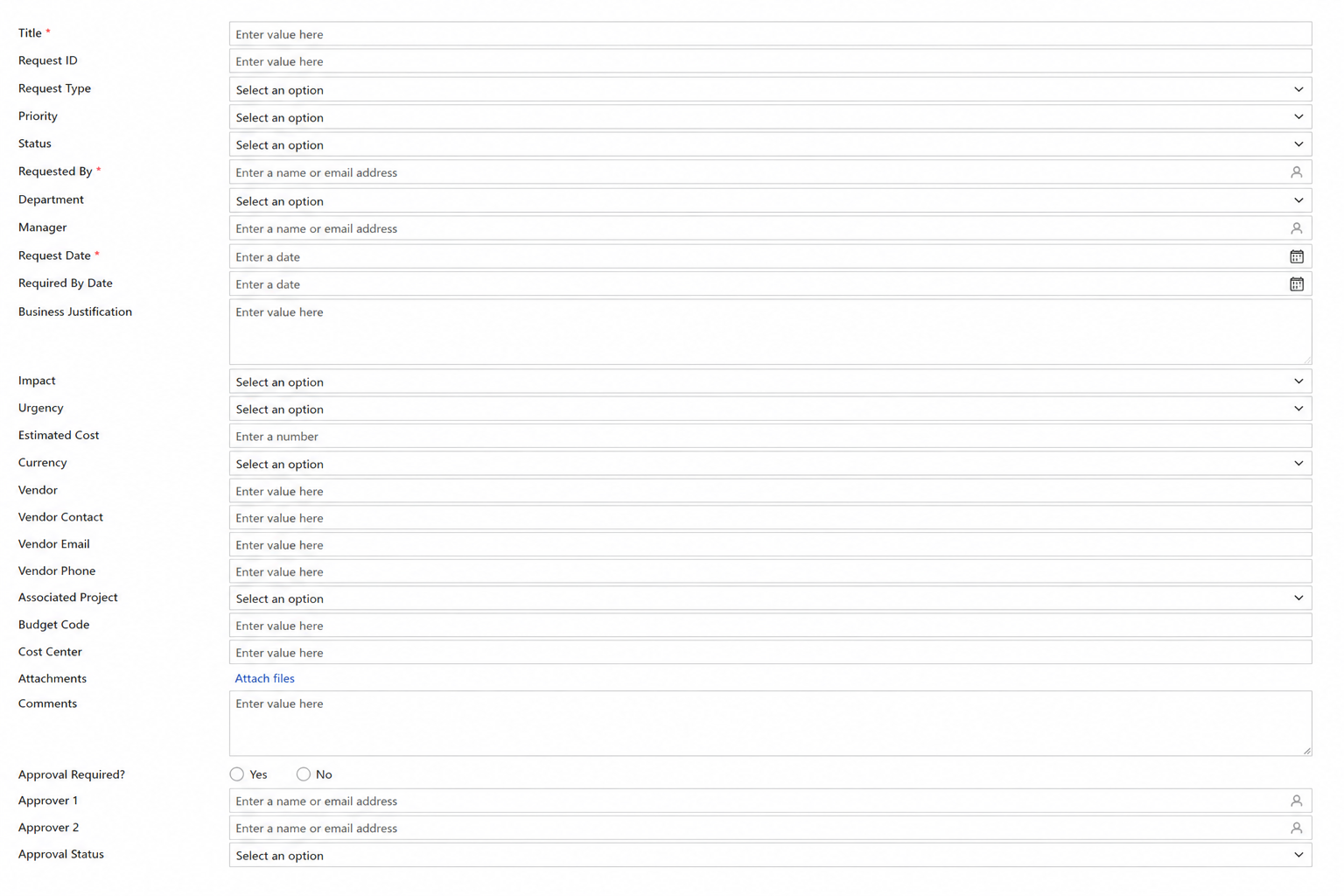
Adding section headers, cards, spacing, icons, and visual grouping creates a form that naturally guides users through the process. Instead of wondering where to look next, the layout itself helps users understand the flow of information.
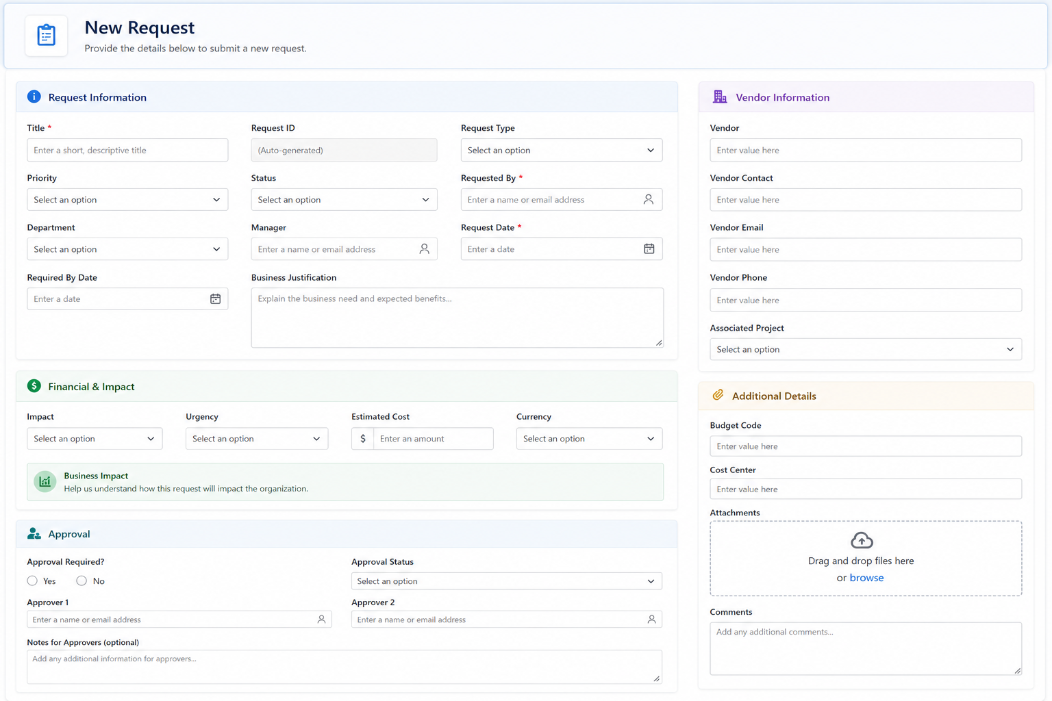
5. Boring Buttons
Standard dropdowns and radio buttons get the job done, but they rarely provide the best user experience.
Custom buttons make common selections much faster while adding visual clarity to the form. Instead of searching through dropdown lists, users can simply click clearly labeled buttons. Workflow actions can also be presented as buttons, making it obvious what the next step in the process should be.
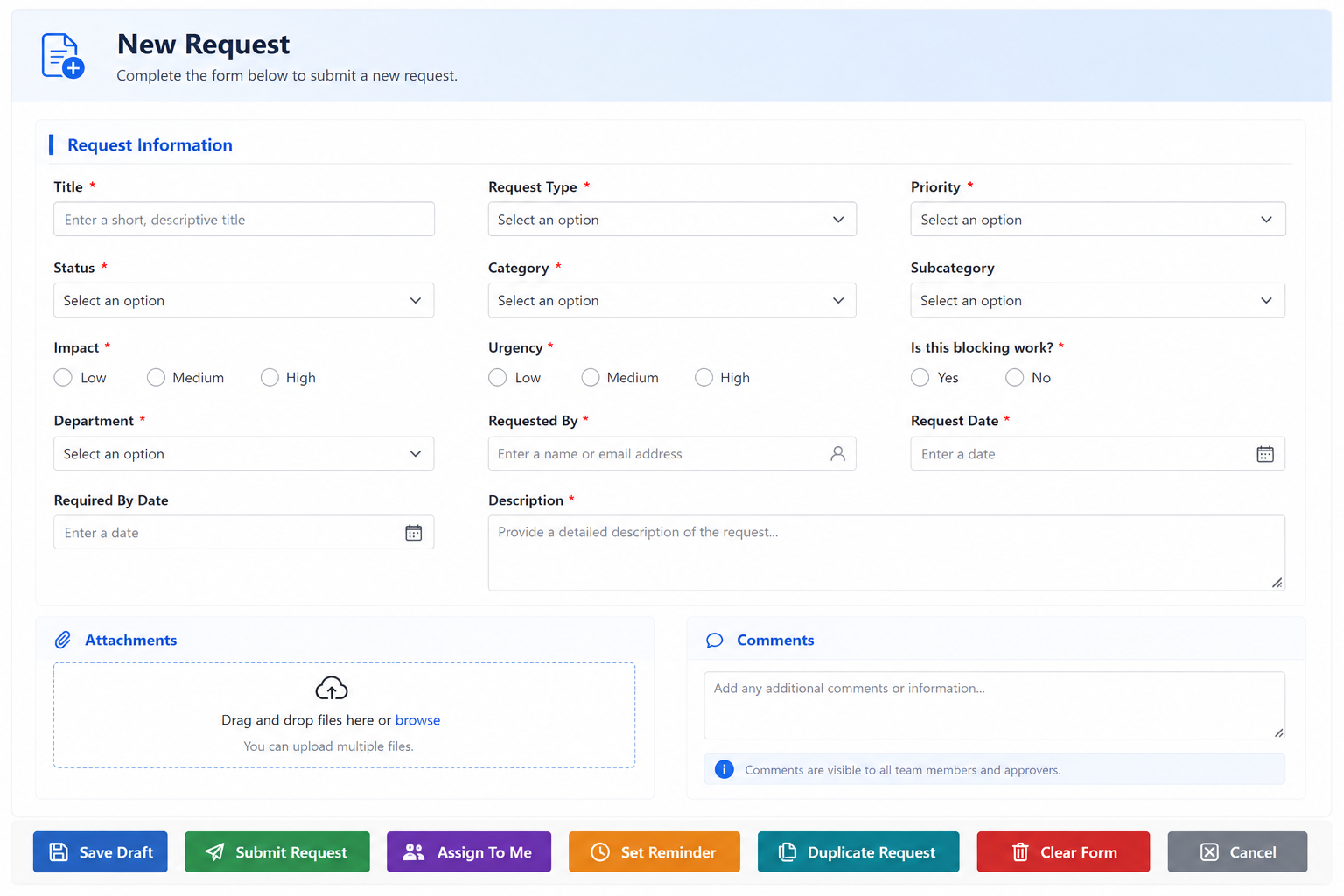
See how Button Controls can replace traditional dropdowns while making forms easier to use.
6. No Visual Status
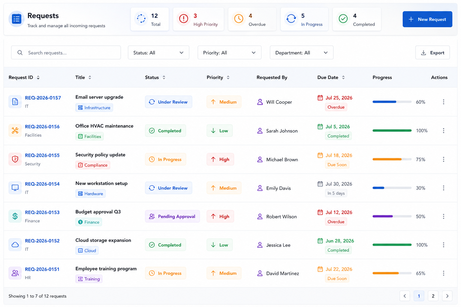
A status field that simply displays "Open" or "Completed" doesn't communicate much at a glance.
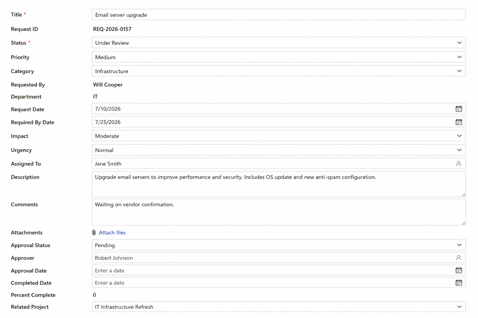
Color-coded badges, progress indicators, icons, and visual labels immediately tell users where an item stands. Instead of reading through multiple fields, users can quickly identify high-priority items, overdue tasks, or completed work with a single glance.
7. Awful Version History
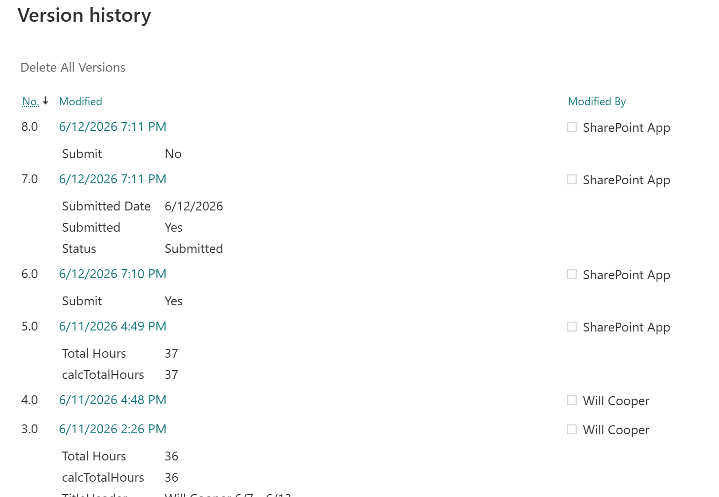
SharePoint's built-in version history contains useful information, but it often feels more like reading a database log than reviewing the history of a business process.
A custom activity history displayed directly on the form provides a much more meaningful experience. Highlight important events with color, emphasize key workflow changes, call out significant updates, and present everything in a clean chronological timeline. Instead of asking users to interpret technical version details, the form tells the story of what happened and when.
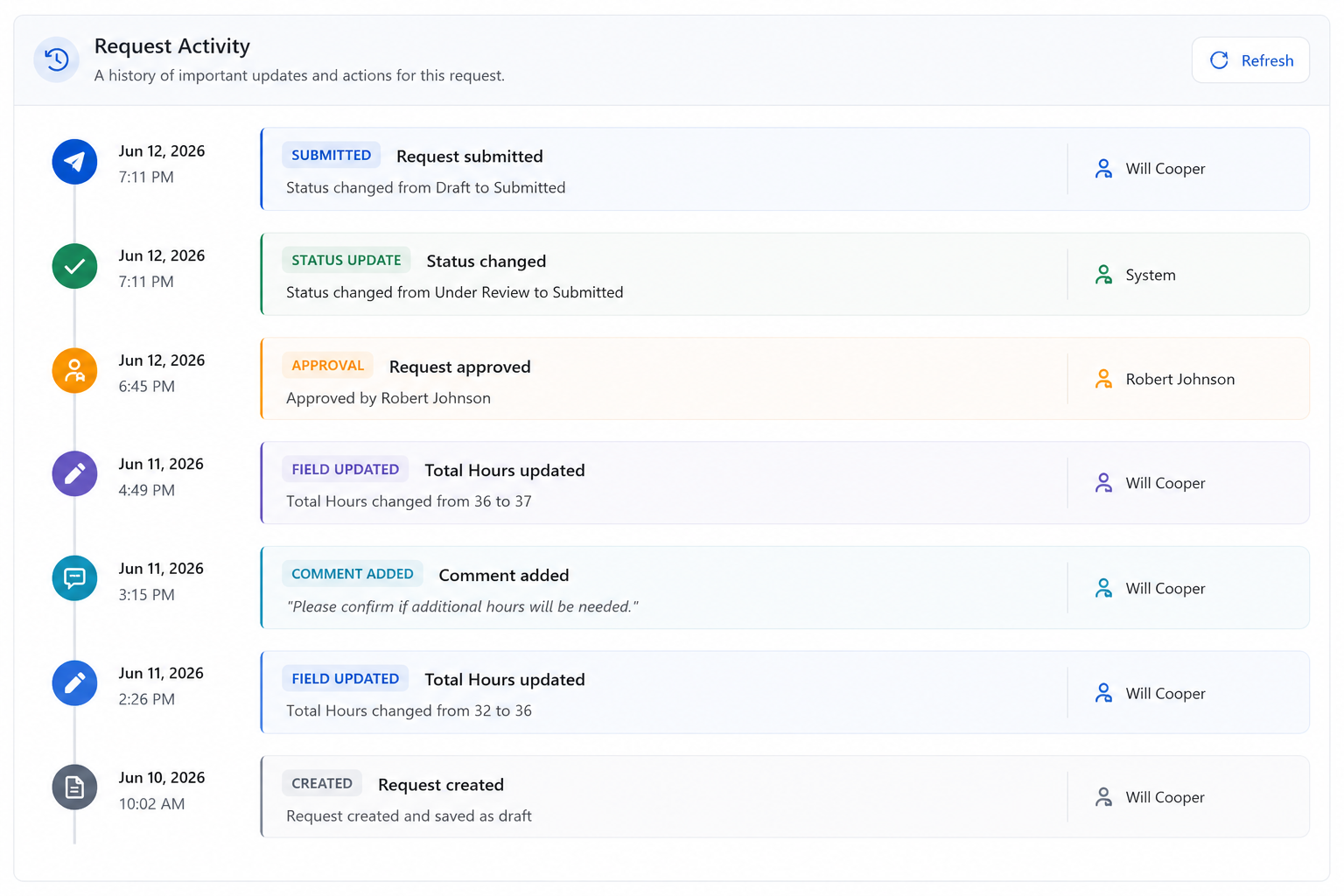
See how the Activity History control presents workflow events in a clean, chronological timeline.
Great Forms Don't Just Look Better
It's easy to think this article is about making SharePoint forms prettier, but that's really just a side benefit. Every improvement above has a practical purpose. Better organization reduces mistakes. Dynamic forms eliminate unnecessary clutter. Picture fields encourage better documentation. Custom buttons make forms easier to use. Visual status indicators help users prioritize their work. Improved activity history makes it easier to understand what's happened without digging through technical details.
Individually, each enhancement is relatively small. Together, they completely transform the user experience. Instead of presenting users with a generic SharePoint form, you're providing an application that guides them through a business process in a way that feels modern, intuitive, and efficient.
If someone looks at one of your SharePoint forms and says, "That's one ugly SharePoint form," don't worry. The good news is that with the right tools, it's surprisingly easy to turn an ordinary form into one your users will actually enjoy using.
Add your comment