
Building Dashboards the Easy Way with Ultimate Forms
One requirement in almost every SharePoint solution is to display key summary data on a single SharePoint page. It sounds like a basic requirement, but this can be difficult without the right tools. It is easy enough to define. Users want to see a summary of totals to track performance and critical issues. Another key requirement is a simple navigation dashboard that allows users to jump to views of records filtered and sorted accordingly.
Ultimate Forms Counters allow you to combine these two requirements by displaying counter boxes which link to filtered SharePoint views.
In this way you can use a dashboard page as a way to see a summary of real time performance as well as jump directly to the list records that you care about.
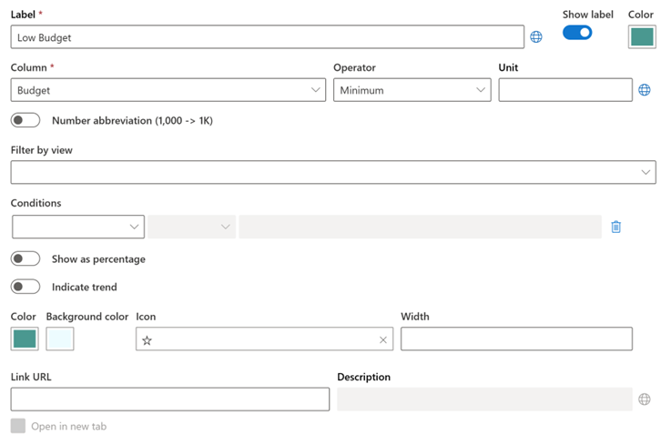
This challenge can quickly spiral into a complex developer project without the right tools. Ultimate Forms takes away the complexity by offering simple to setup counter profiles. A counter is a simple to understand concept. You simply define the list and column that contain the data you want to track. After that, you can define additional filters and settings. The settings needed for the counter are simple to understand. It is only necessary to update dropdown pickers, text boxes, color pickers and toggle buttons as show in the screen below.
If you can set up a SharePoint list view, you can set up an Ultimate Forms Counter.
Counters are Building Blocks
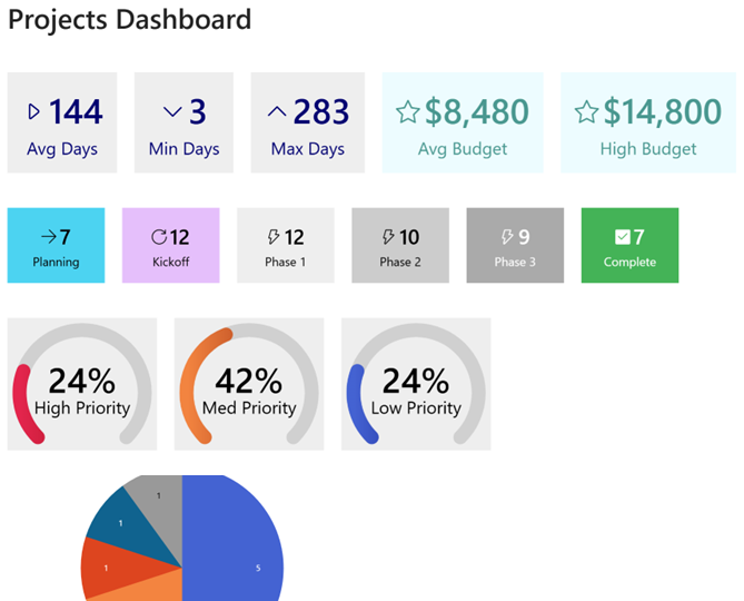
Counters show as boxes on your SharePoint page. Instead of considering many complicated requirements all at once, you can simply build up your dashboard one building block at a time. This process becomes faster when you take advantage of counter copying and profile copying. This allows you to duplicate any of your counter blocks then just make a simple adjustment. Copying counters makes the whole process even faster.
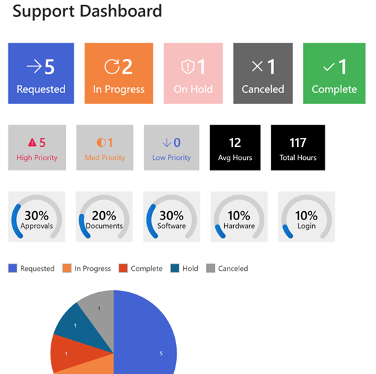
Counters are Navigation Tiles
Yes - that's right. Each tile can be linked to a filtered SharePoint list view. This allows your users to drill down and see the underlying data reported on your dashboard. Just paste in a link to the filtered view in your counter profile. It is easy to setup while also being highly valuable. Instead of having a passive dashboard to view data, you provide an interactive navigation linking to all the key screens in your SharePoint solution from one page.
Add Charts for Extra Impact
Counters are great, but a dashboard looks even better with a chart thrown in. Ultimate Forms Charts are also easy to set up and the perfect compliment to your dashboards page. This has long been a part of the Ultimate Forms features. You can learn more about charting here.
Where Counters Shine in Real-World Solutions
Once you start using counters in real projects, their value becomes very clear. They are not just visual elements, they actively guide users toward the most important work.
Help Desks
Consider a help desk or IT support scenario. You might have a SharePoint list tracking tickets with columns for Status, Priority, and Assigned To. With counters, you can create tiles such as "Open Tickets", "High Priority Issues", and "My Assigned Tickets". Each of these tiles displays a live count and links directly to a filtered view. Instead of users digging through views or applying filters manually, they click once and immediately land on exactly what they need. This reduces friction and improves response time.
Asset Tracking
Another strong use case is asset tracking. Many organizations use SharePoint to track equipment, inventory, or field assets. You could create counters for "Assets in Service", "Assets Due for Inspection", and "Assets Out of Compliance". For example, a maintenance team could start their day by clicking a "Due for Inspection" tile and immediately see what requires attention. This removes guesswork and ensures nothing slips through the cracks.
Project Management
Project management is another area where counters work extremely well. Imagine a project tracking list with fields like Status, Owner, and Due Date. A dashboard could include counters such as "Active Projects", "Overdue Tasks", and "Projects at Risk". A project manager can instantly see where attention is needed and drill into the exact records causing concern. This is far more efficient than reviewing long lists or exporting data into Excel.
Approvals
Counters also work well in business process tracking scenarios like approvals or requests. For example, in a procurement or HR onboarding process, you could display "Pending Approvals", "Rejected Requests", and "Completed this Month". Managers can quickly identify bottlenecks and take action. Because the counters are real time, they always reflect the current state of the system without requiring manual updates or refreshes.
Compliance
Another practical example is compliance tracking. Organizations often maintain lists of policies, certifications, or required training. Counters like "Expired Certifications", "Expiring in 30 Days", and "Compliant Employees" provide immediate visibility into risk areas. Clicking into each tile allows compliance teams to take direct action without navigating through multiple screens.
The key advantage across all these scenarios is that counters reduce cognitive load. Users are not forced to think about where to go or how to filter data. The dashboard tells them what matters and gives them a direct path to act on it.
Summary
Ultimate Forms Counters transform SharePoint dashboards from static displays into interactive, action-driven tools. Instead of building complex reports or relying on external tools, you can create meaningful dashboards directly within SharePoint using simple configuration.
By combining real-time summaries with direct navigation, counters help users focus on what matters most. Whether you are managing support tickets, tracking assets, overseeing projects, or monitoring compliance, counters provide a clear and efficient way to visualize and act on your data.
The result is a dashboard that is not just informative, but genuinely useful. Users spend less time searching and more time getting work done.