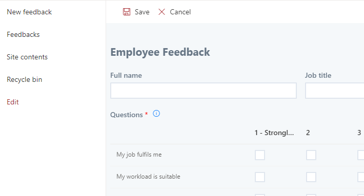
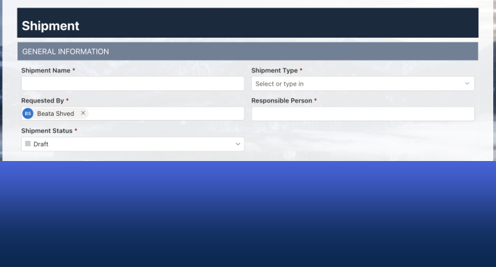
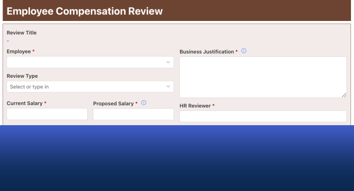
Ultimate Forms styles SharePoint forms at four levels, and each asks a little more of you than the last. Themes restyle a whole form in one click. The Style screen configures backgrounds, content blocks, and controls visually. Dynamic styles change the look of individual elements based on the values users enter. And custom CSS removes every remaining limit. You can stop at any level, and you can combine them all.
This guide walks the ladder from bottom to top, with the screenshots to match. By the end, you will know exactly which level your form needs.
Why looks are not cosmetic
A quick word on why this matters. Users judge a form in the first second, before reading a single label. A polished form signals a real process. A default gray one signals an afterthought, and gets afterthought-quality data in return.
Styling also carries your brand. Internal tools that look like your organization build trust. External forms that face customers have no choice: they are your organization, for that interaction. The good news is that with Form Designer, the polish costs minutes, not a design project.
Level 1: Themes, the one-click restyle
The easiest option, and the most limited. You pick from a set of ready-made themes. That's the whole job.
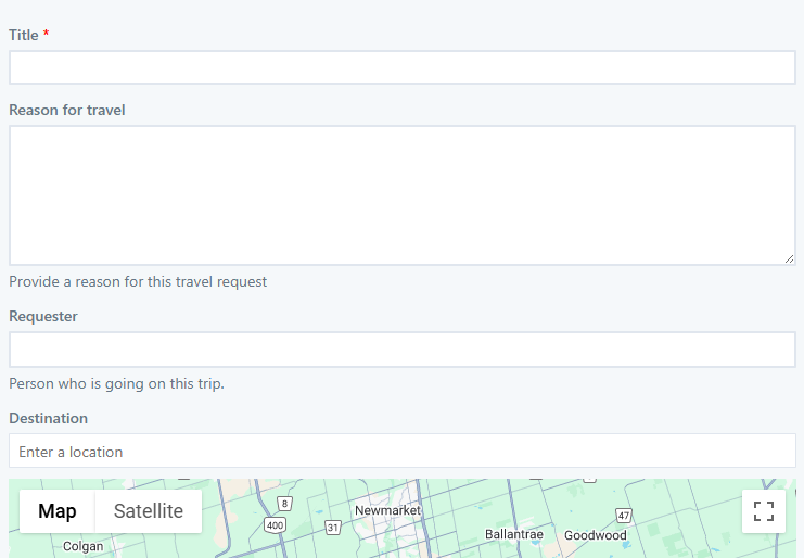
Say you start with this vanilla form:
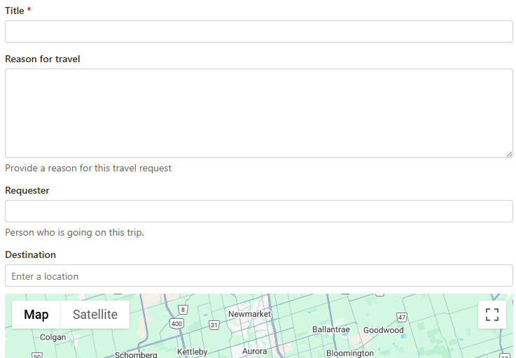
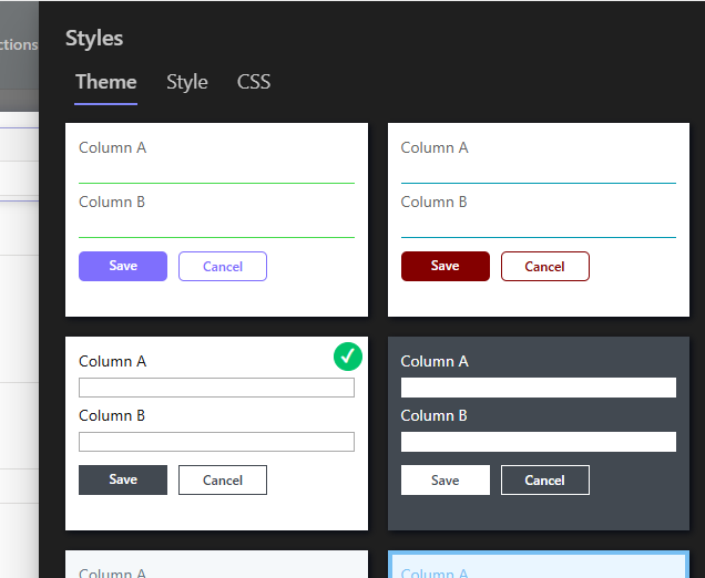
Go to Styles, then Theme. Browse the options and select the one you like:
Publish, and the form is transformed:
There is nothing to configure, which is both the appeal and the constraint. When you need a specific design, a theme alone won't produce it. But for simple forms that just need to stop looking default, a theme is thirty seconds well spent. It also makes a fine base coat for the levels above.
Level 2: The Style screen, visual control without code
Under Styles, then Style, the most common design decisions are presented as friendly settings. No CSS knowledge required. The screen divides into three sections:
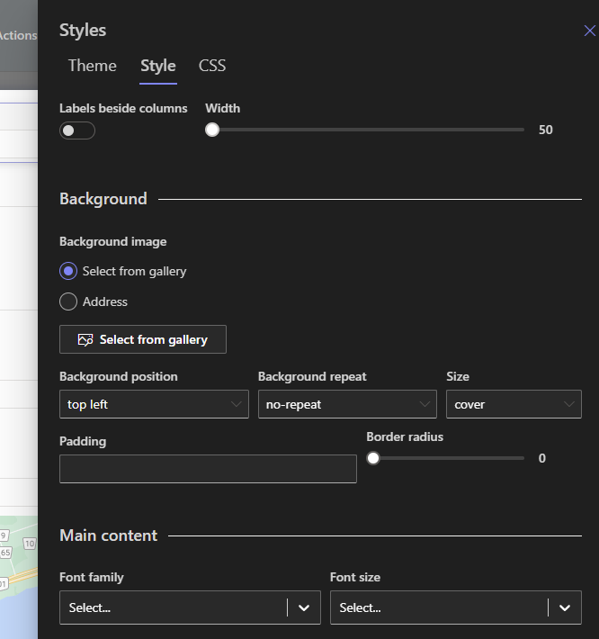
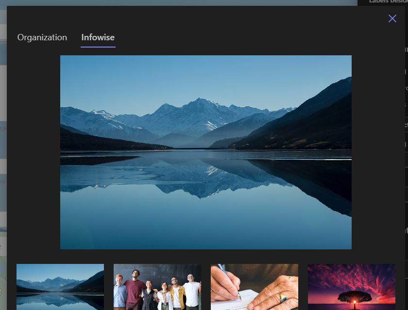
Background covers the form's overall backdrop. This is the natural home for a background image. Choose one from the built-in gallery of royalty-free images, or manage your own gallery under Organization, which is where a company-branded backdrop belongs:
Main content styles the block where the form's substance lives: columns, headers, tabs. You control its background color and transparency, padding, rounded corners, drop shadow, and main font.
Here is the recipe worth memorizing: a background image with a semi-transparent main content block on top. Two settings, and the form looks professionally designed. It is the single highest-impact move on this screen.
Controls define how the data entry columns themselves look: font type and size, borders, background and foreground colors, shadows. One configuration applies to every control on the form at once, which is what makes a consistent, distinctive look cheap to achieve:
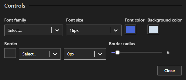
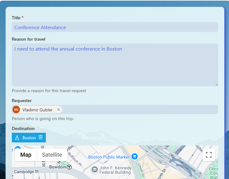
In this example, the font is enlarged, background and text colors are set, corners are visibly rounded, and the borders are removed by setting their width to zero.
And here is the result:
One more move multiplies the value of this screen. A look you have configured can be saved as a shared style and reused on other forms. Build your organization's form look once, share it, and every new form starts from it instead of from scratch. The step-by-step is in the shared styles tutorial.
Level 3: Dynamic styles, when values drive the look
The first two levels style the form as a whole. Sometimes you want to emphasize one element, and better still, emphasize it only when it matters.
Dynamic styles do exactly that. A styling rule attaches to an element and applies according to the values being entered. The form reacts as the user types.
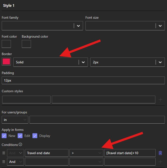
In this example, a travel form adds a red border and padding to the period column when the trip exceeds ten days:
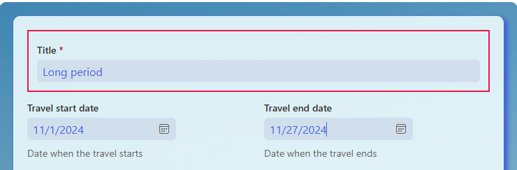
Notice what this really is: visual feedback as a form feature. The long trip glows before anyone clicks Save. Overdue dates can turn red. Amounts above a threshold can demand attention. It is the same rule engine that drives visibility and validation, pointed at appearance, and it turns styling from decoration into communication.
Level 4: Custom CSS, for the experts
When a design requirement is so specific that none of the above delivers it, CSS removes the ceiling.
Assign your own CSS class name to any element on the form, a control, for instance:
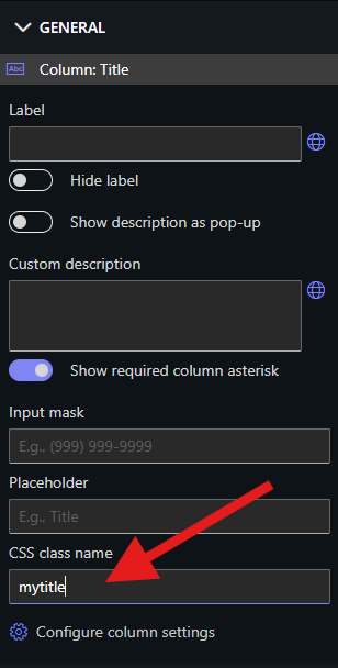
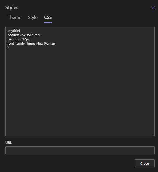
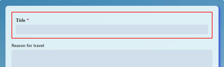
Then define that class under Styles, then CSS, exactly as you want it:
One more option matters at scale. You can keep your classes in a separate CSS file, upload it to a document library, and link it to one or more forms. That file becomes your organization's form stylesheet. Change it once, and every linked form updates. If you maintain many forms, this is the backbone of consistent styling across the tenant.
Choosing your level, and mixing them
A simple decision guide. One form, internal, needs to look decent: pick a theme and stop. A form that should carry your brand: theme plus the Style screen, with the image-and-transparency recipe. A form where values deserve visual feedback: add dynamic styles to the columns that matter. A design system spanning many forms: shared styles for the visual settings, plus a linked CSS file for anything beyond them.
And remember the closing advice, because it is the real technique: combine the methods. Pick a theme as the base. Augment it with Style-screen settings. Add a dynamic rule where feedback helps. Reserve CSS for the last five percent. Each level does what it is best at, and the unique look arrives fast.
Styling is one part of the larger form design story. Structure and steps are covered in the tabs and accordion styling guide, label placement in side-by-side labels, and the full design checklist in Ten Key SharePoint Form UX Principles. Dress the form well, and structure it well, and users will treat it, and its data, with the seriousness it shows them.
Frequently asked questions
Add your comment