
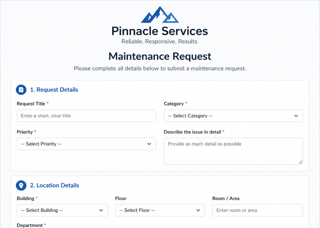
Designing SharePoint Forms for a Better Experience
A well-designed form does more than collect data.
It reduces friction, guides users naturally through each step, and creates confidence that the process is clear and professional.
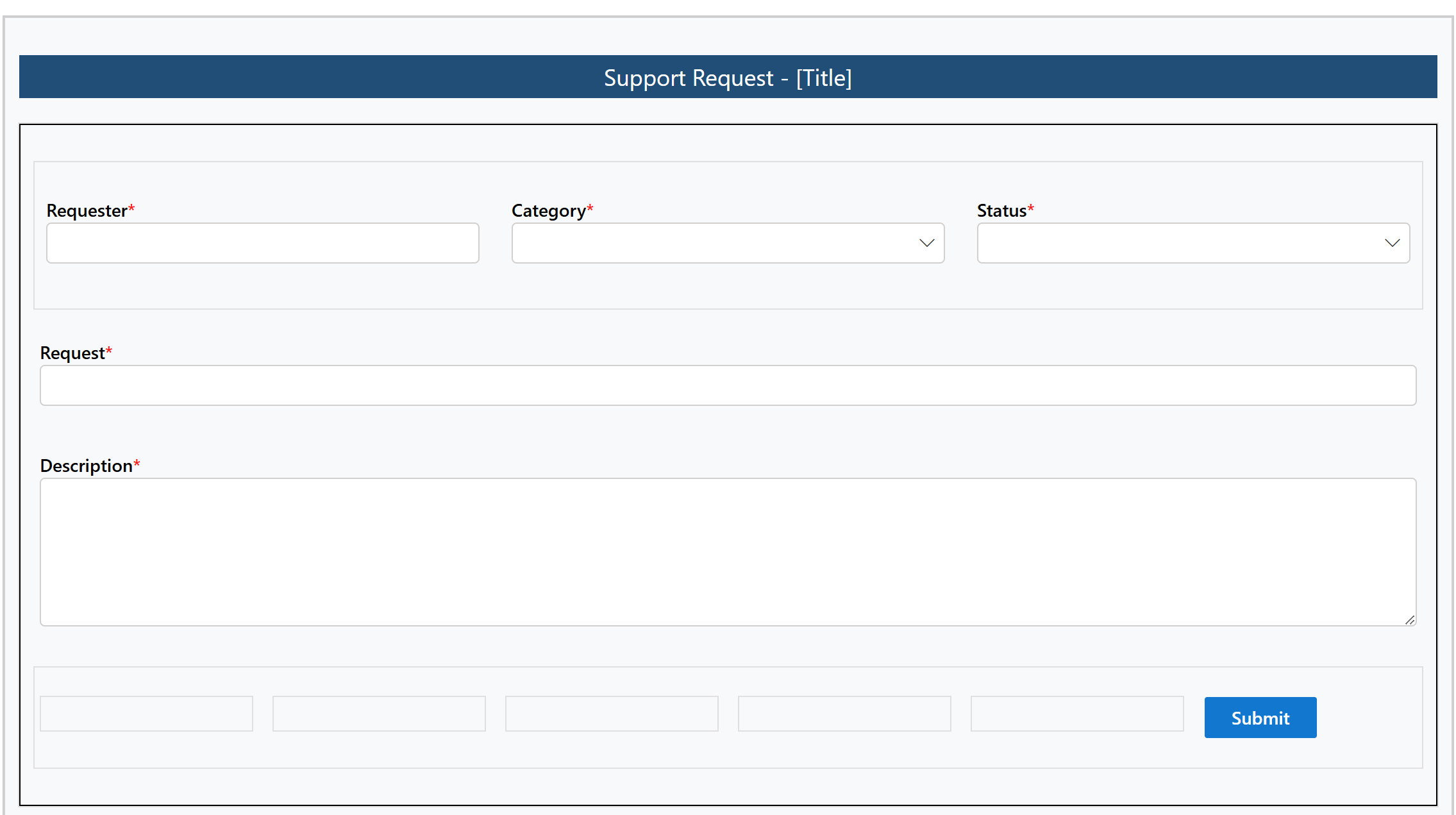
The challenge is that many SharePoint forms are built for functionality first and visual experience second. The result is often forms that technically work, but feel cluttered, inconsistent, or outdated.
With Ultimate Forms Form Designer, improving the user experience is surprisingly easy. Global Style Settings allow you to apply consistent formatting across the entire form in just a few clicks, while individual controls, sections, and rules give you precise control when needed.
In this article, we’ll explore 10 UX design principles that can dramatically improve the look and feel of your SharePoint forms without writing code.
1. Start with a Consistent Visual Theme
Consistency builds trust.
A form that mixes random colors, inconsistent borders, and mismatched styling feels unfinished. Users notice these details immediately, even if they cannot explain why the form feels less professional.
A strong theme often includes:
-
a primary color for headers and buttons
-
a neutral background color
-
consistent border radius and shadows
-
a uniform font family and size
For example:
-
Header background: #1F4E79
-
Accent buttons: #0078D4
-
Neutral section background: #F8F9FA
-
Border color: #D1D1D1
With Ultimate Forms Form Designer, these settings can be configured once using Global Style Settings and applied across the entire form instantly.
2. Use Color with Purpose, Not Decoration
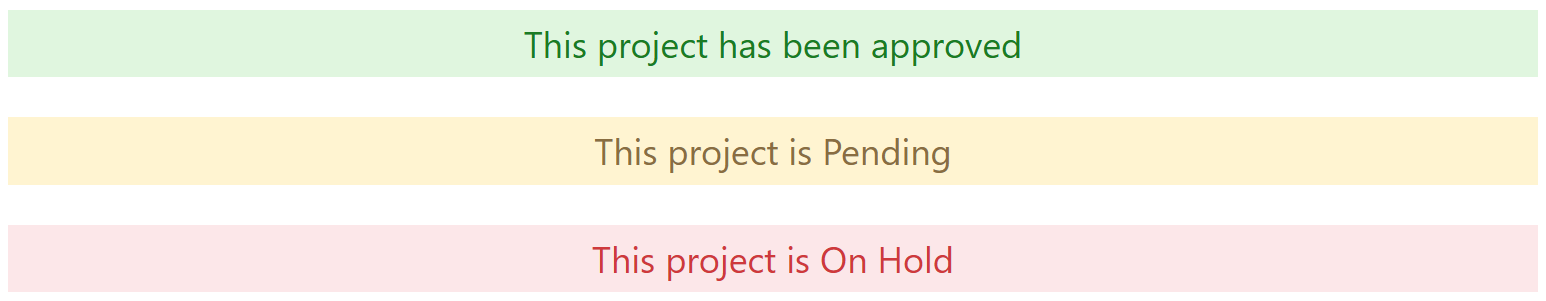
Color should communicate meaning, not simply add decoration.
Well-chosen colors help users understand actions, statuses, and warnings at a glance.
Examples:
-
Blue = action / navigation
-
Green = success / approved
-
Amber = warning / pending
-
Red = error / attention needed
For example:
-
Approved banner: #DFF6DD with text #107C10
-
Pending banner: #FFF4CE with text #8A6D3B
-
Error highlight: #FDE7E9 with border #D13438
Using these visual cues consistently makes your form easier to understand without additional text.
Ultimate Forms allows these styles to be applied globally or dynamically through rules.
3. Use Spacing to Reduce Cognitive Load
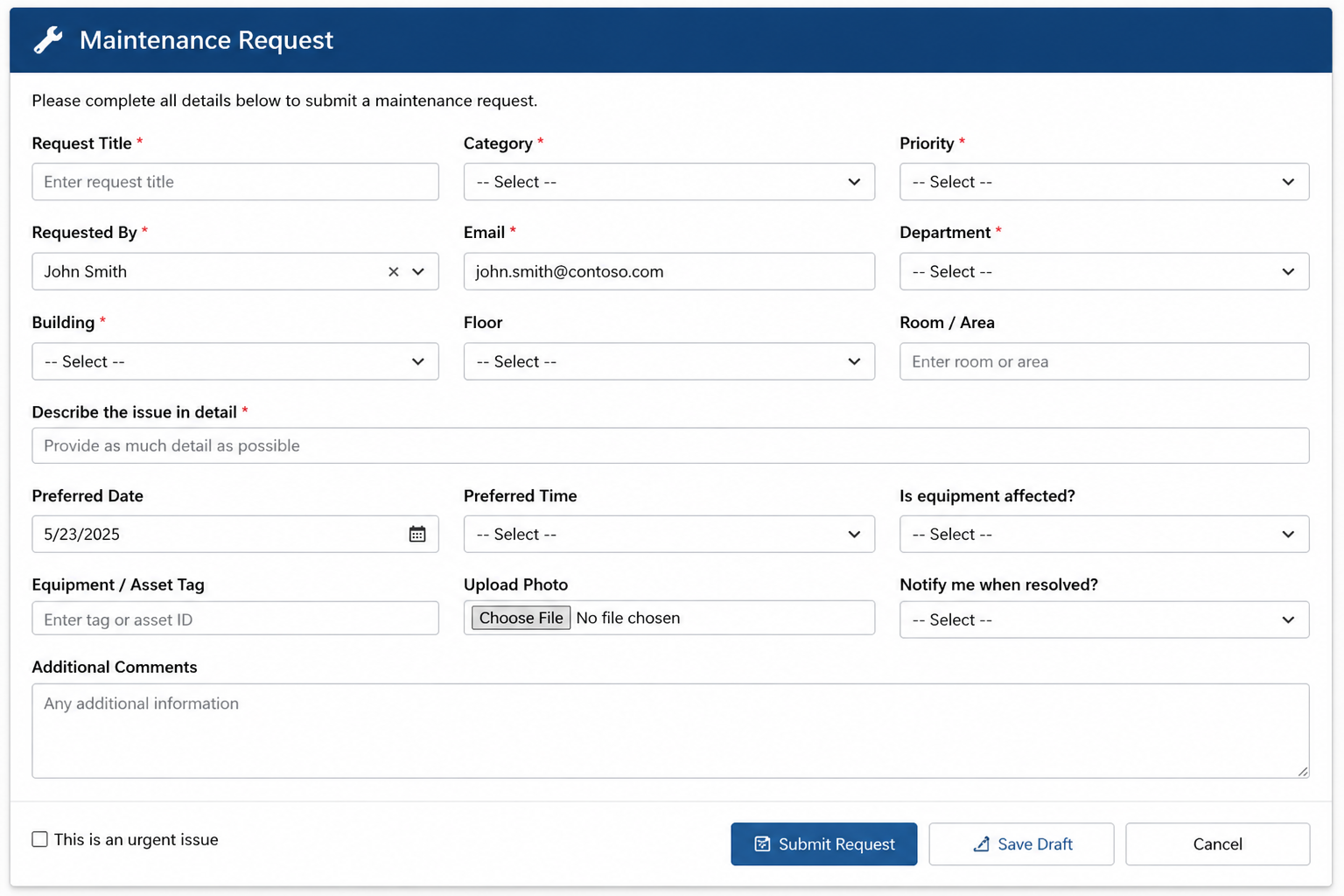
One of the most common design mistakes is density.
When fields are crowded together, forms feel more difficult to complete. Proper spacing creates rhythm and allows users to scan content more naturally.
Consider spacing between:
-
sections
-
labels and inputs
-
grouped controls
-
action buttons
White space is not wasted space. It improves readability and reduces stress.
Ultimate Forms lets you visually adjust margins, padding, and section layout without touching CSS.
CLUTTERED:
FIXED:
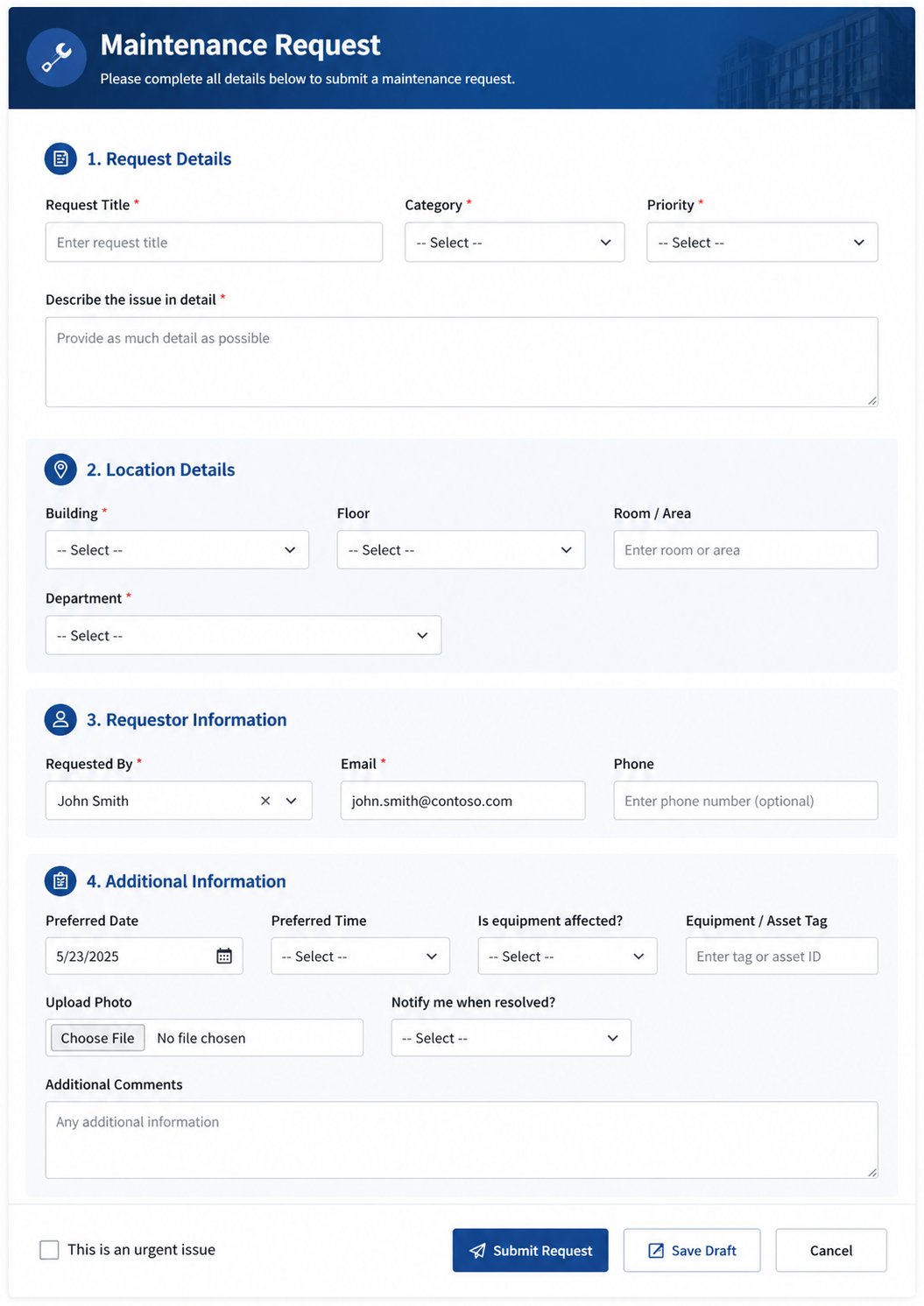
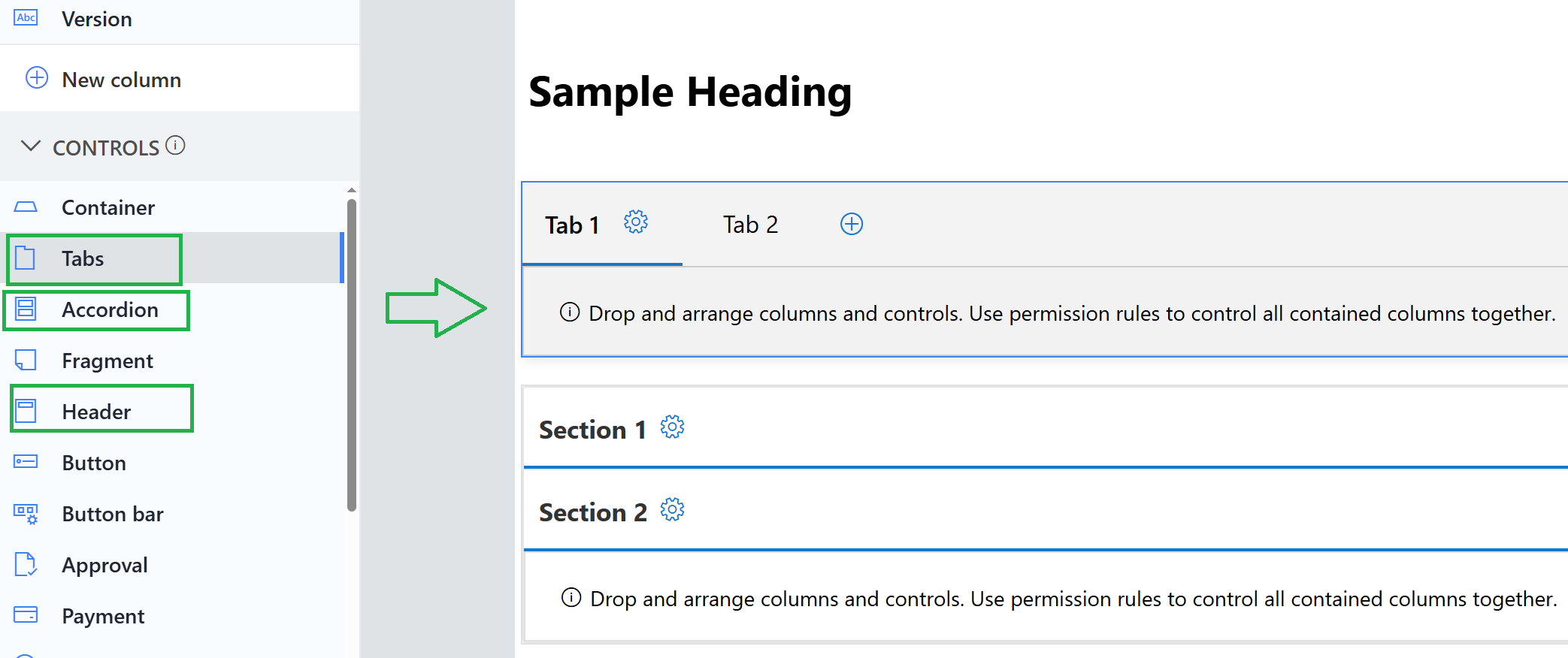
4. Create Clear Section Hierarchy
Users should understand the structure of the form immediately.
Visual hierarchy can be created through:
-
banners
-
section headers
-
collapsible panels
-
tabs
-
indentation
For example, a dark blue banner can define the overall form title, while lighter section headers divide major categories.
This allows users to process the form in logical chunks instead of seeing one long list of fields.
Ultimate Forms supports tabs, accordions, and sections directly in Form Designer.
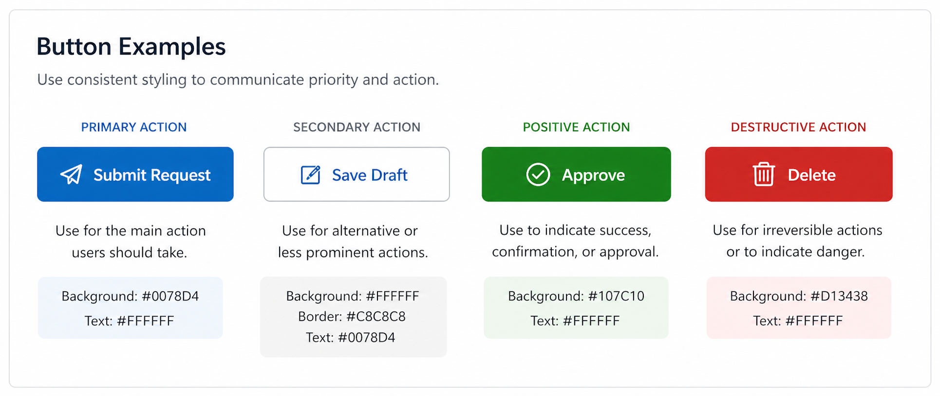
5. Use Buttons to Guide Action
Buttons should communicate priority.
Users should instantly recognize the primary action they need to take.
Example styling:
Primary button:
-
Background: #0078D4
-
Text: white
Secondary button:
-
Background: white
-
Border: #C8C8C8
Destructive action:
-
Background: #D13438
This subtle visual hierarchy helps guide behavior and reduces mistakes.
Ultimate Forms allows button-level styling without writing code.
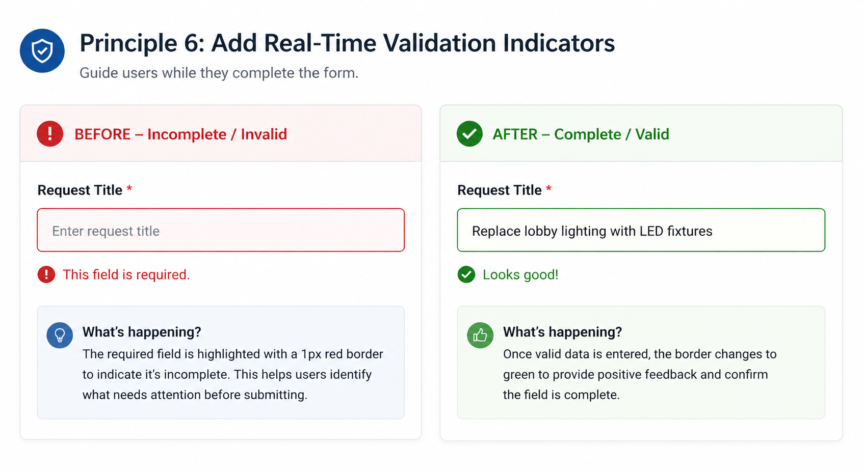
6. Add Real-Time Validation Indicators
Validation should be proactive, not reactive.
Instead of only displaying an error after submission, guide the user while they complete the form.
A highly effective pattern is to place a 1px red border (#D13438) around required fields until valid data is entered.
Once complete, the border can change to neutral or green.
This creates a subtle but effective visual guide and helps reduce submission errors.
Ultimate Forms Rules make it easy to dynamically change styles based on field values.
This kind of behavior often feels custom-built but can be configured in minutes.
7. Minimize Visual Noise
Not every field needs a border.
Not every section needs a colored background.
Not every instruction needs bold text.
Too many visual elements compete for attention and make forms harder to scan.
Use contrast selectively and intentionally.
Ultimate Forms gives you precise control over borders, labels, backgrounds, and visibility so you can create a cleaner experience.
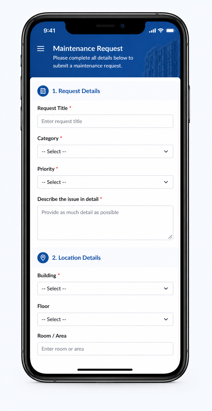
8. Design for Mobile First
A form may look great on desktop and fail on mobile.
A mobile-friendly form should prioritize:
-
single-column layouts
-
larger tap targets
-
minimal horizontal scrolling
-
shorter visible sections
Ultimate Forms automatically adapts forms for mobile devices, but thoughtful layouts improve the experience even further.
This is especially important for field workers, sales teams, and anyone completing forms from a phone.
9. Use Branding Without Overpowering the Form
Branding improves professionalism when used carefully.
A subtle header with a logo and branded colors creates trust and consistency.
For example:
A header with background #1F4E79, white text, and a small logo can create a polished first impression.
But oversized logos, large banners, or overly strong colors can distract from the form itself.
Ultimate Forms supports images, HTML, and styled banners easily.
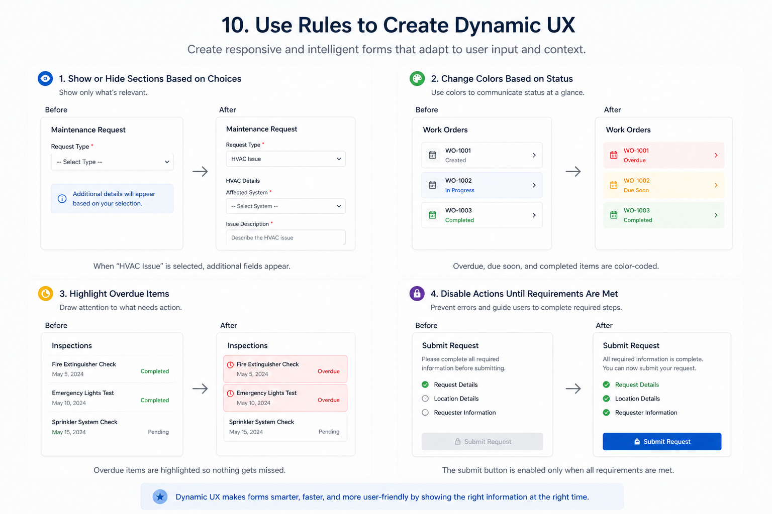
10. Use Rules to Create Dynamic UX
The best forms feel responsive and intelligent.
Examples of dynamic UX include:
-
showing or hiding sections based on choices
-
changing colors based on status
-
highlighting overdue items
-
disabling actions until requirements are met
These interactions make forms easier to use and reduce unnecessary clutter.
Ultimate Forms makes dynamic UX possible through Rules, without JavaScript or custom code.
Great Form Design Is About More Than Appearance
The best forms do more than look attractive. They guide users naturally, reduce errors, and make the entire process feel faster and easier.
Thoughtful use of color, spacing, hierarchy, validation, and dynamic behavior can transform an ordinary SharePoint form into a polished, professional experience that users trust.
What once required custom CSS, JavaScript, or extensive development can now be achieved visually using Ultimate Forms Form Designer. With Global Style Settings, responsive layouts, and powerful rule-based customization, applying modern UX design principles is easier than ever.
A few intentional design improvements can dramatically increase usability, improve data quality, and create forms your users will actually enjoy completing.