
Introduction
Dashboards are a great way to visualize data and help make better business decisions. For SharePoint-based business solutions, creating dashboards in SharePoint makes the most sense. The SharePoint lists already contain the information. And the users are accustomed to working in the environment.
You can use a variety of tools for this purpose, such as Power BI. The downside is that most of these tools are extremely complex. Regular users find it hard to create effective SharePoint dashboards without involving professionals.
Combining Filter and Chart features of Ultimate Forms, you can create great looking dynamic dashboard. This option is available both in Microsoft 365 and on premises. As a Microsoft 365 app, Ultimate Forms integrates directly into the user interface of your SharePoint site.
Charts display the information visually, offering a selection of chart types and a wealth of features. Filters ensure that you can quickly get to the information you need. That creates a dynamic Microsoft 365 dashboard that is able to provide answers in real time. Your users will be able to make data driven decisions with ease.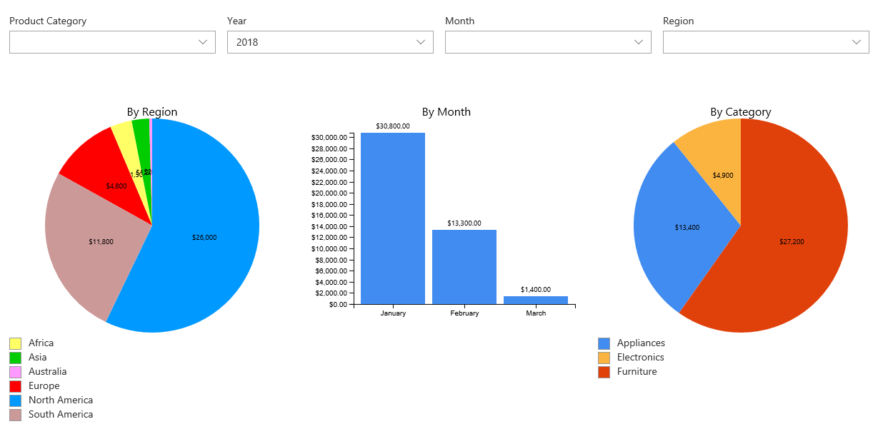
Configuring Charts
You configure your charts in two steps:
- Define the chart profile - configure the design and functionality of your chart
- Place a web part - place the chart web part on your dashboard's web part page. In the web part properties you select the chart profile you want to display.
Define a Chart Profile
You start as always from the Design button on the toolbar of the list. Choose the list that contains the information you want to display.
- Once inside Ultimate Forms, click on Charts and then add a new chart.
- Provide a meaningful title. You select your profile by this title in the web part properties.
- You can select a view to pre-filter your items
- Select a category, the chart will display the data broken by the category values. For instance, to view sales by month, select Month here.
- Add at least one series, the chart will summarize the data by the series. For instance, to view the sales total for a month, select your currency column and the Sum operator. Note that only certain types of charts support more than one series. For example, bar and column chart will display multiple series, but a pie chart will not.

Now you can switch to Display tab to configure your chart's visual representation. Select the most suitable chart type and adjust the rest of the settings according to your preferences.

The rest of the settings is optional and we do not need to configure it right away to create a functional dashboard. You are welcome to try it all out at later.
Placing the Web Part
Edit your web part page, click on the plus icon to add web parts and select Infowise Chart web part. 
Click on the web part properties to open the property pane on the right.

You will find the profile you just created. You can reuse the same profile on multiple pages, across different sites. To display a chart from another site, simply enter that site's URL and click on Load profiles. Remember that your users will have to have access to the underlying SharePoint list of the chart.
Configuring Filters
Filters work in conjunction with other Infowise Ultimate Forms web parts. You can filter charts and rollups by simply placing them on the same page with filter web parts. You do not need to link web parts together, they will recognize each other on their own and will just work.
In the similar fashion, you first configure a filter profile, then select it in the web part properties on the web part page. As with charts, you can freely re-use filters across pages and sites.
Define a Filter Profile
Access Ultimate Forms from a Design button of any SharePoint list. Filters are independent of any particular list, so it doesn't matter which list you begin from.
Like with the Chart profile, give your new profile a meaningful name. Then, optionally set up more options on the General tab. For example, you can control whether or not you want to display Filter and Clear buttons.
Switch to Filters tab to add the actual filters to the profile. You can select from a variety of filter tabs.
- Text - pass free text as filter. You can use "equals", "not equals" and "contains" operators.
- Number - pass any number and use a variety of comparison operators.
- Date - select a date using a date picker and use a variety of comparison operators.
- Choice - provide a selection of values, as well as a default choice. You can use "equals", "not equals" and "contains" operators.
- Lookup - select from a dropdown a value from a lookup list. You can configure any list within the current site collection and use any view from that list. You can use "equals", "not equals" and "contains" operators.
- Person - select a person using a person picker.
- Form - select a parameter value from the page URL. This filter is not visible by users. You control it by a parameter you pass in the web part page URL. You can use a variety of comparison operators.
- Yes/no - checkbox value. You can use "equals" and "not equals".
You can configure each filter to either apply immediately, as the user changes the value. Or you can choose to apply it when you click the Filter button.
The charts will immediately respond, without having to reload the page.

Filters attach to the list columns of the chart by matching the name. You can either give the filter the same name as the column or explicitly provide the column name.
Creating multiple filters in the profile allows you to provide a richer experience to your users. They will be able to filter their charts according to multiple columns in various combinations. That makes it easy to display just the information they want.
You can also control the layout of the filters. For example, you can place them in a row, with up to 5 in each row.
Once you have saved the profile, proceed to placing the web part on the page. You do it the same way as with charts. Once you've placed all the web parts on the page, publish the web part page.
Enjoy this dynamic experience!