
Hi,
We got requests from customers to make validation errors on forms more prominent. Up until now, if you had a validation error on a tab, we would add a red asterisk to the tab name. Customers felt that it was too easy to overlook, especially with larger forms. The Save button would then not work and it would take time to figure out what was going on.
We added a more prominent error sign to the tab name and also a validation summary box under form, listing tab and column names with validation errors, like so: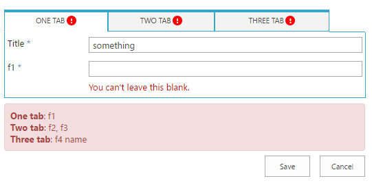
Hope it helps make forms more user-friendly, just re-save the tab settings to get the latest version.
The change applies to O365 customers only, on-prem customer already received a similar update in one of the latest versions.
Loading...
Add your comment
Comments are not meant for support. If you experiencing an issue, please open a support request.
Reply to: from
Products
Vladi Gubler | March 27, 2025
In this post I'm going to go over the Signature component of our Ultimate Forms. I will explain how it can help your SharePoint system meet federal regulations, like FDA 21 CFR Part 11.SharePoint is a great tool for managing all kinds of data: documents, business processes, you name it. Coupled with a Single Sign-on, entering data is a breeze,...
Products
Vladi Gubler | May 07, 2025
When we started to develop Ultimate Forms, we did not position it to be an InfoPath competitor or replacement. We aimed to create a platform that helps our customers use SharePoint better. We wanted to close the gap between their needs and what SharePoint can do. This way, they wouldn't have to spend money on expensive custom development. We did...
Products
Vladi Gubler | April 30, 2025
If you’ve ever used Survey lists in SharePoint, you’re likely familiar with a powerful and often underappreciated feature: the Rating Scale column. This special column type presents a matrix of statements or questions alongside a numeric scale, typically used for gathering structured feedback. The idea is simple but incredibly effective - allow...