
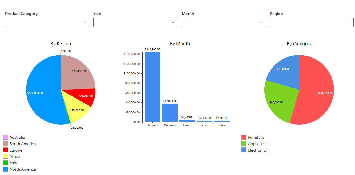
Enhance Your Charts with Dynamic Filters in SharePoint
Charts are visually compelling and great for telling a story. But without filtering controls, users see only static representations of data. Filters let users manipulate what data is displayed. Be it by date, category, user, or any other dimension, they turn static charts into interactive dashboards. With Infowise Ultimate Forms’ Chart web part, adding filters is straightforward and powerful. In this expanded guide, we’ll explore how to configure filters, types of filtering approaches, design patterns, and tips to build user-driven charts that adapt to insight needs.
Why Filtering Matters in Chart Web Parts
Before diving into configuration, let’s consider the benefits:
-
User Empowerment — Instead of static charts, users can adjust filters to see only data relevant to them (time periods, categories, departments).
-
Reusability — Rather than building a separate chart for each scenario, a single chart plus filters can cover many use cases.
-
Performance — By filtering data upstream, you reduce the volume of data that the chart must process or render.
-
Clarity & Focus — Filters help remove clutter, highlighting trends or anomalies in specific slices of data.
-
Responsive Dashboards — Filters support dashboards that respond live to user input, improving exploration and analysis.
How Filtering Works in Infowise Chart Web Part
Infowise Chart web part relies on our Filter web part for filter integration. Below are the principal methods and options of the Fiter web part:
Filter Types & Placement
-
Predefined Filters / Static Filters
These are filters set at design time in the filter profile. For instance, filter chart data to only include items whereStatus = ActiveorDate >= [Today] - 30 days. These filters are always applied and aren’t user-modifiable. -
User Filters (Interactive / Dynamic Filters)
Filter web part can expose filter controls: dropdowns, sliders, checkboxes, date pickers. These let end users dynamically adjust the filter criteria at runtime. For example, a user can pick a department or time range to slice the data. -
Contextual Filters / Page Filters
You can filter charts based on context—such as query string parameters. For example, if you're on a "Department" page, you might pass aDeptIDin the URL so the chart filters accordingly. -
Linked Filters / Cascading Filters
Multiple filter controls can influence each other. Selecting a region filter might limit the list of countries in the next filter, which then filters the chart accordingly. -
Custom Filter Expressions
Advanced filter logic (AND / OR combinations, comparisons, date ranges, string contains, numeric ranges) is supported. You can combine filters for rich filtering logic (e.g.Category = “A” AND (Date > X OR Value > Y)).
How Filters Are Applied
When filters are configured or user-selected:
-
Data Query — The chart retrieves items from its underlying list or view using filter conditions.
-
Aggregation / Grouping — After filtering, the data is grouped or aggregated (sum, count, average) based on chart series definitions.
-
Rendering — The chart renders only the filtered dataset, showing appropriate axes, labels, colors, segments, etc.
All filter processing happens on the server before rendering, not as post-render manipulation. This ensures performance and correctness.
Step-by-Step: Configuring Filters and Charts
Here’s how you might go about adding dynamic filters to a chart in SharePoint Online using Ultimate Forms:
1. Create a Chart Profile
-
On the desired SharePoint list, click on Design button to enter Ultimate Forms.
-
Switch to Charts module and start adding a new chart profile. Set a unique title, you will use it later on.
2. Configure Data & Series
-
In Chart settings, pick the columns you want to chart (e.g.
Category,Date,Value, etc.). -
Define series, axis configuration, labels, aggregation logic (sum, count, average) as needed.
3. Create a Filter Profile
- While still inside Ultimate Forms, switch to Filters configuration page.
- Add a new filter profile. Set a unique title, you will use it later on.
4. Expose Dynamic Filter Controls
-
Switch the Filters tab
-
Choose the filter type (Text, Number, Date, etc.).
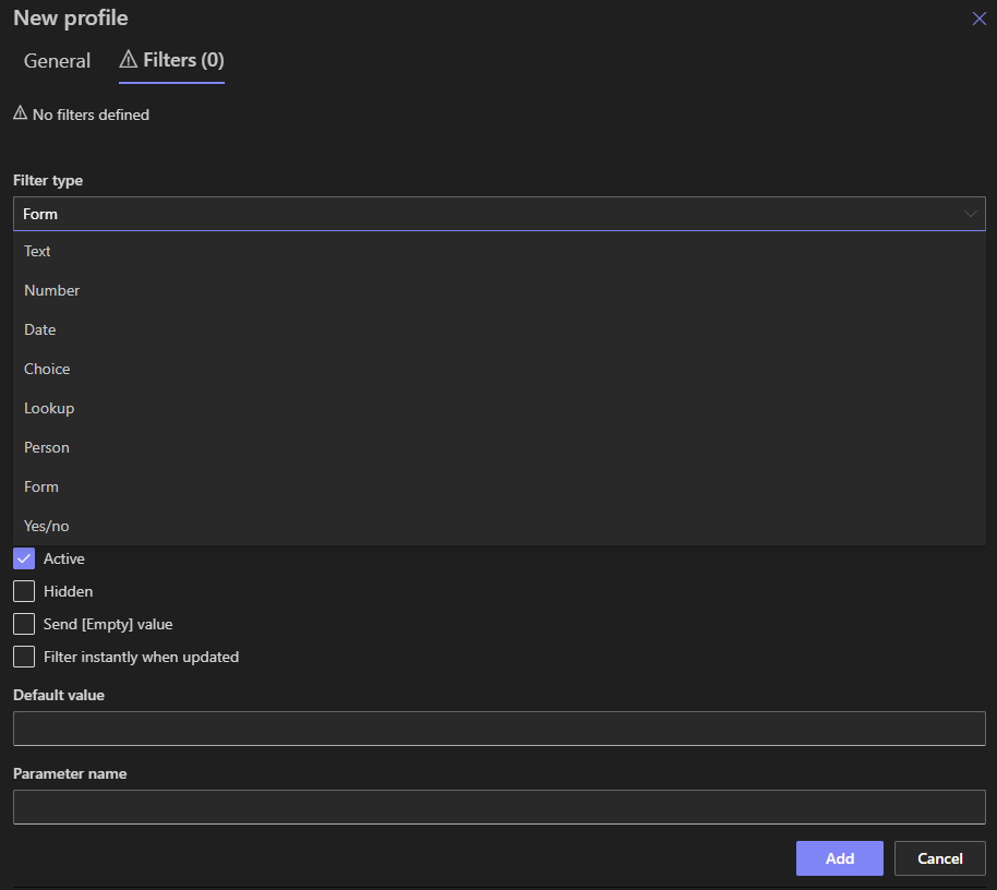
-
Give a name to your filter. In most cases it should be the same as the title of the column you are planning to filter. Alternatively, specify the column name below.
- Configure filter-specific settings. For example, for a Lookup filter, provide the source list and display column.
-
Optionally specify default filter values (e.g. default amount = 100,000).
5. Link Filters (if needed)
-
If you have multiple Lookup filters, configure dependencies or cascading behavior so filter options adapt based on earlier selections.
-
For example, after choosing a
Region, onlyCountrieswithin that region appear in theCountryfilter.
6. Configure Contextual / Parameter-Based Filtering
-
If the page uses query string parameters (e.g.
?DeptID=5), bind the filter control or chart filter to that parameter so chart automatically filters to that context.
7. Place Web Parts on Page
- Select existing or create a new web part page.
- Drag and place Infowise Chart and Infowise Filter web parts.
- In the web part properties, select the Chart and Filter profiles you just created.
NOTE: the Connection Channel on both web parts is set to 1 by default. To connect, both Filter and Chart web part must be set to the same channel. You can place multiple chart/filter combinations on the same page by using separate channel for each. A Filter web part can filter unlimited Chart web parts on the same page, provided they are configured to use the same channel.
7. Preview & Test
-
Load the page and test different filter combinations.
-
Ensure the chart updates in real-time (or with appropriate “Filter” button).
-
Check axis & scaling behavior, data gaps, label clarity, tooltips, etc.
Best Practices & Design Patterns
To make sure your filtered charts are useful, performant, and maintainable, consider these guidelines:
-
Limit the number of filter controls
Too many filters can overwhelm users. Start with essential filters (time period, category) and expand only when needed. -
Use friendly filter defaults
Set default filter values (e.g. “Last 30 days”, “Current Department”) so users see meaningful data at load time. -
Provide “Reset to defaults” or “Clear filters” option
Users should be able to return to the baseline view easily. -
Avoid expensive queries
If filtering over very large lists, limit the dataset with static filters or indexes so the chart doesn’t time out or gets throttled. -
Index filtered columns
Ensure columns you filter on are indexed in SharePoint for query performance. - Use cascading filters thoughtfully
Cascading (dependent filters) enhance usability but add complexity. Test dependencies thoroughly. -
Synchronize filter UI with other page components
If the page has multiple charts or data components, ensure filters apply consistently across them for unified dashboards. -
Document filter logic
Admins or maintainers should know which filters are linked, default values, dependencies, and context bindings. -
Test mobile responsiveness
On narrow viewports, filter controls and chart legends should adapt or collapse gracefully.
Use Cases: Where Filtered Charts Shine
Dashboard by Department / Team
A company tracks sales performance by region and team. A chart shows revenue over time. Users select the region filter to focus on their own region. An additional filter lets them switch between product categories.
Time-Based Trends
You maintain a chart of monthly incidents. Users use a date range filter to view last quarter, last year, or custom period. The chart updates accordingly—without needing multiple versions.
Comparative Analysis
A chart shows metrics for multiple categories (e.g. product lines). A multi-select filter lets users display one or more lines for comparison.
For instance, show “Product A” vs “Product B” side by side.
Embedded Context Filtering
On a project details page (for a specific project), the chart filters automatically by ProjectID from the page context. The user sees only data relevant to that project without selecting filters explicitly.
Drill-Down Dashboards
You have a high-level summary chart (e.g. total sales), and a filter control lets users switch to more granular views (by region, product, salesperson). The chart updates to reflect the deeper slice.
Common Challenges & How to Address Them
| Challenge | Solution / Mitigation |
|---|---|
| Large lists causing slow filter response or timeouts | Use indexed columns adn view-level filters. Also limit date ranges by default. |
| Filter controls not reflecting valid options (empty dropdowns) | Use cascading filters or default “All” value; ensure underlying column definitions allow full term sets. |
| Mismatch between filter terms and data values | Normalize data values and ensure consistency (e.g. avoid trailing spaces). |
| Unexpected chart caching / stale data | Ensure the chart refreshes when filters change; disable aggressive caching where necessary. |
| Access / permission differences | If some users can't see certain items, filters must adjust so charts don’t break due to permission-denied errors. |
| Responsive layout issues | Test charts with filter controls on mobile and tablet; collapse or hide less critical filters on narrow screens. |
The Future of Filtered Charts & Dashboards
As business needs evolve, filtered charts will play a central role in self-service analytics inside SharePoint. Potential future enhancements include:
-
Cross-component filters: A single filter UI that drives multiple charts or web parts simultaneously.
- Bookmarkable dashboards: Filter states encoded in URLs so users can share specific views.
-
Dynamic filter discovery: Charts showing which filters are most used or relevant based on data patterns.
-
Conditional filter logic: Filters that dynamically appear or disappear based on data conditions (e.g. only show product filter if region > 1).
These patterns turn charts into interactive data tools, not static visuals.
Summary
Filtered charts bring dashboards to life. With Infowise Chart and Filter web parts, you can add user-friendly, dynamic filtering with minimal effort. Between user UI controls, contextual filters, and cascading logic, your charts become powerful interactive tools.
By following best practices, such as limiting filters, indexing, graceful fallbacks, mobile adaptation, and performance tuning, you can build dashboards that users actually enjoy interacting with.