Forms
Actions
Alerts
Associated Items
Connected Lookup
Print
Import
Signature
External Data Lookup
Calendar
Rollups
Charts
List Search
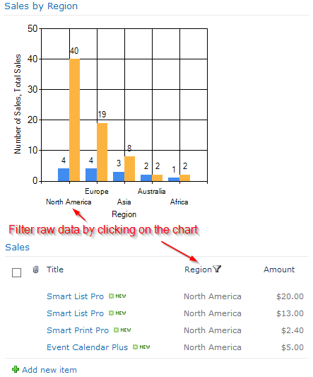
Filters
Item IDs
Color Choice
User Property
Document Link
Voting
Stay in the know
Get helpful videos
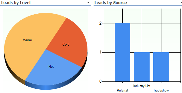
Visualize your SharePoint list data using 30+ chart types with fully configurable layout. Works in Microsoft 365.
UltimateForms:
Charts
helps you visualize data from SharePoint lists.
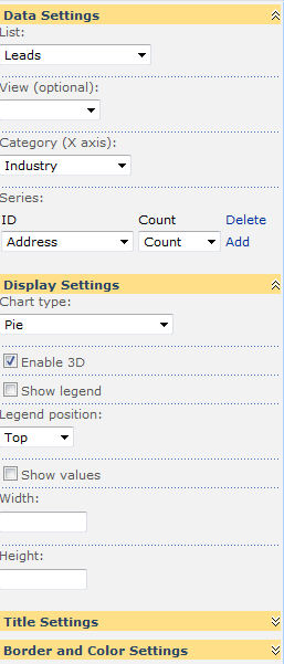
- Show your list data as a configurable chart
- Select one of 30+ chart types
- Control layout, background colors and borders
- Summarize your list data by category columns
- Use more than one data series on a single chart
- Optionally show values as percentage
- Optionally show user-defined colors for categories
- Optionally filter presented data by list view
- Works in Microsoft 365
Visualize and summarize your data in easy-to-understand chart format. You can count, sum-up or calculate the average value for any number of columns. You can even connect it to Filters web part to dynamically filter represented data to create visually-appealing dashboards.
Features
| UltimateForms | SharePoint Native | |
|---|---|---|
| Multiple chart types | ✓ |
|
| Connects to SharePoint lists | ✓ |
|
| Allows multiple series on a single chart | ✓ |
|
| Fully customizable look and feel | ✓ |
|
| Show values as percentage | ✓ |
|
| Localization into English, French, German and Spanish | ✓ |
✓
|
Screenshots