Stacked Column Chart
Stacked Column charts allow you to visualize both the total value and the individual contribution of each segment within that total.
They are especially useful when you want to:
- compare totals across categories
- understand how different parts contribute to a whole
- analyze composition within each category
- visualize grouped data in a compact vertical format
In this tutorial, you will reuse the Sales Tracking list created in the previous tutorial to create a Stacked Column chart.
Instructions
Step 1: Prepare the data source
We will reuse the Sales Tracking list.
The list contains:
- Month
- 2025 Sales
- 2026 Sales
- Index
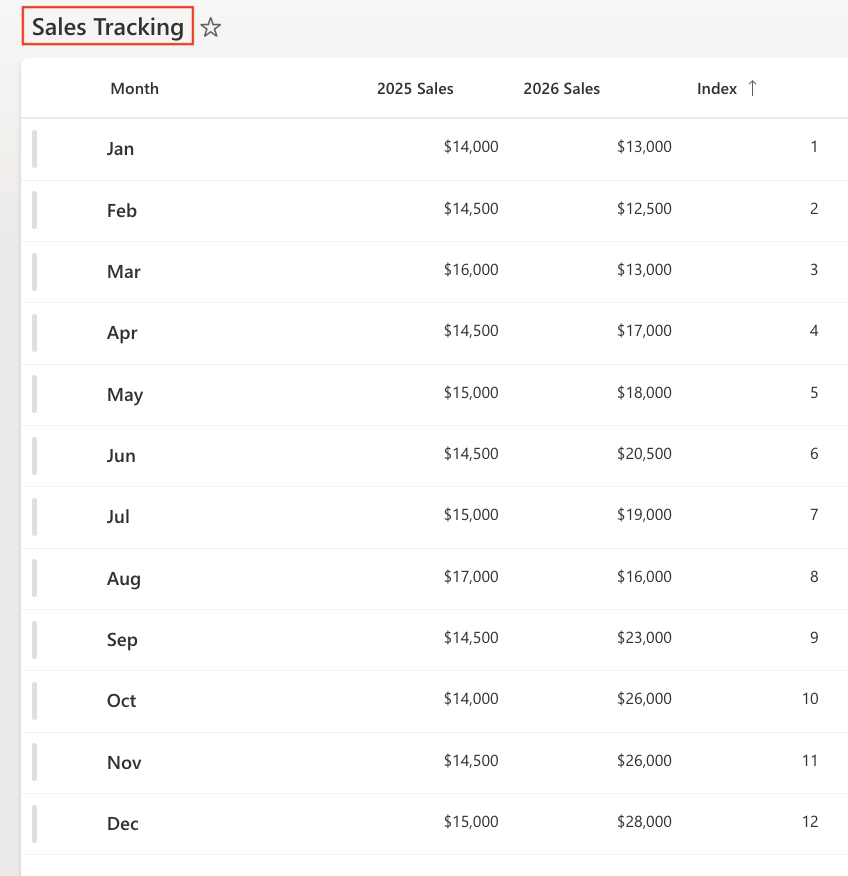
Make sure the view is sorted by: Index (Ascending)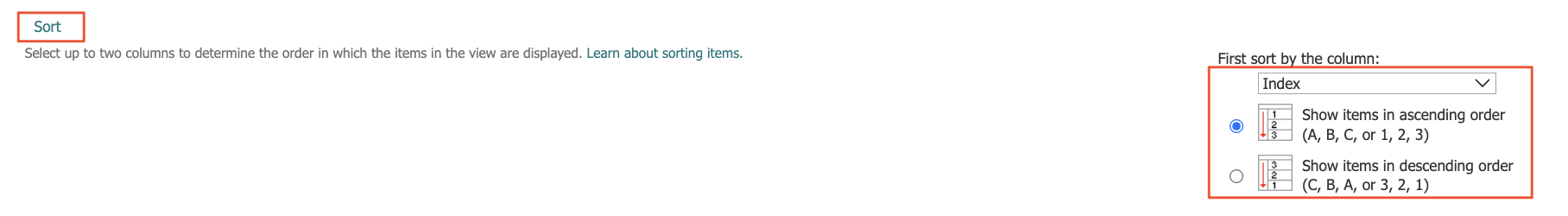
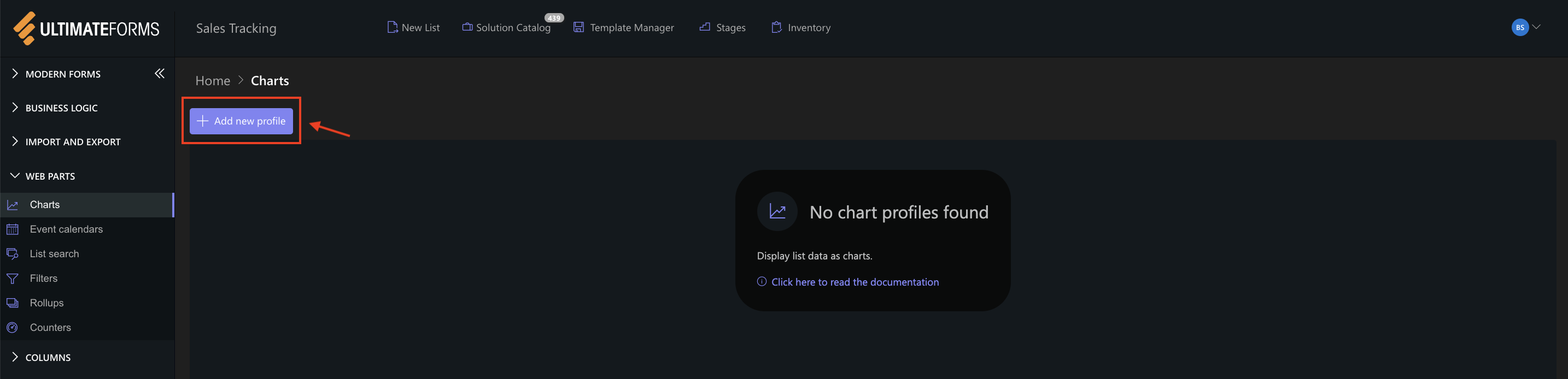
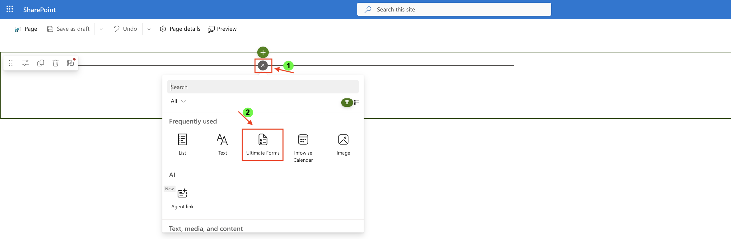
Step 2: Open Charts in Ultimate Forms
- Open Design
- Select Charts
- Click Add new profile
Step 3: Configure General settings
- Title: Monthly Sales Composition
- View: All Items (or your sorted view)
- Category (X axis): Month
- Colors (optional)
- Add two Series:
- Series 1:
- Column: 2025 Sales
- Aggregation: Sum
- Label: 2025
- Series 2
- Column: 2026 Sales
- Aggregation: Sum
- Label: 2026
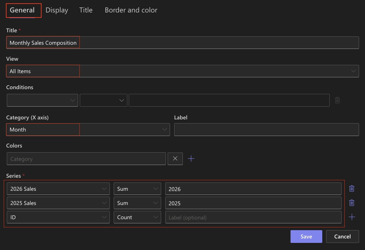
- Series 1:
Step 4: Configure Display settings
Open the Display tab.
- Chart type: Stacked Column
- Enable 3D - Optional (can be enabled for a more visual effect)
- Show legend: Enabled
- Legend position: Top
- Show values: Enabled
- Width: 1000
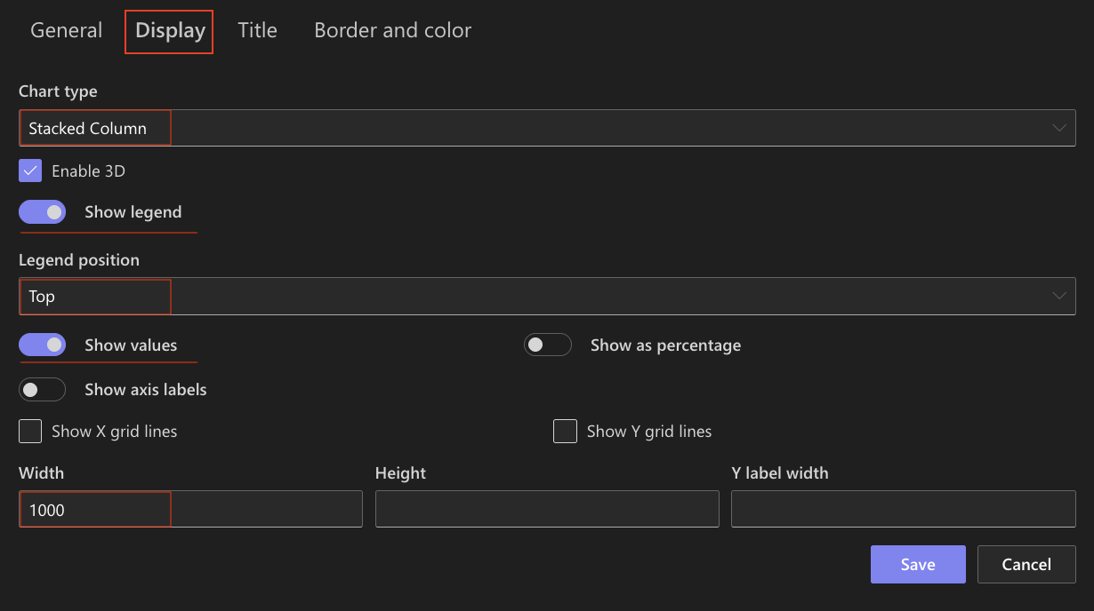
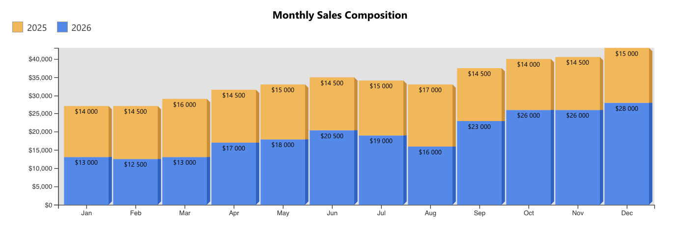
In a Stacked Column chart, values are stacked on top of each other, forming a total for each category.
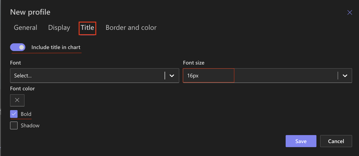
Step 5: Configure Title settings
- Include title: Enabled
- Font size: 16px
- Bold: Enabled
Step 6: Save the chart profile
- Click Save
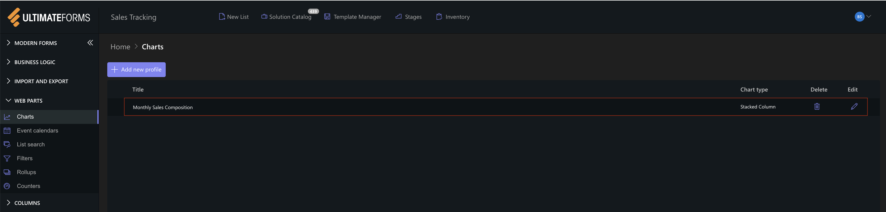
The Stacked Column chart profile is now available for use.
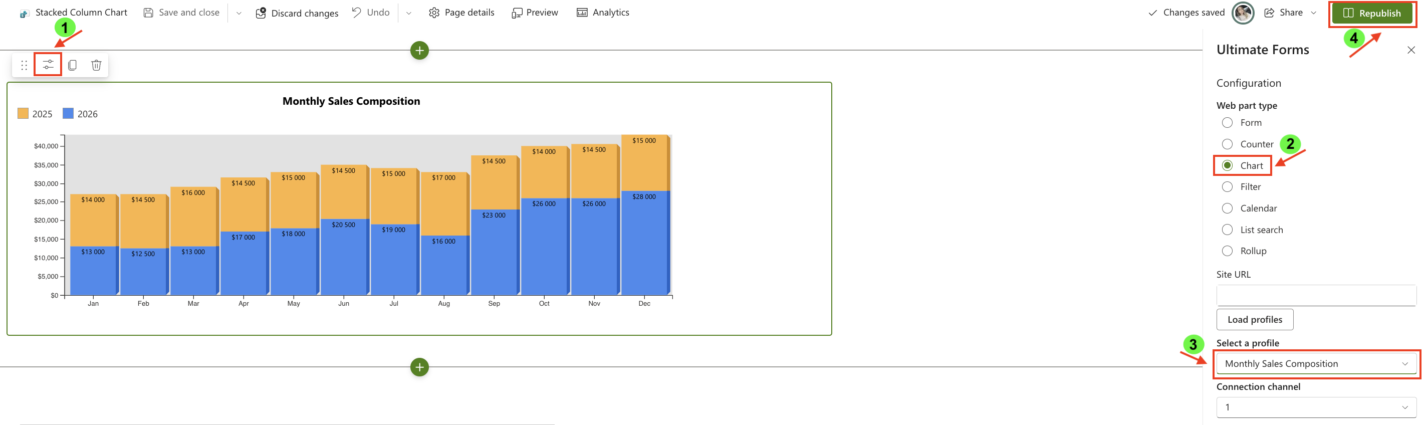
Step 7: Add the chart to a SharePoint page
After saving the chart profile, you need to add it to a SharePoint page using a web part:
- Create a new SharePoint page.
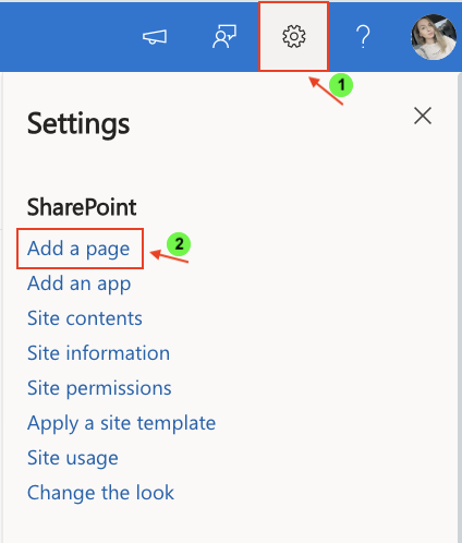
- Click the + button and add the Ultimate Forms.
- Once added, click the Edit Properties.
- In the web part properties:
- Set Type to Charts
- Select the profile: Monthly Sales Composition
- Publish the page
Result
The Stacked Column chart displays total monthly sales while showing how each year contributes to that total.
This makes it easy to:
- compare overall performance
- understand composition within each month
- analyze how values combine into totals
Compare with Column Chart
To better understand the difference, compare this chart with the standard Column chart.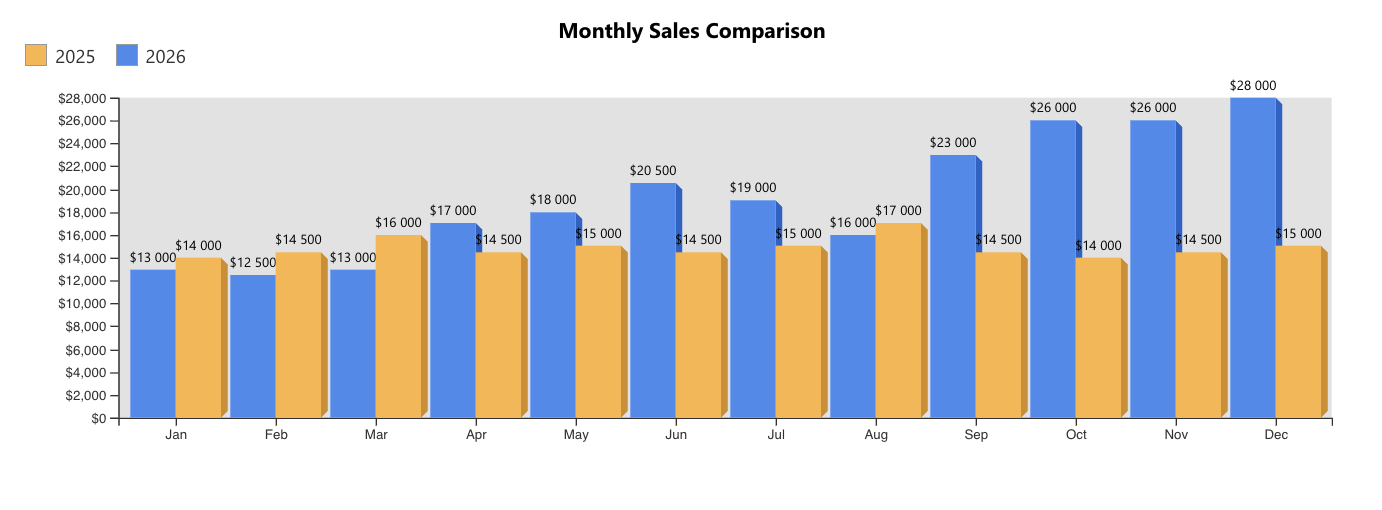
What changes:
- Column chart → values are shown side-by-side
- Stacked Column chart → values are stacked into a single column
When to use each:
- Use Column chart when you want to compare values directly
- Use Stacked Column chart when you want to show contribution to a total
Summary
In this tutorial, you learned how to create a Stacked Column chart to visualize how multiple values contribute to a total. This type of chart is useful for understanding both composition and overall distribution across categories.