Point Chart
Point charts display data as individual points without connecting lines, making them useful when you want to focus on separate observations rather than continuous trends.
They are especially useful when you want to:
- display individual values across categories
- identify variation between data points
- compare separate observations without implying continuity
- highlight clusters or unusual values
In this tutorial, you will create a Point chart that visualizes monthly sales values for two different years.
Instructions
Step 1: Prepare the data source
In this tutorial, we will reuse the Sales Tracking list created in the previous tutorial to create a Point chart that displays monthly sales values for two different years.
The list contains the following columns:
- Month
- 2025 Sales
- 2026 Sales
- Index
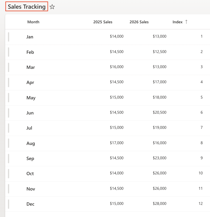
Make sure the view is sorted by: Index (Ascending)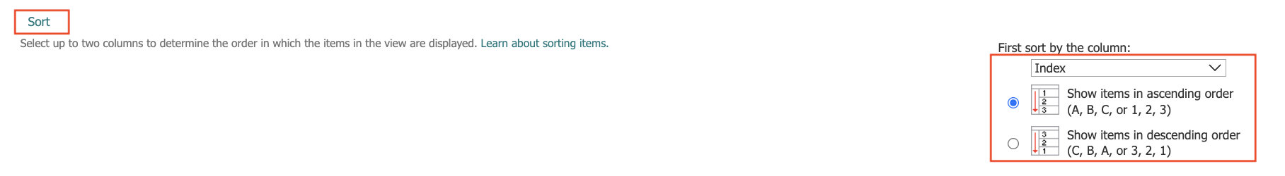
This ensures that months appear in chronological order.
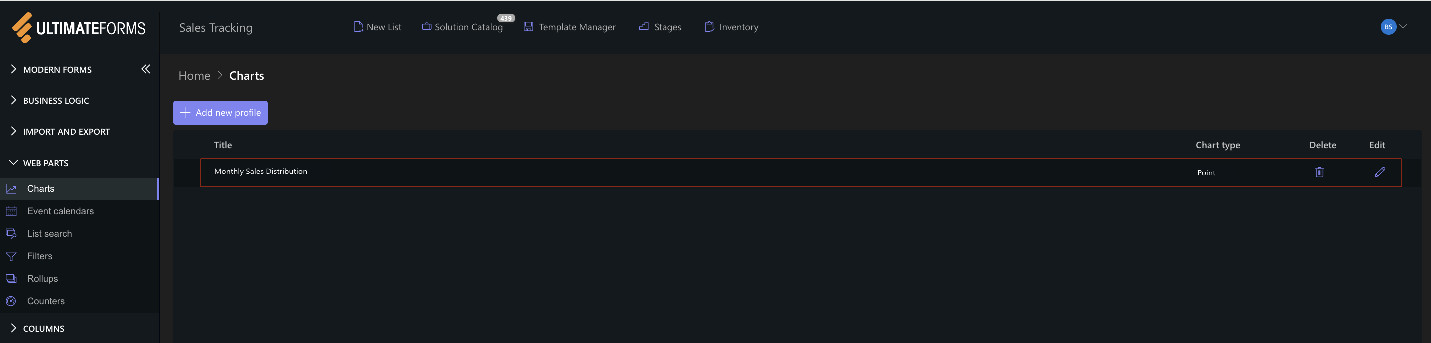
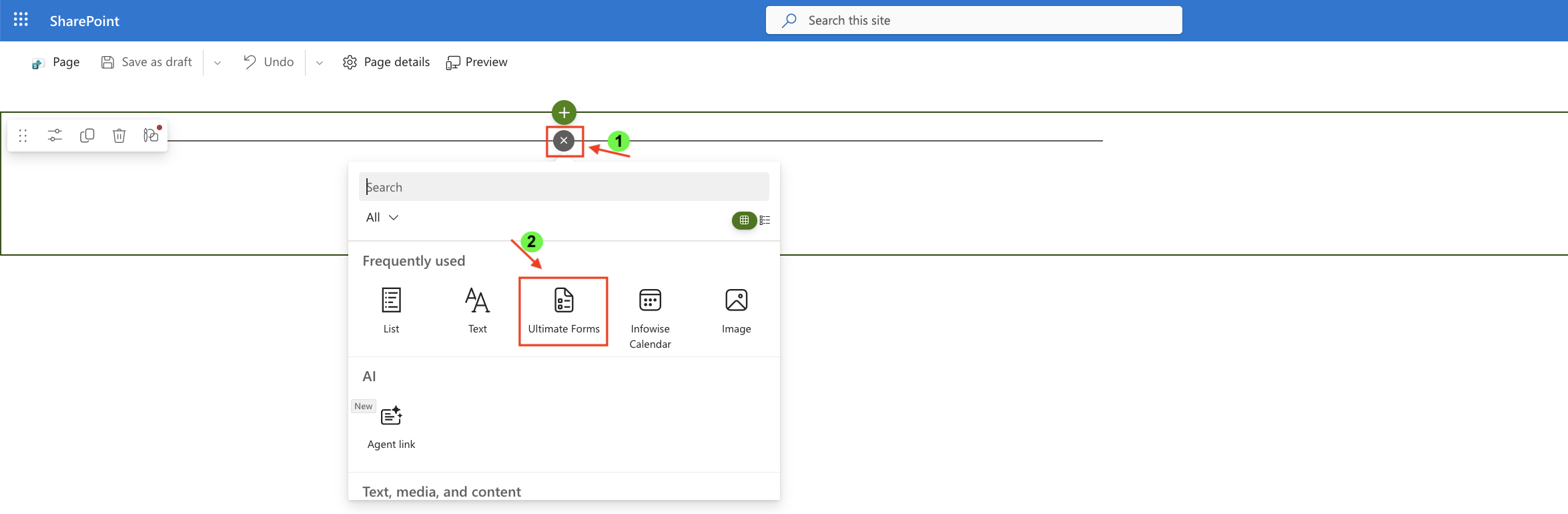
Step 2: Open Charts in Ultimate Forms
- Open Design.
- Select Charts from the main menu.
- Click Add new profile.
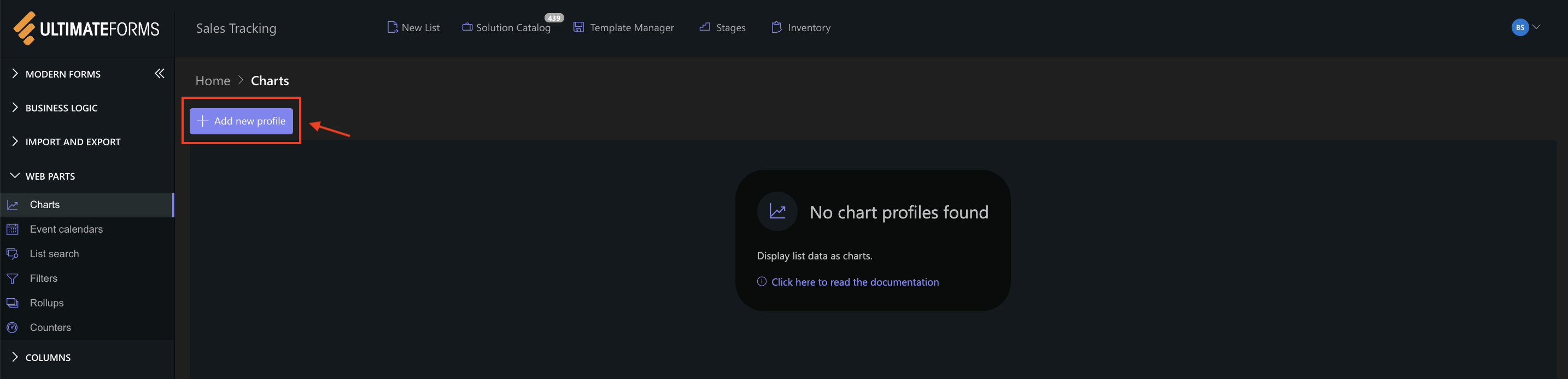
The Chart profile configuration panel opens.
Step 3: Configure General settings
- Title: Monthly Sales Distribution
- View: All Items (or your sorted view)
- Category (X axis): Month
- Colors (Optional)
- Add two Series:
- Series 1
- Column: 2025 Sales
- Aggregation: Sum
- Label: 2025
- Series 2
- Column: 2026 Sales
- Aggregation: Sum
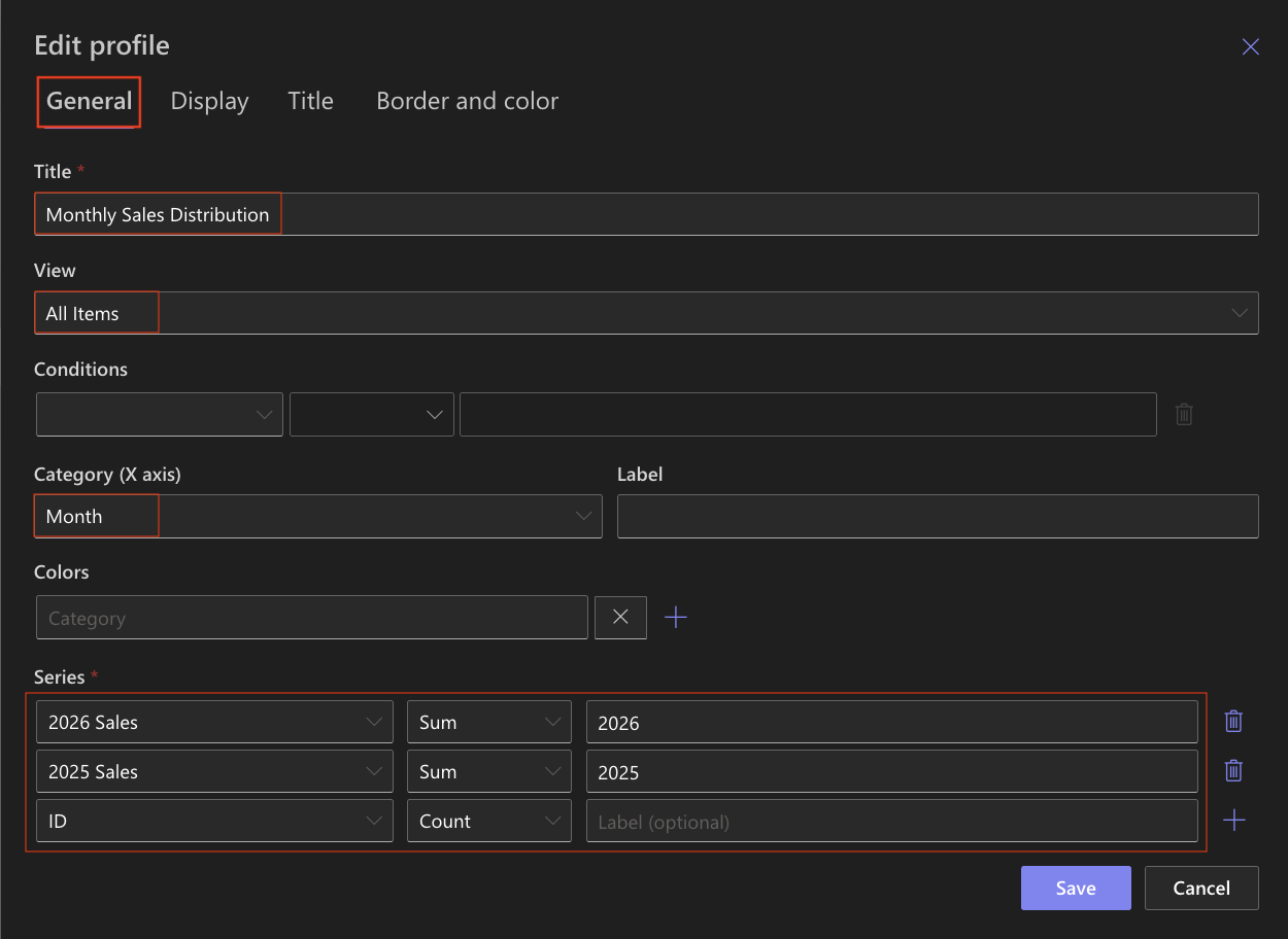
- Series 1
This configuration displays the monthly sales values for each year as separate points.
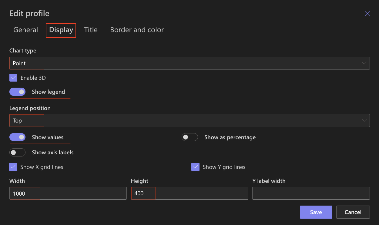
Step 4: Configure Display settings
Open the Display tab.
Use the following settings:
- Chart type: Point
- Enable 3D - Optional
- Show legend: Enabled
- Legend position: Top
- Show values: Enabled
- Show axis labels: Enabled
- Show X grid lines / Show Y grid lines: Optional (Enable if you want to visually compare values)
- Width: 1000
- Height: 400
Unlike Line or Spline charts, Point charts do not connect values, which makes it easier to focus on each individual data point.
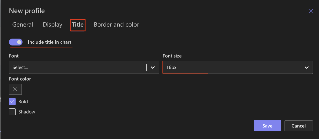
Step 5: Configure Title settings
Open the Title tab.
- Include title: Enabled
- Font size: 16px
- Bold: Enabled
Step 6: Save the chart profile
- Click Save.
The Point chart profile is now available and can be used on any SharePoint page.
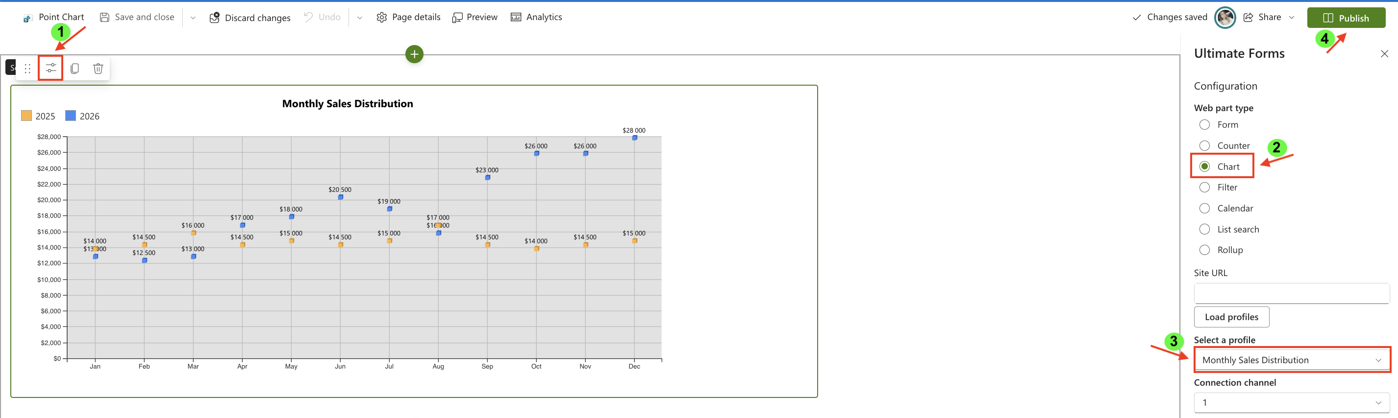
Step 7: Add the chart to a SharePoint page
After saving the chart profile, you need to add it to a SharePoint page using a web part:
- Create a new SharePoint page.
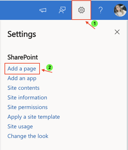
- Click the + button and add the Ultimate Forms.
- Once added, click the Edit Properties.
- In the web part properties:
- Set Type to Charts
- Select the profile: Monthly Sales Distribution
- Publish the page
Result
The Point chart displays two sets of monthly sales values as separate points:
- one set for 2025
- one set for 2026
This makes it easy to compare individual monthly values while keeping the visualization clean and uncluttered.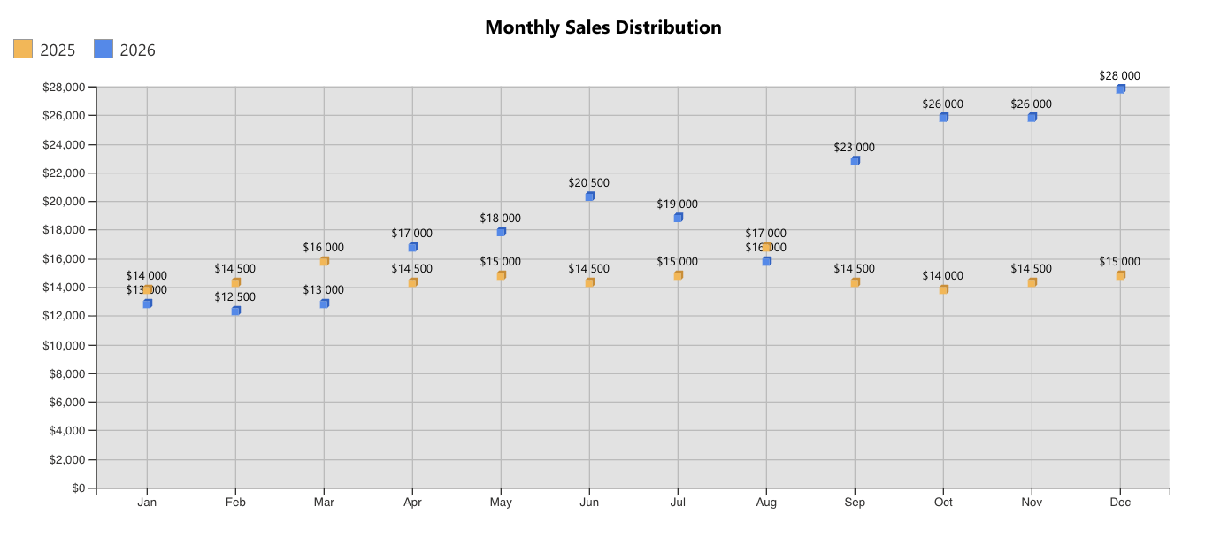
Compared to the Line chart, the Point chart focuses more on individual observations than on overall direction.
Summary
In this tutorial, you learned how to create a Point chart to display individual values across categories. Point charts are useful when you want to compare separate data points without connecting them into a continuous trend.