Area Chart
Area charts are similar to Line charts but include a filled area beneath the line, making it easier to visualize both trends and magnitude.
They are especially useful when you want to:
- highlight overall growth trends
- emphasize volume over time
- compare how values accumulate across periods
- present data in a more visually impactful way
In this tutorial, we will reuse the Sales Tracking list created in the previous tutorial (Column Chart) to create an Area chart that visualizes monthly sales trends for two different years.
Instructions
Step 1: Prepare the data source
In this tutorial, we will reuse the Sales Tracking list created in the previous tutorial.
The list contains the following columns:
- Month
- 2025 Sales
- 2026 Sales
- Index
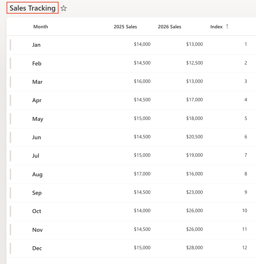
Make sure the view is sorted by: Index (Ascending)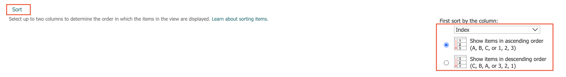
This ensures that months appear in chronological order.
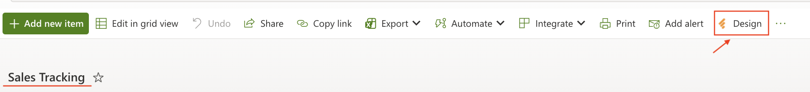
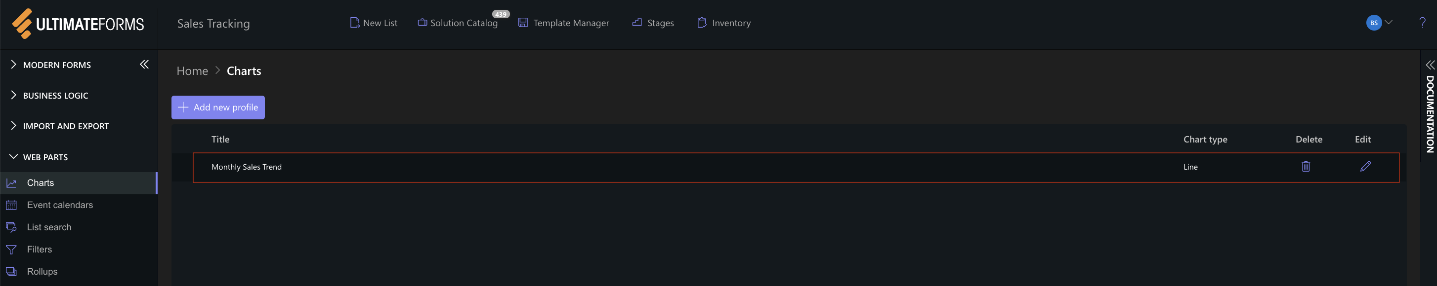
Step 2: Open Charts in Ultimate Forms
- Open Design.
- Select Charts from the main menu.
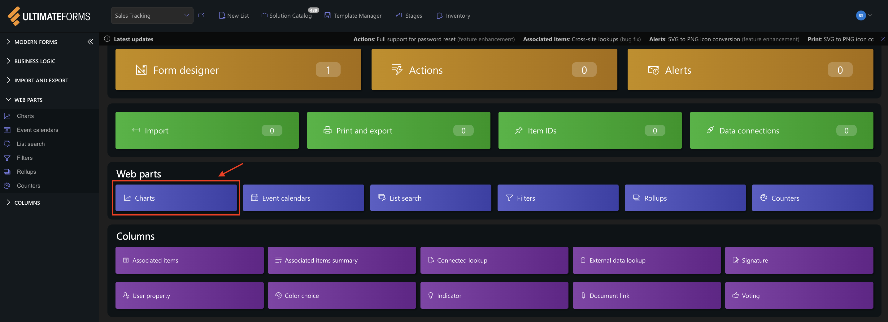
- Click Add new profile.
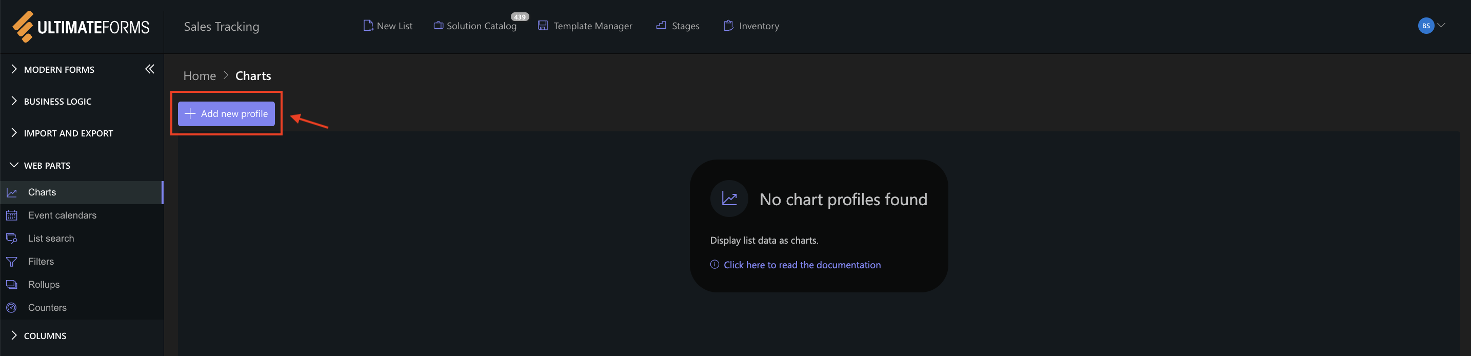
The Chart profile configuration panel opens.
Step 3: Configure General settings
- Title: Monthly Sales Trend
- View: All Items (or your sorted view)
- Category (X axis): Month
- Colors (Optional)
- Add two Series:
- Series 1
- Column: 2025 Sales
- Aggregation: Sum
- Label: 2025
- Series 2
- Column: 2026 Sales
- Aggregation: Sum
- Label: 2026
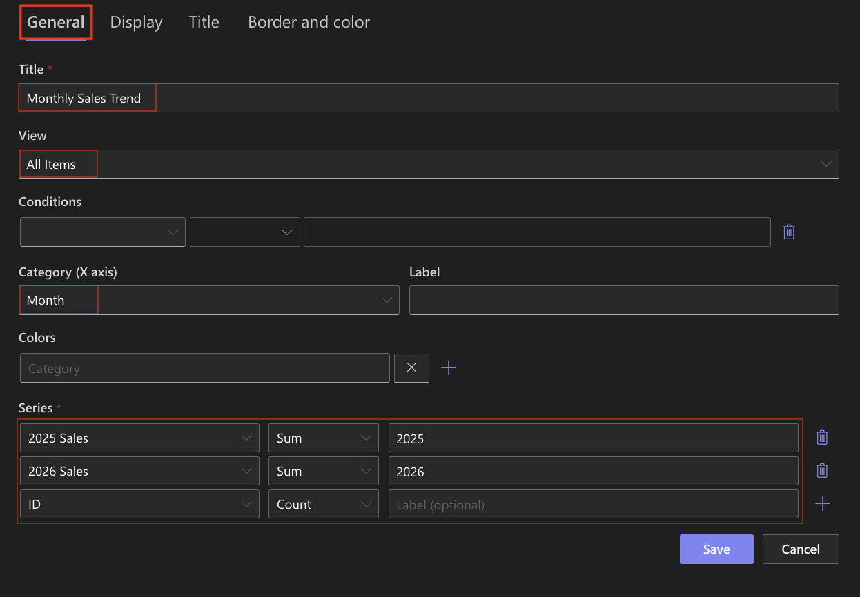
- Series 1
This configuration creates two layered areas representing sales performance for each year.
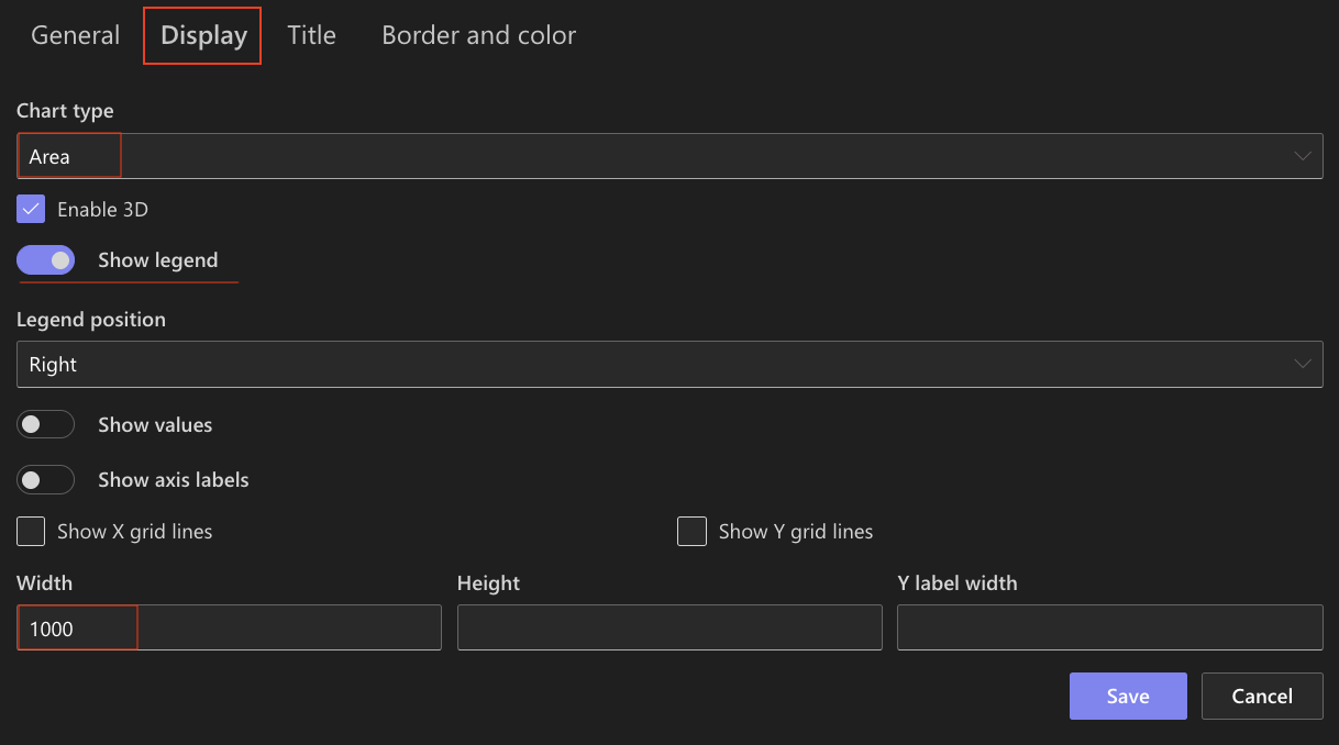
Step 4: Configure Display settings
Open the Display tab.
- Chart type: Area
- Enable 3D - Optional
- Show legend: Enabled
- Show values: Optional
- Show axis labels: Optional
- Show X grid lines / Show Y grid lines: Optional (Enable if you want to visually compare values)
- Width: 1000
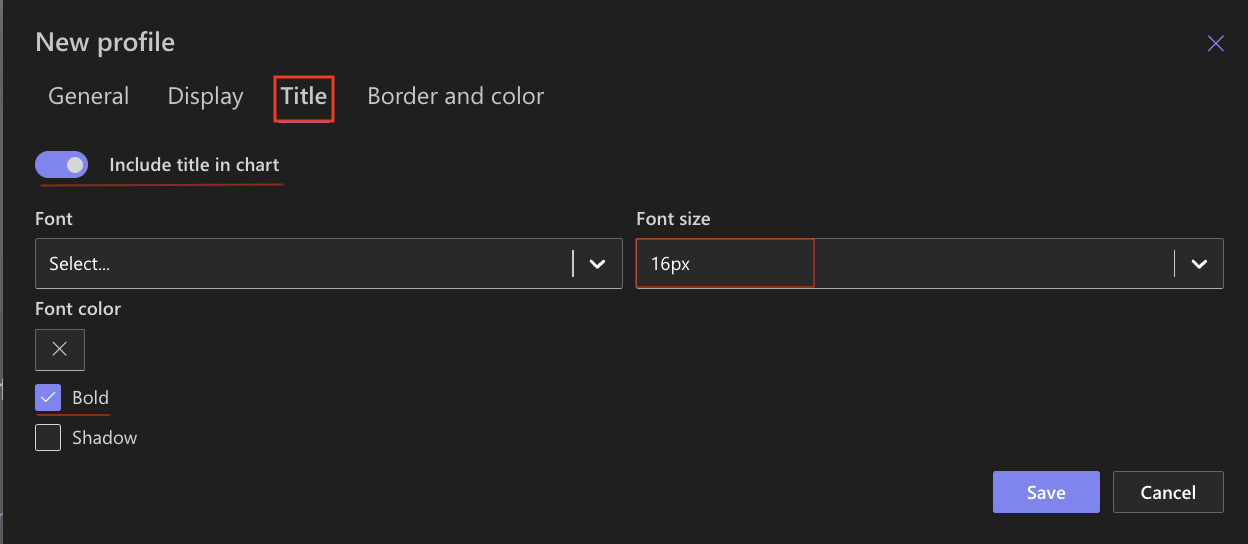
Step 5: Configure Title settings
Open the Title tab.
- Include title: Enabled
- Font size: 16px
- Bold: Enabled
Step 6: Save the chart profile
- Click Save.
An Area chart profile is now avalibale for use.
Step 7: Add the chart to a SharePoint page
After saving the chart profile, you need to add it to a SharePoint page using a web part:
- Create a new SharePoint page.
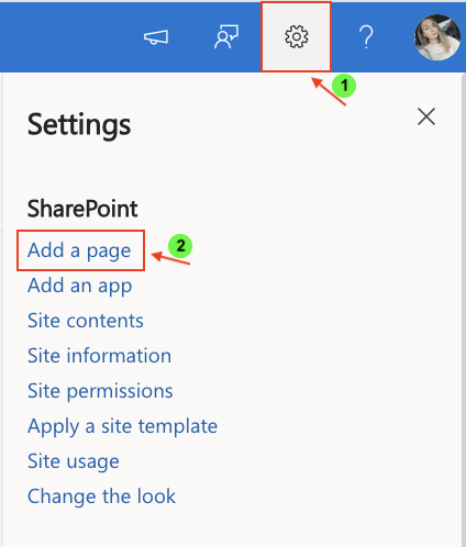
- Click the + button and add the Ultimate Forms.
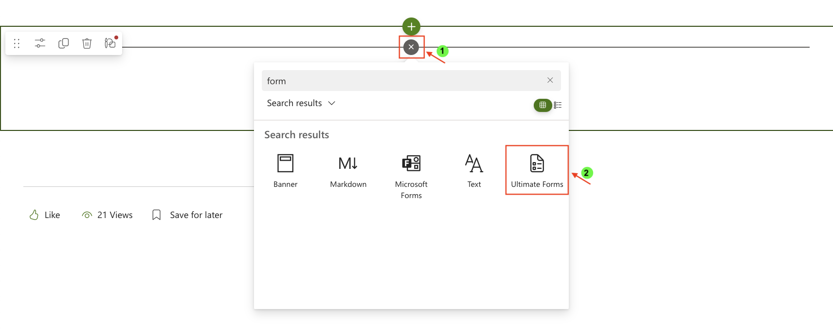
- Once added, click the Edit Properties.
- In the web part properties:
- Set Type to Charts
- Select the profile: Monthly Sales Trend
- Publish the page
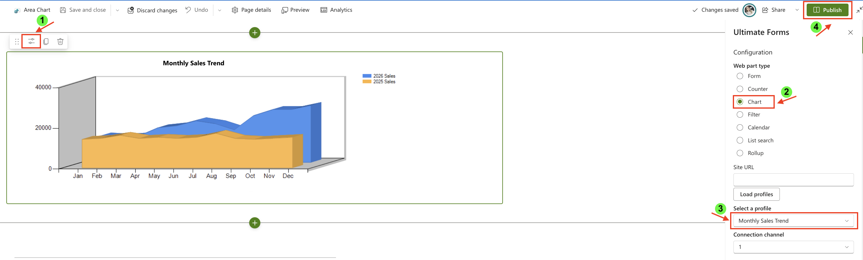
Result
The Area chart displays two filled areas representing monthly sales for 2025 and 2026.
The chart makes it easy to observe:
- overall growth trends
- differences in total volume between years
- seasonal fluctuations
- how values accumulate over time
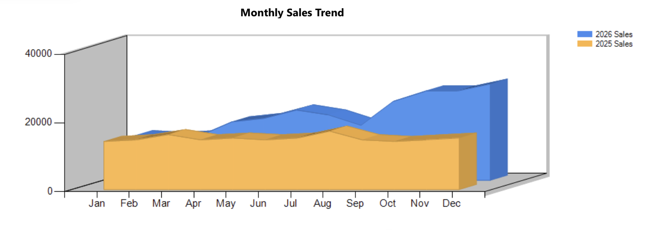
Compared to the Line chart, the Area chart provides a stronger visual emphasis on magnitude and total contribution.
Summary
In this tutorial, you learned how to create an Area chart to visualize trends and volume over time. Area charts are especially useful when you want to highlight both progression and the relative size of values across periods.