Line Chart
Unlike Column charts, which emphasize comparison between categories, Line charts focus on continuity and progression. They help identify:
- upward or downward trends
- seasonal fluctuations
- long-term growth patterns
- performance shifts between time periods
In this tutorial, we will reuse the Sales Tracking list created in the previous tutorial (Column Chart) to configure a Line chart that visualizes monthly sales trends for two different years.
Instructions
Step 1: Use the existing data source
We will reuse the previously created list:
Sales Tracking
Columns:
- Month - Choice
- 2025 Sales - Currency
- 2026 Sales - Currency
- Index - Number
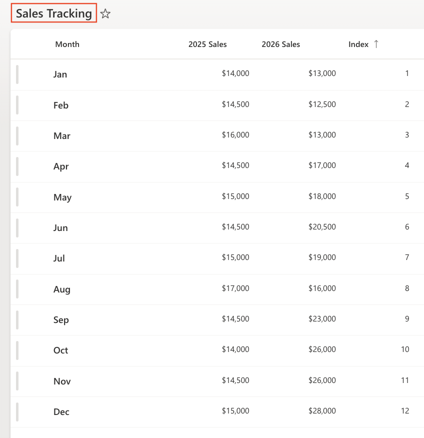
Ensure the view is sorted by: Index (Ascending)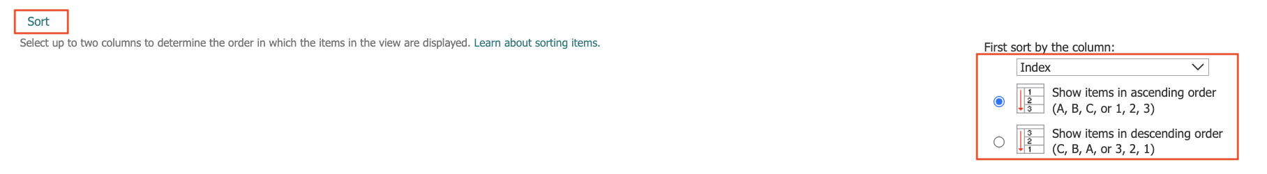
This keeps months in chronological order.
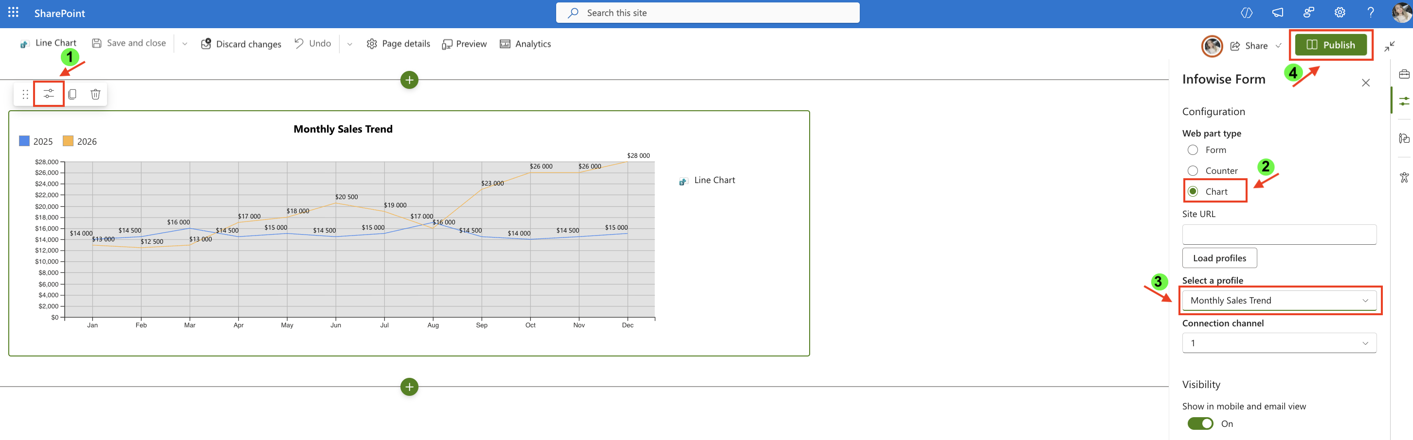
Step 2: Open Charts in Ultimate Forms
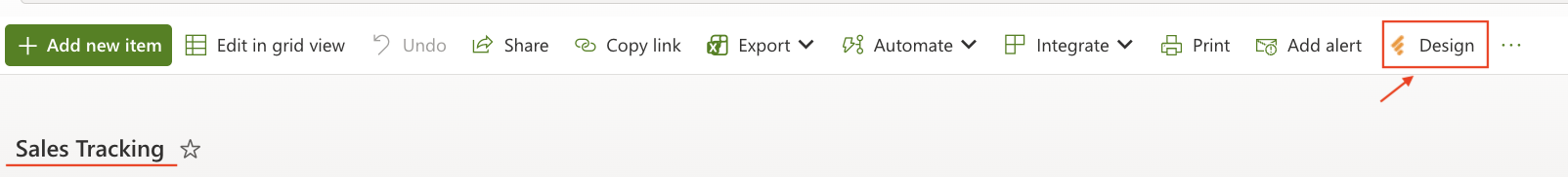
- Open Design.
- Select Charts from the main menu.
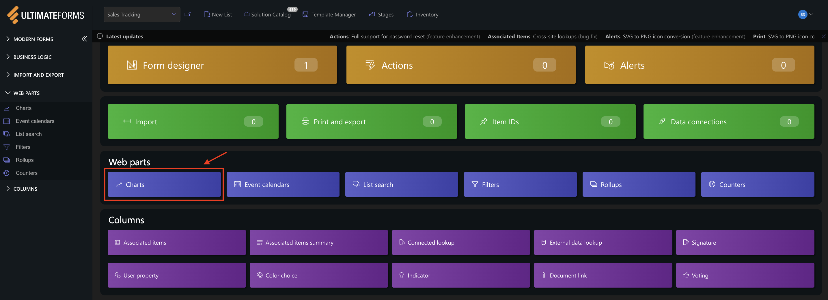
- Click Add new profile.
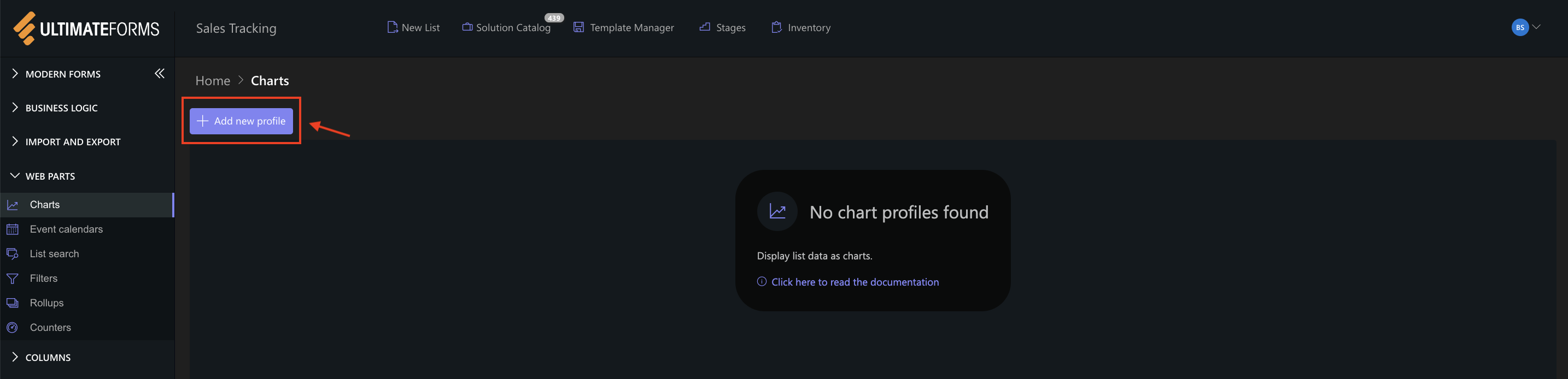
The Chart profile configuration panel opens.
Step 3: Configure General settings
- Title
Monthly Sales Trend - View
All Items (or your sorted view) - Category (X axis)
Month - Colors (optional)
- Add two Series:
- Series 1:
- Column: 2025 Sales
- Aggregation: Sum
- Label: 2025
- Series 2
- Column: 2026 Sales
- Aggregation: Sum
- Label: 2026
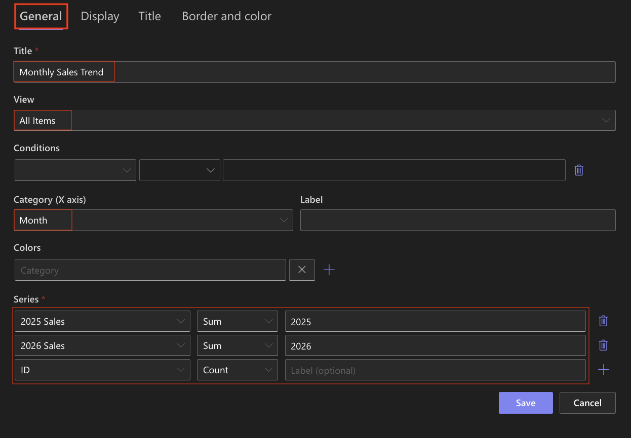
- Series 1:
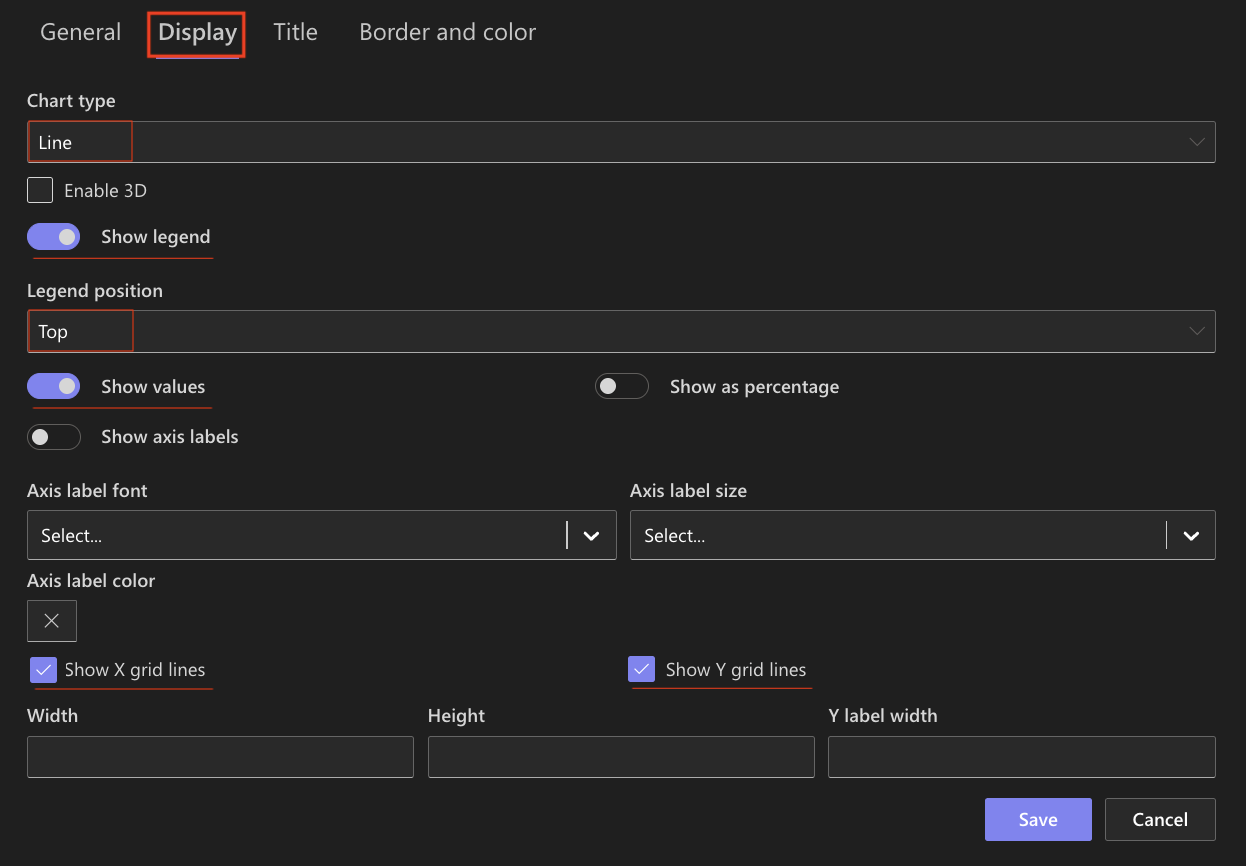
Step 4: Configure Display settings
- Chart type → Line
- Enable 3D - Optional
- Show legend ✔ Enabled
- Show values → Optional
- Show X grid lines / Show Y grid lines: Optional (Enable if you want to visually compare values)
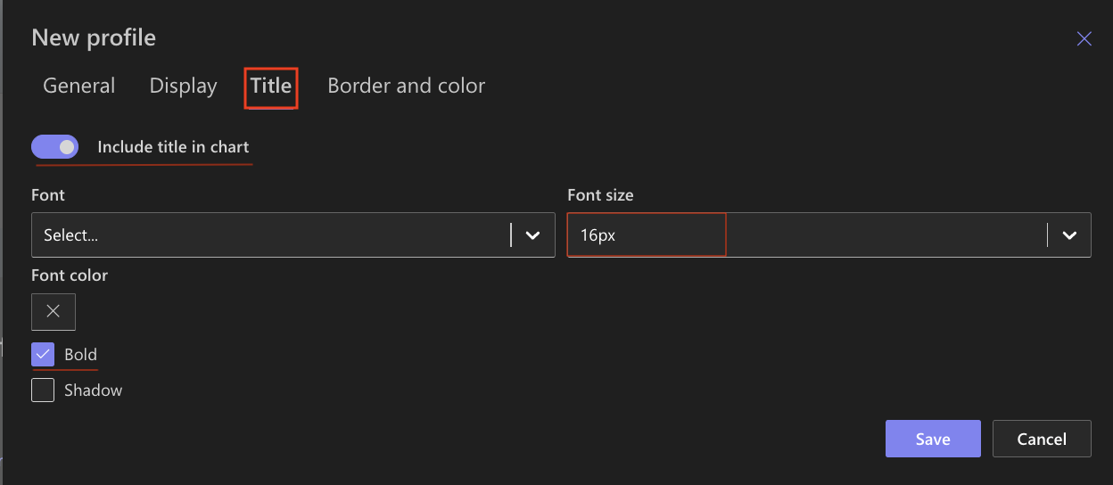
Step 5: Configure Title settings
- Include title ✔ Enabled
- Font size: 16px
- Bold ✔ Enabled
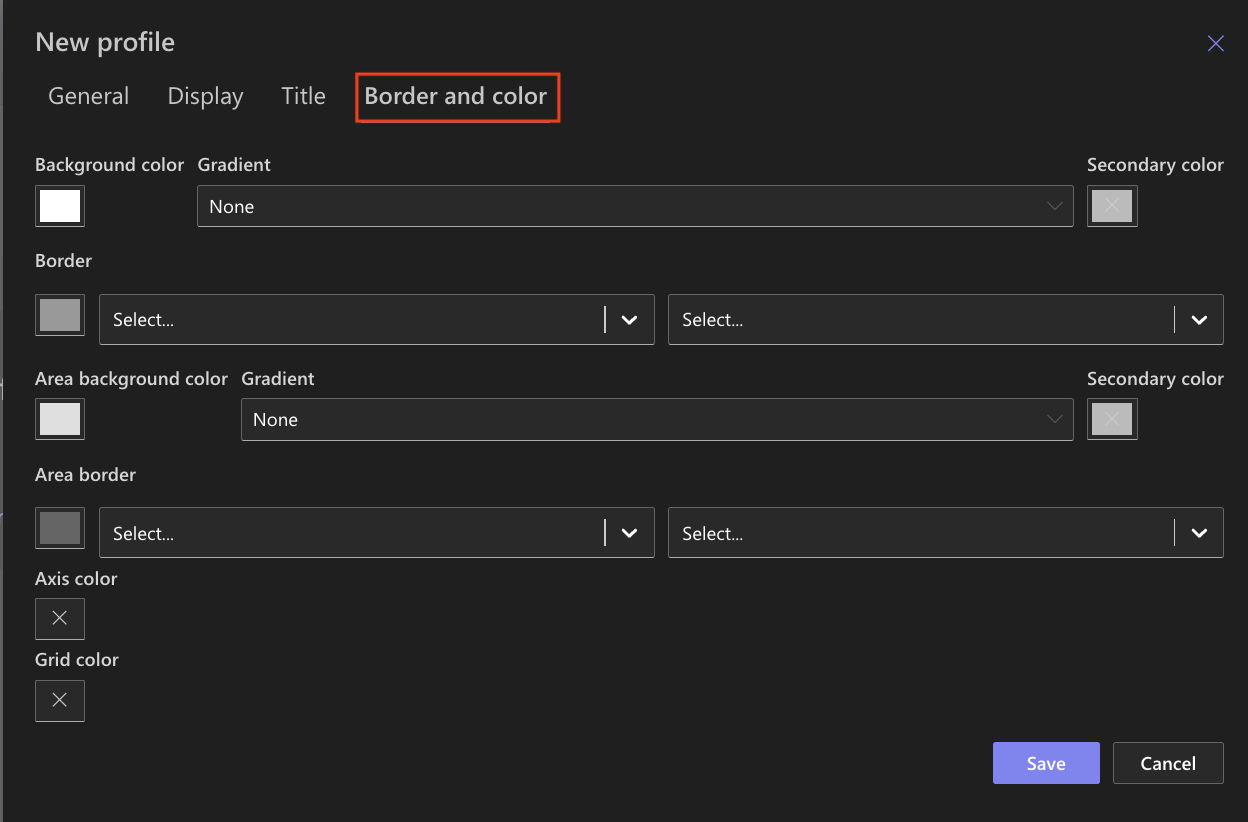
Step 6: Configure Border and color settings
Recommended settings:
- White background
- Light gray border
- Neutral chart area
Step 7: Save the Chart profile
- Click Save.
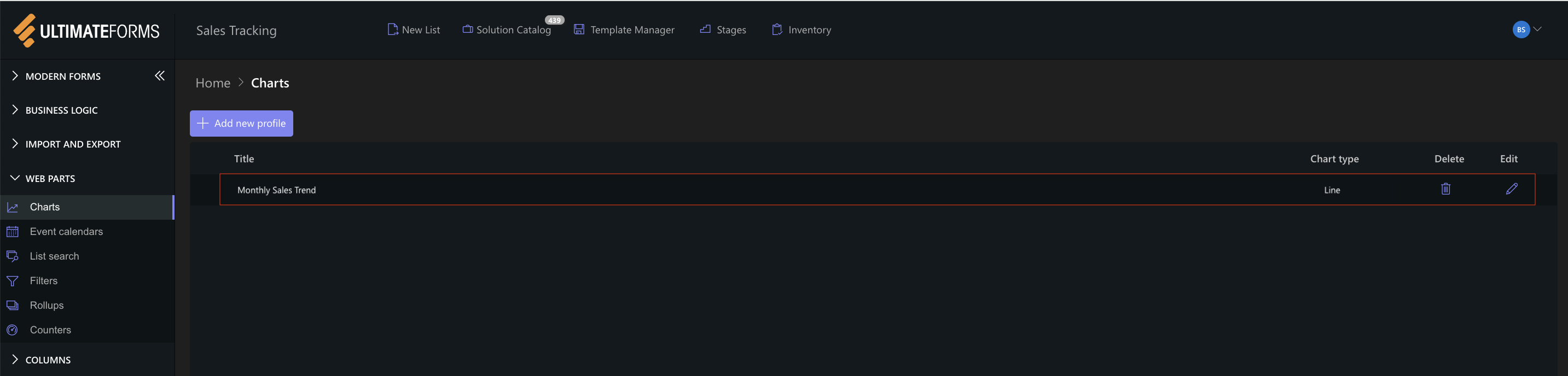
The Line chart profile is now available for use.
Step 8: Add the chart to a SharePoint page
After saving the chart profile, you need to add it to a SharePoint page using a web part.
- Create a new SharePoint page.
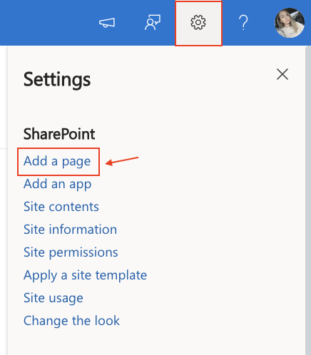
- Click the + button and add the Ultimate Forms.
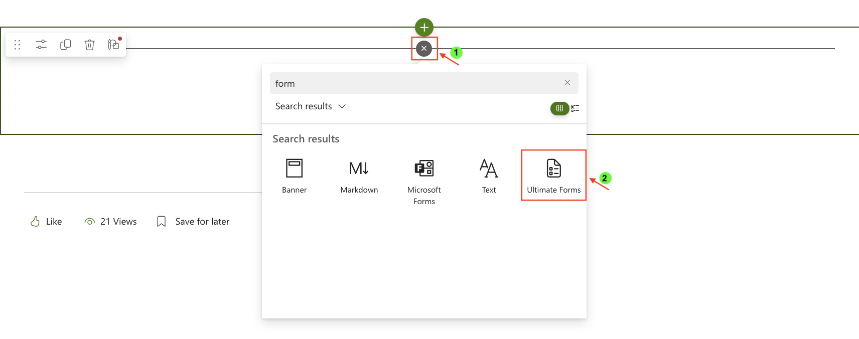
- Once added, click the Edit Properties.
- In the web part properties:
- Set Type to Charts.
- Select the profile: Monthly Sales Trend.
- Publish the page.
Result
The Line chart displays two continuous lines:
- A blue line representing 2025 sales
- An orange line representing 2026 sales
The chart clearly shows:
- Steady growth in 2026
- Moderate stability in 2025
- Strong upward trend in Q4
- Overall improvement year-over-year
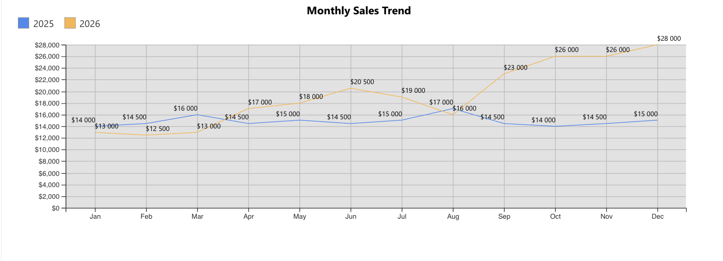
Compared to the Column chart:
- Column emphasizes side-by-side comparison
- Line emphasizes progression and momentum
Summary
You created a Line chart to visualize monthly sales trends across two years. Line charts are especially effective for identifying growth patterns and long-term performance trends over time.