Color Choice as a status indicator
When working with SharePoint lists, readability and quick navigation are key. A list with dozens or even hundreds of items can become difficult to scan if every column looks the same. The Color Choice column in Ultimate Forms is designed to solve this problem. It allows you to assign background colors, text colors, and even icons to different choice values. This feature provides clear visual indicators that make it easy for users to spot priorities, statuses, or categories at a glance.
Example We’ll Build:
We’ll create a Status column with these choices:
- Not Started
- In Progress
- On Hold
- Completed
- Canceled
You’ll configure it twice:
- as icons, and
- as colors (with options to color text, the cell, or the whole row).
Instructions
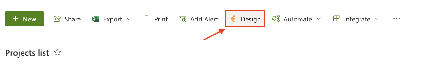
Step 1: Open Design
- Open your SharePoint list.
- Click Design.
Step 2: Add the Color Choice column
- Go to Columns → Color Choice.

- Add new column.
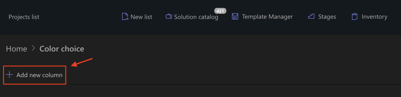
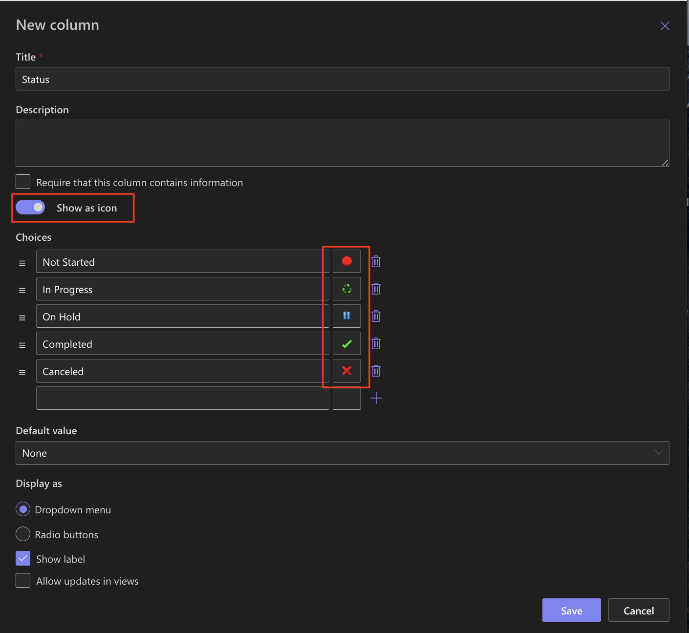
- Name it Status.
- Add the choices exactly as listed above:
- Not Started
- In Progress
- On Hold
- Completed
- Canceled
- Save.
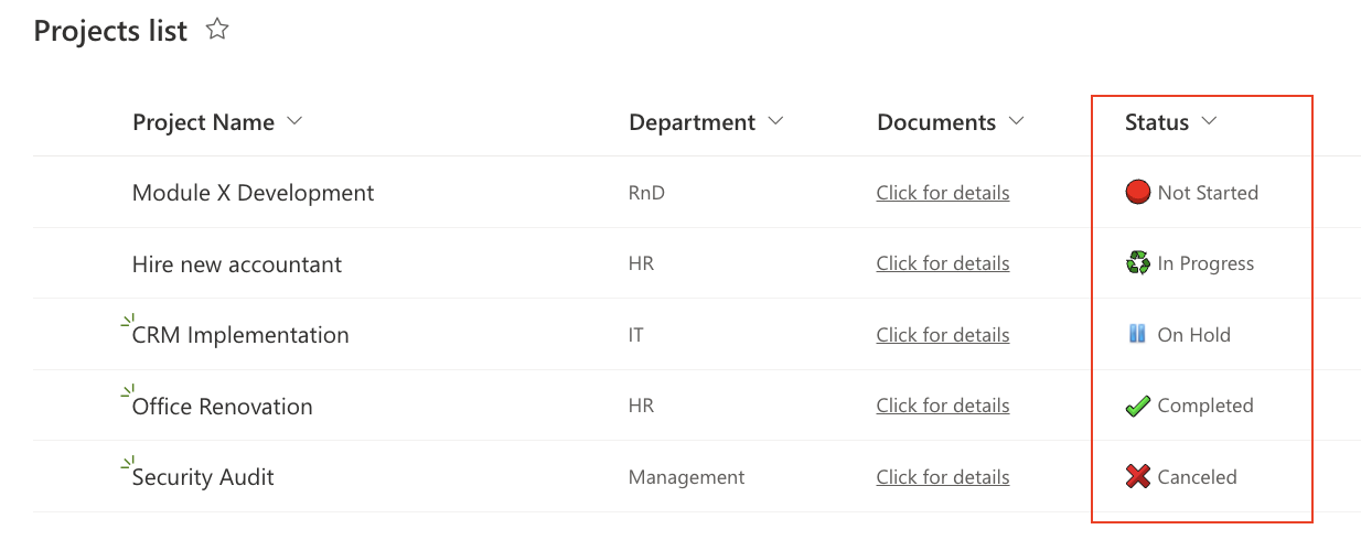
Path A - Show Status as Icons
Step 3A: Assign icons per choice
- Open the Status column you just created.
- Enable Show as icon
- For each choice, set an icon (you can use any set; here’s a clear, familiar mapping):
- Not Started → white circle
- In Progress → spinner / arrows
- On Hold → pause bars
- Completed → check mark
- Canceled → cross / stop
- Save.
Step 4A: Add to form & view
- In Form Designer (Layout), drag Status into your form where you want it. Publish.
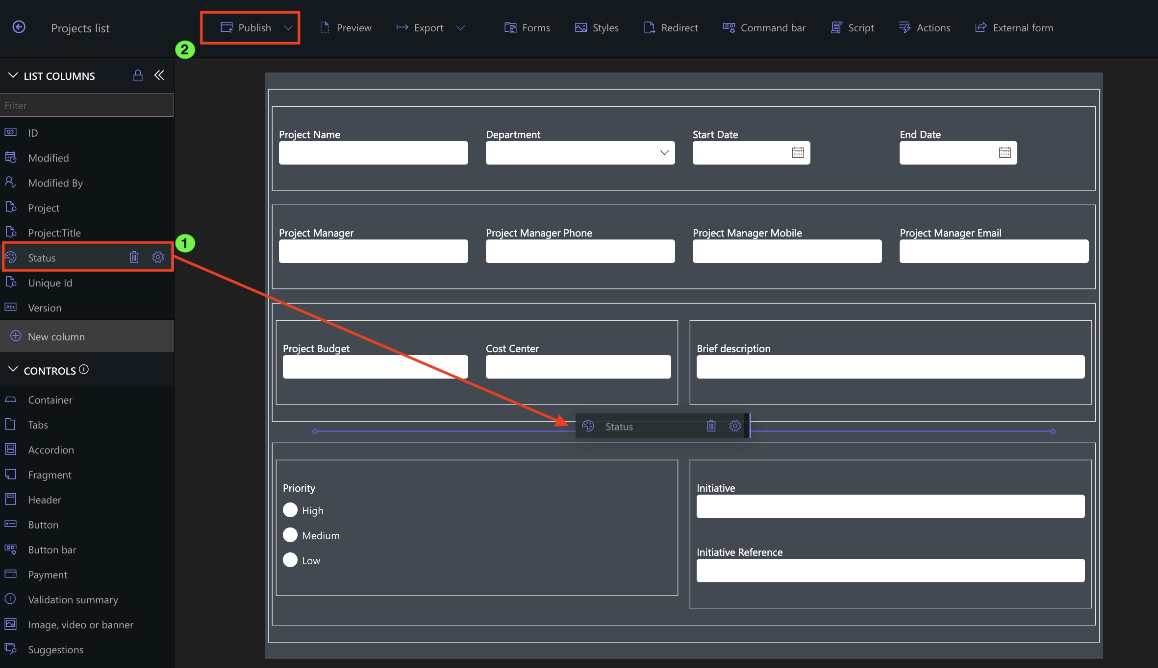
- Back in the list view, ensure Status is included in the current view (View settings).
- Confirm items now display icons next to the Status value.
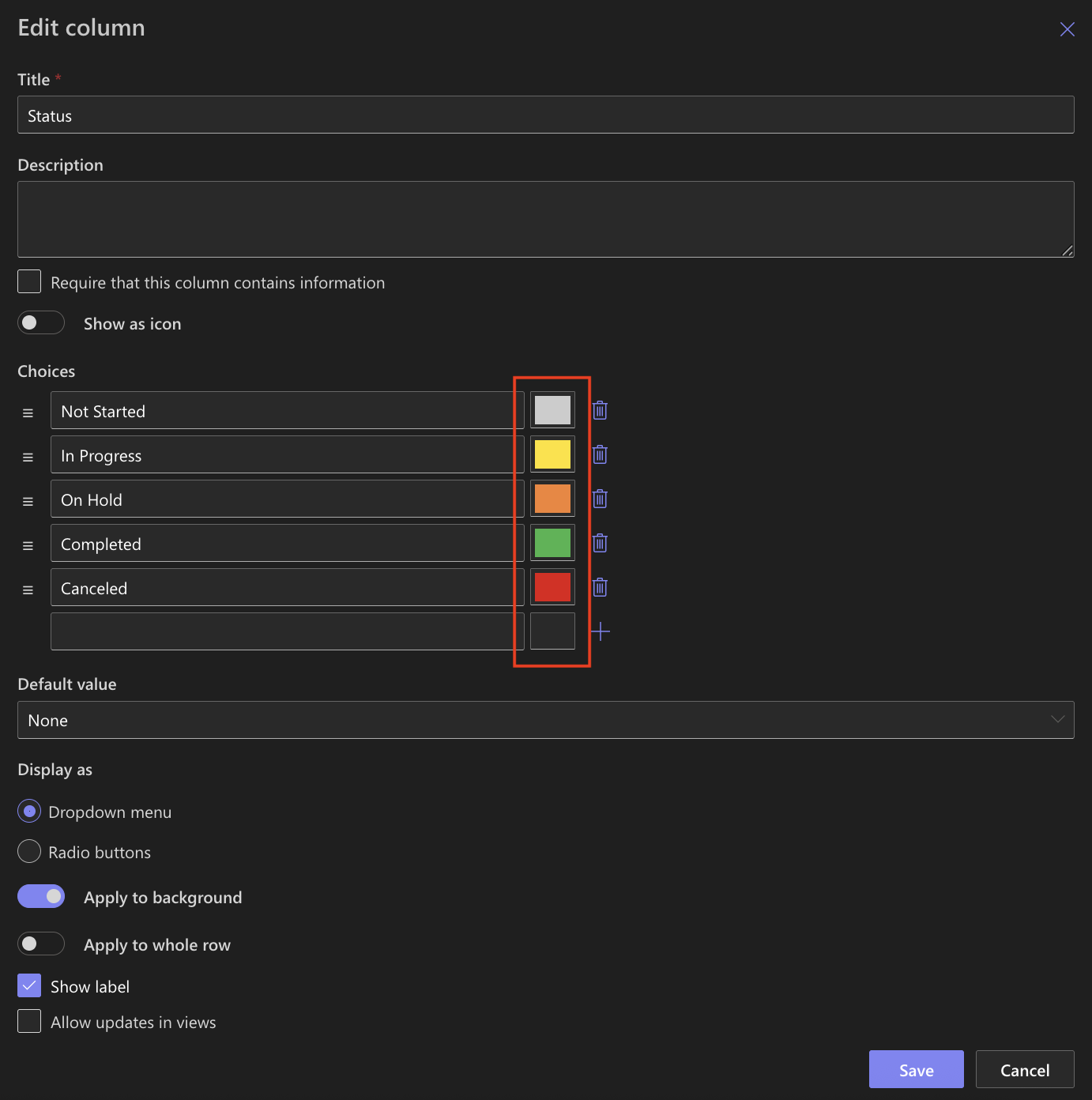
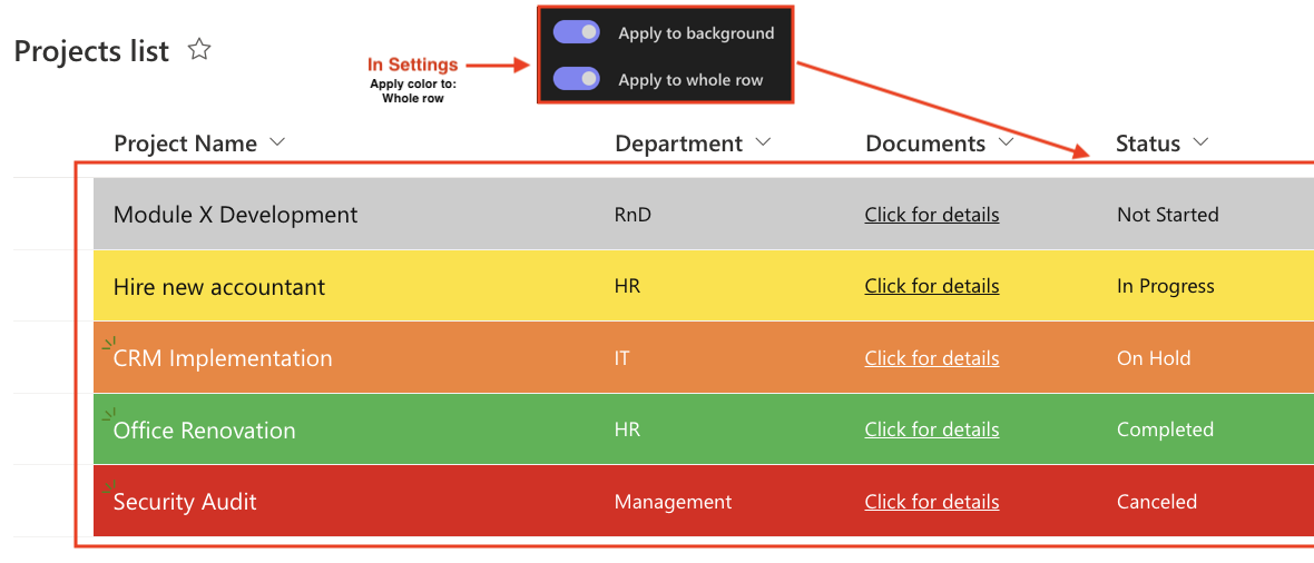
Path B - Show Status as Colors (new addition)
Step 3B: Assign colors and how they apply
- Open the Status column again.
- Switch to Color display (turn off “Show as icon”).
- Configure each choice with a color scheme (example):
- Not Started → light gray background
- In Progress → yellow background
- On Hold → orange background
- Completed → green background
- Canceled → red background
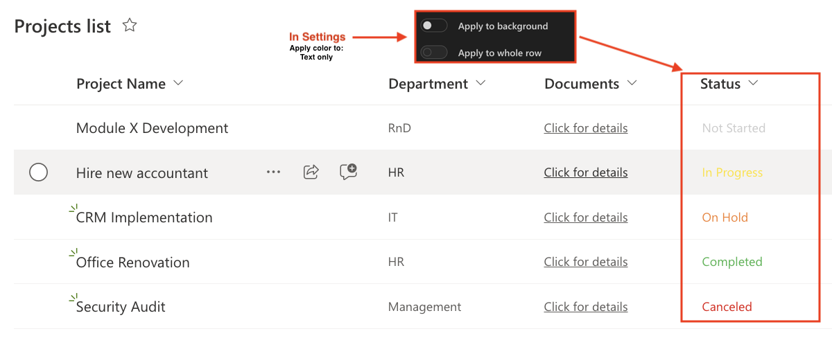
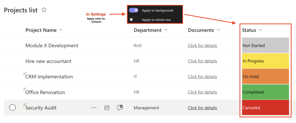
- Apply color to: choose what fits your dashboard:
- Text only (turn off “Apply to background” and turn off “Apply to whole row”)
- Column (Apply to background),
- Whole row (Apply to whole row).
- Save.
Step 4B: Add to form & view
- In the list view, make sure Status is visible.
- Confirm items now show colored labels.
Tips & Best Practices
- Consistency matters: use the same color/signals across lists (e.g., green = done, red = stop).
- Don’t overdo it: 3–5 distinct statuses is a sweet spot.
- Row vs. column: use Whole row color for attention-critical boards; use Column for lighter visuals.
- Order your choices so the most common or most important appear first.
Watch this quick video walkthrough from Infowise:
Summary
The Color Choice column in Ultimate Forms enhances list readability by assigning colors and icons to choice values. This makes it easier for users to quickly identify statuses, priorities, or categories directly in their lists